The network for creativity
Join 1.25M professional creatives like you
Connect with clients, get discovered, and run your business 100% commission-free
Creatives on Contra have earned over $150M and we are just getting started
Back to feedPost
Taste Test

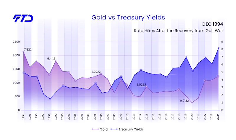
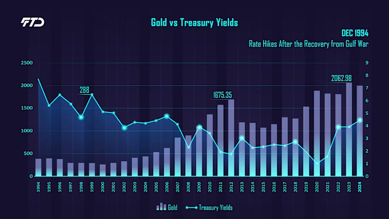
This chart was made for a trading company’s animated video, so it had to read in seconds while the lines move. Dark feels like a trading terminal and glows on screen. Light feels like a calm analytics report. Dark speaks to traders, light to everyone else.
Place your bets: which one did the client pick? 🎲
1 vote
Ends in 1d

Both options are interesting. Apparently, in option A, he liked it better that there are columns
The network for creativity
Join 1.25M professional creatives like you
Connect with clients, get discovered, and run your business 100% commission-free
Creatives on Contra have earned over $150M and we are just getting started



Related posts

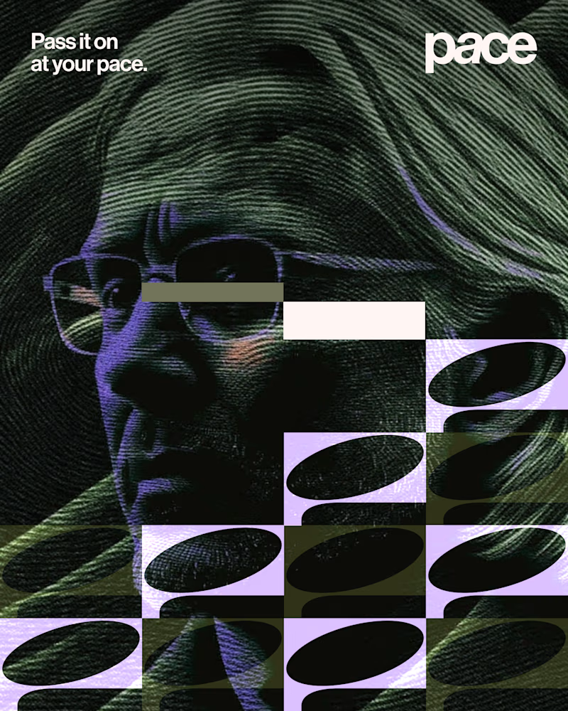
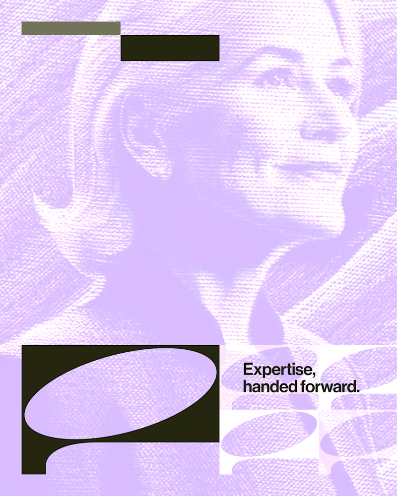
Experimental layouts for Pace. Which one do you like?
23 voted
52%
21 voted
48%
44 votes
Closed

Looks cool.

Exploring the listening state for an AI voice interface.
Which direction would you ship, A or B?
10 voted
29%
25 voted
71%
35 votes
Closed

The particle field looks more polished and beautiful🔥
Text animation looks like a small detail, until you put a few versions side by side 👀
Which one works better for you, A or B?

16 voted
44%
20 voted
56%
36 votes
Closed

B is way smooth