The network for creativity
Join 1.25M professional creatives like you
Connect with clients, get discovered, and run your business 100% commission-free
Creatives on Contra have earned over $150M and we are just getting started
Back to feedPost

Adaptive Interface [Concept]
The interface quietly adjusted itself to where you are: bright office, dimmed room, late night. A small prototype exploring context-aware UI.
The network for creativity
Join 1.25M professional creatives like you
Connect with clients, get discovered, and run your business 100% commission-free
Creatives on Contra have earned over $150M and we are just getting started
Related posts


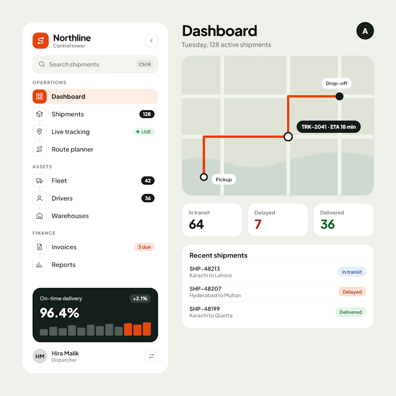
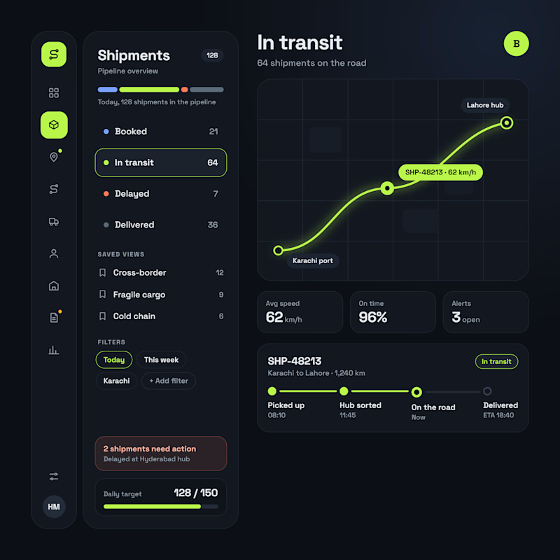
Logistics SaaS Dashboard | Light & Dark UI Exploration
A logistics management dashboard explored in two visual directions, taking a Vibe Coded interface through further UI/UX refinement.
Version A — Light UI
A clean operational dashboard focused on shipment visibility, route planning, delivery performance, and logistics analytics.
Version B — Dark UI
A data-focused interface featuring shipment pipelines, real-time tracking, delivery statuses, operational filters, and progress monitoring.
Key UI/UX Focus:
Logistics & Shipment Tracking Dashboard
SaaS Dashboard UI Design
Fleet & Operations Management
Data Visualization & Information Architecture
Which direction works better for a logistics SaaS product — Light or Dark?
#SaaSDesign #DashboardDesign #LogisticsSoftware #UIDesign #VibeCoding


4 votes
Ends in 1d

Really liked how these designs turned out!
Explored a concept for AI SaaS product, focusing on a clean interface and a simple, intuitive chat experience.
Tried two different layout variation for the hero section.
Which would you like?


1 vote
Ends in 1d

Mobile concept for Madison, a fashion e-commerce store. I wanted the photography to lead, so the interface stays minimal: a serif logo, a quiet navigation bar and plenty of white space.



Full bleed photo with just a serif logo on top is the right call for fashion, the type lets the jewelry do the talking. Does the Best seller strip swipe sideways on mobile?