The network for creativity
Join 1.25M professional creatives like you
Connect with clients, get discovered, and run your business 100% commission-free
Creatives on Contra have earned over $150M and we are just getting started
Back to feedPost

Designing for AI products requires more than just aesthetics it requires clarity, trust, and structured information flow.
This AI Platform Landing Page concept features both Light and Dark UI versions.
The goal was simple:
Create a landing experience that helps AI companies clearly communicate their product value, capabilities, and pricing to potential customers.
Key design considerations:
• Information hierarchy – guiding users from product value → capabilities → proof → pricing → conversion
• Dual theme experience – ensuring readability and visual balance across light and dark modes
• Trust signals – testimonials, team section, statistics, and case studies to build credibility
• Product storytelling – breaking down complex AI workflows into digestible sections


The network for creativity
Join 1.25M professional creatives like you
Connect with clients, get discovered, and run your business 100% commission-free
Creatives on Contra have earned over $150M and we are just getting started



Related posts


A bold, modern landing page for a creative agency, built around immersive visuals and strong typography. We’d love to hear your thoughts!


A high-end Kajabi landing page, built in just a few prompts with Pro Studio. 🌊
Meet TIDELINE: a fictional freediving school demo with immersive visuals, oversized typography, a custom header with dropdown navigation, and carefully crafted layouts. One page, with a whole lot of personality.
Explore the live page: https://mm-themes.mykajabi.com/tideline_2_
Built with https://tryprostudio.com
Graphics are AI promotional mockups.

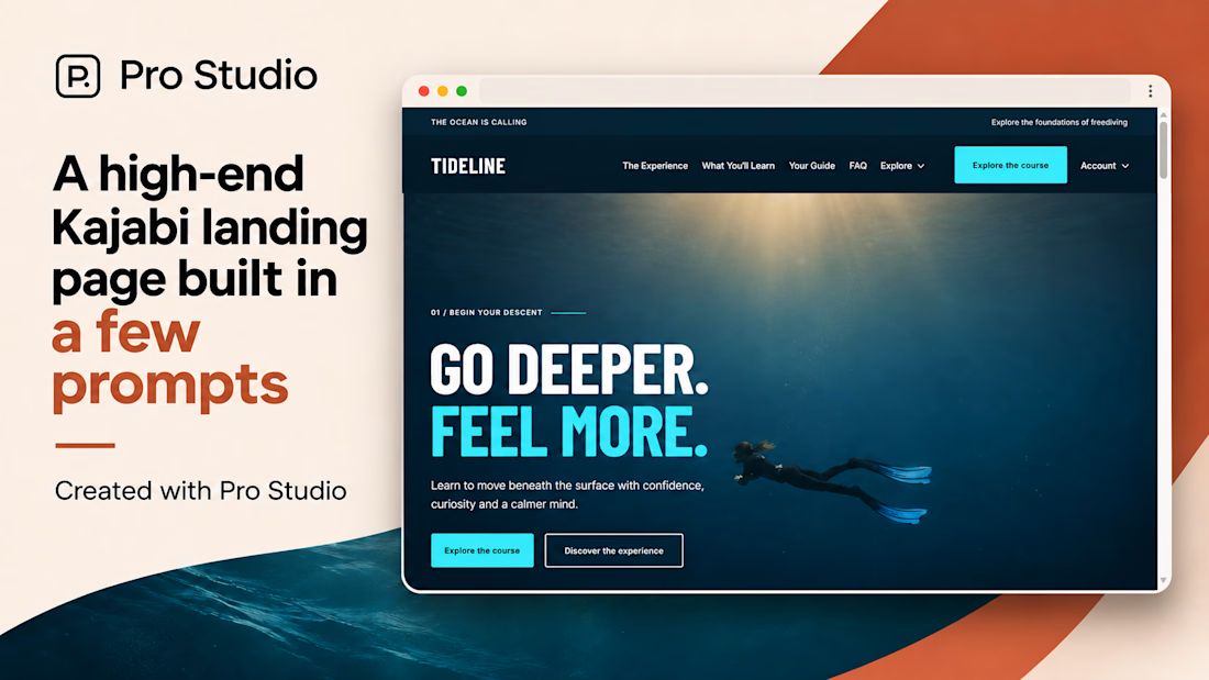
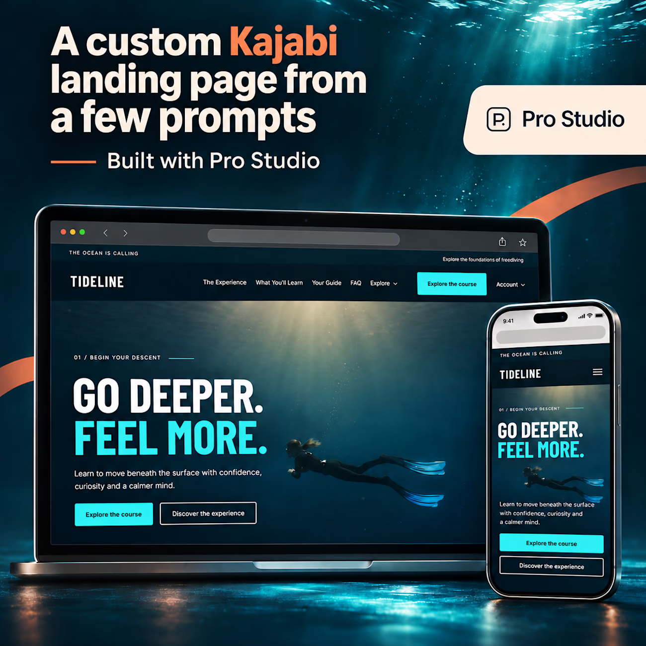

The oversized "GO DEEPER. FEEL MORE." headline works really well against the underwater shot. Does Pro Studio output native Kajabi sections the client can still edit in the page builder, or custom code blocks? That's the first thing my course clients would ask.

Really liked how these designs turned out!
Explored a concept for AI SaaS product, focusing on a clean interface and a simple, intuitive chat experience.
Tried two different layout variation for the hero section.
Which would you like?
13 voted
57%
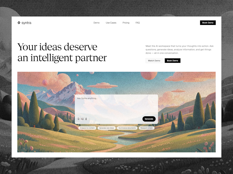
10 voted
43%
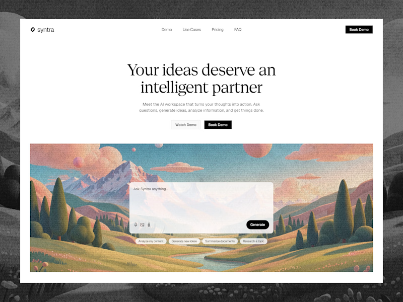
23 votes
Closed

Really clean concept! 👏
I like the second layout more — the headline "Your ideas deserve an intelligent partner" + the chat preview below makes the AI feel real and easy to use immediately. The first one is also clean, but this one sells the product faster.
I also design SaaS...


