The network for creativity
Join 1.25M professional creatives like you
Connect with clients, get discovered, and run your business 100% commission-free
Creatives on Contra have earned over $150M and we are just getting started
Back to feedPost

And.Immo — multilingual real estate site for Andorra on Webflow (ES, FR, EN, CA). Node integration syncs their external CRM into Webflow CMS so listings stay current. Case study on my profile → Check it out


Love this!
The network for creativity
Join 1.25M professional creatives like you
Connect with clients, get discovered, and run your business 100% commission-free
Creatives on Contra have earned over $150M and we are just getting started





Related posts


Which real estate homepage makes the stronger first impression?
ListingVision AI features a bright layout, teal accents, and property imagery to introduce its AI staging and listing tools.
San Diego Property Market pairs coastal photography with classic typography, neighborhood search, and market resources.
Which design feels more inviting and makes you want to explore further? Does the clean presentation of ListingVision AI catch your attention, or do you prefer the location-focused experience of San Diego Property Market?
Vote for your favorite and share what influenced your choice: imagery, colors, typography, layout, or calls to action.
#WebDesign #RealEstateMarketing #AIWebsites #UIUXDesign #TransformedDesign


3 voted
43%
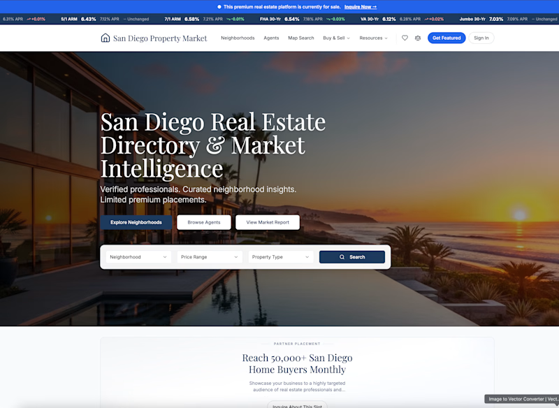
4 voted
57%
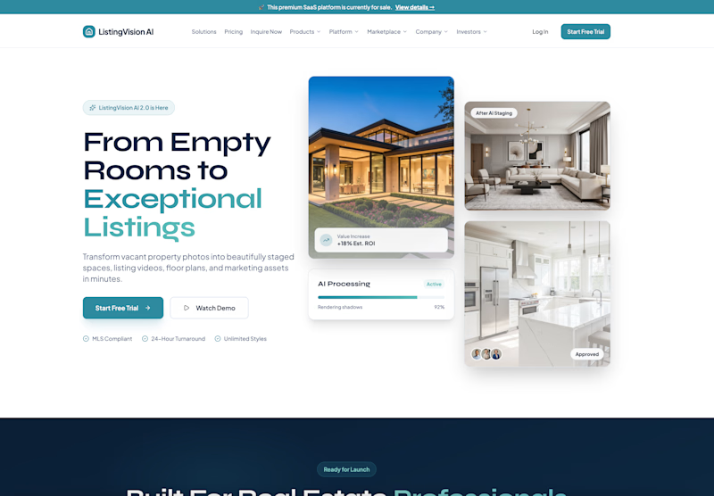
7 votes
Closed

ListingVision AI. One clear primary button and the staged before/after right in the hero, while San Diego asks you to choose between three equal buttons and a search bar before you know why.


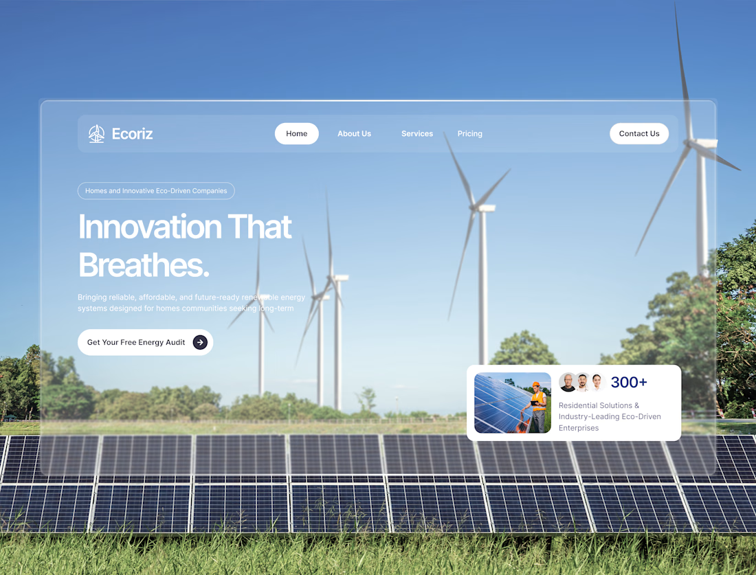
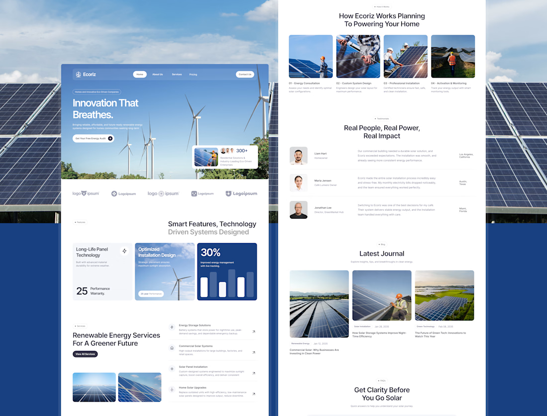


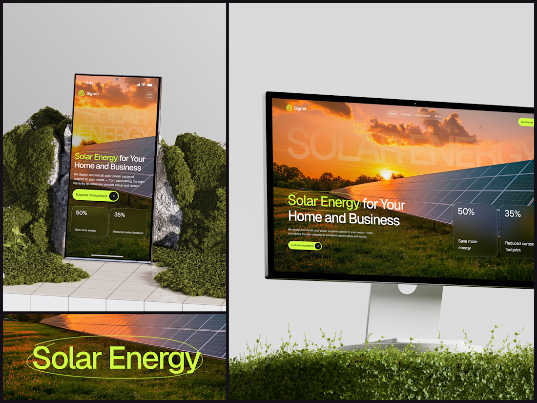
Solar Energy Website
A thin lime circle tells you which two words this page is about.
The headline sits over a sunset photo of a panel field. The "Get started" and "Explore innovations" buttons share the circle's lime, so the eye moves from the circled words straight to the next step.
Large faded capitals repeat those two words across the sky, faint enough to stay inside the photo. On mobile they break onto two lines, and the headline and button stack above two frosted cards.
Only two words of "Solar Energy for Your Home and Business" are lime, and the whole page follows them.
Designed by the Hue & Machine team.
#SolarEnergy #RenewableEnergy #CleanTech #WebDesign #LandingPage #HeroSection #UIDesign #ResponsiveDesign #MobileDesign #FigmaDesign

This is really cool, Nice job Dmytro