The network for creativity
Join 1.25M professional creatives like you
Connect with clients, get discovered, and run your business 100% commission-free
Creatives on Contra have earned over $150M and we are just getting started
Back to feedPost
Taste Test
Which version do you prefer the most?
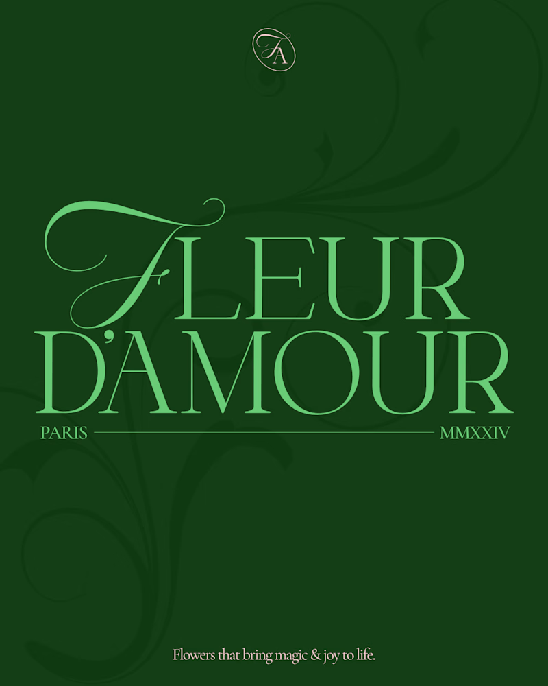
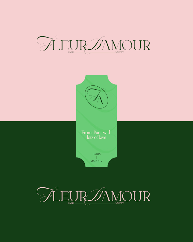
Compact logo or the horizontal one?
Check the main post here for more project visuals.
1 voted
25%
3 voted
75%
4 votes
Closed

PRO Design 😍

I really appreciate that man!!

creative visual
Thank you!!
The network for creativity
Join 1.25M professional creatives like you
Connect with clients, get discovered, and run your business 100% commission-free
Creatives on Contra have earned over $150M and we are just getting started

Challenges
View all


Related posts

Working on the homepage for Still Blooming, a wedding and floral studio, I explored two different layout directions for the hero section. Same brand, same copy, just a different structure and visual rhythm.
Option 1 : Left Aligned. Text sits on the left with supporting content beside it, giving an editorial, asymmetrical feel.
Option 2 : Centered. Everything is stacked and centered, giving a clean, balanced, more classic hero layout.
Would love your honest UX/UI take which direction feels more elegant, functional, and true to a wedding/floral brand, and why?
22 voted
41%
32 voted
59%
54 votes
Closed
Great Design :)

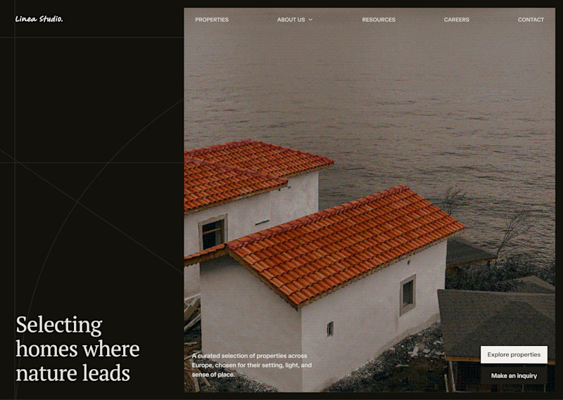
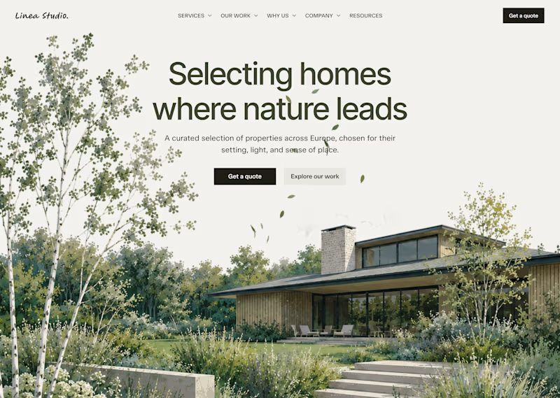
On my profile, you can see which version I chose out of these two, but I'm curious which one would you choose?
19 voted
26%
53 voted
74%
72 votes
Closed

Light hero

Which Phoenix Vector Logo You Guys Like Most?
These 100% Handmade Vector Logos Are Also Available For Purchase With Exclusive Copyrights Transfer Ownership, Feel Free To Contact Us.

5 voted
38%
8 voted
62%
13 votes
Closed

B has more life to it, that wing gradient gives it some motion the flat mark in A doesn't have. Are you pricing these as one-off logo packs or is there a bigger identity system behind them?