The network for creativity
Join 1.25M professional creatives like you
Connect with clients, get discovered, and run your business 100% commission-free
Creatives on Contra have earned over $150M and we are just getting started
Back to feedPost

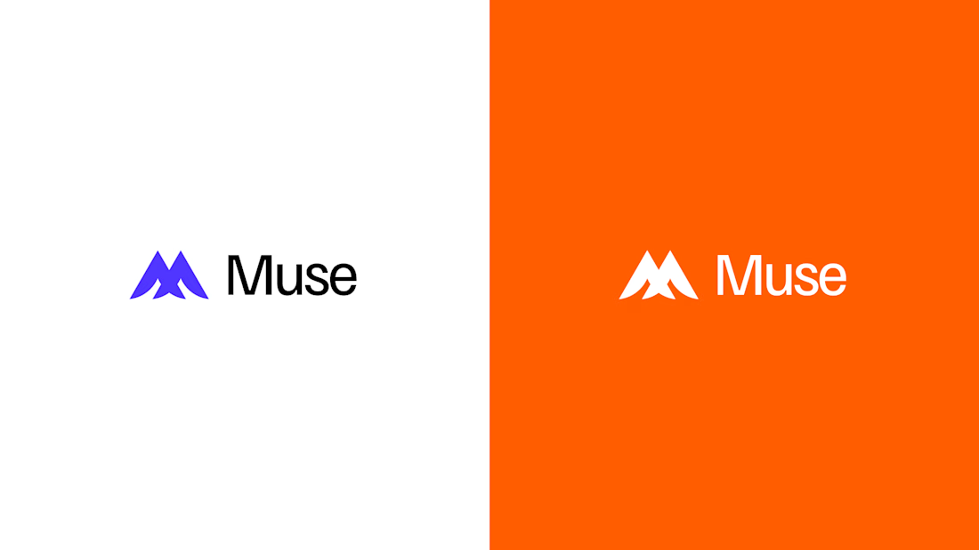
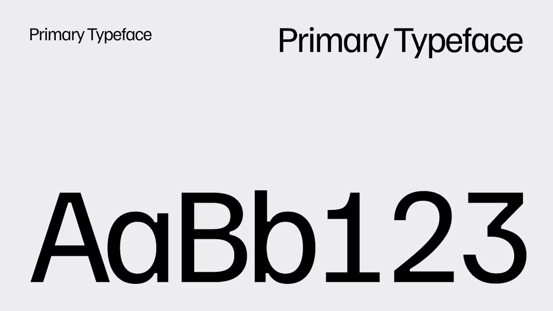
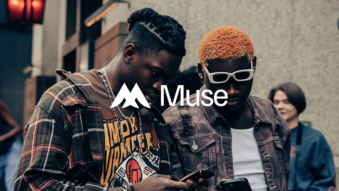
Muse - A community based app for Creators and Fans.
Here's something i am working on at the moment, I'd share more shots as i continue.
What do you think so far.



The network for creativity
Join 1.25M professional creatives like you
Connect with clients, get discovered, and run your business 100% commission-free
Creatives on Contra have earned over $150M and we are just getting started



Related posts

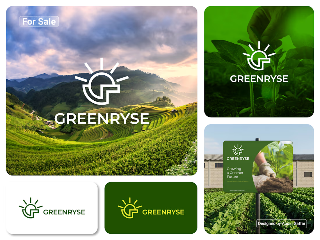
GREENRYSE – G Lettermark, Sun Logo Design, Sustainable Agriculture.
Introducing GREENRYSE, a modern logo concept inspired by nature, agriculture, and the power of growth. The symbol combines a geometric letter G with a rising sun, representing new beginnings, natural energy, and a brighter future for agriculture.
The presentation explores how the logo works across different backgrounds and applications, including agricultural landscapes, product imagery, and outdoor signage. Its clean geometric structure and fresh green color direction create a natural yet professional look.
Designed for agricultural companies, organic farming businesses, crop production, sustainable agriculture, and modern agritech ventures.



Stunning!

Was playing around with Rogie King's Noise & Texture plugin in Figma and thought it’d be fun to throw in a few excerpts from Sylvia Plath’s The Bell Jar.
One thing led to another, and I ended up with these experiments in typography and texture.
It got me thinking about how texture and typography can do more than just look interesting. They can help communicate the mood and meaning behind the words.
What do you think? Does the chaos add to the story, or get in the way of it?
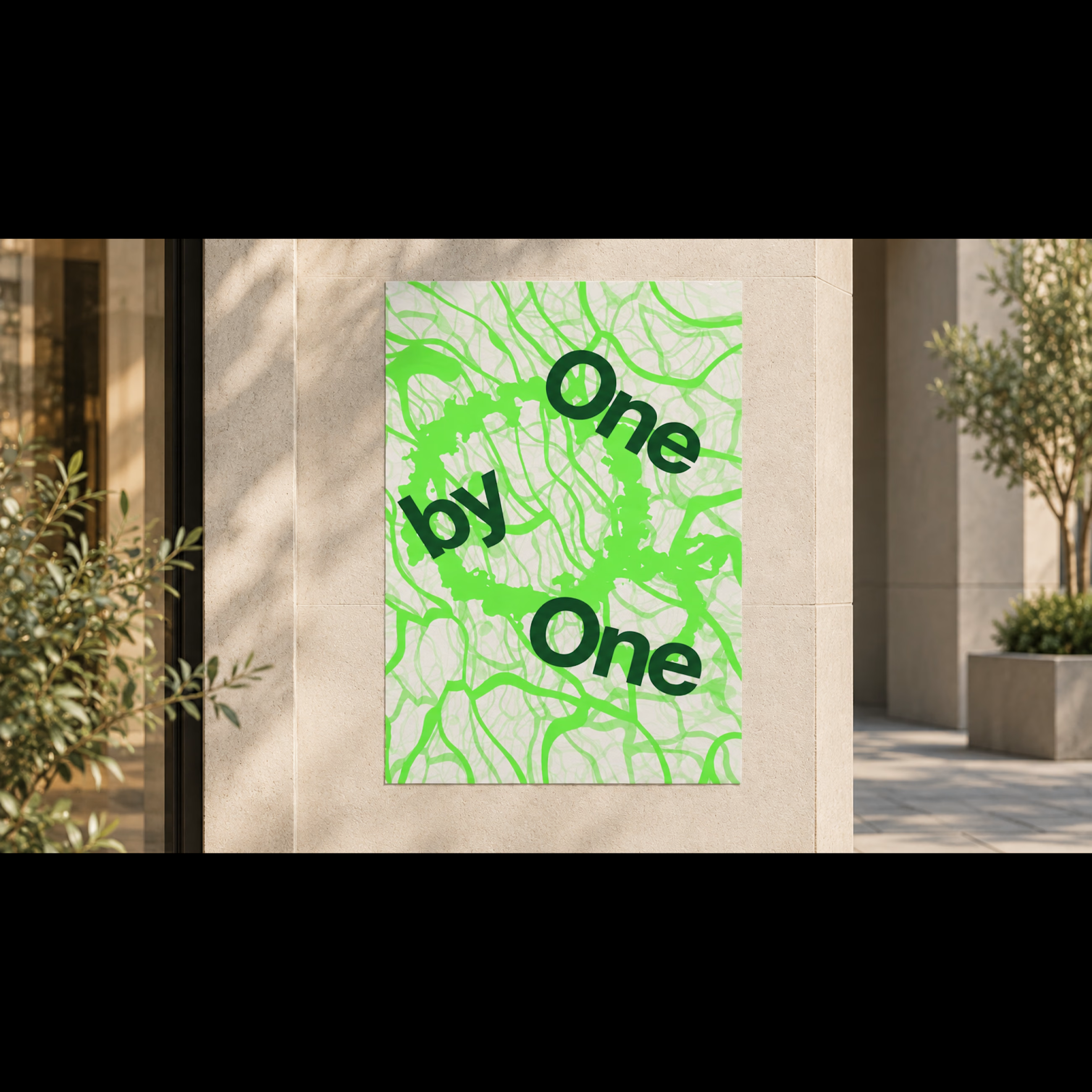
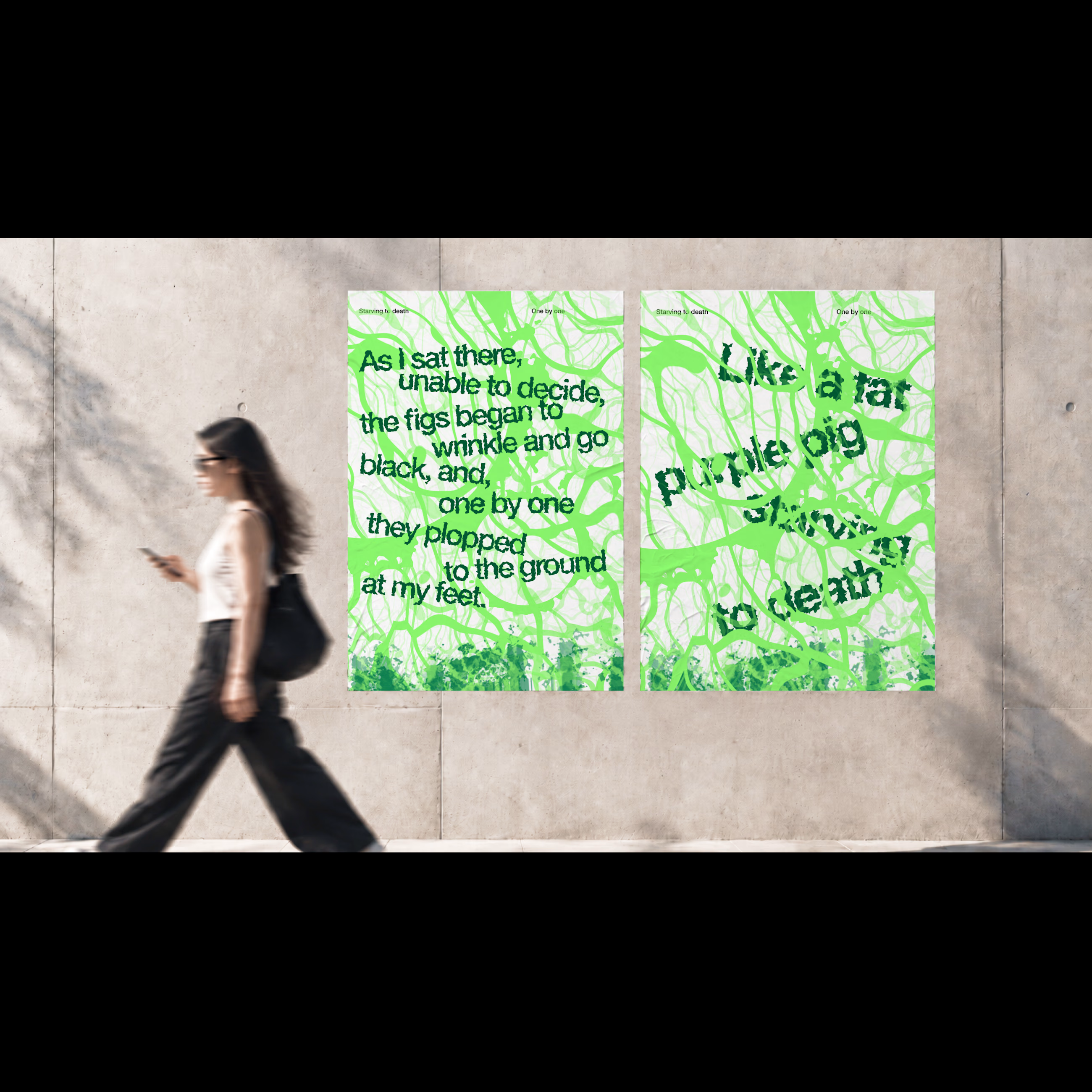
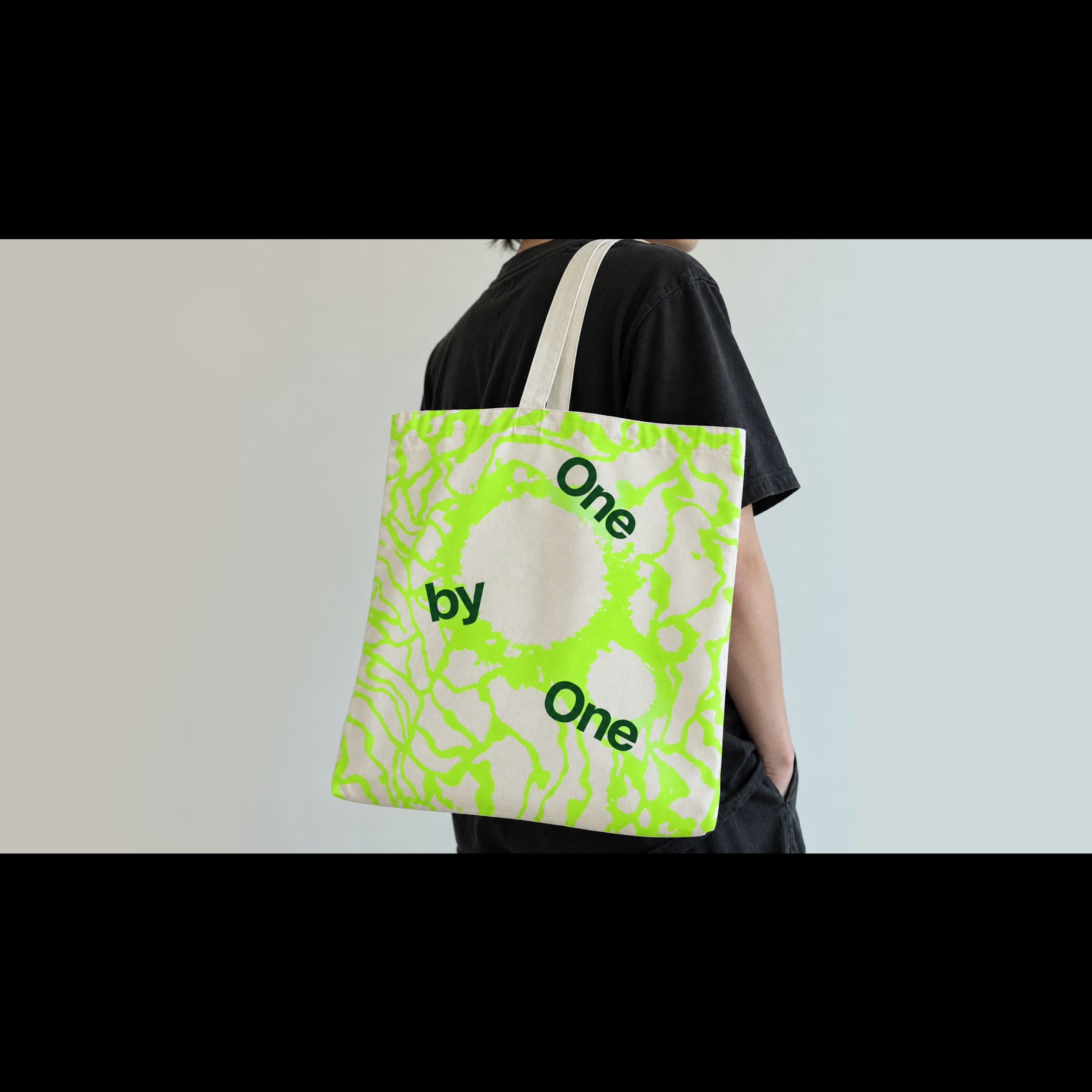
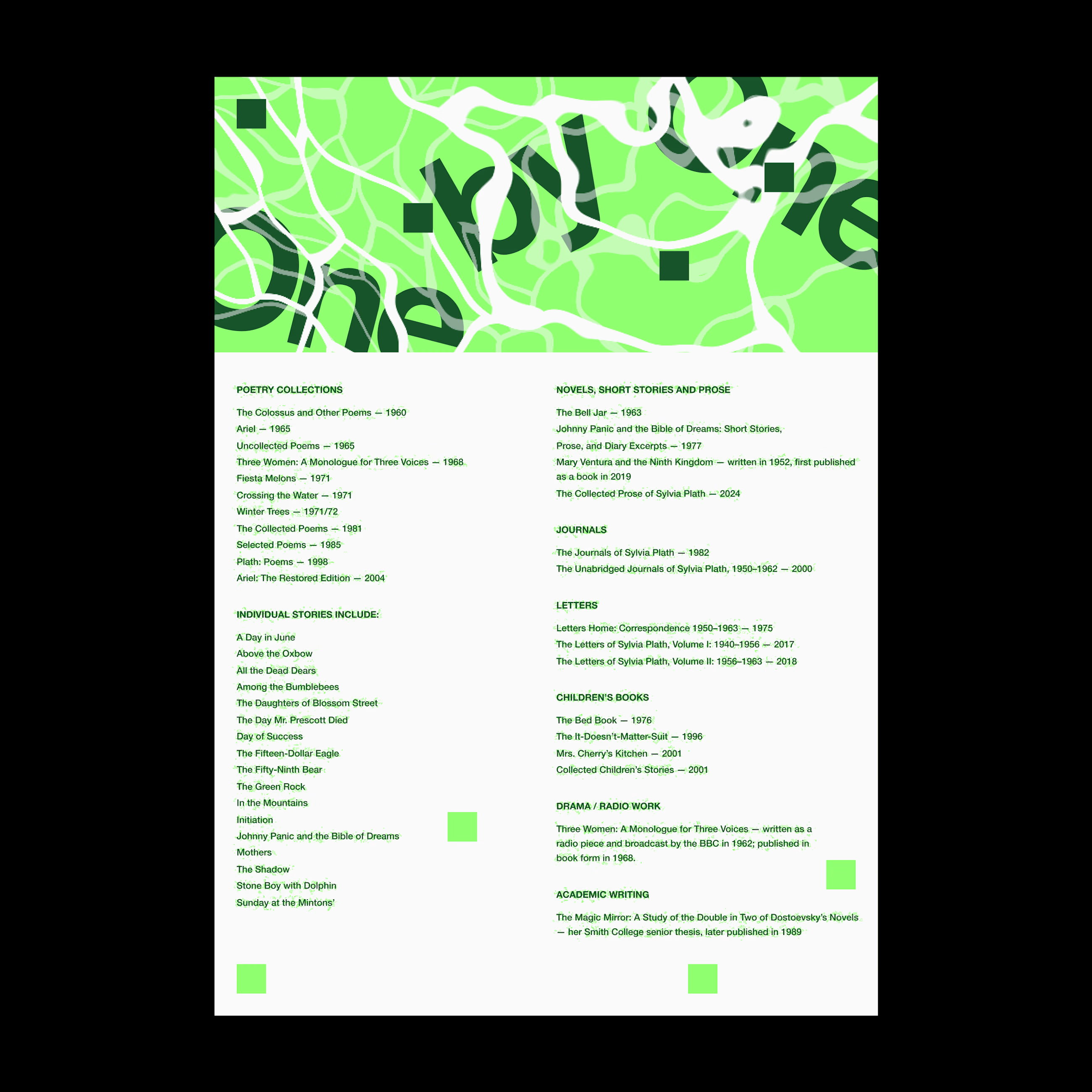

For me the chaos works when it stays tied to the words, like the tangle looping around "One by One". On the dense excerpt layouts legibility starts to eat the story, so I'd keep the noise away from the lines you want read first.

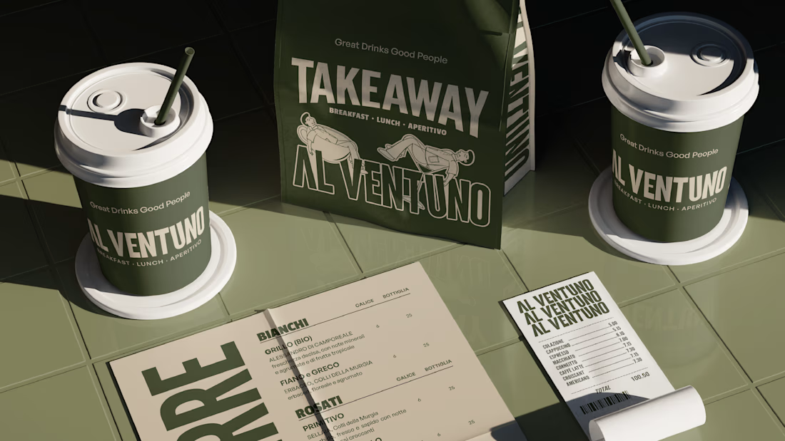
Hey Everyone! I've been a little quiet on here lately, but I'm finally back with lots of amazing branding and packaging design case studies which I was working behind the scenes.
Keep an eye out for lots of verified case studies coming your way. 👀
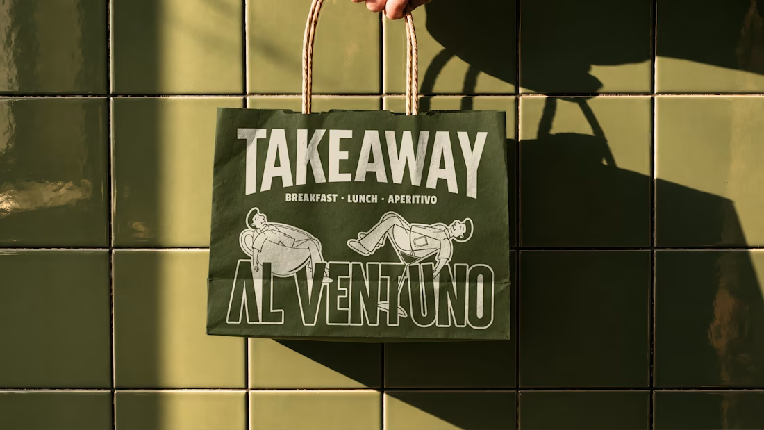
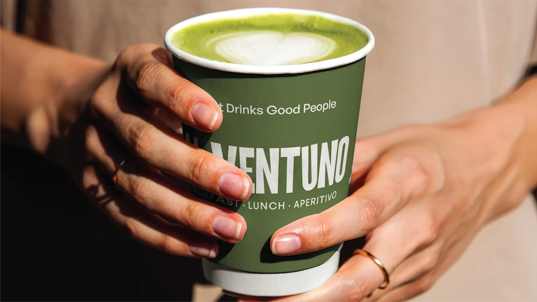
For now, here’s a little peek at some of the work I’ve created lately for a contemporary Italian cafe in Lecce.

Love it! Great work!