The network for creativity
Join 1.25M professional creatives like you
Connect with clients, get discovered, and run your business 100% commission-free
Creatives on Contra have earned over $150M and we are just getting started
Back to feedPost

Nocturne is a fictional all-night café created around
the idea of a place that remains awake while the
city sleeps. Serving coffee and hearty breakfast
food throughout the night, the brand combines the
atmosphere of late-night cafés with the comfort of
an early morning meal. The visual identity explores a
dark, playful, and atmospheric character designed to
feel inviting at any hour.


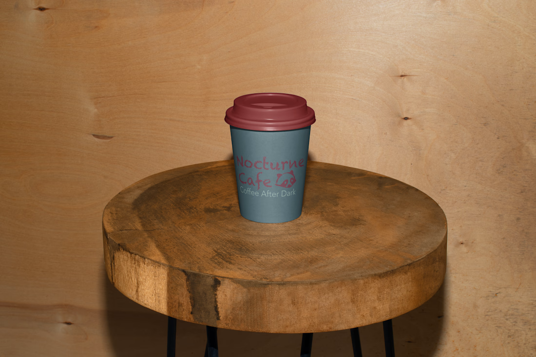
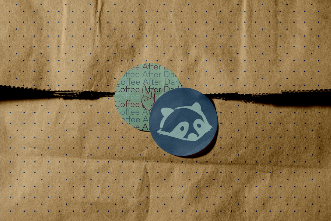
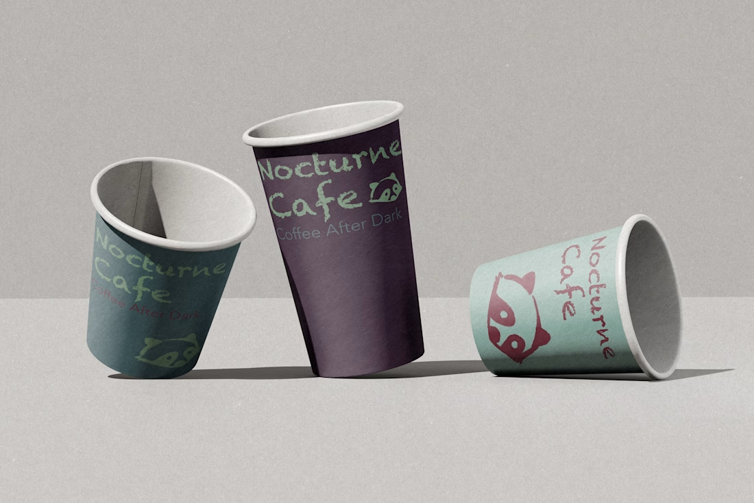
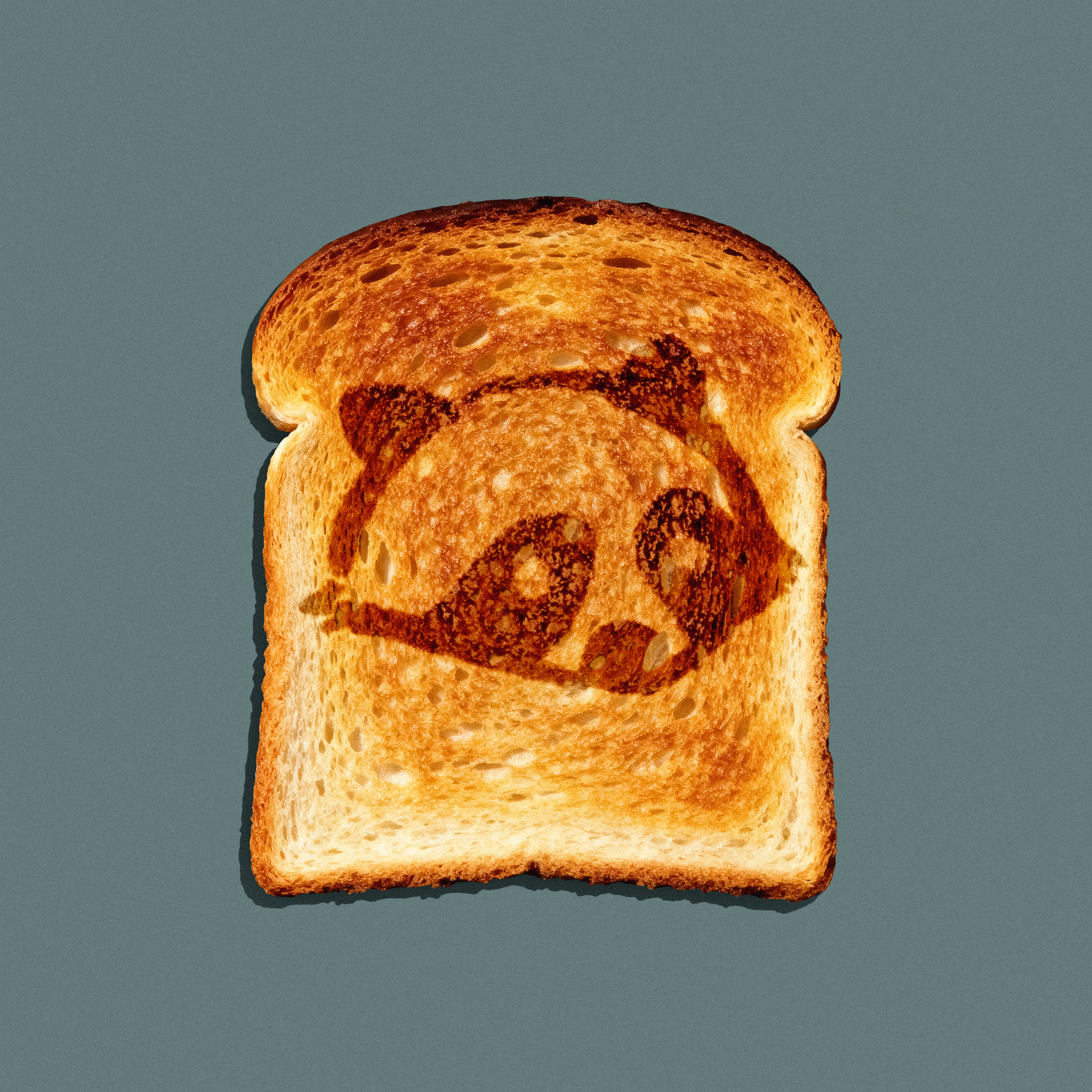

The hard part with an all-night concept is that one cup has to work at 2am and at 7am, and those are close to opposite moods - one wants dim and hushed, the other wants the day starting. Looks like the raccoon and the illustration work carry that crossover rather than the...
The network for creativity
Join 1.25M professional creatives like you
Connect with clients, get discovered, and run your business 100% commission-free
Creatives on Contra have earned over $150M and we are just getting started

Challenges
View all


Related posts

Wonder -- Visual Expressions

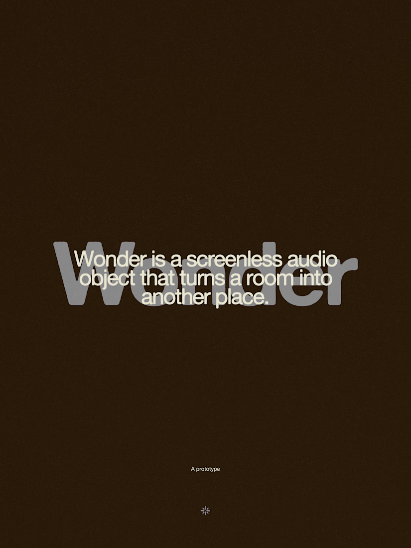
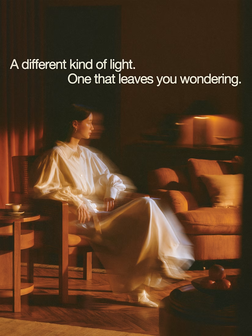

The restraint in the warm palette really lets the sound-object concept breathe—especially that shift from readable type to atmosphere.


A look at the identity we designed for Vetti, a dog health monitoring brand.
There’s a lot of data behind a product like this but the person using it just wants to know their dog is okay.
That’s the balance in the design with a connected dot system that feels precise and warm colors and photography that keep it close to what people care about.
Also, an excellent excuse to spend far too long choosing dog photos.


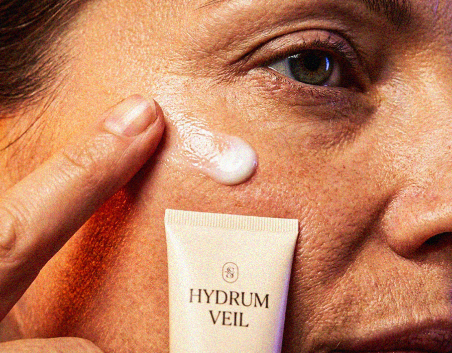
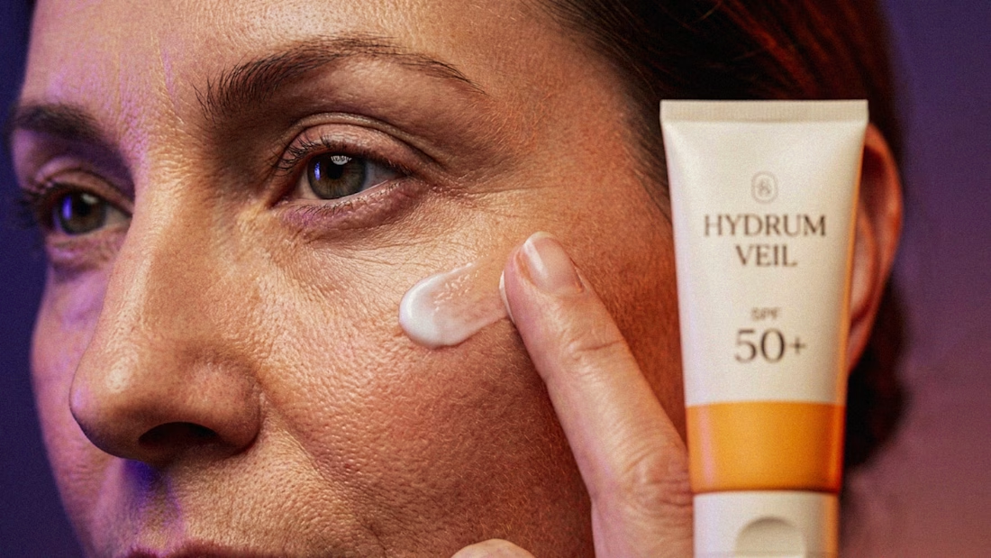
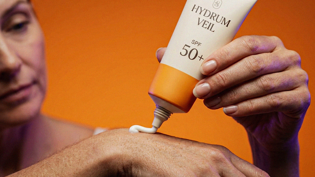
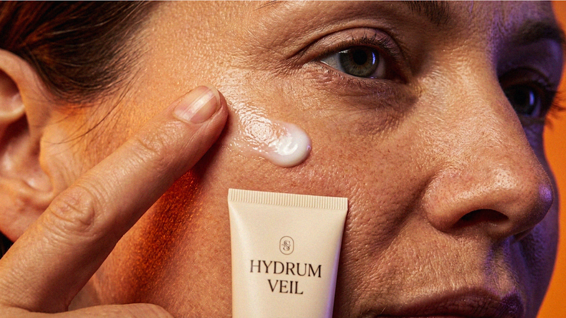
I Just Created HYDRUM VEIL 🔥
HYDRUM VEIL is a skincare brand built around a premium SPF 50+ sunscreen, developed as a complete brand identity, packaging design, and seasonal advertising campaign.
The project explores a question most seasonal beauty work gets wrong: how do you make a limited-edition campaign feel festive without making it feel cheap?
Instead of stacking decorative props, the campaign holds a strict visual system - vivid pumpkin orange, deep twilight violet, warm cream, and restrained black and lets a single product carry every frame.
Drop your replies in cmnts.....!!!!! 🙌
branddesignertastetestBrand DesignGraphic DesignPackaging DesignAdobe IllustratorAdobe PhotoshopClaude