The network for creativity
Join 1.25M professional creatives like you
Connect with clients, get discovered, and run your business 100% commission-free
Creatives on Contra have earned over $150M and we are just getting started
Back to feedPost

Most photographers I meet have the same problem.
Their photos are beautiful.
Their website makes them forgettable.
I think about why a lot.
Usually it's the same thing: the site talks before it shows.
A hero, a mission statement, a long scroll and the work waits its turn.
But no one hires a photographer for their words.
They hire for the feeling the photos give them.
So when I design for a photographer, I start from one rule: the work leads.
On my latest project, that meant a homepage that is just the gallery
images you move through, each one opening its own story.
The writing comes later, once the photos have already earned your attention.
A small shift in order. It changes how the whole site feels.
That's the kind of problem I like most
not making a site prettier, but making it do the one job it exists for.
So I built the whole approach into a template, ready to use.
If your photos deserve a site that leads with them, this is it.
✨ Remix Link Here ✨

The network for creativity
Join 1.25M professional creatives like you
Connect with clients, get discovered, and run your business 100% commission-free
Creatives on Contra have earned over $150M and we are just getting started





Related posts

Designed the landing page for Smug — an AI support agent that resolves tickets, knows exactly when to escalate to a human, and has zero interest in pretending otherwise.
Most AI support tools go the humble, over-apologetic route. Smug does the opposite — the whole brand is built around a smug little cat mascot and copy like "Handled it. You're welcome." It's a genuinely fun brief: figuring out how to make confidence read as charming instead of obnoxious.
Bold electric blue and orange instead of the usual muted SaaS palette, because a product this confident shouldn't look shy about it. 💙


cool

A little peek at the project I started this week.
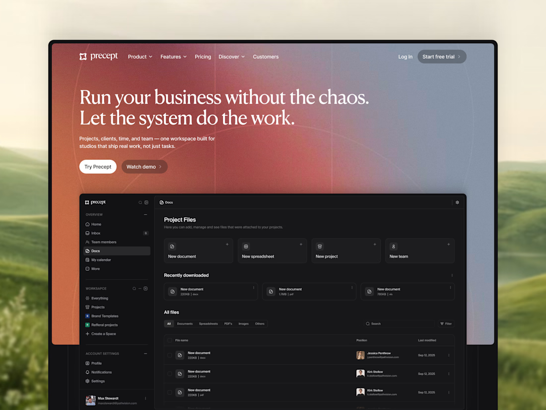
A new hero section for Precept — a project management tool for creative agencies and studios.
Designed in Figma, with development in Framer planned next.
Very excited to see the whole thing come together 🔥

Modern, modern, modern

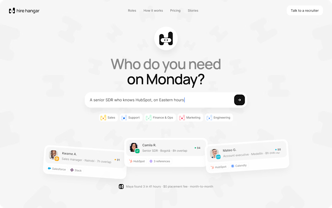
A good landing page shouldn’t make you work to understand it.
Been working on a new project where the goal was simple:
Make a complex product feel simple, clear, and easy to explore.
Less explaining.
Less clutter.
More visual hierarchy.
A clearer path to the next step.
Still working through the details, but this one is coming together nicely.
Full case study soon.
This pairs well with the Hire Hangar screenshot because the design itself demonstrates the point—you don't need to reveal the whole project yet.


Appreciated @Mehdi Hassan
keep on rocking