The network for creativity
Join 1.25M professional creatives like you
Connect with clients, get discovered, and run your business 100% commission-free
Creatives on Contra have earned over $150M and we are just getting started
Back to feedPost

Fewer Form Fields = More Leads. But One Field Is a Mistake Too.
The fewer fields you have in a form, the more leads you’ll usually get.
But reducing a form to a single field can be a mistake too.
I work at a web development studio, and lead forms are something we discuss with clients on almost every project.
The conversation usually follows the same pattern.
The client wants more fields because they want the sales manager to know everything upfront.
I explain that adding more fields will probably reduce the number of submissions.
Then we go back and forth until we find a middle ground.
Here’s where we usually end up — and why the popular advice to “just ask for a phone number” isn’t necessarily right either.
Long forms don’t get filled out — and session recordings make that painfully obvious
One of the most useful things you can do is open your session recordings in Yandex Metrica and watch what people actually do when they reach your form.
Not what you think they do.
What they actually do.
They reach the form. Start filling it out. Get to the third or fourth field. Hesitate.
And leave.
It’s not necessarily because they’re lazy.
People judge a form visually within seconds, often before they’ve read a single word.
Eight fields look like work.
Three fields look like a quick task.
That distinction matters.
A user can decide to close the tab before they’ve even processed what half of the fields are asking for.
It gets even worse when the form asks for information the user simply isn’t ready to give you yet.
Company name.
Tax ID.
Job title.
Budget.
Think about the context.
They haven’t even decided whether they want to work with you, and you’re already asking them to disclose detailed business information.
We see this all the time in client briefs.
And whenever I see something like a tax ID being requested at the first-contact stage, I ask a simple question:
What is the manager actually going to do with this information right now?
There usually isn’t a particularly good answer.
But “just ask for their phone number” is a trap too
“Reduce the form to the absolute minimum” has become one of those pieces of conversion advice you hear everywhere.
And like most simple advice, it can be taken too far.
A one-field form can generate a lot of leads.
It can also generate a lot of useless ones.
The sales manager ends up calling people completely blind.
They don’t know what the person wants, what service they’re interested in, how urgent the request is, or whether there’s even a real project behind the submission.
So the first few minutes of every call are spent collecting basic information that could have been captured before the call.
And then there’s the junk.
Accidental clicks.
Typos.
People who submitted the form out of curiosity.
Low-intent leads.
On paper, everything looks great.
The conversion rate goes up.
But the sales team has to work harder, while the number of actual deals barely changes.
That’s a dangerous situation because the metric improved while the business didn’t.
We’ve seen a similar effect when analyzing websites where time on site drops while informational traffic increases. A metric can move in the “right” direction without actually telling you that the business is performing better.
So what do we usually build instead?
Two or three fields.
And at least one of them should be about the actual problem the person wants to solve.
Something like:
Name + contact + “What do you need?”
That last field is often underestimated.
It does two important things at the same time.
First, it filters out low-intent submissions.
Someone who accidentally clicked your ad probably isn’t going to spend time writing a meaningful description of what they need.
Second, it gives the sales manager context before the conversation starts.
Instead of:
“Hi, what can we help you with?”
the conversation can start with:
“I saw that you’re looking for a landing page for your new service. Let me ask a couple of questions about the project.”
That’s a completely different conversation.
Use choices when you need qualification
If you need to qualify a lead, you don’t always need another text field.
Sometimes three buttons are enough.
For example:
I need a website
I need redesign
I need marketing
That takes a second to choose.
Compare that with asking the user to type the same information manually.
We also tend to prefer visible buttons over dropdown menus.
With a dropdown, the user has to click it, wait for it to open, scan the options, and then choose one.
Buttons are already there.
The user can understand their options immediately.
Every additional interaction is another opportunity for someone to drop off.
And sometimes the phone number shouldn’t be required
We try to make the phone number optional whenever there’s a reasonable alternative.
Some people simply don’t want to give you their number.
That doesn’t necessarily mean they aren’t interested.
They might be perfectly comfortable messaging you on Telegram, WhatsApp, or another messenger.
On one project, all form submissions were going to an email inbox that the business owner checked once every couple of days.
That was obviously a problem.
We moved the leads to Telegram and kept email as a backup.
The form itself barely changed.
But the response time changed dramatically.
Sometimes the biggest conversion problem isn’t the form.
It’s what happens immediately after someone submits it.
What quietly kills a form
Required fields with no explanation.
If someone doesn’t understand why you need their company name, job title, or budget, they may simply leave.
Validation that fights the user.
A red error message appearing while someone is still typing a phone number creates unnecessary friction.
The user starts feeling like they’re doing something wrong instead of completing a simple form.
No clear confirmation after submission.
If the page doesn’t visibly change after clicking “Submit,” the user has no idea whether the request went through.
Some will submit it again.
Now your sales manager has two identical leads.
Others will simply leave, assuming the website is broken.
A form that only works on desktop.
More than half of your traffic may be mobile.
A form that looks perfectly fine on a desktop can behave completely differently on a phone.
The keyboard can cover the input.
The button can end up below the fold.
The fields can become awkward to navigate.
This takes about a minute to test.
Yet it’s surprisingly easy to miss.
Here’s a test you can run right now
Take your phone.
Open your own website.
And fill out your form like a completely new visitor.
Pretend you have no idea what the company does and don’t know where anything is.
Start the timer.
If it takes more than 30 seconds, or you find yourself stopping to think about what you’re supposed to enter in any field, you’ve probably found a point of friction.
And there’s a good chance it’s the same field someone once insisted on adding because:
“We might need this information later.”
Maybe you will.
But if asking for it now costs you a lead, it may not be worth asking for at all.
The network for creativity
Join 1.25M professional creatives like you
Connect with clients, get discovered, and run your business 100% commission-free
Creatives on Contra have earned over $150M and we are just getting started

Challenges
View all


Related posts

NEXOR — Creative Digital Agency Website 🔥
NEXOR is a futuristic website concept for a creative digital studio focused on digital products, brand systems, and bold digital experiences.
The goal was to create a memorable first impression while keeping the agency’s services and next steps clear.
Special attention was given to:
• a bold hero composition with oversized typography and futuristic imagery;
• a vibrant orange and black palette that creates a distinctive visual identity 🟠;
• a strong visual hierarchy that balances creative expression with usability;
• clear CTAs for starting a project or booking a call;
• a contact form integrated directly into the hero section;
• responsive mobile layouts that preserve the visual impact 📱;
• a full-screen mobile menu with intuitive navigation and prominent contact options.
The result is an expressive digital experience that combines bold visual storytelling with a clear path to conversion.
Looking to create a distinctive website for your creative agency, digital studio, or technology brand? Let’s build something extraordinary together ⚡


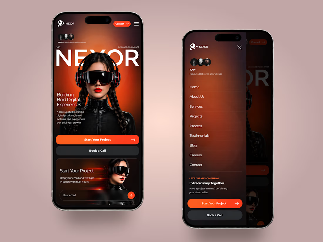
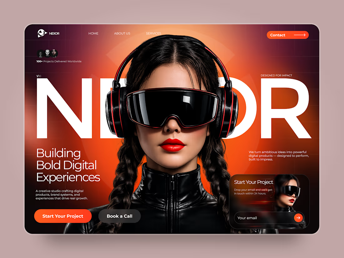


The orange-and-black system has real presence, and the mobile frames show the hierarchy holding together rather than just shrinking. The clear CTA placement is a smart counterweight to the oversized hero type.

AI Voice Agent for Real Estate Lead Booking
An AI-powered phone receptionist built for real estate agencies that answers inbound calls, qualifies leads in real time, and books showings directly to Google Calendar — all within the call itself, with no manual follow-up required.
The problem: Real estate agencies routinely lose leads to missed calls — after-hours inquiries, calls during showings, or overflow during busy periods. A slow callback often means the lead has already moved on to a competitor.
What it does:
Answers every call instantly, 24/7
Naturally qualifies the caller (buy/sell intent, area of interest, showing vs. agent call)
Collects contact details and preferred timing conversationally
Checks real-time calendar availability before booking
Prevents double-bookings and duplicate entries automatically
Confirms the appointment out loud before ending the call
Built with: Retell AI (conversational voice layer), n8n (workflow automation and business logic), Google Calendar API (scheduling)
Available for: Custom builds for real estate agencies, brokerages, or property management companies looking to stop losing leads to missed calls


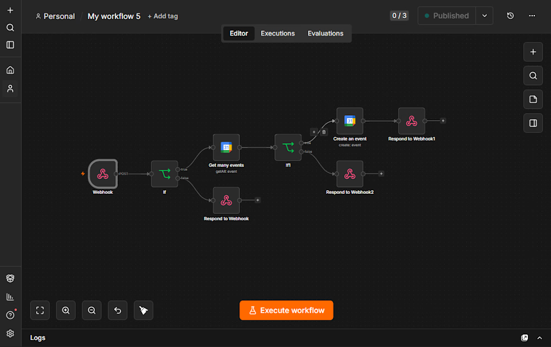

Beautiful workflow by the way. My nicheeee

👐🏻🏡 Our new case is a care home website built so a local authority and a future employee each get the answers they came for.
See how it's structured inside the case.


Choosing what to leave out is the part of the work that pays for itself once development begins" exactly right for a trust-driven site like this. Showing the house room by room as it really looks, rather than styled, is what actually earns that trust.