The network for creativity
Join 1.25M professional creatives like you
Connect with clients, get discovered, and run your business 100% commission-free
Creatives on Contra have earned over $150M and we are just getting started
Back to feedPost

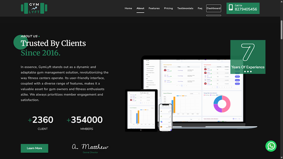
Enhanced features for the GymLyft Dashboard, managing active and inactive member pages, leveraging Firebase for data management.


The network for creativity
Join 1.25M professional creatives like you
Connect with clients, get discovered, and run your business 100% commission-free
Creatives on Contra have earned over $150M and we are just getting started

Challenges
View all


Related posts


workout tracker app


Food delivery platforms have a lot happening behind the customer-facing experience.
Orders are coming in, deliveries are moving, restaurants are performing, customers are interacting with the platform and revenue is changing throughout the day.
This Food Delivery Dashboard SaaS concept was designed to give operators a clearer view of all of it.
The dashboard brings key business metrics, order activity, delivery information and performance data into a structured workspace.
Rather than filling the screen with every possible metric, the design prioritizes information based on how an operator would actually use it.
The result is a SaaS interface that feels analytical without becoming difficult to navigate.
Services: SaaS Product Design · Dashboard Design · UI/UX Design · Data Visualization · Web App Design · Restaurant Tech
The goal was straightforward: turn a large amount of operational data into a workspace people can actually work from.
Designed by WaxyWeb.


great one

After a short hiatus, I’m gradually getting back to posting.
During this time, a few changes have come up that I’d like to share.
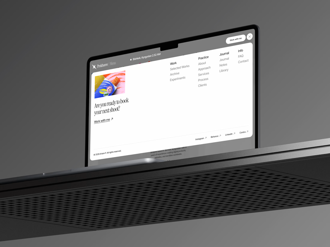
First and foremost, I’ve started updating my website. I’ve long wanted to give it a new visual design—one that more accurately reflects my approach to design, my taste, and my vision of modern digital design.
At the same time, I’m working on a more traditional business project that isn’t related to design. It’s taking up quite a bit of my time and energy right now, but I’m excited to try my hand at something different and go through the entire process from an entrepreneur’s perspective.
That said, I haven’t forgotten about my client projects and am continuing to work on them.
So there will gradually be more posts here: about the website update, current projects, design, and perhaps a little about this new business venture.
I’m glad to be back.


Great work