The network for creativity
Join 1.25M professional creatives like you
Connect with clients, get discovered, and run your business 100% commission-free
Creatives on Contra have earned over $150M and we are just getting started
Back to feedPost


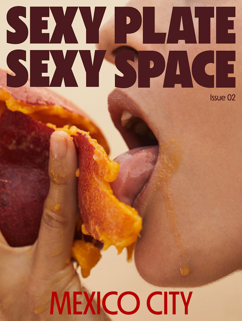
Founder and editor of Sexy Plate Sexy Space — a biannual print magazine with international distribution, placed in design-forward hotels and hospitality spaces worldwide.


The network for creativity
Join 1.25M professional creatives like you
Connect with clients, get discovered, and run your business 100% commission-free
Creatives on Contra have earned over $150M and we are just getting started





Related posts

BEYOND THE FRAME 🎩✨
Three peculiar stories. One wonderfully distorted reality.
A suspiciously curious cat, an eccentric family with secrets dating back to 1892, and a collection of memories coming together to tell their own STORY.
For this project, I combined surreal AI-generated visuals with manually edited camera shakes, white flashes, music synchronisation and carefully timed transitions using the InVideo Editor.
Halfway through, my AI credits ran out — so I completed the remaining effects manually.
Apparently, even artificial intelligence has a budget. 😉
Creative direction, storytelling and final editing by The Triadic Studio.
#invideocontrachallenge


Your product page shouldn’t make customers work this hard to buy.
For pet apparel, one of the biggest conversion killers isn’t always the product.
It’s uncertainty about fit.
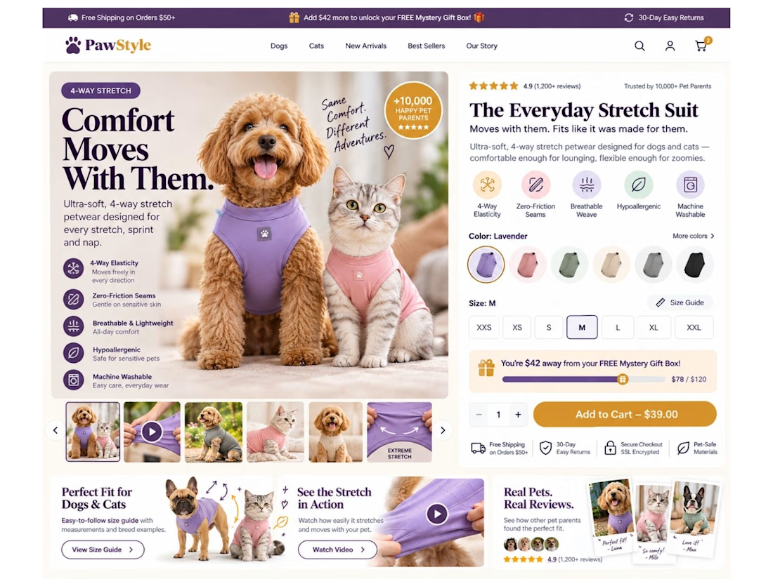
So I designed this Shopify product page concept around one goal: remove hesitation before the Add to Cart.
Instead of a basic product page, I built the buying experience around:
🐾 Dog + cat sizing support
📏 Easy-access interactive size guide
🧵 4-way stretch & product benefit callouts
🎥 Stretch demonstration video
⭐ Pet-specific reviews & UGC
🎁 Free gift progress tracker to increase AOV
🎨 Color + size selection above the fold
🛒 Clear, high-visibility Add to Cart
📱 Mobile-first sticky purchase experience
📩 Back-in-stock flow for unavailable sizes
The idea is simple:
Don’t just show the product. Answer the questions stopping someone from buying it.
“Will it fit my dog?”
“Will it stretch?”
“Which size should I choose?”
“Can I trust the quality?”
“What are other pet owners saying?”
Good eCommerce design should answer those questions before the customer has to ask them.
That’s how I approach Shopify design: UI/UX + CRO + buyer psychology, not just making pages look good.
What’s the #1 thing that makes you hesitate before buying clothing online—for yourself or your pet? 👇



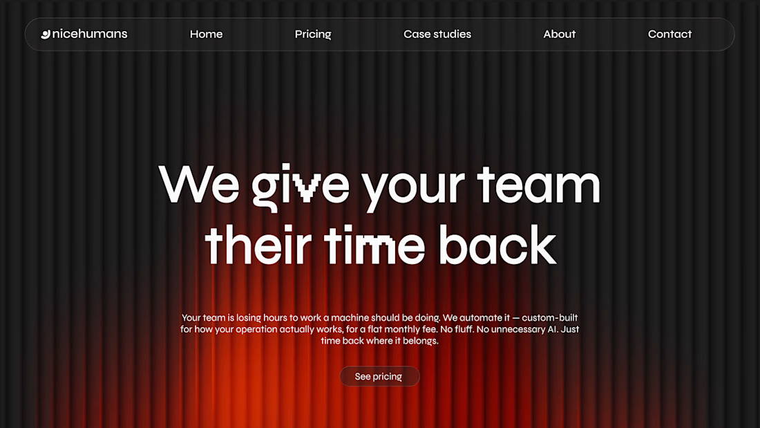
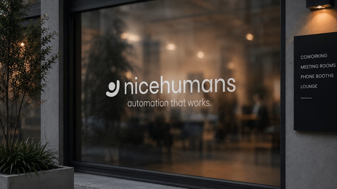
NICE HUMANS
Making automation feel human.
Context
Nice Humans is a growing automation studio that helps teams streamline how they work. As they scaled, their brand no longer reflected the expertise or the people behind it.
The challenge
The automation market speaks in efficiency, systems and scale, and it often sounds interchangeable. Nice Humans needed to claim leadership in that space while standing for something competitors overlook: automation is ultimately about people.
The approach
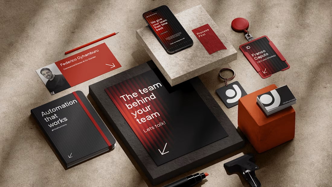
Rather than starting with a logo, we started with a positioning: a team that builds for other teams. From there we developed a complete brand strategy, including archetype, tone of voice, verbal identity and a visual language. Each one was designed to balance technical authority with human warmth.
The outcome
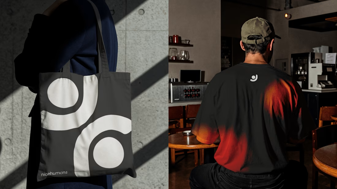
A cohesive brand system that sets Nice Humans apart in a crowded category and gives them a clear, consistent voice to grow with.


Great strategy and sleek execution! The visual hierarchy across web and print is spot on. 👏