The network for creativity
Join 1.25M professional creatives like you
Connect with clients, get discovered, and run your business 100% commission-free
Creatives on Contra have earned over $150M and we are just getting started
Back to feedPost

Lune Product Launch Template

The network for creativity
Join 1.25M professional creatives like you
Connect with clients, get discovered, and run your business 100% commission-free
Creatives on Contra have earned over $150M and we are just getting started
Related posts

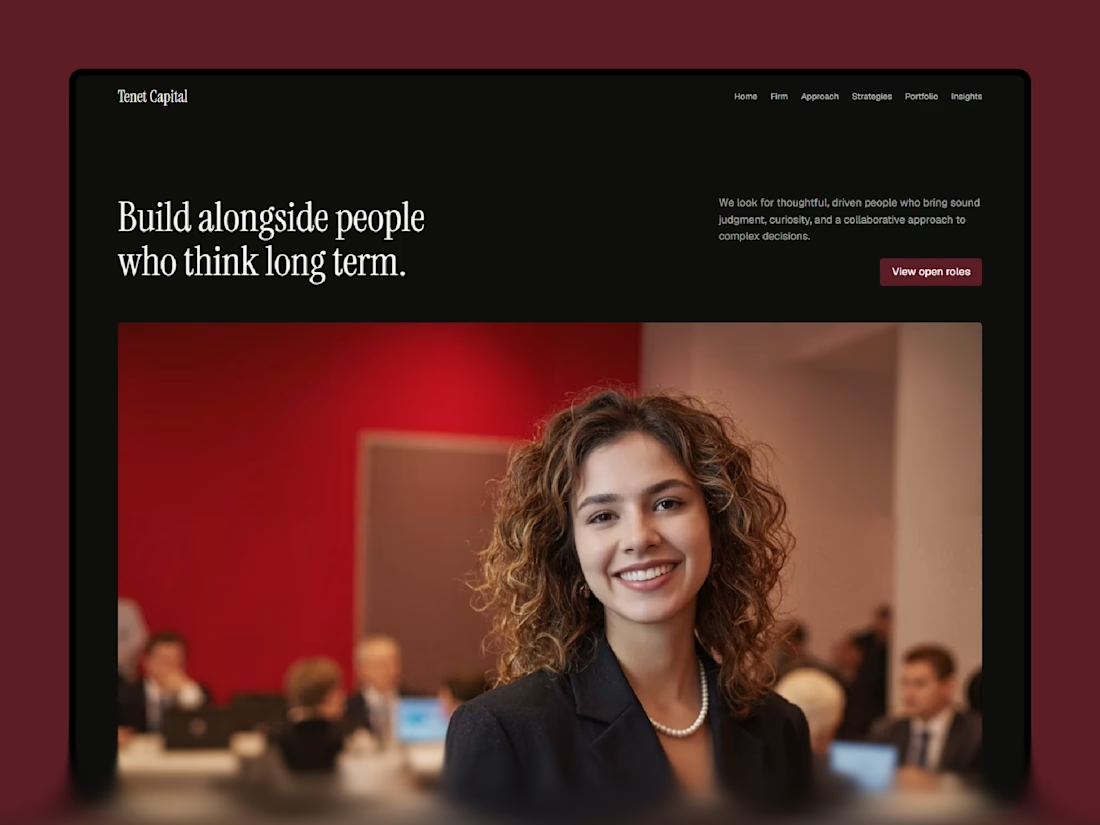
Discover my exciting🔥new template designed specifically
for venture capital and private equity!
Don't miss out!
Experience it live here: https://tenetcapital.framer.website/

Lovely 😍 great work


We’re testing two filtering layouts for a template library.
Top Filters
The filters are placed above the content. This option feels lighter, leaves more space for the cards, and works well when there are only a few main categories.
Sidebar Filters
The categories remain visible in the sidebar. This makes the available options easier to scan and works better for more complex filtering, but takes up some of the content space.
Which layout would help you find the right template faster?

24 voted
39%
37 voted
61%
61 votes
Closed

Such a clean presentation. You can tell a lot of thought went into this.

AI can generate a dashboard. But can it give a product its own identity?
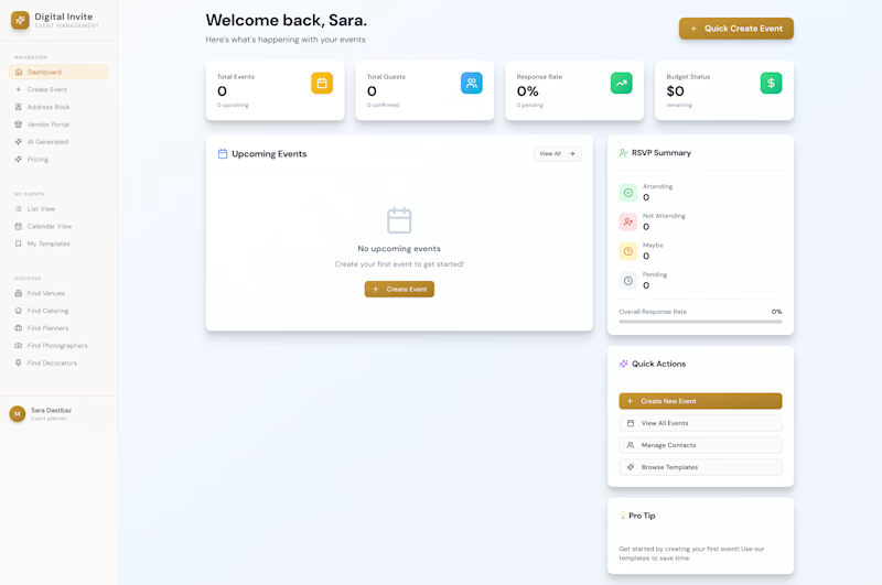
The first design was created by my client using AI a familiar dashboard style you've probably seen across countless AI-generated products.
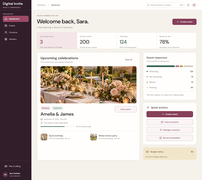
I redesigned it to feel less generic and more intentional, with a distinctive visual identity, clearer hierarchy, and an experience built around meaningful celebrations.
The goal wasn't just to make it look better. It was to make it feel like its own product.
What do you think is missing from most AI-generated interfaces?
#ProductDesign #UIDesign #AI

5 voted
23%
17 voted
77%
22 votes
Closed

I think personality is what makes a product stand out. A clean design is good, but it should also feel unique and memorable. 👏