The network for creativity
Join 1.25M professional creatives like you
Connect with clients, get discovered, and run your business 100% commission-free
Creatives on Contra have earned over $150M and we are just getting started
Back to feedPost

A clean, minimalist promotional video featuring soft beige tones, subtle botanical shadows, and a calm aesthetic, designed to elegantly showcase a brand, and its logo with a modern, soothing vibe.

The network for creativity
Join 1.25M professional creatives like you
Connect with clients, get discovered, and run your business 100% commission-free
Creatives on Contra have earned over $150M and we are just getting started





Related posts

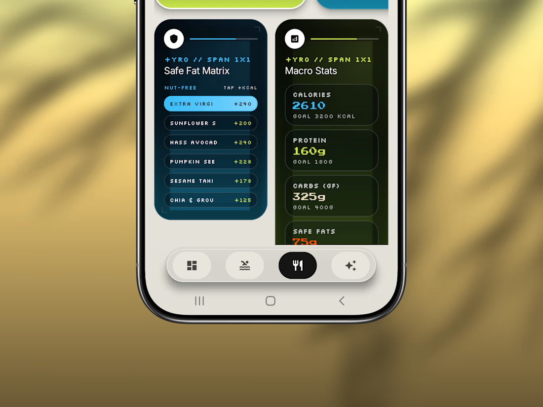
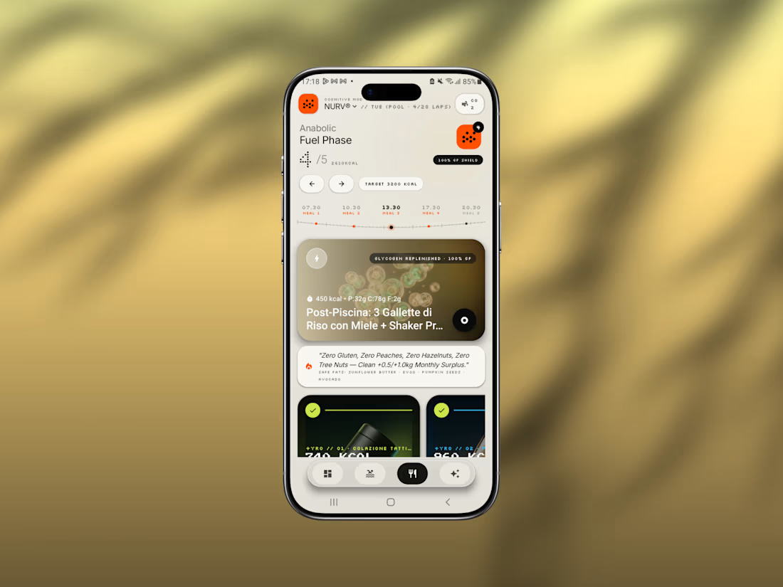
Friday app: NURV® 🟠
Swim training, nutrition and AI coaching in one Android app.
Dot-matrix numerals, a cream canvas, one hot orange accent. Built to feel like a lab instrument, not a fitness tracker.
Pool ops, fuel phases, CO₂ tolerance drills, all in one place.
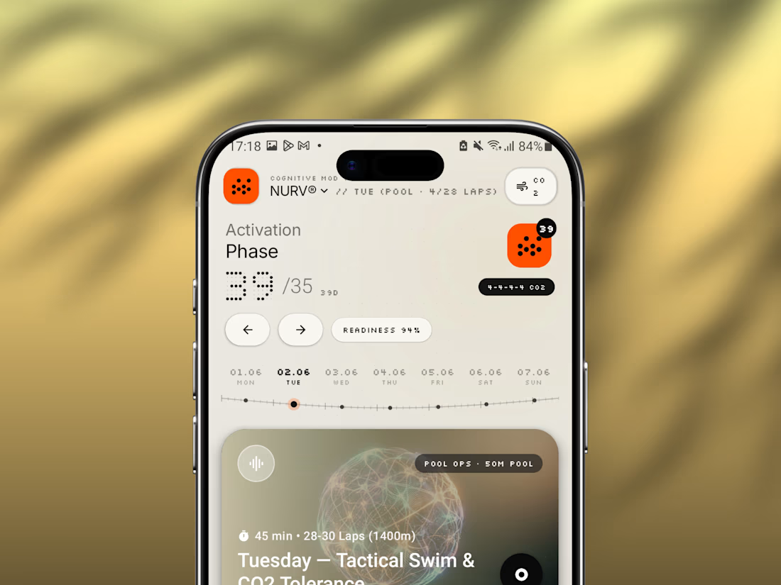
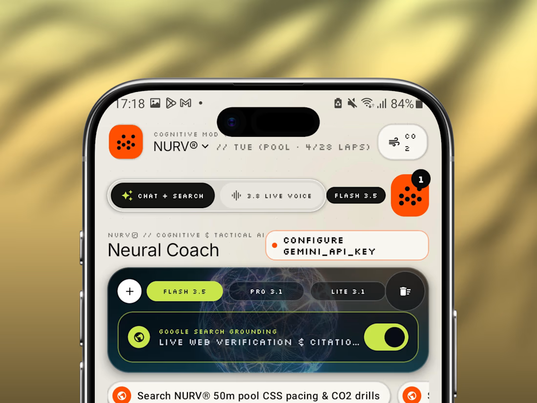

Another day, another inspiration. Lovely 🔥

Sharing a simple trick for transforming a video background:
Add a slow-shutter effect.
By turning the surroundings into long, curved motion streaks, you can transform an ordinary environment into a more abstract composition that adds another layer to the shot.
I applied the effect...
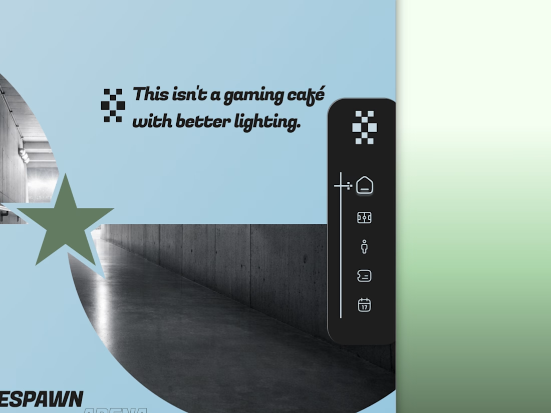
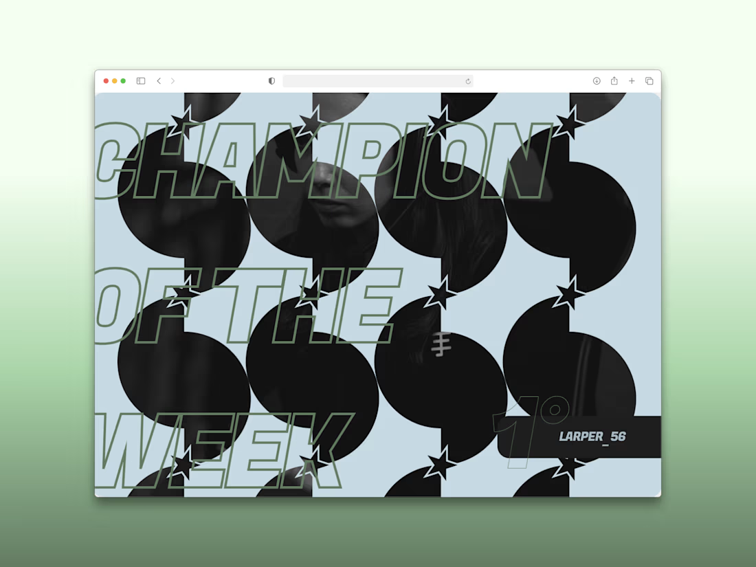
Every esports brand reaches for neon and a mascot.
RESPAWN ARENA reaches for a scoreboard.
Case study on the stadium-grade identity — typography, system, the whole build — dropping soon.