The network for creativity
Join 1.25M professional creatives like you
Connect with clients, get discovered, and run your business 100% commission-free
Creatives on Contra have earned over $150M and we are just getting started
Back to feedPost

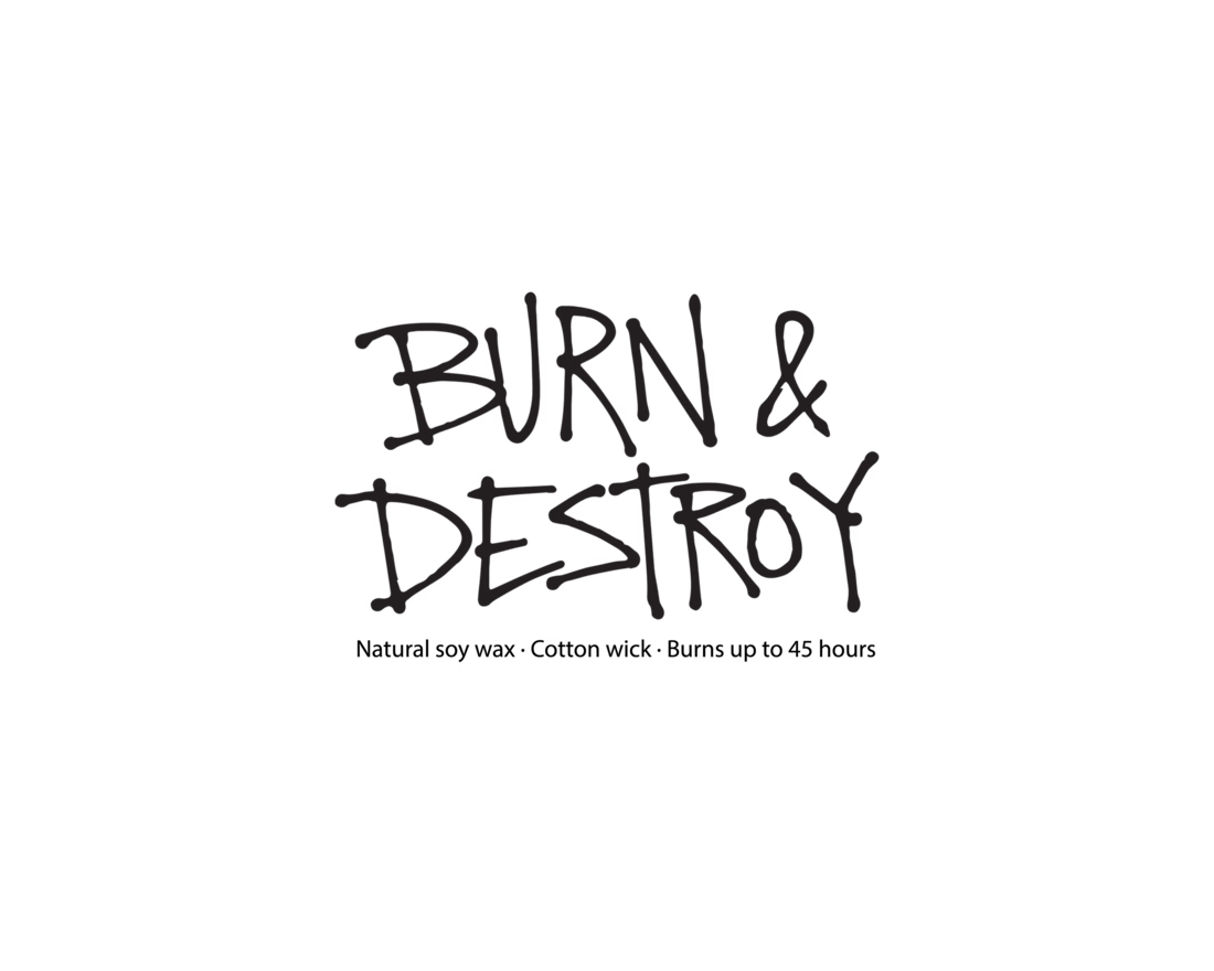
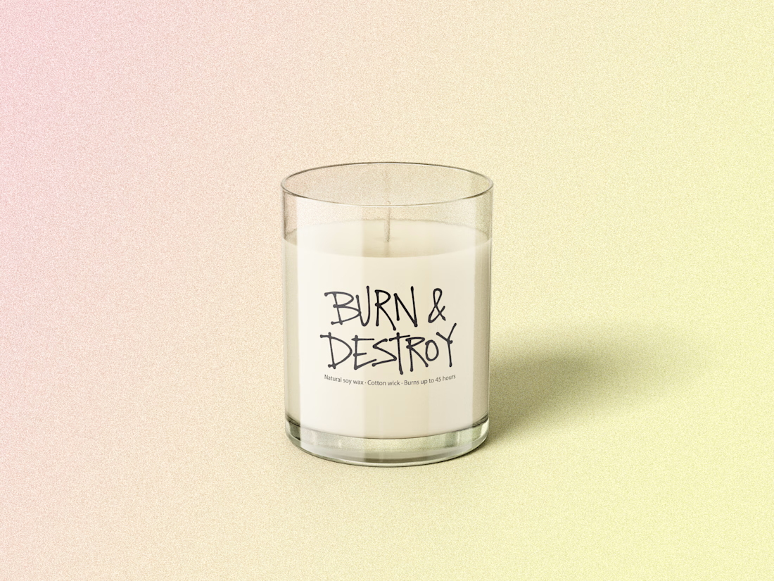
Custom typographic label design for candle packaging


Loved it 😍
The network for creativity
Join 1.25M professional creatives like you
Connect with clients, get discovered, and run your business 100% commission-free
Creatives on Contra have earned over $150M and we are just getting started

Challenges
View all


Related posts


One of my first identity projects from 2021. 🥹
SVNT was a skincare brand built around inclusivity, accessibility, and shaping the future of beauty. My goal was to reflect that through a futuristic but clean visual identity, keeping the system modern and simple while giving the brand room to celebrate individuality.
Looking back at this project four years later, it’s interesting to see what decisions still feel relevant to me today.
Do you ever revisit your early work and realize your design instincts were already there?

Curious - how did you approach making futuristic not feel cold, to keep the inclusivity/accessibility warm? The balance here is really nice.

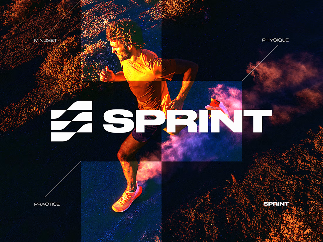
SPRINT — Experimental Brand Visual
A visual experiment built around an unused logo concept from a recent branding project.
The design was created manually, while exploring how AI-driven aesthetics are increasingly influencing contemporary visual language, even when AI itself isn’t part of the design process.
Logo design, art direction and visual exploration.


Good work

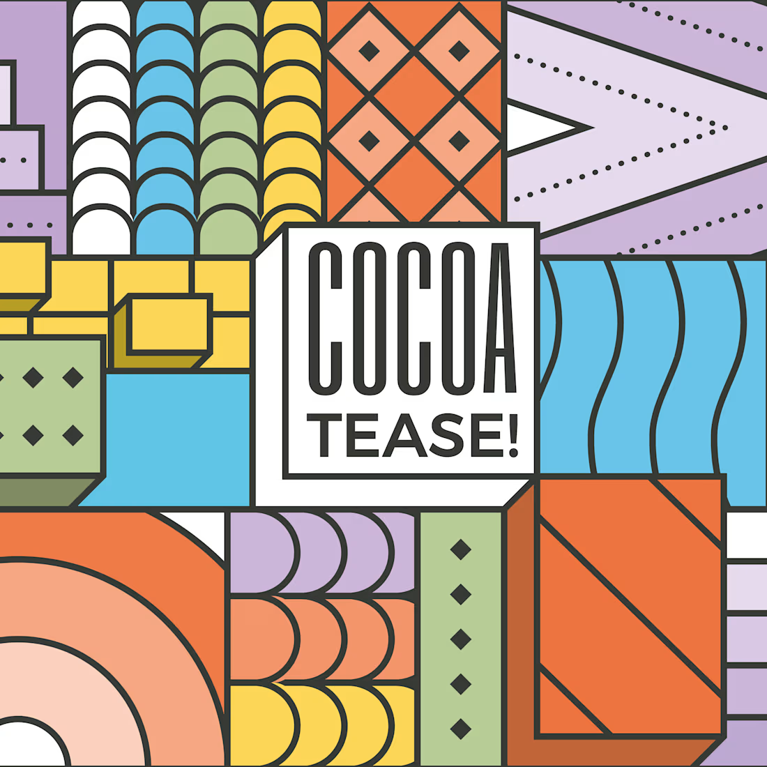
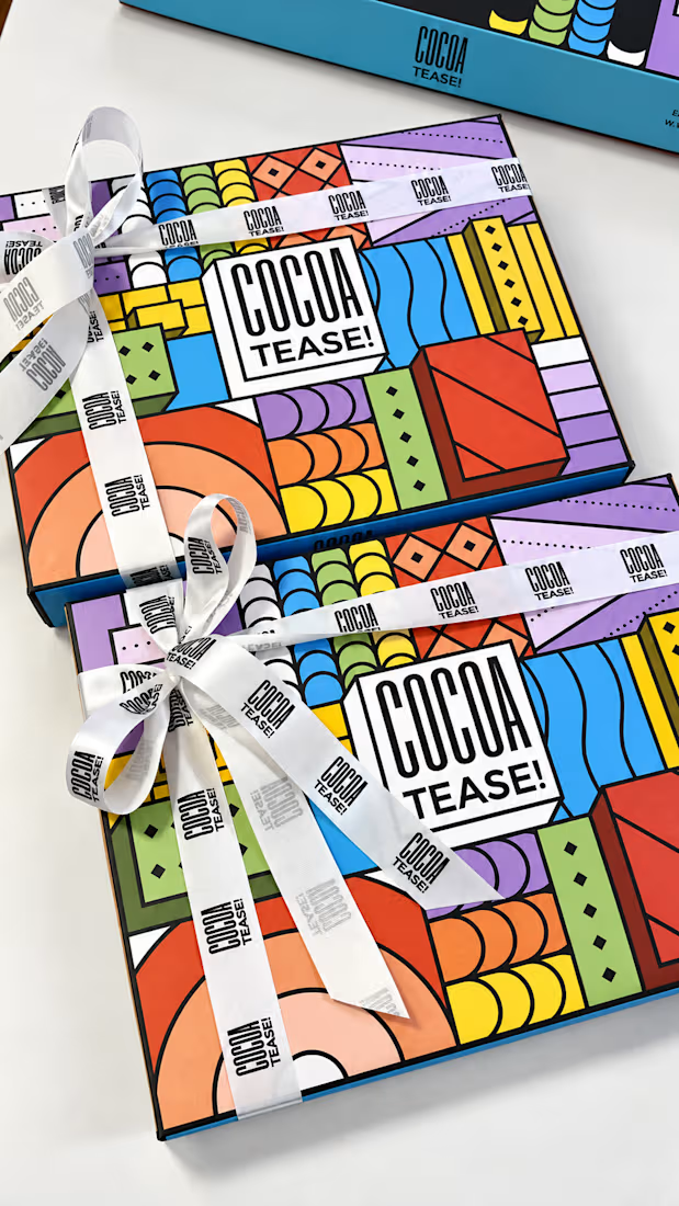
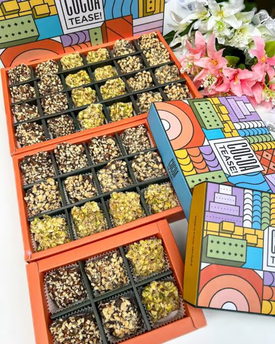
Brand & packaging design for Cocoatease! 🍫
•
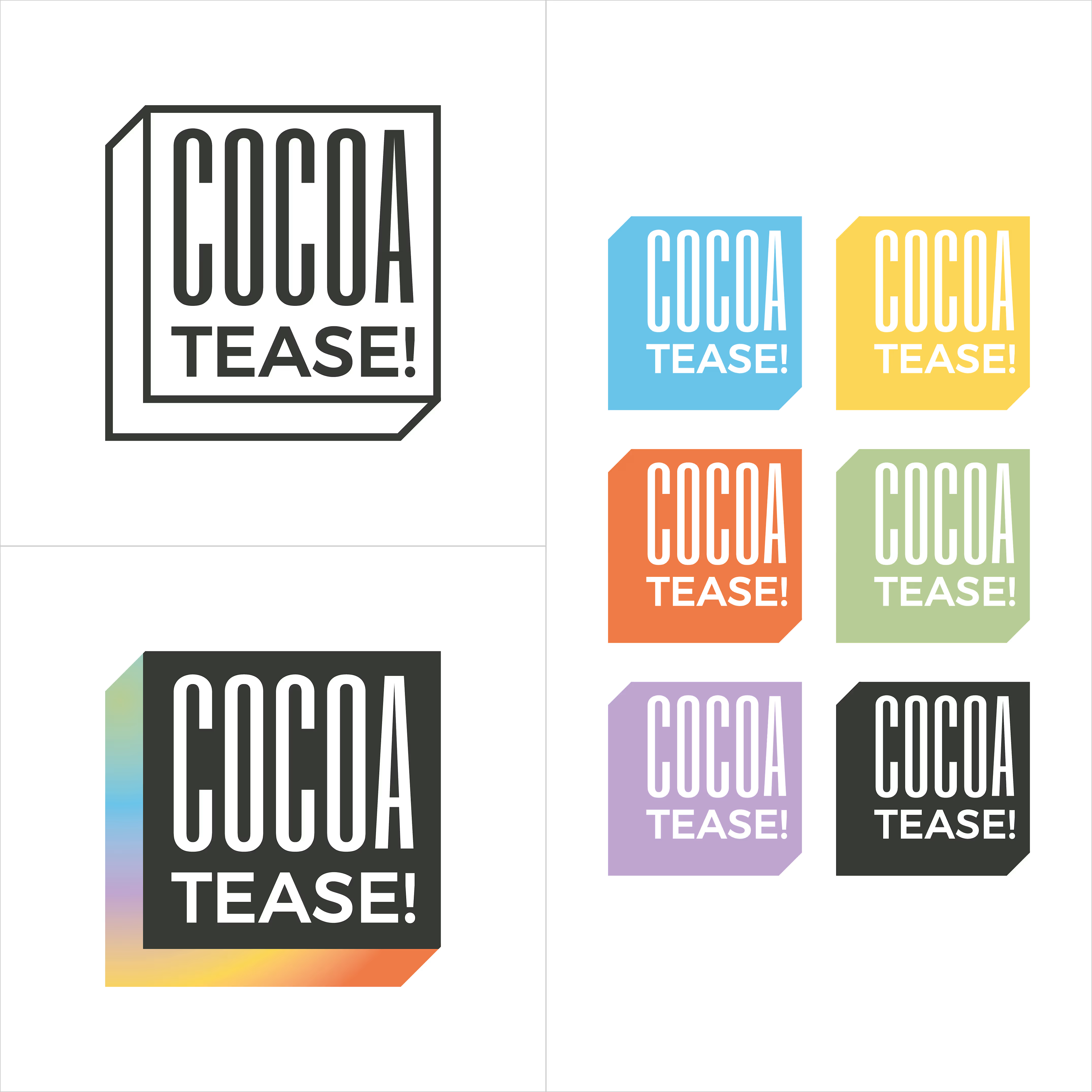
A chocolate company at heart, Cocoatease! is a dessert brand that aims to “tease your palette”. This unofficial tagline prompted the idea of a button for the logo…a visual way of saying “push for a treat”.
•
While a logo is usually designed first, the packaging was conceptualised first to meet growing demand. That pushed us (wink wink) to create a bunch of colour variations to match it.
•
Logo design, logo symbol, branding, brand design, visual identity design, packaging, packaging design, colour palette, typography