The network for creativity
Join 1.25M professional creatives like you
Connect with clients, get discovered, and run your business 100% commission-free
Creatives on Contra have earned over $150M and we are just getting started
Back to feedPost

Designed & directed a 25-second hero video for RUSH, blending seamless storytelling with neon aesthetics. One continuous camera flow—no hard cuts. Lime green, cyan, and golden-hour lighting track the emotional arc: morning ritual → gym grind → product reward.
Narrative-driven, Gen Z-native, made for social but feels like a real film.


The network for creativity
Join 1.25M professional creatives like you
Connect with clients, get discovered, and run your business 100% commission-free
Creatives on Contra have earned over $150M and we are just getting started











Related posts


Lovely cohesive work, Alex. The motion is spot on!

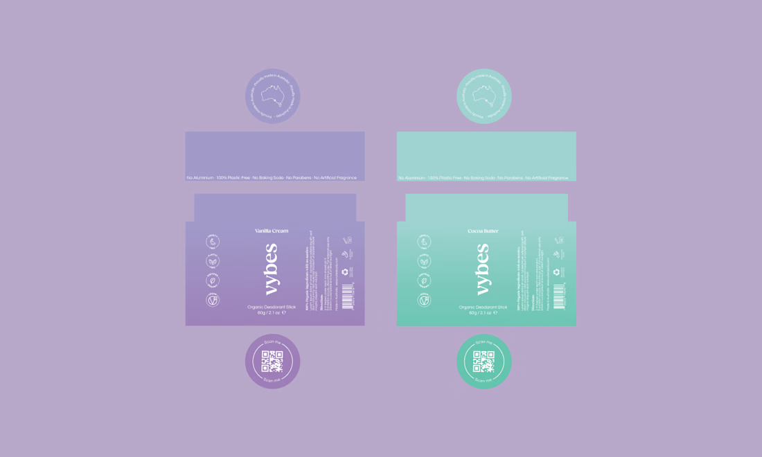
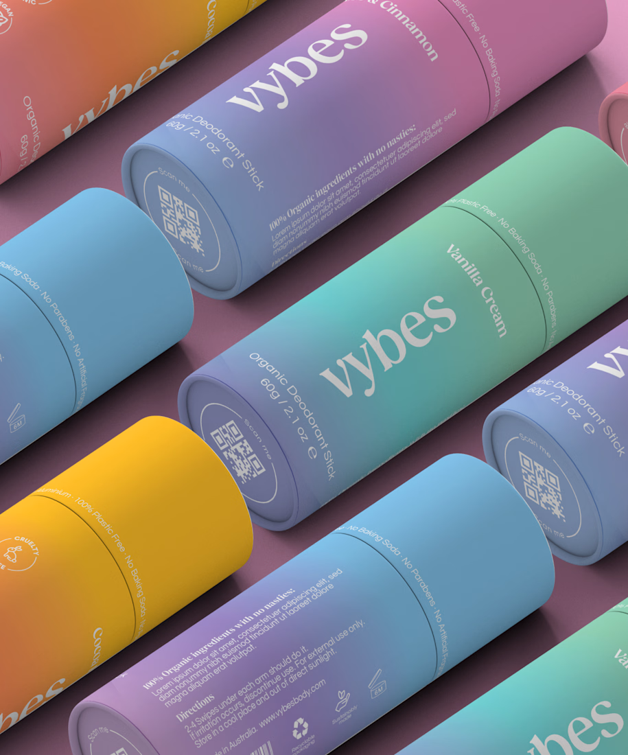
Have you ever designed packaging for a brand that never launched? 👀
Surprisingly, it’s happened to me more times than I expected.
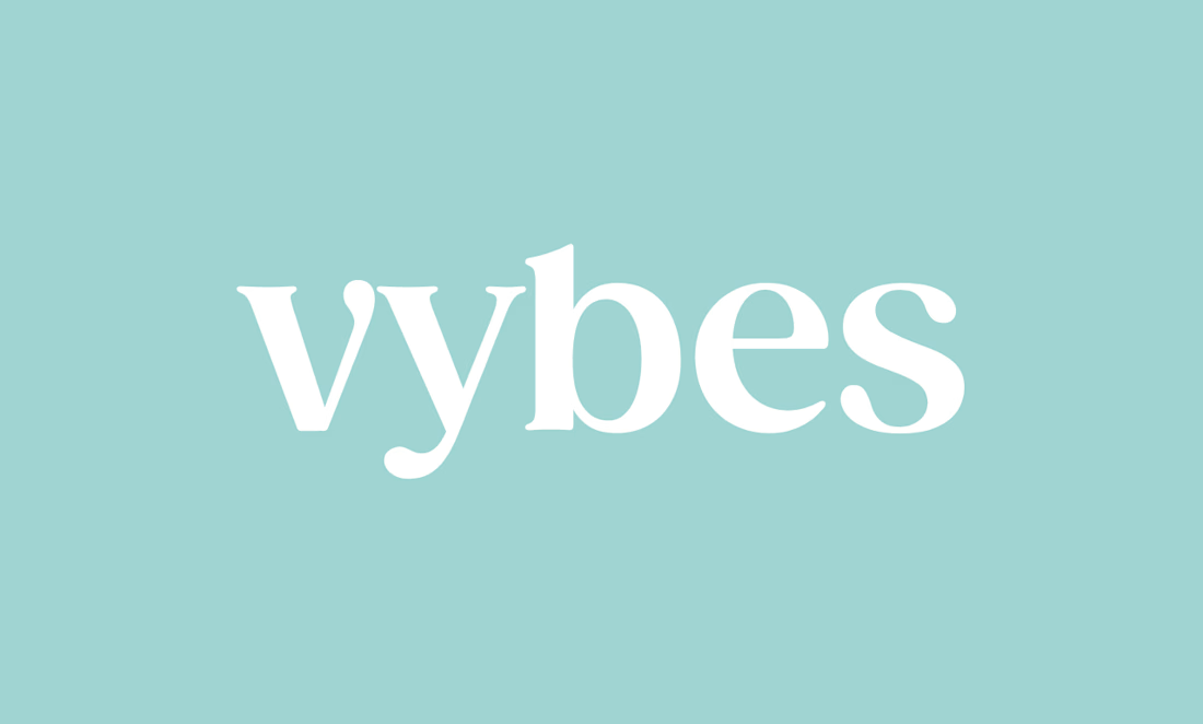
Vybes was an organic deodorant brand from Australia I worked on, designing packaging for a product that, in the end, never made it to market.
It’s a weird feeling putting so much thought into packaging for a product that people will never see on a shelf.
How many unreleased projects are hiding in your folders? 😂




Approved logo for a mental health and daily habit app built for seafarers and offshore workers.
Can't wait to share more.