The network for creativity
Join 1.25M professional creatives like you
Connect with clients, get discovered, and run your business 100% commission-free
Creatives on Contra have earned over $150M and we are just getting started
Back to feedPost

Lessons from The Project – Post #5
Title: Product organization - 48 Products. One Problem: Choice Overload.
Having 48 products is exciting for the business. It can also be overwhelming for the customer. Imagine opening a product page and seeing dozens of titles without knowing where to start.
For Komik Anakku, I organized the experience around: Individual titles → Thematic bundles → Complete collection.
The goal wasn't to reduce choice. It was to make the choice easier to understand.
One of the biggest lessons I took from the project: Product organization is part of customer experience.
The network for creativity
Join 1.25M professional creatives like you
Connect with clients, get discovered, and run your business 100% commission-free
Creatives on Contra have earned over $150M and we are just getting started

Challenges
View all


Related posts

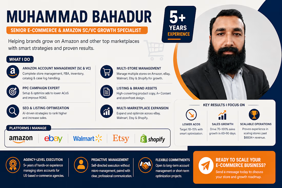
Full A–Z Account Management: End-to-end operations, FBA logistics, catalog health, and brand protection.
PPC Campaign Optimization: Strategic campaign structuring focused on lowering ACoS and maximizing ROAS.
Multi-Marketplace Growth: Store expansion, listing optimization, and scalable revenue strategies.



Great mix of strategy and operations. Strong PPC optimization and account management can make a real difference in marketplace growth.

A Friday pick from the archives. I made this for Whale a few months ago, and it’s still close to my heart.
The task was to explain a product with several features without making viewers work to understand it.
I kept the structure simple: the problem, the main solution, then the extras.
First, scattered company knowledge and the same questions being asked repeatedly. Then, how Whale puts answers inside the tools teams already use. Recording processes and training quizzes come later, once the main value is clear.
That order matters. Viewers should understand why they need the product before learning everything it can do.
I took the same approach with the animation: calm transitions, focused UI, and time to follow each action.
Still proud of this one. Not because I squeezed everything in, but because I gave the important parts enough room.


Delivered a web-based, AI-powered project management platform designed to simplify daily tasks, team collaboration, and project tracking.
The platform allows businesses to add team members, assign tasks, monitor progress through an intuitive dashboard, and gain valuable insights with clear analytics.
In today's fast-paced business environment, every organization needs an efficient project management solution to streamline workflows, manage tasks, and track overall performance.
What do you think of the design and user interface? I'd love to hear your feedback!


