The network for creativity
Join 1.25M professional creatives like you
Connect with clients, get discovered, and run your business 100% commission-free
Creatives on Contra have earned over $150M and we are just getting started
Back to feedPost

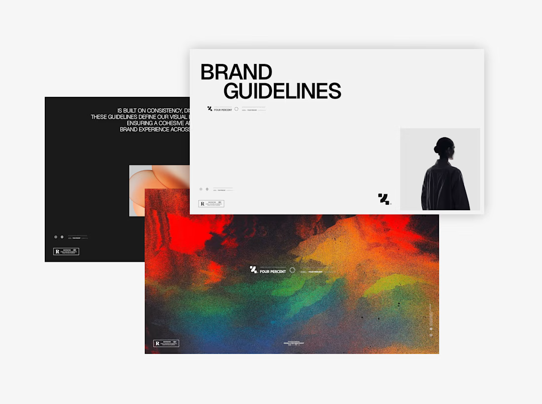
Four Percent — Visual Identity
Worked on the visual direction for Four Percent, creating a bold and modern identity inspired by American innovation. The project included the logo system, typography, graphic elements, apparel applications, and overall art direction.



Great work 👍
thanks

Building the identity around American innovation gives the whole system a story to lean on. The brand guidelines piece is the most important part here, it is what keeps bold work consistent.
The network for creativity
Join 1.25M professional creatives like you
Connect with clients, get discovered, and run your business 100% commission-free
Creatives on Contra have earned over $150M and we are just getting started






Related posts

Logos & Marks — Volume 12
A curated selection of recent logo and identity work.
This collection brings together commissioned projects, unused concepts, and exploratory directions across technology, AI, finance, sports, retail, and other industries.
The work explores geometric symbols, custom typography, monograms, and abstract forms, with a focus on clarity, distinction, and strong visual character.
Selected marks are available for acquisition.
For licensing, customization, or brand identity inquiries, feel free to get in touch.
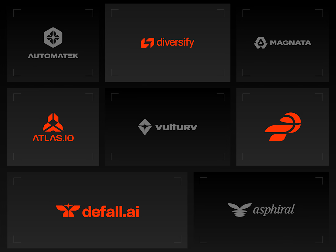
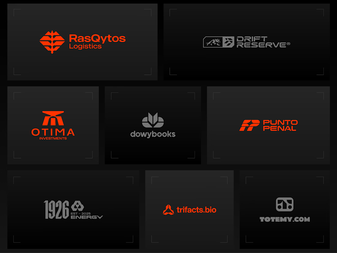
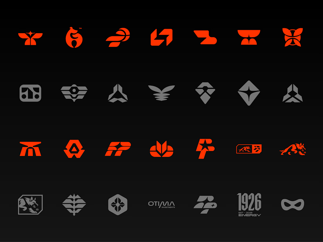
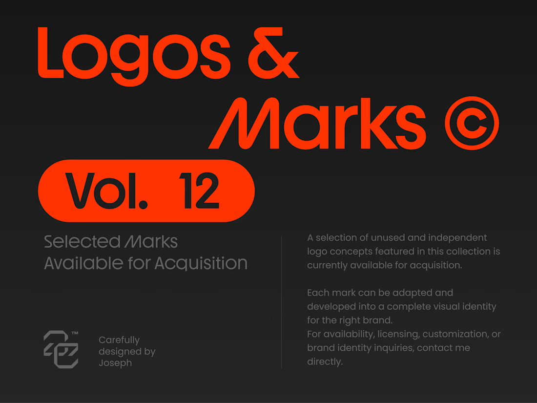


Holding the whole volume to one hot orange on charcoal makes the marks easy to compare, and the Otima symbol stacking a gate shape over the wordmark is my favorite of the set.
VibesAreHigh - Visual Identity

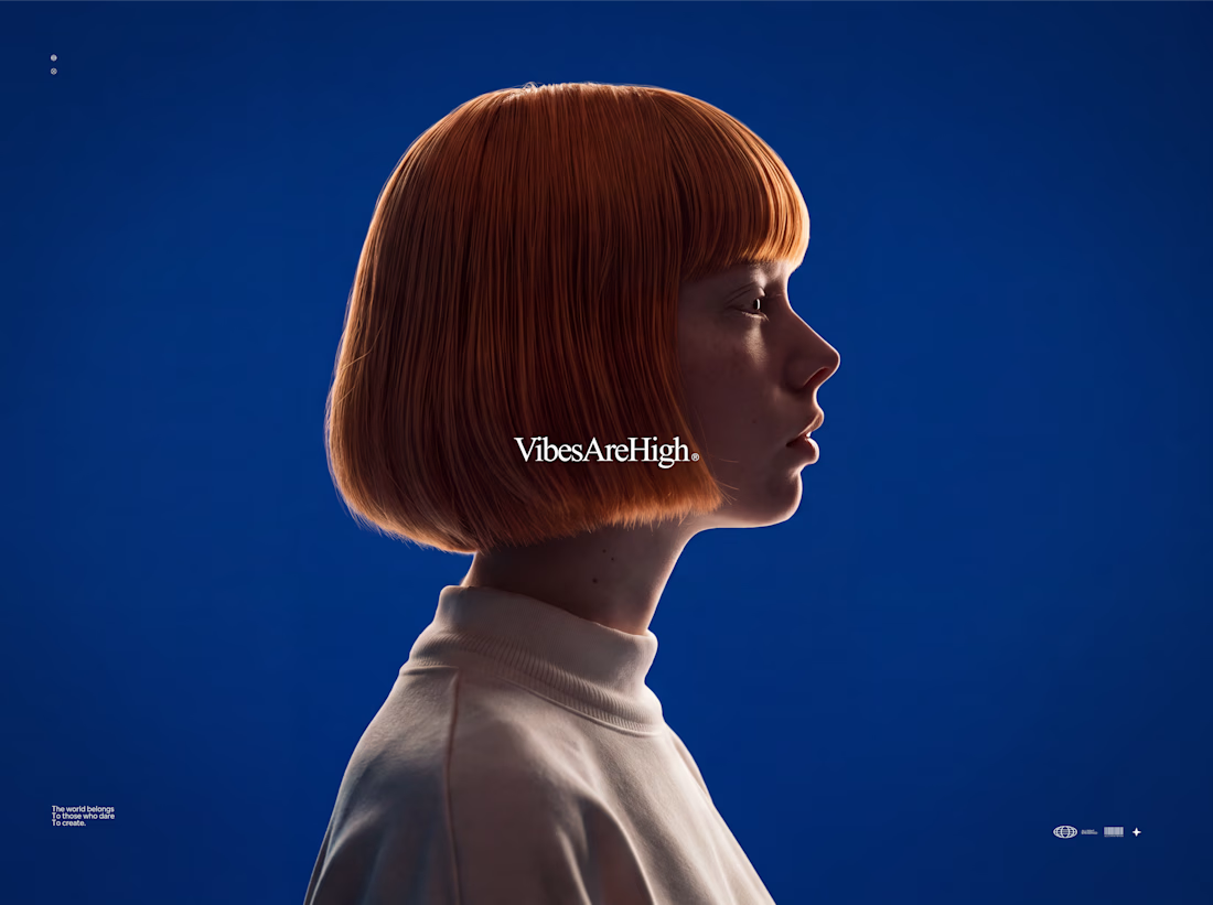

Siiiiiiick 😍

A product design project focused on creating a distinctive visual identity and a clear, professional presentation for the Agroxim brand.
Product and visual design
Layout and composition
Color palette and typography selection
Visual consistency and attention to detail
Preparing the final design for presentation
Tools & Software:
Adobe Illustrator · Adobe Photoshop · Adobe After Effect · Adobe Indesign
Focus:
Creating a visually appealing, professional design that communicates the brand's identity and helps the product stand out.

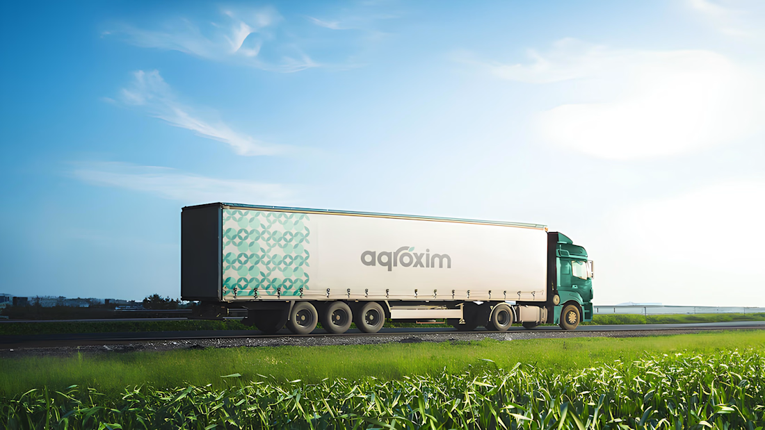
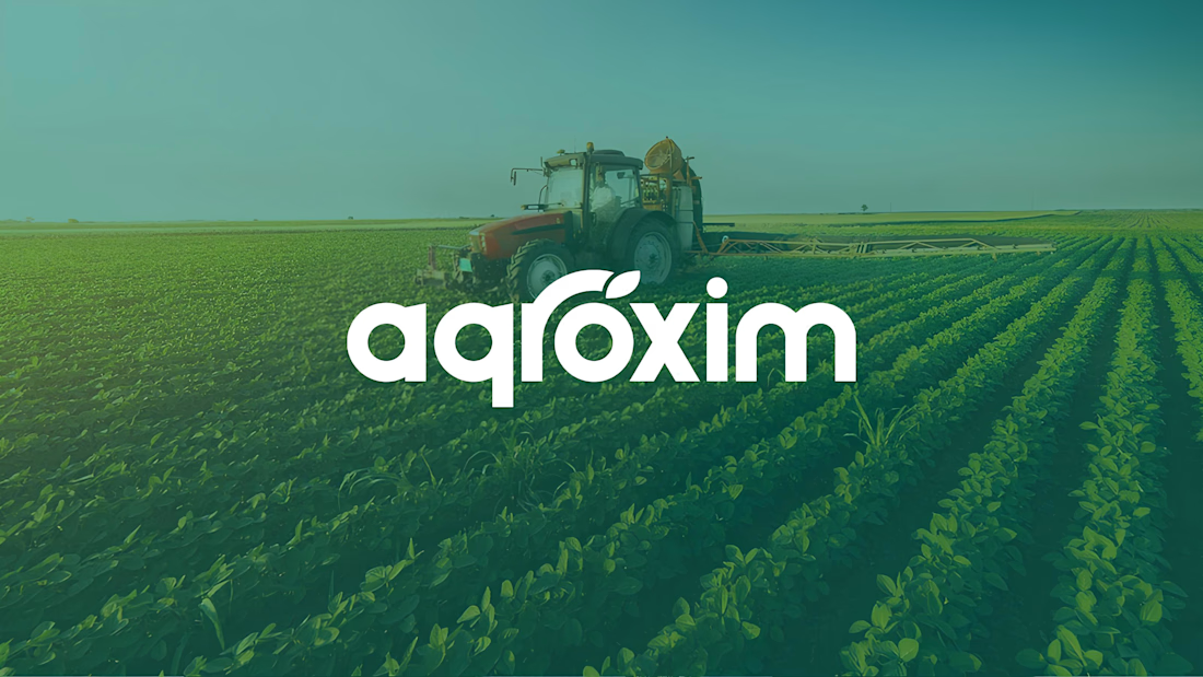
The agroxim wordmark sitting over that field photography is a lovely pairing, Sahib. Fresh greens really do the heavy lifting for an ag brand. Strong identity work.