The network for creativity
Join 1.25M professional creatives like you
Connect with clients, get discovered, and run your business 100% commission-free
Creatives on Contra have earned over $150M and we are just getting started
Back to feedPost

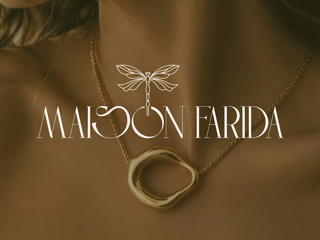
Nature has always been one of the greatest luxury designers.
That idea inspired the identity for Maison Farida, a jewelry brand where elegance meets craftsmanship.
Minimal details. Timeless typography. A dragonfly that symbolizes beauty, transformation, and grace.
Sometimes the strongest identities are the ones that whisper instead of shout.
Which element stands out to you the most? 👇
#BrandIdentity #LogoDesign #BrandDesign #VisualIdentity #LuxuryBranding #JewelryBrand #CreativeDirection #BrandStrategy #GraphicDesign

Branding 😍

I agree, nature is the greatest luxury designer and the master of whispered authority. Your design has captured that essence quite well.
The element that stands out to me the most is the typography... Structured yet free, untamed yet graceful, enhanced by the sentiment and...
Thank you, Natasha, I appreciate it 😊


Hi @Ermela Juniku !
I really appreciate how the dragonfly mark uses clean, fine-line geometry to mirror physical gold filigree craft rather than relying on a heavy or literal organic illustration. It pairs seamlessly with the high-contrast vertical strokes of the serif logotype without...
Thank you so much! I really appreciate your thoughtful feedback. 😊
The inspiration came from combining the elegance of nature with the precision of fine jewelry craftsmanship. I wanted the dragonfly to feel refined and timeless through a clean, geometric form that complements...
The network for creativity
Join 1.25M professional creatives like you
Connect with clients, get discovered, and run your business 100% commission-free
Creatives on Contra have earned over $150M and we are just getting started



Challenges
View all


Related posts


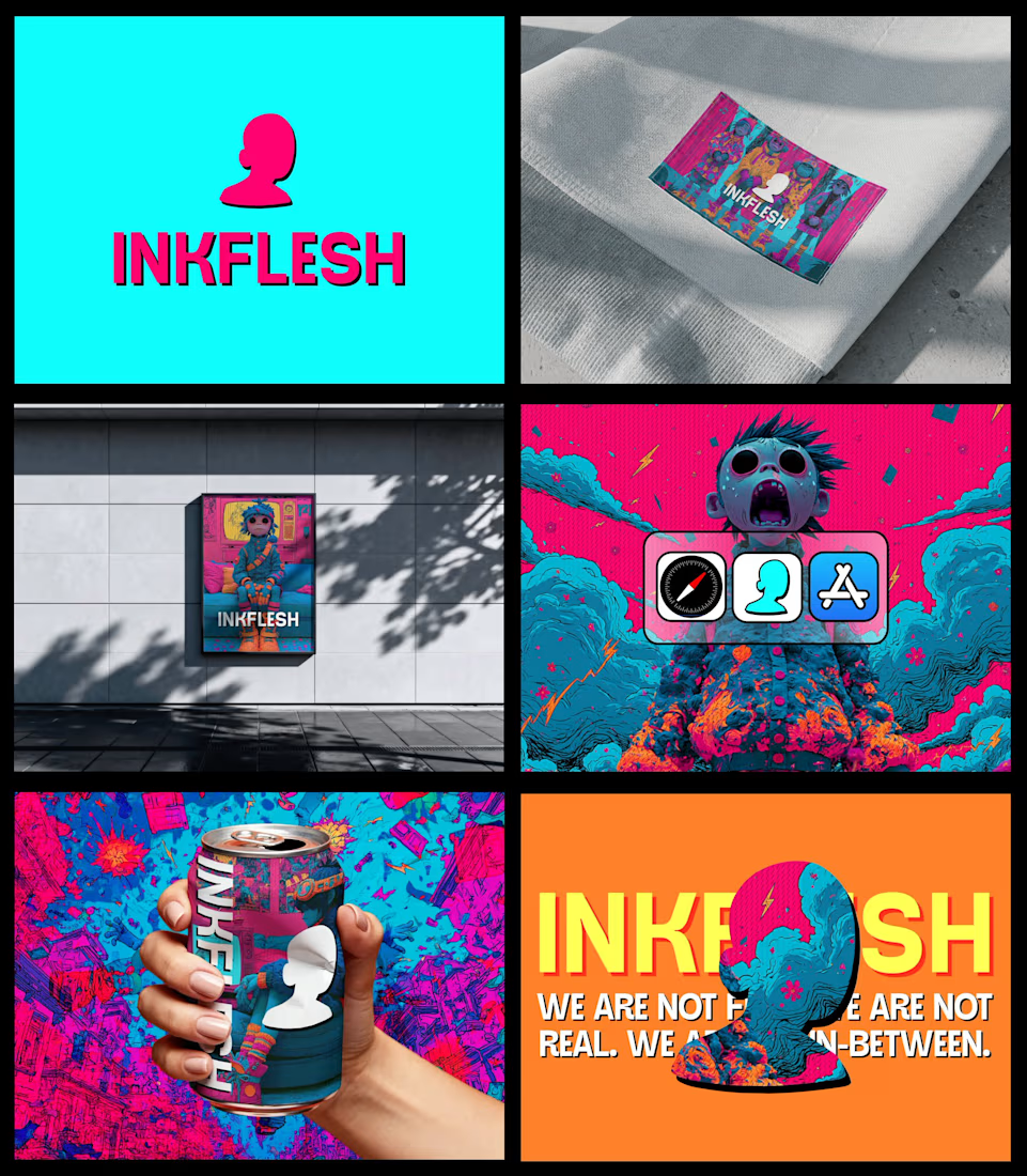
In my INKFLESH identity work, the wordmark runs off the can's curve and gets partly hidden behind artwork on posters. That crop asks the rest of the identity to carry more recognition. The mark has a job when the name is only partly there.


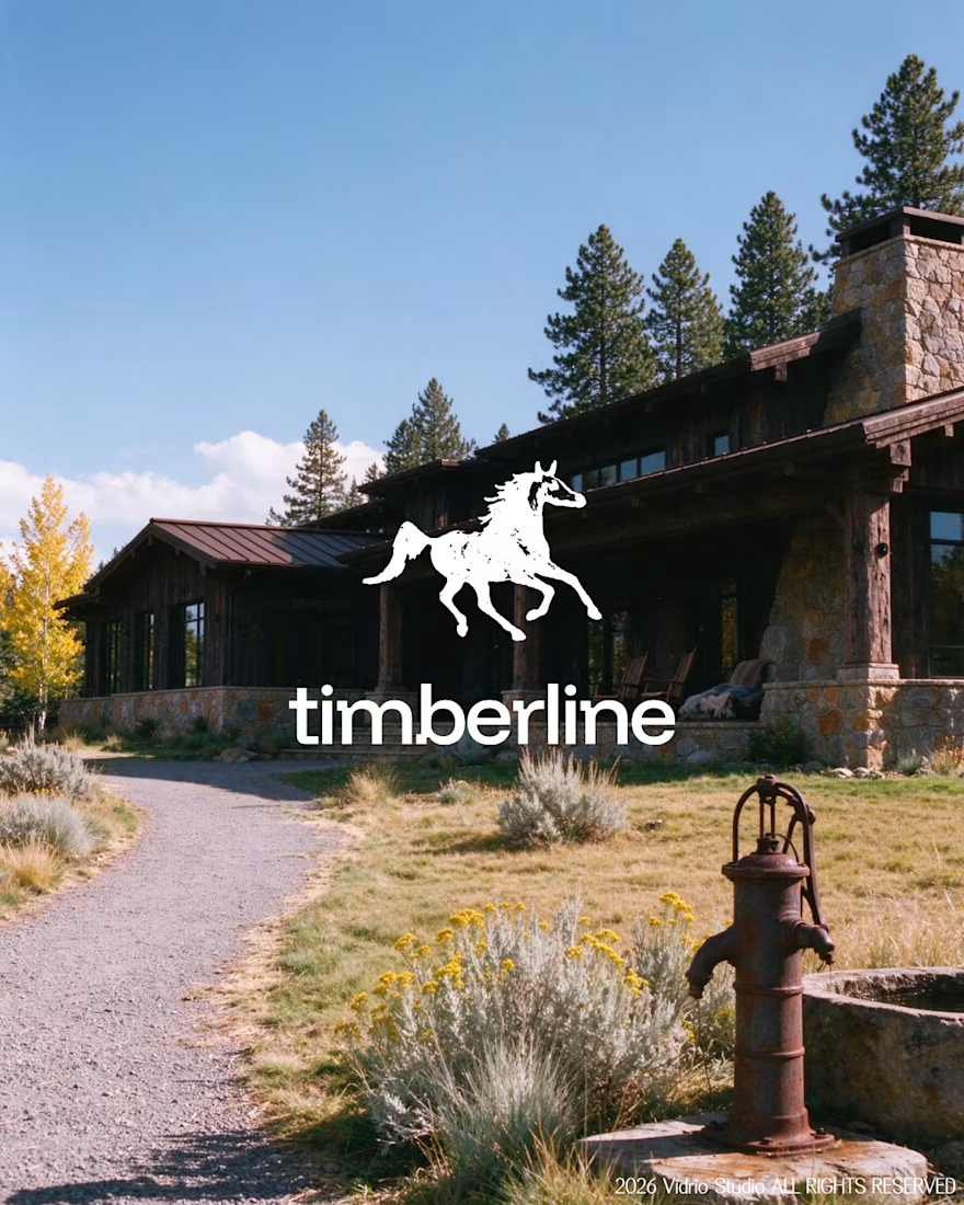
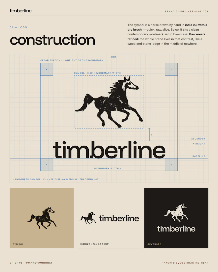
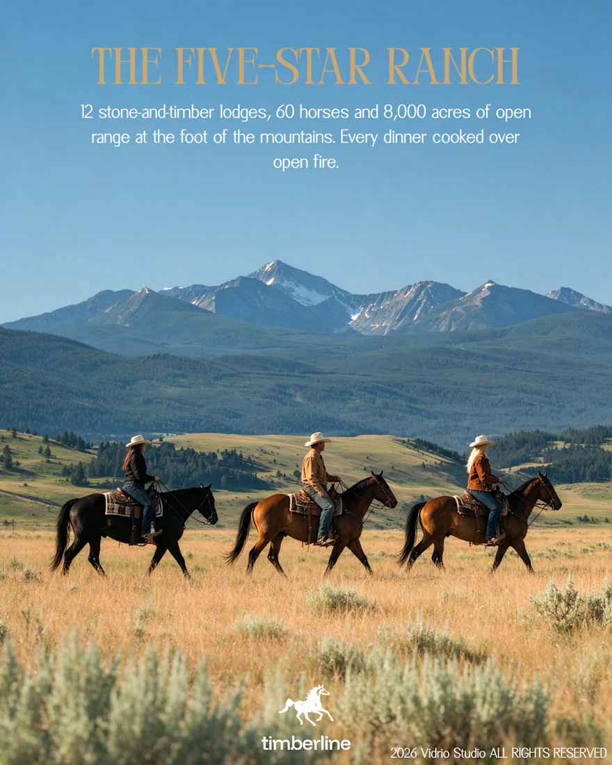
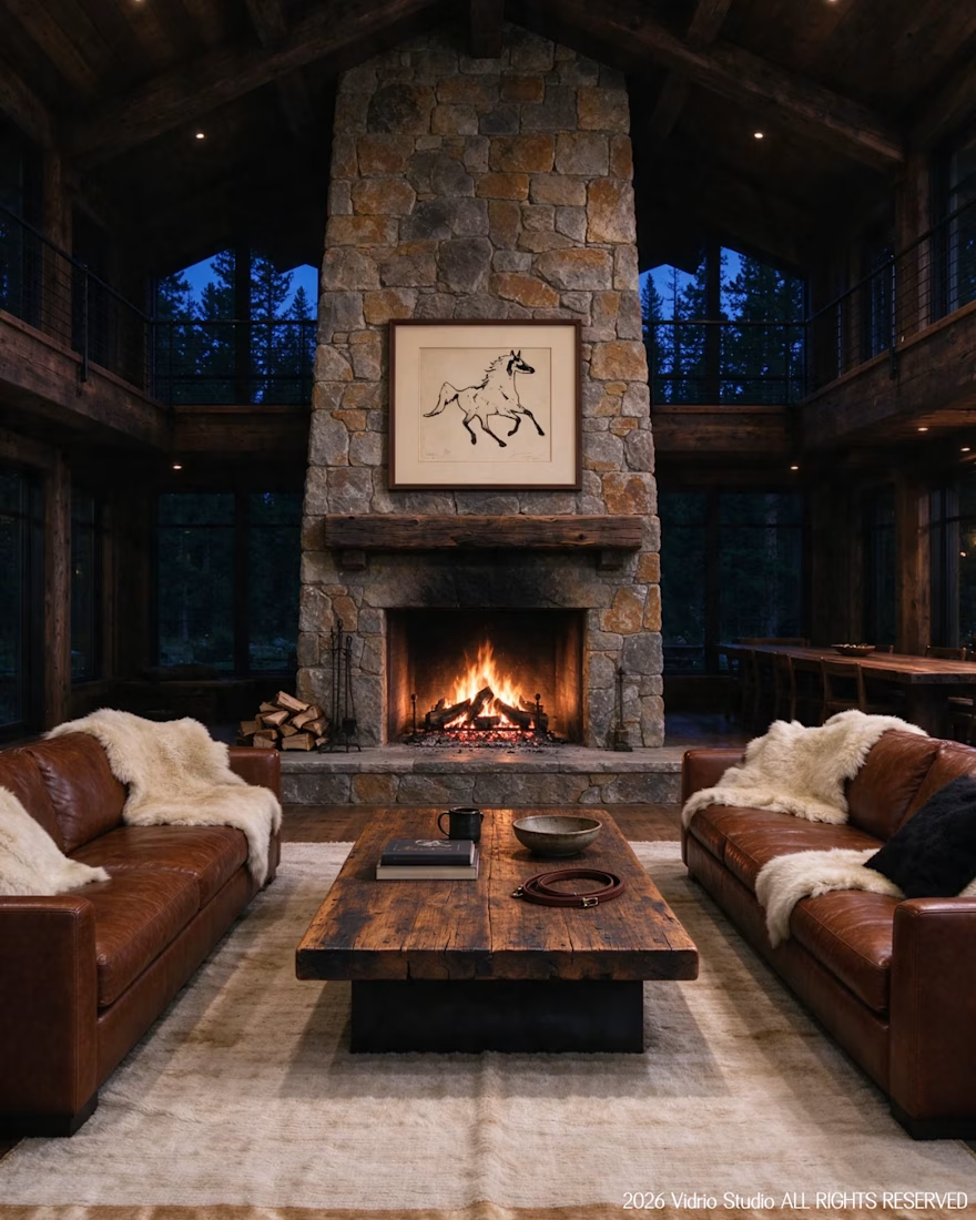
I worked on Brief 05 of the @makeyourbrief challenge: a brand identity for Timberline, a luxury ranch and equestrian retreat. I hand-drew the horse symbol with a marker, paired it with a clean modern wordmark and an earthy palette, and extended it into merch and lodge photography using AI under my own art direction, with retouching by hand.
Would you stay here? Tell me which image sold you.



That's really incredible great job Andreu❤️❤️

My Top Featured Projects on @Contra Labs 🔥
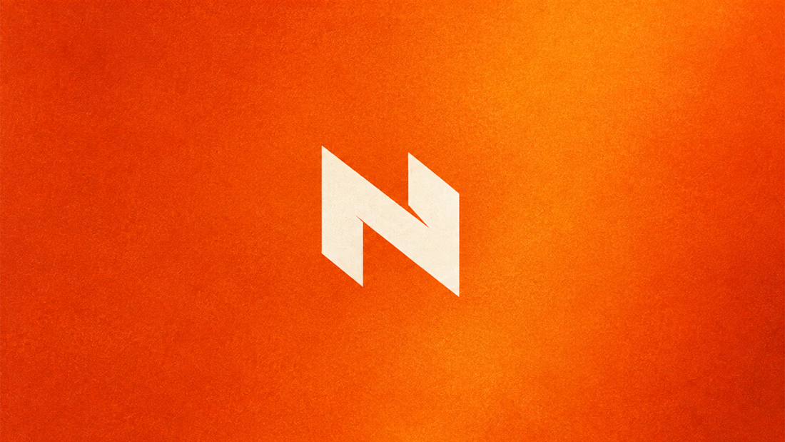
⚡| NEXVOLU
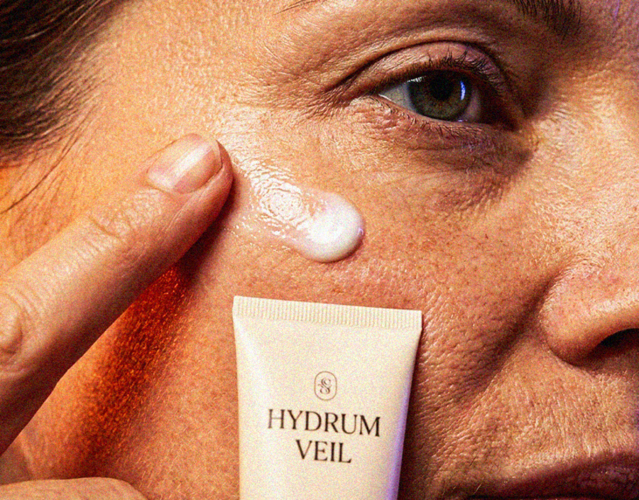
⚡| HYDRUM VEIL
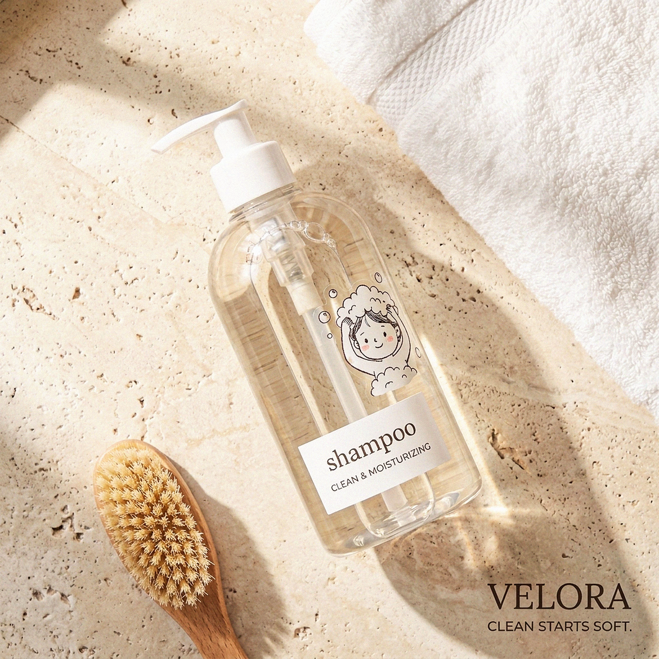
⚡| NOIRÉ
Each project explores a different direction, but the goal stays the same: build brands that stand out.
Which project is your favorite?
Drop the name below 👇

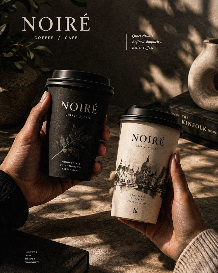

These are 🔥 Mine are all fav 🙌
Congo for Featured on @Contra HQ & @Contra Labs ... 😍