The network for creativity
Join 1.25M professional creatives like you
Connect with clients, get discovered, and run your business 100% commission-free
Creatives on Contra have earned over $150M and we are just getting started
Back to feedPost
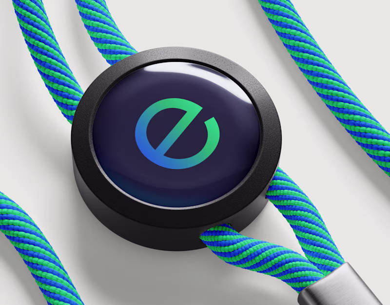
Taste Test
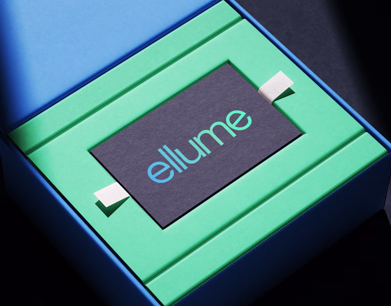
one thing i learned working on ellume's brand identity
color isn't decoration, it's information
we picked a deep midnight blue and a bright energy green not because they looked nice together (they do) but because the brand needed to feel both serious and alive at the same time. an energy infrastructure company has to read as trustworthy, but also forward looking. one color alone can't do that. you need the tension between two
every shade in that palette earned its spot by answering one question: does this make the brand feel more grounded, or more inevitable.
Finally, what should make it to the cover of the brand?
5 votes
Ends in 1h
Going with #1, that 3D icon has a presence the flat card can't match. Feels like a product you want to hold. The way the teal gradient catches the light against the dark base really sells the "serious but alive" tension you described.
GOing for #1
The network for creativity
Join 1.25M professional creatives like you
Connect with clients, get discovered, and run your business 100% commission-free
Creatives on Contra have earned over $150M and we are just getting started
Related posts
🏠I've been exploring two identity directions for PropOS, both using the same purple-and-white palette on dark, but each speaks to a completely different brand personality.
Which direction do you lean toward, the one that shows the industry or the one that transcends it? 👇
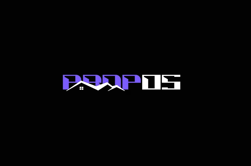
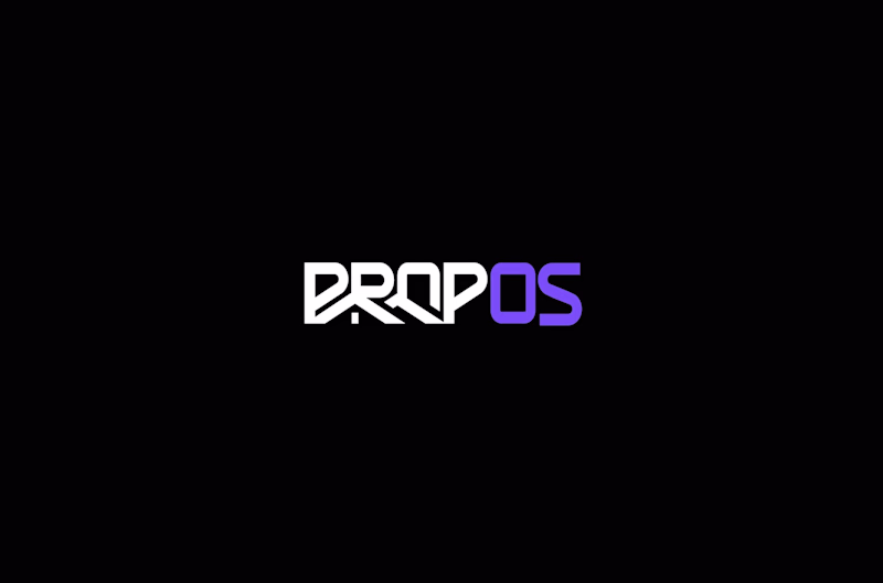
4 votes
Ends in 1d
big on tech, it held my eye longer, but both clearly are thought through & aesthetically really solid.
AI Visual Brand Development: Blissora™ & Glidora™
Project Overview
This creative showcase demonstrates my ability to build complete AI-powered visual brand ecosystems from concept to campaign-ready assets.
For this project, I developed two distinct luxury consumer brands in completely different industries—skincare and wellness beverages—to showcase the versatility of AI-assisted visual branding, product visualization, packaging design, and lifestyle marketing.
The goal was to create brands that feel authentic, market-ready, and visually cohesive across multiple customer touchpoints.
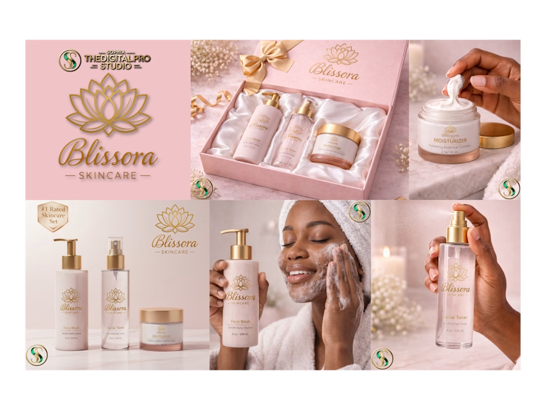
Blissora™ Skincare
Luxury Beauty Brand Concept
Blissora™ was created as a premium skincare brand focused on elegance, self-care, and everyday luxury.
The visual identity combines soft blush tones, gold accents, botanical symbolism, and clean packaging design to create a calming, aspirational customer experience.
Deliverables
✔ Brand Identity Development
✔ Luxury Product Packaging Concepts
✔ Product Mockups
✔ Lifestyle Marketing Imagery
✔ Beauty Campaign Visuals
✔ Gift Set Presentation Design
✔ AI-Generated Brand Photography
Creative Direction
The Blissora™ collection was designed to appeal to consumers seeking a high-end skincare experience that feels feminine, sophisticated, and gift-worthy while maintaining a modern luxury aesthetic.
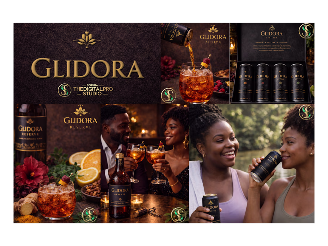
Glidora™ Active & Reserve
Premium Wellness Beverage Brand Concept
Glidora™ was developed as a non-alcoholic botanical beverage brand inspired by wellness culture, heritage, and elevated social experiences.
The project explores how premium packaging, storytelling, and lifestyle imagery can position an alcohol-free beverage as a luxury consumer product.
Deliverables
✔ Brand Identity Development
✔ Beverage Packaging Design
✔ Product Line Extensions
✔ Lifestyle Campaign Visuals
✔ Social Media Marketing Assets
✔ Product Photography Concepts
✔ AI-Generated Advertising Creative
Creative Direction
The Glidora™ visual ecosystem combines rich earth tones, luxury packaging, sophisticated lifestyle imagery, and premium product presentation to create a brand experience that feels aspirational, modern, and culturally connected.
✔ Skills Demonstrated
✔ AI Visual Branding
✔ Brand Identity Design
✔ Product Visualization
✔ Packaging Concepts
✔ Creative Direction
✔ Advertising Design
✔ Marketing Asset Creation
✔ Campaign Development
✔ Consumer Brand Storytelling
✔ Luxury Brand Positioning
Outcome
This project demonstrates how AI can be leveraged to rapidly create cohesive, high-quality brand visuals that help businesses visualize new products, launch concepts, marketing campaigns, and complete brand experiences before investing in traditional photography or production.
Created by SophiaTheDigitalPro Studio™
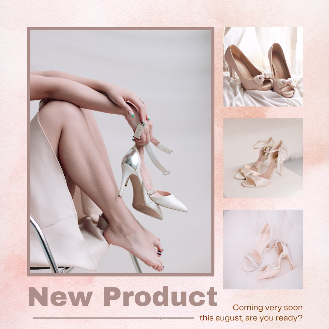
Just dropped a new project: Casual Comfort ➔ High-End Fashion.
A casual brand jumping into premium fashion is one of the ultimate design challenges. I recently partnered with an e-commerce footwear brand expanding from their signature casual flip-flops into an exclusive line of stylish heels.
When a product pivot is this big, the visual strategy has to adapt instantly. You can't sell editorial luxury using a laid-back, beachy aesthetic.
How I engineered their launch assets for conversion:
1. The Visual Pivot: Shifted from vibrant tones to a sleek, neutral, high-fashion color palette.
2. Hero Framing: Focused on sharp product isolation to let the craftsmanship and textures shine.
3. Hype Elements: Designed high-contrast typographic layouts to capture scroll-stopping attention for the "New Arrival" drop.
The final creative assets perfectly bridge the gap between upscale branding and high-converting direct-response design.
Check out the full case study, design process, and final mockups right here on my profile! 👇

Trending
Claude
Claude has entered the design space. How are you using Claude Design?
Contra University
Learn from expert creatives how to earn more using next-gen AI tools.
MagicPath
The canvas is infinite, and exploration is becoming the workflow. How are you using MagicPath?
creativeaiflow
Creative AI workflows are evolving. What tools do you use, and what are their strengths and weaknesses?
freelancerlife
Freelancer life is wins, pivots, and everything in between. What’s yours right now?