The network for creativity
Join 1.25M professional creatives like you
Connect with clients, get discovered, and run your business 100% commission-free
Creatives on Contra have earned over $150M and we are just getting started
Back to feedPost

Hi! I'm new here!
I'm Manu, and I specialize in mascots and vector illustrations. Feel free to check out my profile. Any helpful advice is welcome 🙌

The network for creativity
Join 1.25M professional creatives like you
Connect with clients, get discovered, and run your business 100% commission-free
Creatives on Contra have earned over $150M and we are just getting started



Related posts



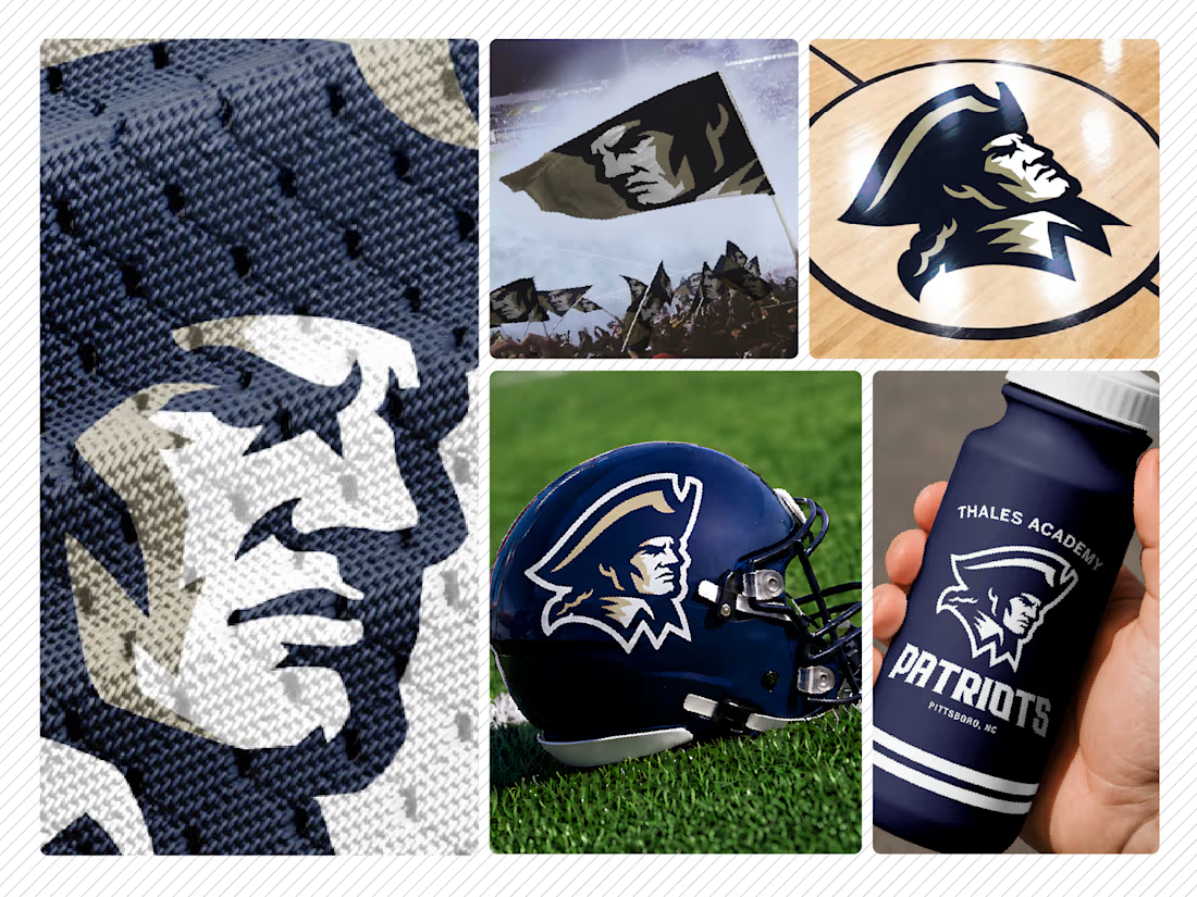
Thales Academy Patriots — Athletic Logo & Mascot Design
A logo for Thales Academy’s Patriots in Pittsboro, North Carolina, built around a bold patriot mascot with a determined expression and distinctive silhouette.
My approach follows a “less is more” philosophy: simplify the artwork while preserving the character and intensity that give a sports identity its presence. Strong shapes, controlled detail, and a navy, gold, and white palette help the mark read clearly across different sizes and applications.
The presentation mockups show how the identity translates to helmets, apparel, flags, court graphics, and merchandise.


Superb work!

Second #Rive animation locked in! 🏰✨
For this build, I designed and animated a gothic portcullis interactive UI element triggered by a glowing gemstone mechanism.
What I focused on for this experiment:
End-to-end vector design in Rive: Built entirely from scratch inside Rive to dust off my vectoring skills and master its native pathing/drawing tools.
Interactive State Machines: Configured the click logic using listener triggers to handle the open/close state loop smoothly.
Gothic UI Aesthetics: Balanced heavy metallic structures with subtle vector lighting to keep that dark fantasy feel.
Still diving deeper into interactive vector motion every day! What do you all think of the timing and state transitions?
Looking for a motion designer for your next project? Let’s collaborate! 🚀


Cool gothic style!