The network for creativity
Join 1.25M professional creatives like you
Connect with clients, get discovered, and run your business 100% commission-free
Creatives on Contra have earned over $150M and we are just getting started
Back to feedPost

Working on something fun today! ✨
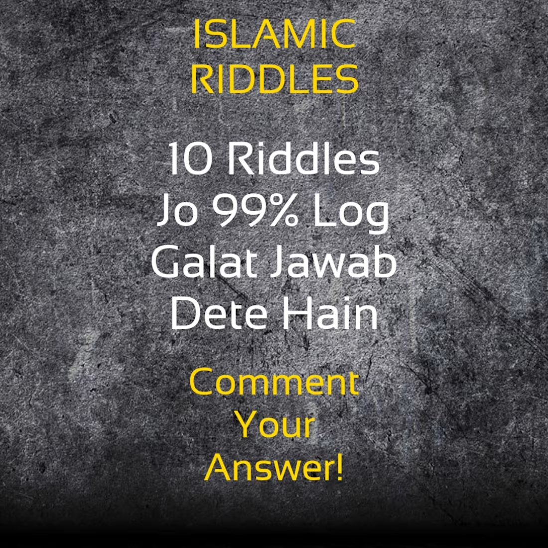
I just designed this Islamic Riddles poster for Facebook -
"10 Riddles Jo 99% Log Galat Jawab Dete Hain"
My goal was simple: Make people stop, read, and comment!
I love creating engaging posters + captions that get replies, not just likes.
Would you stop and comment on this one? 👇
The network for creativity
Join 1.25M professional creatives like you
Connect with clients, get discovered, and run your business 100% commission-free
Creatives on Contra have earned over $150M and we are just getting started



Related posts


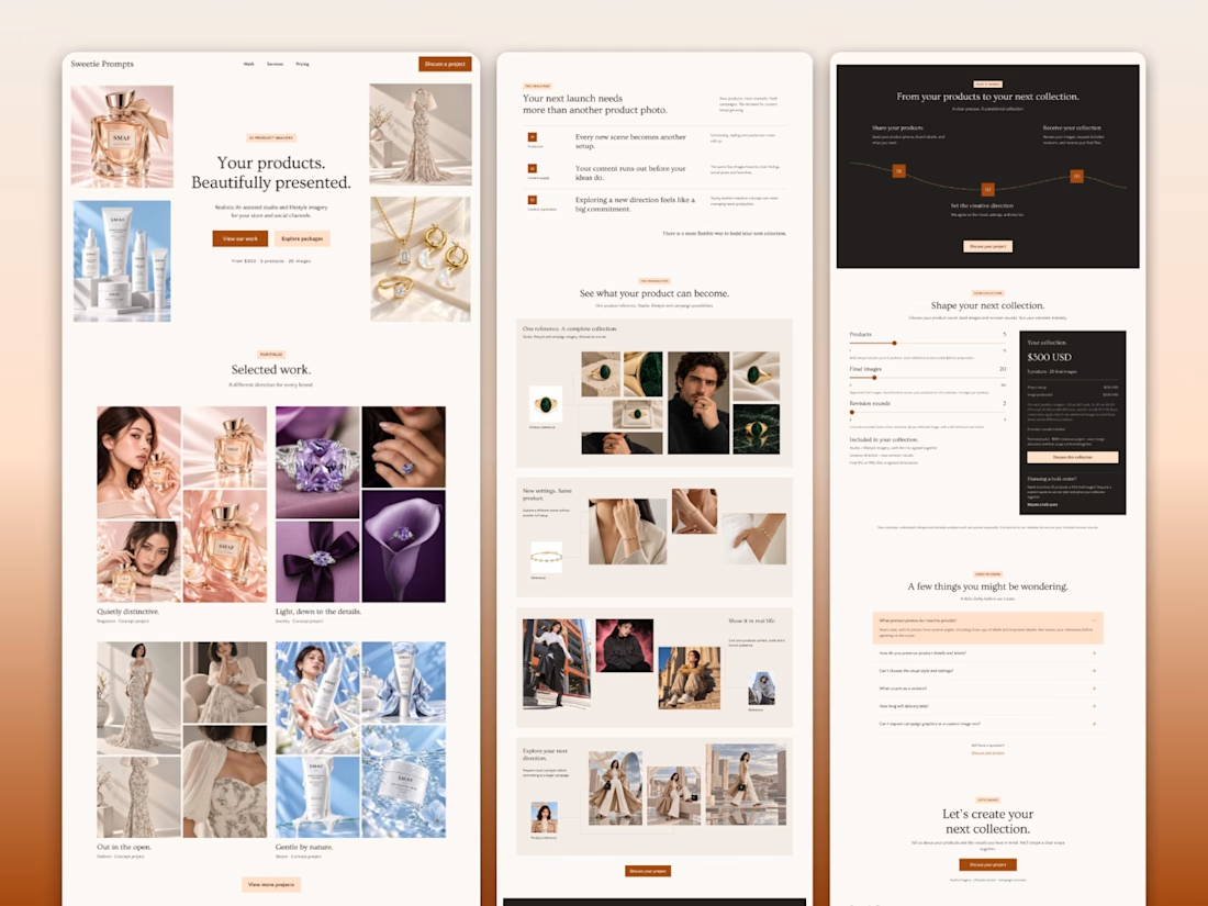

Nice landing page!

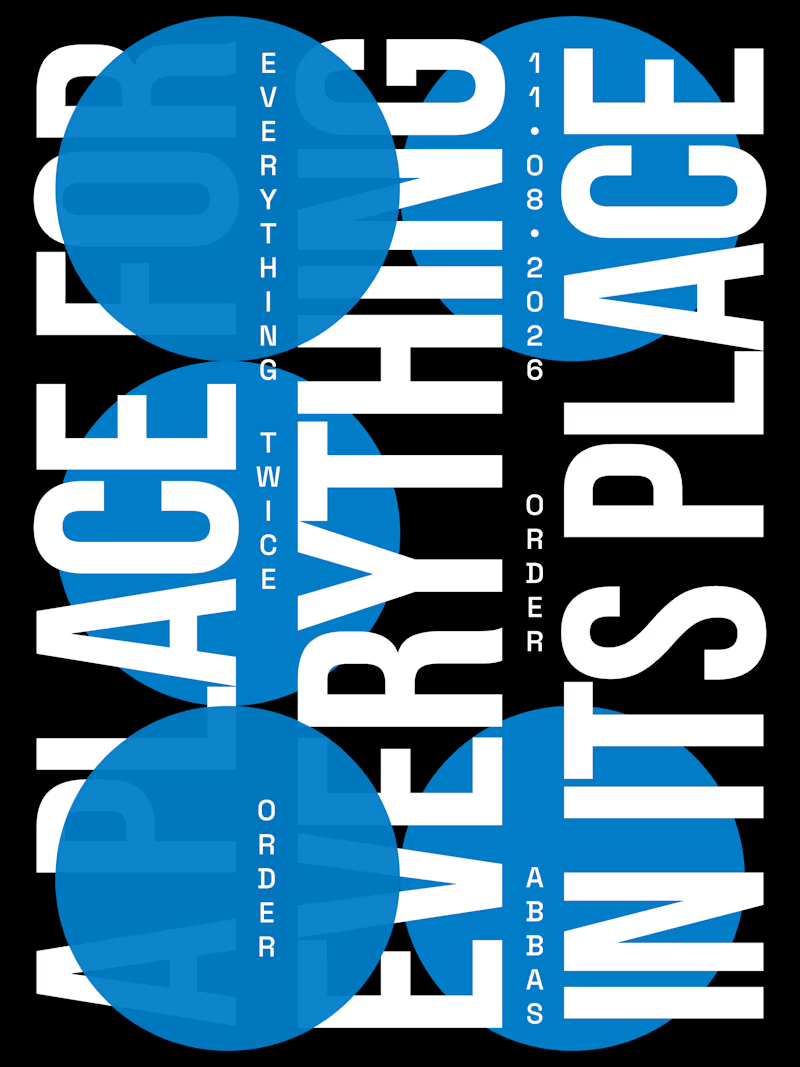
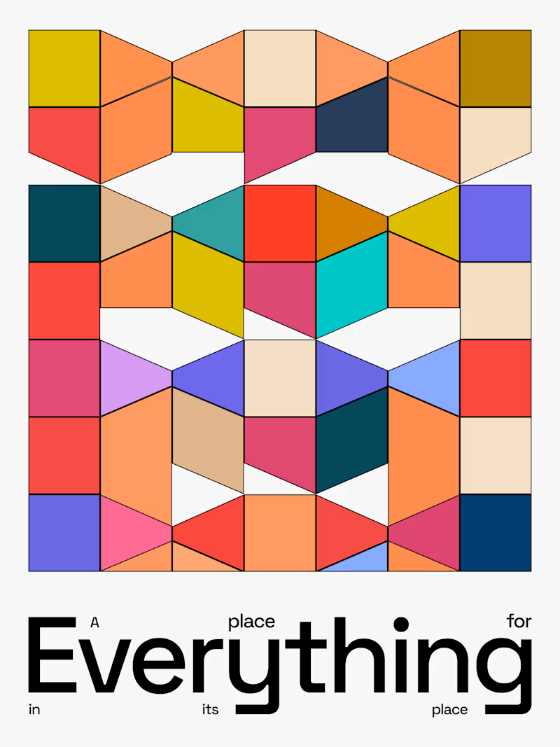
Day-02 of Poster Design
Style: Swiss International | Word: Order
The Quote i used i from benjamin franklin.
"A place for everything, everything in its place."
If someone ask you a question that 'define design in a single quote'
This is the perfect one to say.
Which design do you like?


3 voted
38%
5 voted
62%
8 votes
Closed


Paid social graphics that grab attention fast.
We designed a set of graphics for the paid social campaigns of Melvic Autocare, a Japanese and European auto specialist in Ravenhall, Victoria. They needed eye-catching tiles that stay true to their signature red and blue gradient brand style.
What we designed
1. A series of tiles for paid social campaigns that are visually striking and on-brand
2. Clear promotion of their most in-demand services, from Full Engine Service to Aircon Recharge and Re-gas ahead of summer
3. Designs built around their reputation as a Japanese and European auto specialist
4. A spotlight on their 30% promotional offer, with strong visuals and a clear call to action
5. One red and blue gradient style across every tile, so the set feels modern and consistent
The result is a set of modern, on-brand designs built to grab attention quickly online and show off the quality of their services.
The full case study is on our profile.
What makes someone stop scrolling when they see your ad?

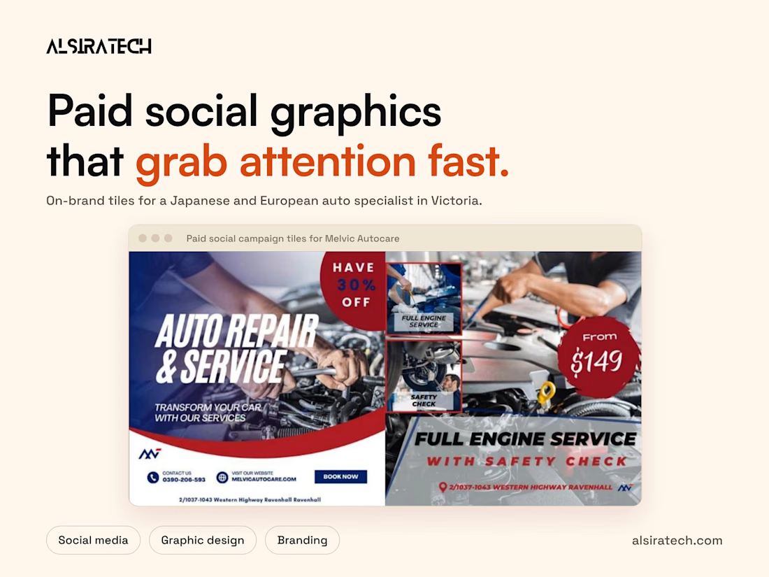

For me it's a clear price in a bold badge plus one offer line. Your $149 badge on the engine service tile does that well, and the red and blue gradient keeps the whole set consistent.