The network for creativity
Join 1.25M professional creatives like you
Connect with clients, get discovered, and run your business 100% commission-free
Creatives on Contra have earned over $150M and we are just getting started
Back to feedPost

Unused logo concept exploration for Hornways Airline
This concept didn’t make the final cut, but I’d love to know: would you have explored this direction further?
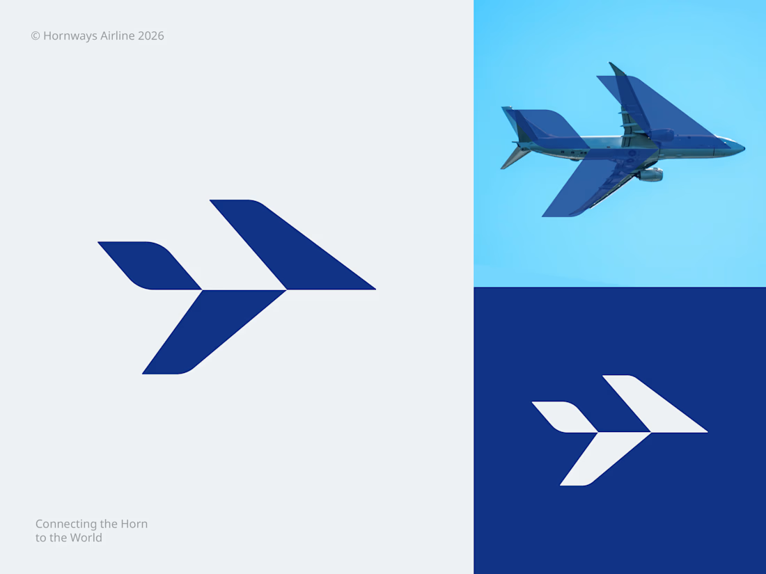

Yes, but I'd push on the negative space first - the chevrons read as a bird before they read as a plane, and for an airline that ambiguity is usually an asset rather than a problem. Worth testing at tail-fin scale before writing it off.
The network for creativity
Join 1.25M professional creatives like you
Connect with clients, get discovered, and run your business 100% commission-free
Creatives on Contra have earned over $150M and we are just getting started
Trending
retrofuturism
Share your favorite designs from the past exploring the distant future. Or your own take on the aesthetic 🚀
halftone
Dots. Texture. Grain. Let's see your designs using the halftone technique.

Midjourney
Creatives are showing off what they're making with Midjourney.
colorgrade
Video editors sound off: How do you enhance the mood of your video in color grading?





Related posts


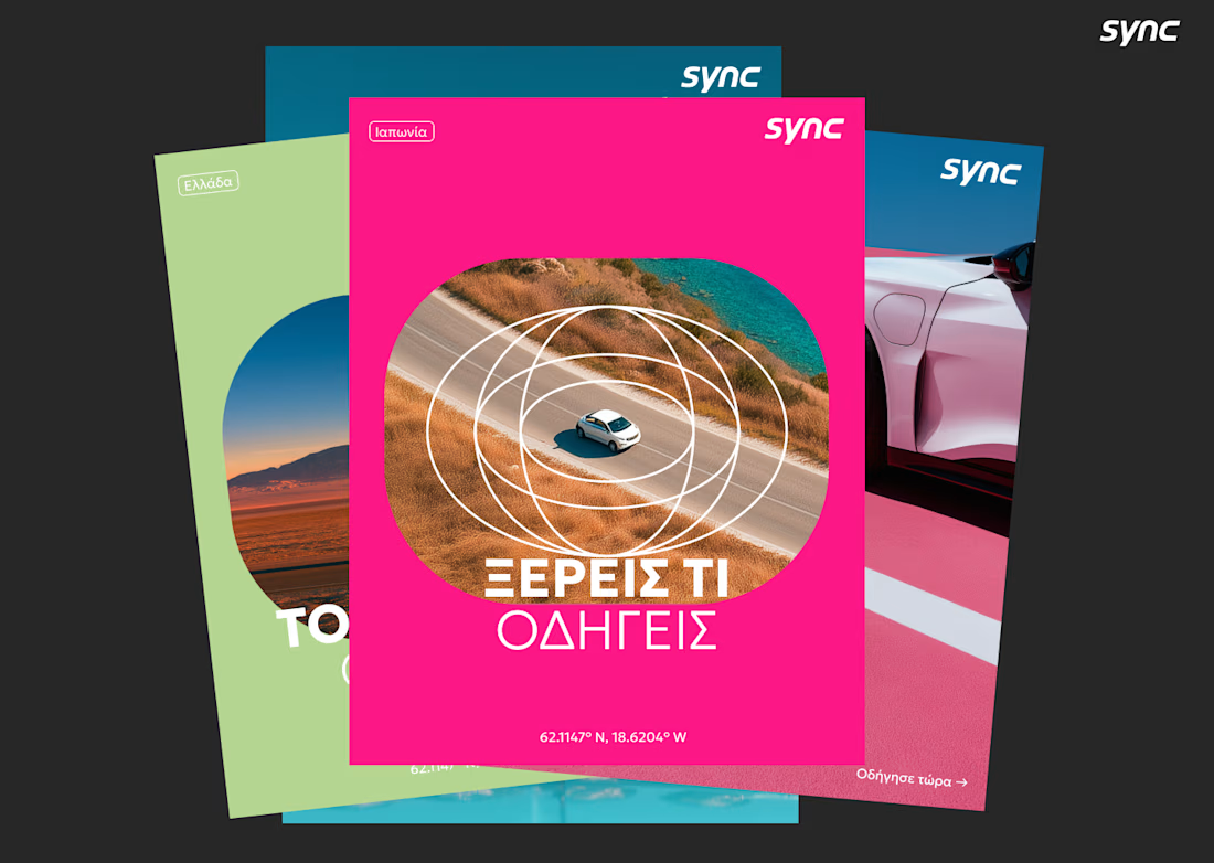
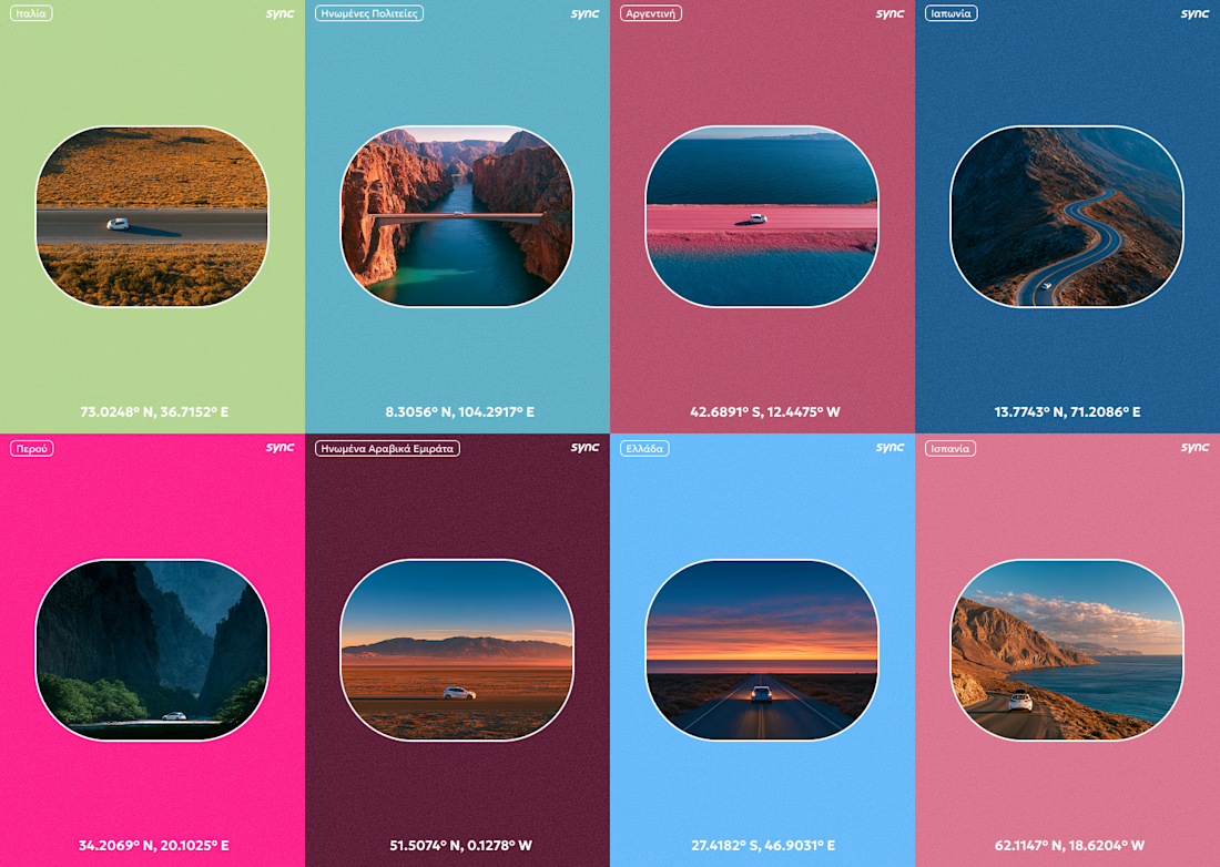
I don't speak any Greek, but I still made it work.
This is a part of the original exploration for an Athens based car rental company called Sync. The final identity looks a lot different and I cant wait to be able to share it as well.


Great Great work!!



This is such a standout piece.

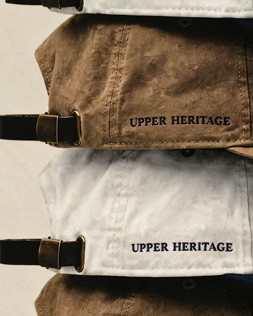
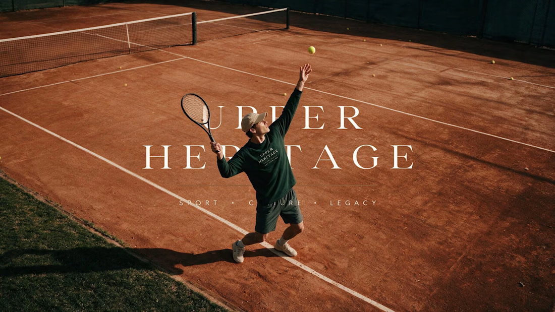
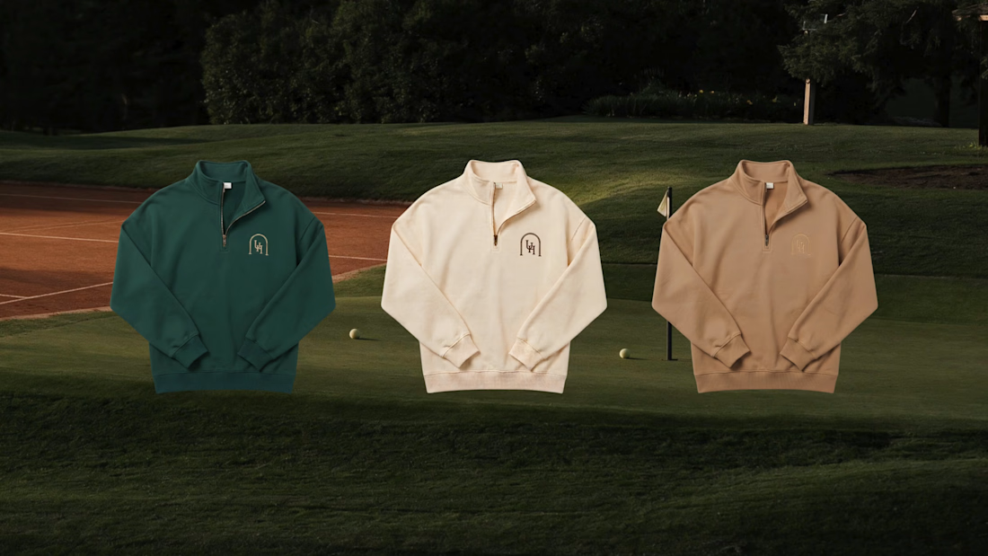
Built to Look Like It Has Always Existed 🎾
Some brands want to look new. This one wanted the opposite.
Upper Heritage borrows the codes of club tennis — crests,
hand-painted signage, court green. Designed to feel founded
in 1934 and simply never advertised.
The hardest part of heritage design isn't adding history.
It's knowing what to leave out.
You can see the full project here.


I love the vibesssss, old money style!! 💯