The network for creativity
Join 1.25M professional creatives like you
Connect with clients, get discovered, and run your business 100% commission-free
Creatives on Contra have earned over $150M and we are just getting started
Back to feedPost
We’re experimenting with Apple-style “glass” to make our Glide (glideapps.com) calmer and easier to scan.
Not trying to be fancy.. just clearer.
What we’re learning about the glass look:
It’s not pure transparency. It’s a soft blur + a hint of tint so content stays readable.
Depth comes from three gentle layers: background blur, a thin highlight border, and a soft shadow.
Contrast matters. Text should pass accessibility checks, or the “wow” quickly turns to “where?”
How we’re doing it in Glide with a touch of custom CSS:
Frosted cards/nav: light translucent backgrounds, small blur.
Subtle borders: 1px, low-opacity, to define edges.
Rounded corners and roomy spacing to reduce visual noise.
Minimal motion so the content, not the chrome, gets attention.
Tiny snippet that powers a lot of the feel:
.glass {
background: rgba(255,255,255,.08);
backdrop-filter: blur(12px);
border: 1px solid rgba(255,255,255,.18);
border-radius: 16px;
box-shadow: 0 8px 24px rgba(0,0,0,.2);
}
Impressive
The network for creativity
Join 1.25M professional creatives like you
Connect with clients, get discovered, and run your business 100% commission-free
Creatives on Contra have earned over $150M and we are just getting started
Related posts
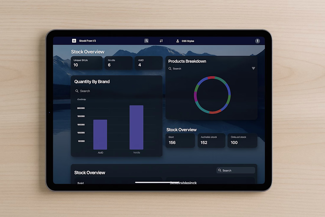
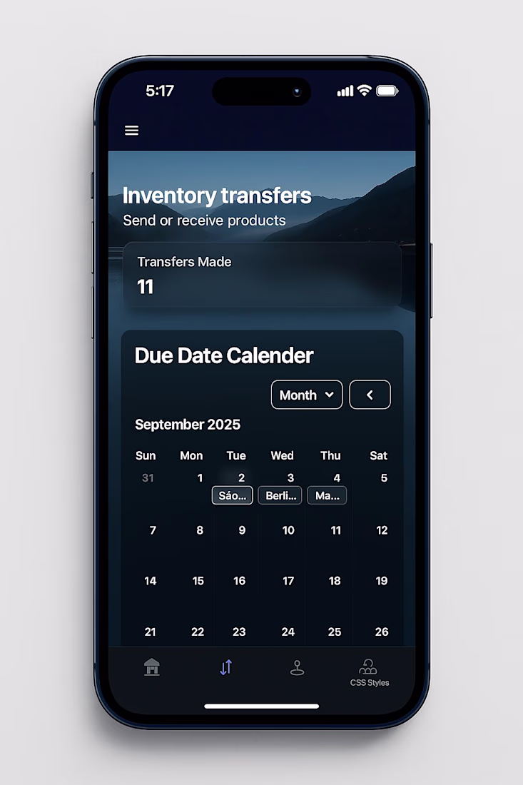
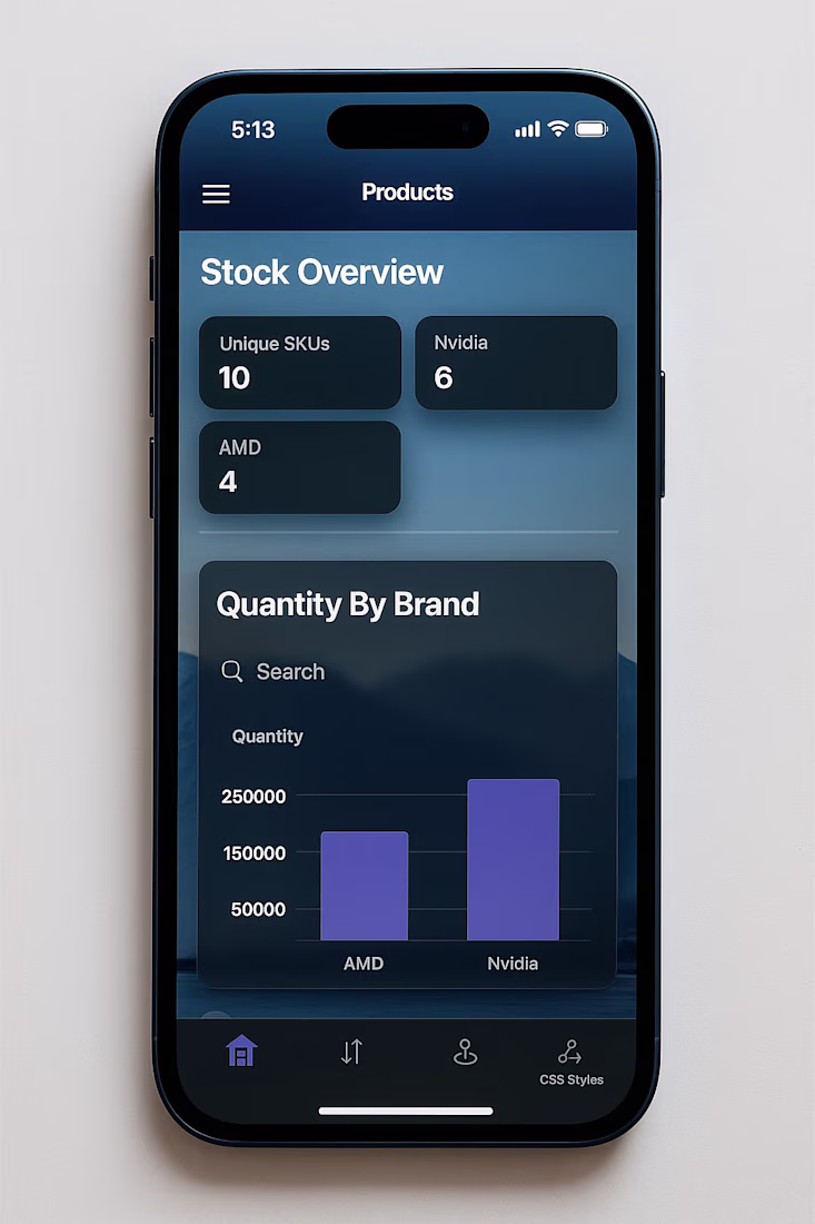
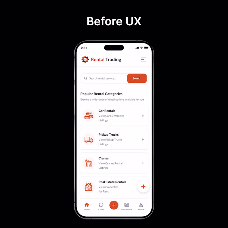
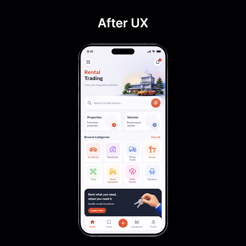
👀 Before vs After — Which UI would you choose?
Every redesign is more than just a visual upgrade—it's about creating a smoother, faster, and more intuitive experience.
🅰️ Before: Functional, but cluttered and harder to navigate.
🅱️ After: Cleaner layout, improved hierarchy, better usability, and a modern visual style.
If you were using this app for the first time, which version would you prefer?
👇 Vote in the comments:
❤️ BEFORE or 🔥 AFTER
1 voted
4%
24 voted
96%
25 votes
Closed
Pure design bliss.
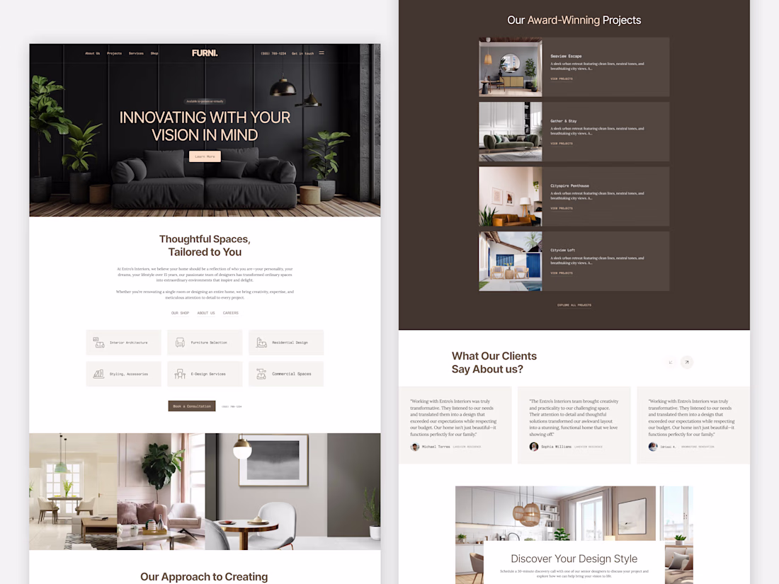
Modern Interior Design Landing Page ✨
Designed this modern interior design landing page with a focus on elegance, minimalism, and a seamless user experience. From immersive visuals and refined typography to thoughtfully structured sections, every element is crafted to showcase premium interiors while guiding users effortlessly through the brand story, services, and portfolio.
A clean aesthetic, warm color palette, and conversion-focused layout come together to create a timeless digital experience.
What do you think of this concept? 👇
Clean 🚀
Which version looks better? 👀
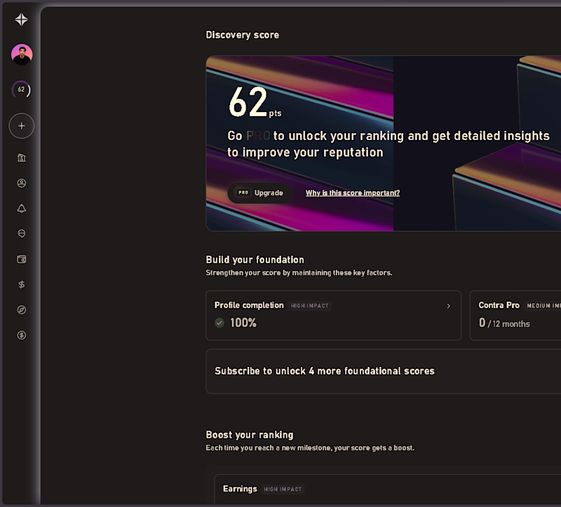
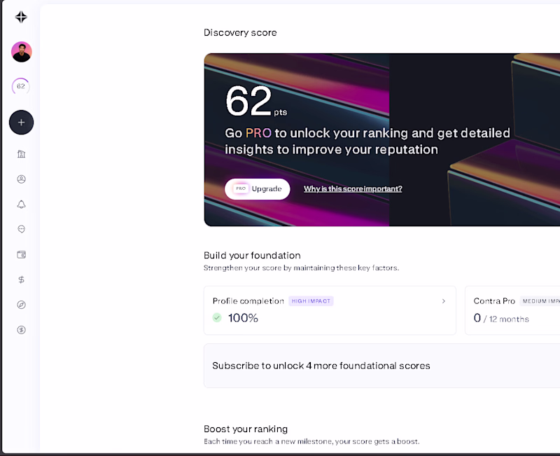
I tried Contra in Dark Mode using Dark Reader.
🤍 Light Mode
🖤 Dark (Reader)
Which one would you choose for everyday use?
Vote below 👇
#Contra #UIDesign #WebDesign #DarkMode #DesignDiscussion #ContraCommunity @Contra
8 voted
73%
3 voted
27%
11 votes
Closed
The dark Looks premium 🚀
Challenges
View allTrending
Claude
Claude has entered the design space. How are you using Claude Design?
Contra University
Learn from expert creatives how to earn more using next-gen AI tools.
fifaworldcup2026
The World Cup is here and the whole world's watching. How are you designing for the world stage?
creativeaiflow
Creative AI workflows are evolving. What tools do you use, and what are their strengths and weaknesses?
freelancerlife
Freelancer life is wins, pivots, and everything in between. What’s yours right now?