The network for creativity
Join 1.25M professional creatives like you
Connect with clients, get discovered, and run your business 100% commission-free
Creatives on Contra have earned over $150M and we are just getting started
Back to feedPost
Is the trend toward glass still trendy? 🧠

Hi from EHU :)
Sick 3D

Hey hey! Nice to meet you here:) Thanks!
The network for creativity
Join 1.25M professional creatives like you
Connect with clients, get discovered, and run your business 100% commission-free
Creatives on Contra have earned over $150M and we are just getting started





Related posts

Re Entries for the Creative Intelligence 2026 giveaway close Sunday, Oct 11 at 11:59pm PT.
I THINK—
Predicted growth #job sectors, (https://x.com/contraben/status/2108227412156932298?s=46 ):
1. AI and Machining Learning Specialists
2. Big Data and Cybersecurity Experts
3. Renewable Energy and Advanced Environmental Engineers
4. Advanced Healthcare and Nursing Professionals.
Skilled Trades —whose complex environments resist #full automation.
Based on the WEF Skills Analysis 2025 Report, I think we could see around 39% of core job skills #change become noticeable by/from 2030.

If you had to use the same booking calendar every day... 👀
🅰️Dark Normal Variant
🅱️ Dark Glass Variant
What's your pick? 👇
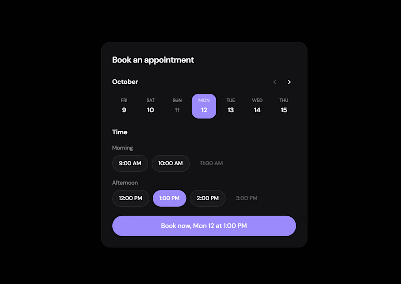
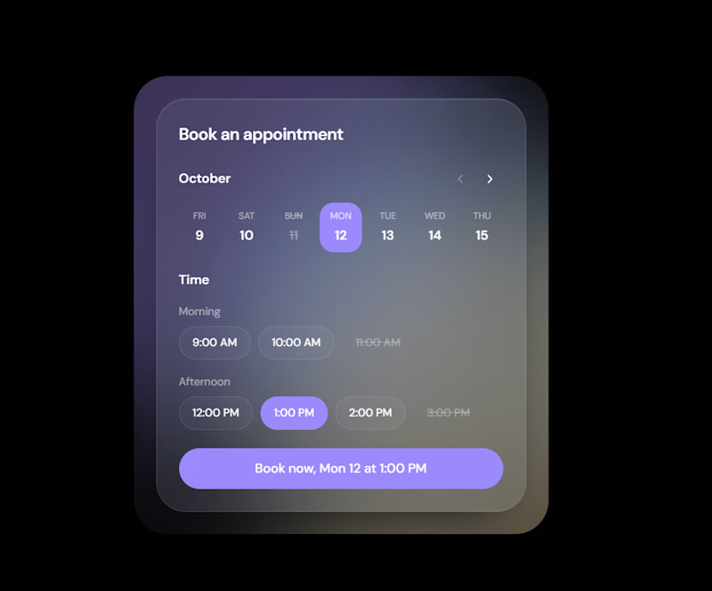
3 votes
Ends in 23h

looks good but clarity is in the dark one 🔥

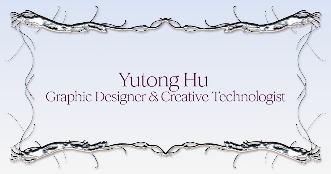
Woo Hu! Back on Contra after 2 years. I've spent that time building AI-powered creative tools, including the pattern tool behind this frame, designing brands, and have fun. Fresh portfolio is up :https://woo-hu.com/, services are live. If you need a designer who speaks fluent brand AND AI, I'm here 🎀



Great job Yutong congratulations 🎉🎉