The network for creativity
Join 1.25M professional creatives like you
Connect with clients, get discovered, and run your business 100% commission-free
Creatives on Contra have earned over $150M and we are just getting started
Back to feedPost


The network for creativity
Join 1.25M professional creatives like you
Connect with clients, get discovered, and run your business 100% commission-free
Creatives on Contra have earned over $150M and we are just getting started



Related posts


What makes a website feel cohesive?
It’s not just the colors.
It’s not just the typography.
And it’s definitely not about making every section look the same.
A cohesive website is built when every visual decision feels like part of the same story, from typography and imagery to spacing, buttons, cards, and even the smallest details.
The goal isn’t repetition.
It’s creating a visual language that people recognize and remember.
That’s when a website starts to feel like a brand, not just a collection of sections.
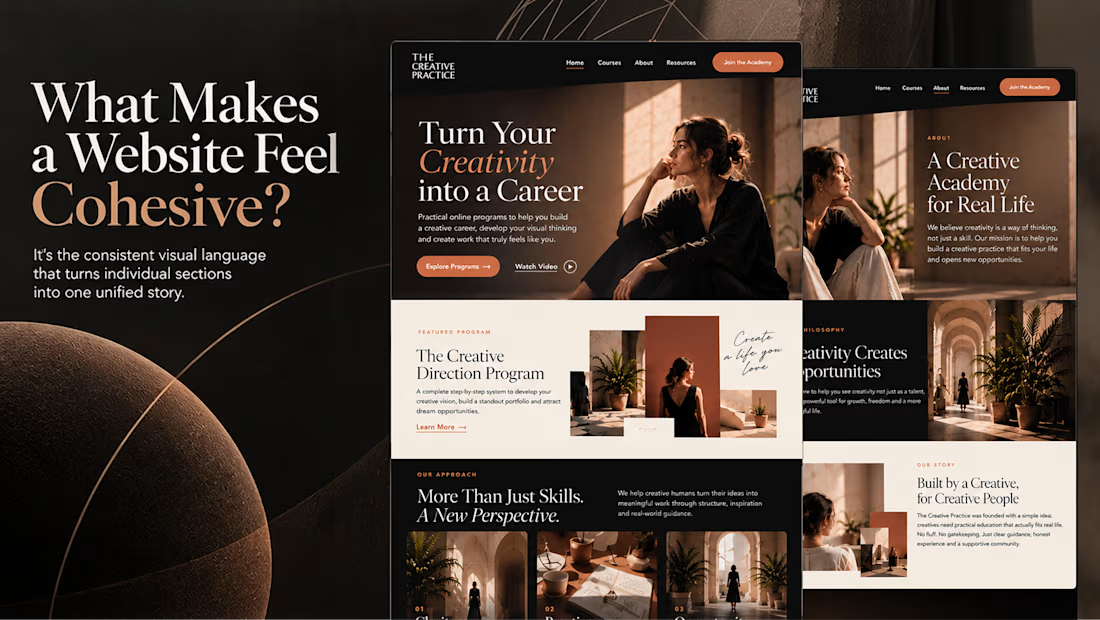

Well put, Serge. Consistent spacing, buttons and cards do more for that feeling than making sections match, and they are usually the first things to drift as a site grows.

Rebuilt my portfolio with AI and added new case studies.
Brand, web, and product UI. All custom coded, all in one page.

One page with brand, web and product UI together is a strong move. Clients see the range without clicking around. Rebuilding mine with AI coding tools taught me the same thing: the speed lets you spend the saved time on the case study writing, which is what actually wins work.

🚀 Need a Professional Website for Your Business?
I'm a Professional Web Developer, and I can help you build a modern, attractive, and fully responsive website for your business.
💻 My Services:
WordPress Website Development
E-commerce Websites
Business Websites
Landing Page Design
WooCommerce Stores
Mobile Responsive Websites
Custom Website Development
✨ Why Work With Me?
Professional & Modern Design
Mobile-Friendly Layout
Clean & Organized Code
User-Friendly Experience
On-Time Delivery
Whether you need a new website or want to redesign your existing one, I'm here to help!
📩 Let's Build Your Website!
Feel free to message me and discuss your project.
🌐 Portfolio: https://unique-seahorse-c819cb.netlify.app
eCommerce ManagementResponsive DesignWeb DesignElementorGitHubWordPressWeb Developmentbusinesswebsitefreelancewebdesigner




Great work