The network for creativity
Join 1.25M professional creatives like you
Connect with clients, get discovered, and run your business 100% commission-free
Creatives on Contra have earned over $150M and we are just getting started
Back to feedPost
Taste Test
My Design 🆚 Live Website
Which one caught your attention? 👀💚
My Design or Live Website?
Tell me your choice below 👇


2 voted
33%
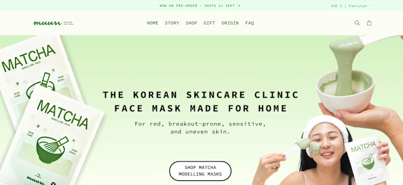
4 voted
67%
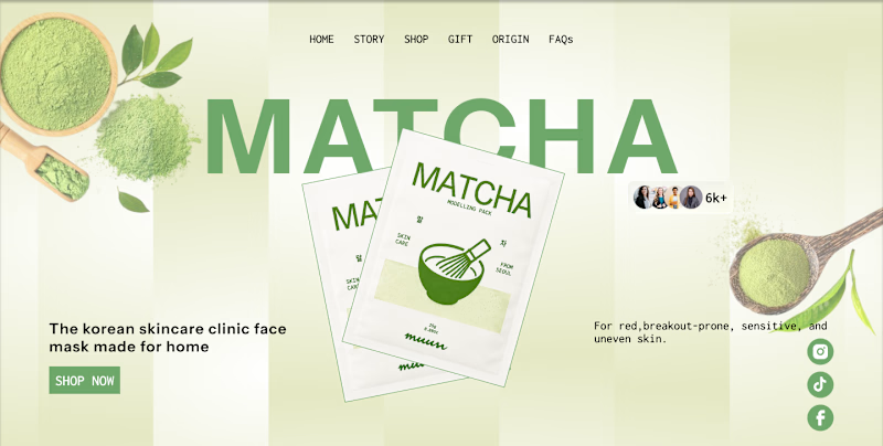
6 votes
Closed

The side-by-side framing makes the difference easy to read, and the live result feels nicely restrained. I’d be curious to see how the interaction behaves on mobile too.

Thank you! I’ll definitely explore how the interaction and overall UX can be optimized for mobile as well. I appreciate the feedback!

Went with your Figma design, the hero photography gives it a face while the live version leans too hard on product shots. It feels warmer and easier to trust in the first three seconds.
Thank you so much! I’m glad the hero photography helped create a warmer and more trustworthy first impression. I really appreciate your feedback!
The network for creativity
Join 1.25M professional creatives like you
Connect with clients, get discovered, and run your business 100% commission-free
Creatives on Contra have earned over $150M and we are just getting started



Related posts

Which hero would you choose — 1 or 2?
Two directions for Amber House, my real estate website template. The first pairs a closer architectural crop with an asymmetric layout. The second gives the building more breathing room, with a wide view and a centered headline.
Same template, two different first impressions. Which feels stronger to you, and why?
24 voted
59%
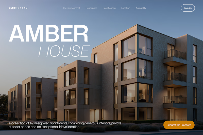
17 voted
41%
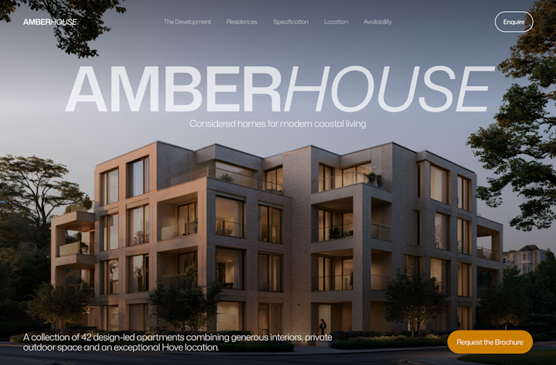
41 votes
Closed

I will go with Bold & Asymmetric!

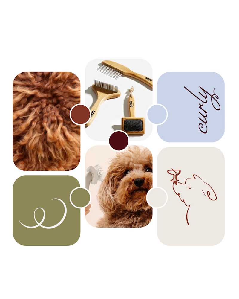
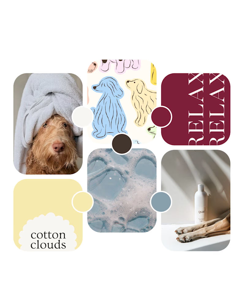
Working on a new brand identity for a curly-coated dog grooming brand!
We're exploring the initial visual directions and atmosphere. Which mood board speaks to you more?
19 voted
66%
10 voted
34%
29 votes
Closed

Option 1 looks amazing!


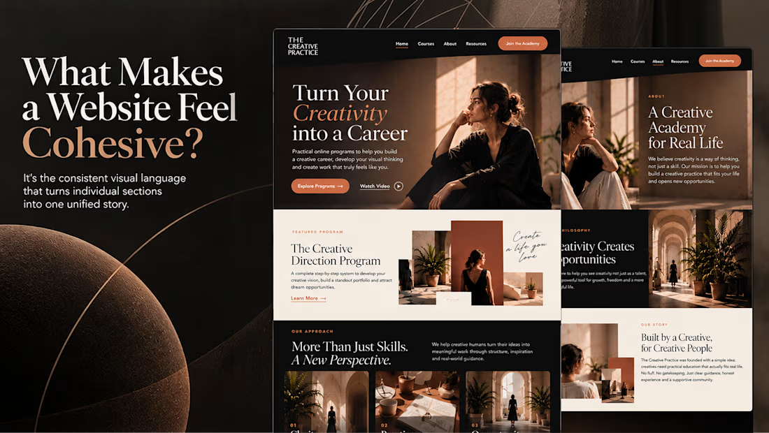
What makes a website feel cohesive?
It’s not just the colors.
It’s not just the typography.
And it’s definitely not about making every section look the same.
A cohesive website is built when every visual decision feels like part of the same story, from typography and imagery to spacing, buttons, cards, and even the smallest details.
The goal isn’t repetition.
It’s creating a visual language that people recognize and remember.
That’s when a website starts to feel like a brand, not just a collection of sections.

Well put, Serge. Consistent spacing, buttons and cards do more for that feeling than making sections match, and they are usually the first things to drift as a site grows.