The network for creativity
Join 1.25M professional creatives like you
Connect with clients, get discovered, and run your business 100% commission-free
Creatives on Contra have earned over $150M and we are just getting started
Back to feedPost

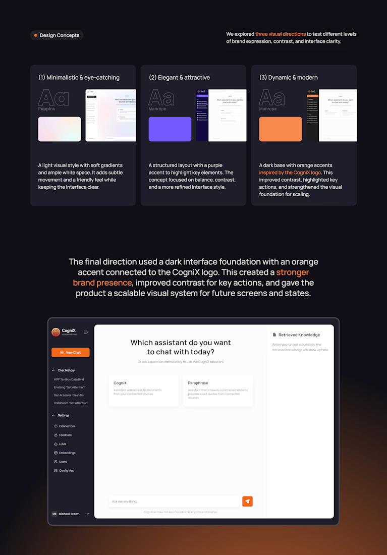
I designed three versions of CogniX, knowing two would be thrown away.
Before polishing a single screen, I tested the brand:
☁️ Light and airy
💜 Structured with purple
🧡 Dark with orange from the logo
Picking the "prettiest" one wasn't the point. I was looking for the one that works hardest.
Orange won because key actions stood out, and the UI finally looked like CogniX.
Exploring first means fewer redesigns later.

Testing three directions before polishing is smart. Did the orange test better with users or just internally?
The network for creativity
Join 1.25M professional creatives like you
Connect with clients, get discovered, and run your business 100% commission-free
Creatives on Contra have earned over $150M and we are just getting started





Related posts

Hi Contra Community! I'm new here, what do you think about this design? I'll love to have your feedback.


Welcome to the Contra Community Juan!

I know that many people who've done a website design for their own personal brands tend to say something like, "I am my worst client!" because of numerous unexpected revisions, perfectionism, constant changes made to it etc.
I guess I accidentally chose another path...
To me, working with myself as a client has been a pleasure. First of all, the deadline could be broken — no deadline at all! Sick leave? No problem honey, you can go have an extra cup of cocoa. Workaholic alter-ego is gonna sit in mental prison for a while.
Secondly, our taste matches. I literally got to catch everything I only thought about AND made it come true. Isn't it amazing? You think it — you got it!
To my greatest surprise, as a former perfectionist myself, I wasn't demanding at all. I understood that I must give myself freedom while having some constraints — by the way, they are stated in the full case, check it out here:
Likes are highly appreciated ❤️
To those who have ever made designs for themselves, what type of client were you? Were you strict or, vice versa, let yourself be as creative as possible? Maybe you skipped a wireframe stage and went right to designs?..

"I am my worst client!" - that is so true!!


Which Kajabi pricing section would you ship?
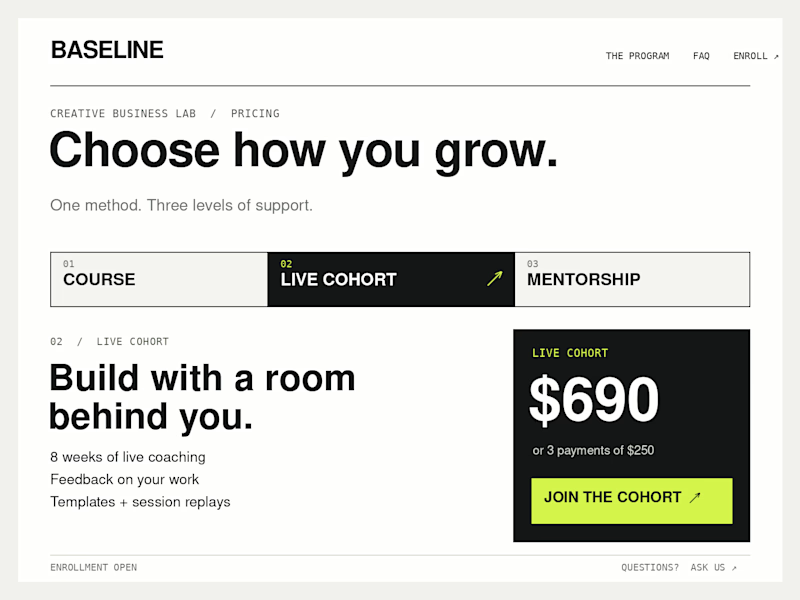
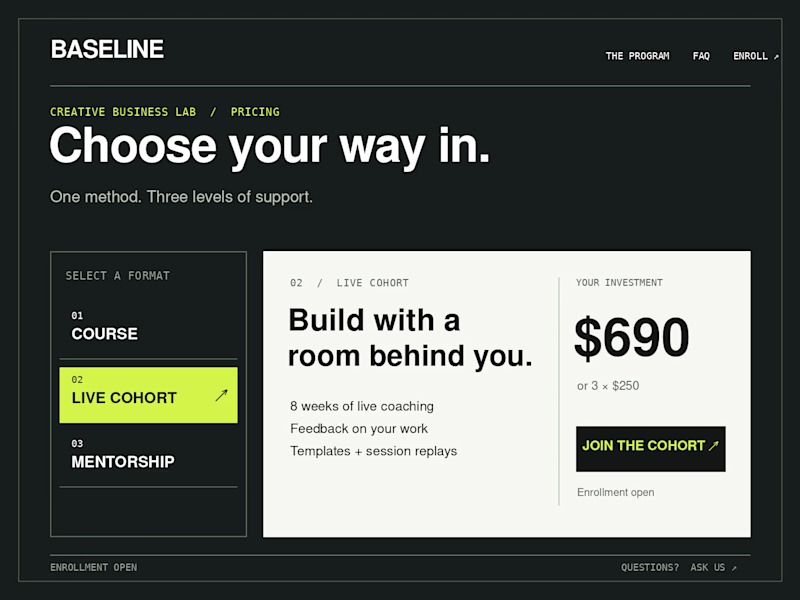
Creative Business Lab has three paths: Course, Live Cohort, and Mentorship. Both designs show the same $690 Live Cohort with the same benefits. Only the presentation changes.
Vote Horizontal tabs or Side tabs, then tell me the one thing you’d improve before launch. Have a stronger third approach? Show it in the replies.

21 voted
50%
21 voted
50%
42 votes
Closed

Horizontal. side tabs read as nav, people skip them. though the stronger third option is no tabs at all, three cards side by side. both of these hide two prices behind a click and comparison is the one job a pricing section has.