The network for creativity
Join 1.25M professional creatives like you
Connect with clients, get discovered, and run your business 100% commission-free
Creatives on Contra have earned over $150M and we are just getting started
Back to feedPost

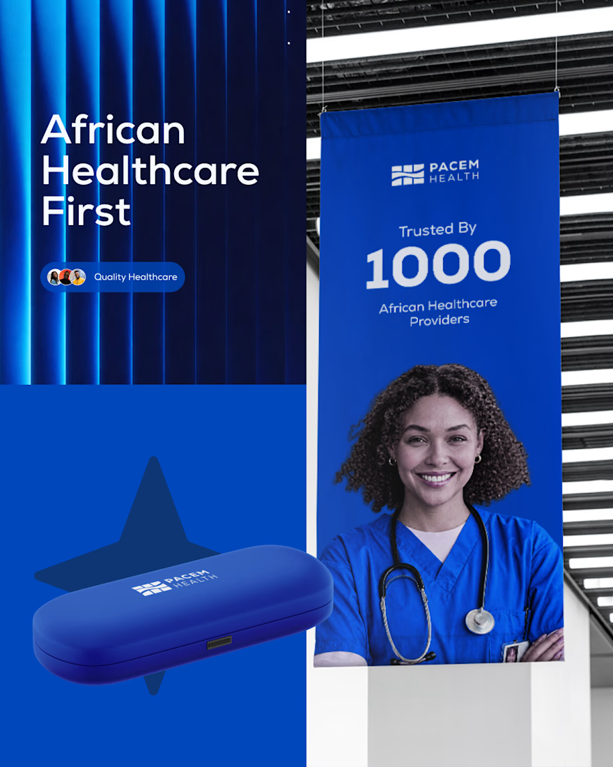
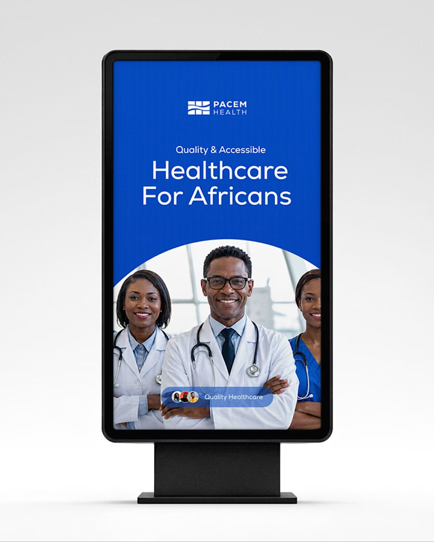
Creating Pacem’s identity was an interesting exercise in translating complexity into something simple, structured, and trustworthy.
Pacem is a U.S.-headquartered healthcare systems integration and strategic sourcing company focused on building resilient health systems across Africa.
One of the biggest parts of the project for me was figuring out how to represent everything Pacem does without making the identity feel overly complicated.
The logo became a visual system built around structure, flow, symmetry, and negative space. Each element was intentional, from the outer frame representing the system boundary to the internal flow representing connection and efficiency.
I wanted the identity to feel intelligent and technical, but still human and trustworthy.
I explored the full identity and how it could come to life across different touchpoints.
I’ve shared the full project presentation on Behance
https://www.behance.net/gallery/254955951/Pacem-Health-Branding
Looking for a designer for your next project? Send me a message. Let’s create GREATNESS
#BrandIdentity #Branding #LogoDesign #HealthcareBranding #BrandStrategy #GraphicDesign #VisualIdentity #AfricanDesign #DesignProcess #BrandDesigner




The network for creativity
Join 1.25M professional creatives like you
Connect with clients, get discovered, and run your business 100% commission-free
Creatives on Contra have earned over $150M and we are just getting started





Related posts


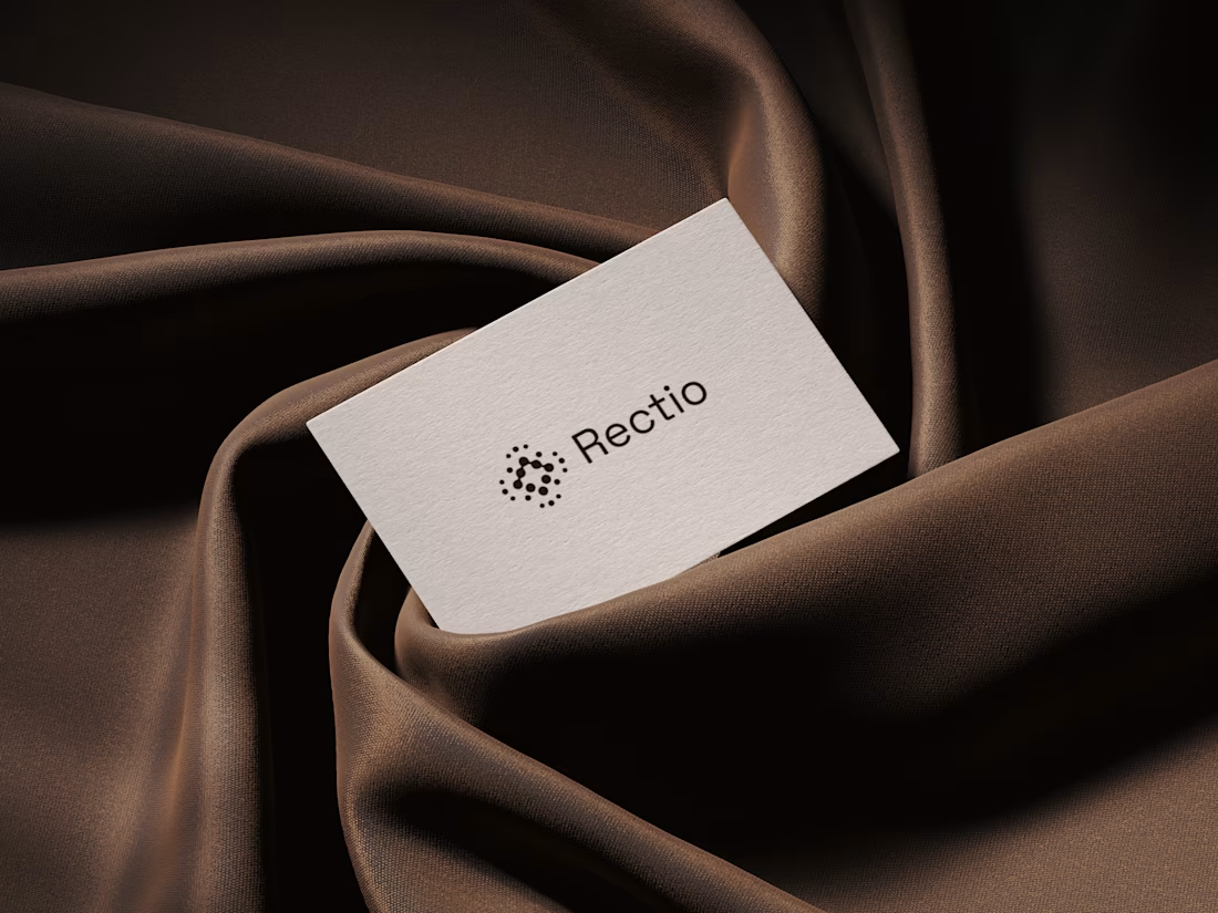
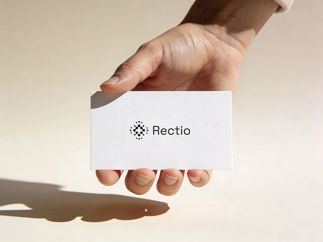
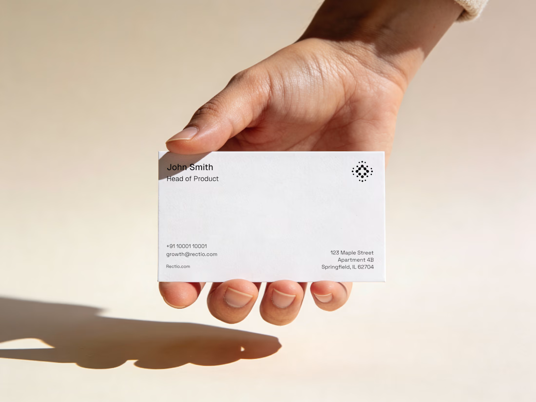
Rectio — Brand Identity
Brand Identity • Visual Direction • Business Cards • Mockups
A modern and minimal branding direction for Rectio, from visual identity to business card applications.
Created by Artonest Design Studio — artonest.design









Great work!

I wrote a great hook for this one..
That's a fib, but here's a truth, you sell more when you fit into your customers' routines.
Need an example? Afters is for finding underground parties in Berlin. There are so many ways people can find parties from Resident Advisor to posters on lampposts.
The easy CTA for a brand like Afters is "Find Underground Parties in Berlin".
Short, clear, to the point,
But most people already search on Resident Advisor, how would that line convince them to change their behaviour and search Afters? Unfortunately being a "cooler" app doesn't motivate many people.
With a clear strategy, I delivered a way in that RA could never hope for.
Afters pulls from sources where line ups are posted last minute or after the event – Telegram groups, fan websites, Soundcloud – and being for people in the scene, they're the kind of folk who go to a party for the vibe and look up DJs after the fact.
So I did the opposite of what you'd expect.
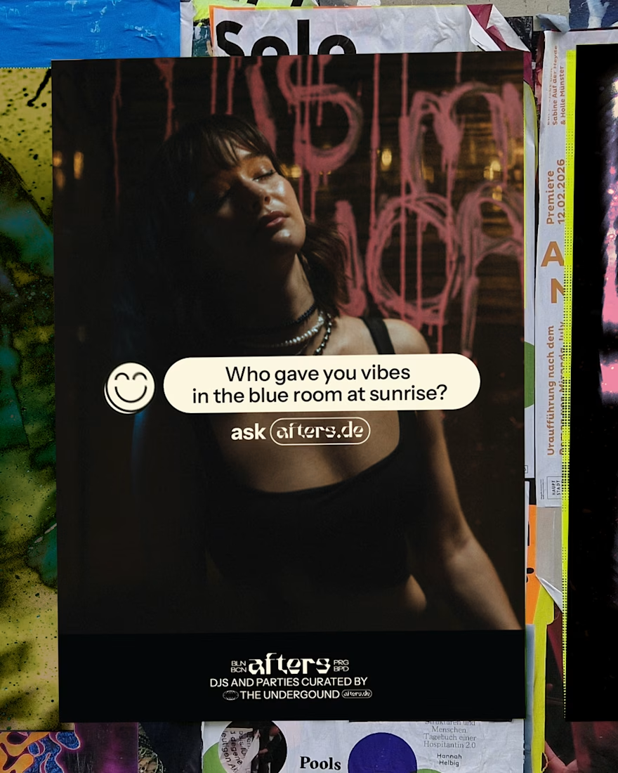
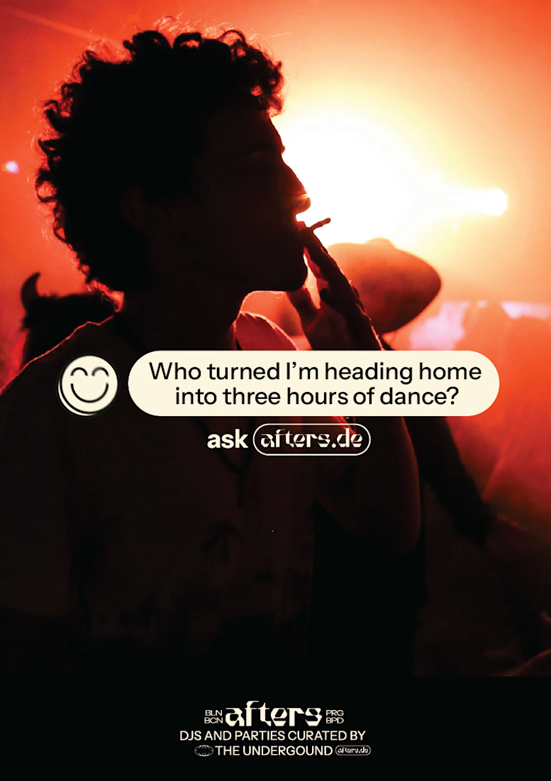
If you want to know who you just danced to, ask Afters.
Instead of competing to be the place to find parties in the future, I found a key moment the target audience has a problem that Afters is uniquely positioned to solve and built the strategy around it. No one can compete, because no one else works like Afters.
Problem -> Strategy -> Branding

Love it!