The network for creativity
Join 1.25M professional creatives like you
Connect with clients, get discovered, and run your business 100% commission-free
Creatives on Contra have earned over $150M and we are just getting started
Back to feedPost


The network for creativity
Join 1.25M professional creatives like you
Connect with clients, get discovered, and run your business 100% commission-free
Creatives on Contra have earned over $150M and we are just getting started

Challenges
View all


Related posts

Generated these looks in Midjourney — but the layout is what really pulls it together.
Grid, crosshairs, typography, detail callouts: same images, but the presentation makes them read like an actual editorial spread instead of just pretty pictures.

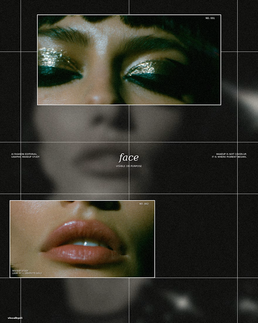
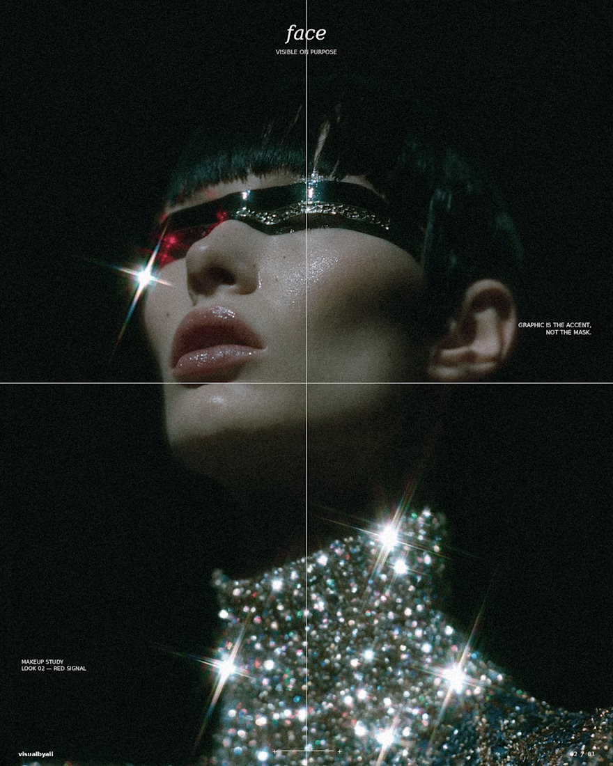
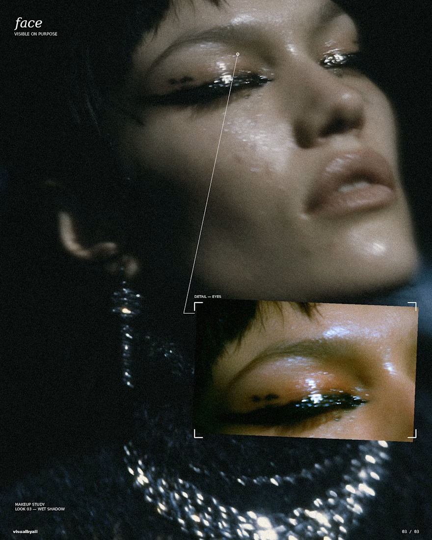

The grid, crosshairs, and detail callouts do more than decorate the Midjourney output—they turn it into an editorial system. Great example of how art direction can make a set feel like a coherent campaign.

Brand identity and logo design collection. Developed strategic, versatile logos from initial conceptualization to final vector delivery, ensuring strong visual hierarchy and adaptability across digital and print media.

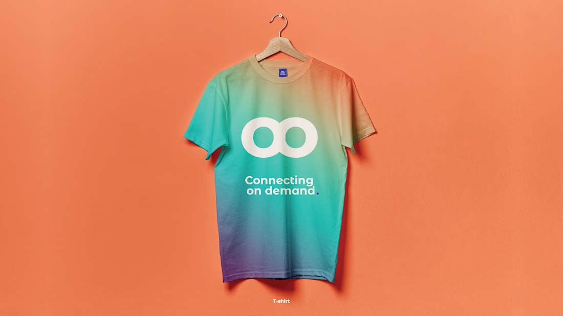
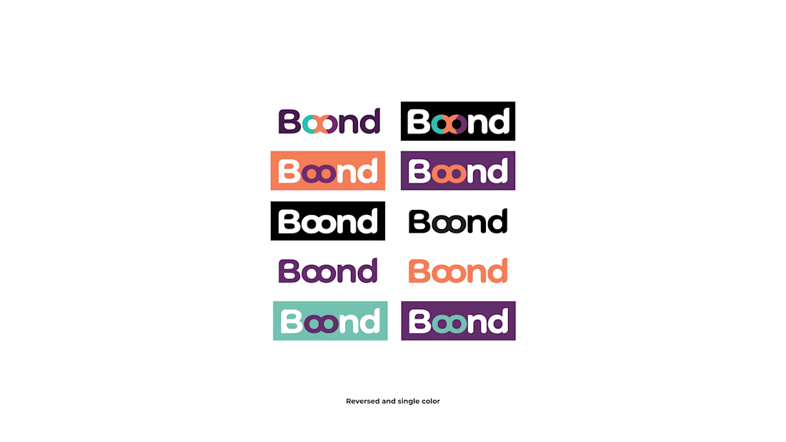
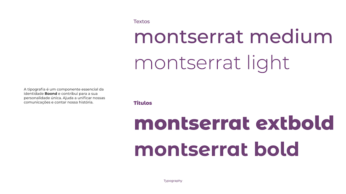
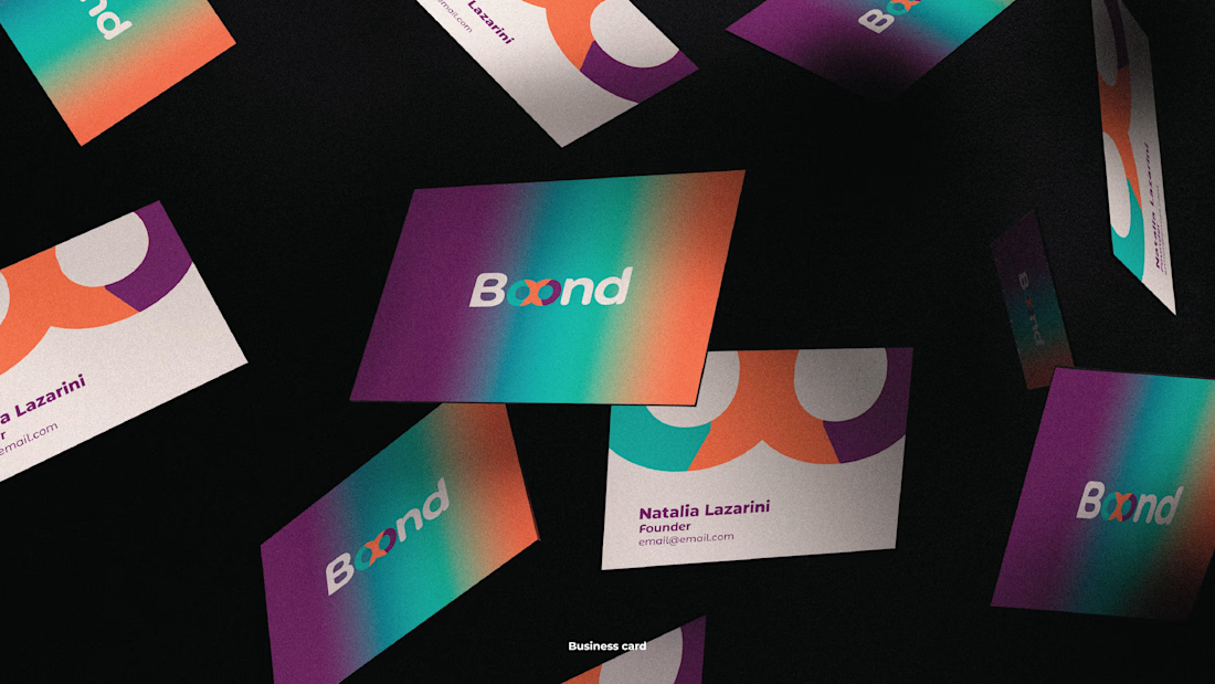
The typography system is doing a lot of work here—the Montserrat weight progression keeps the identity flexible while the saturated gradient gives it a memorable signature. Strong balance between strategy and real-world applications.

ATTENTION GRAPHIC DESIGNERS!
Let's be real. How do you feel about AI?

I feel it's a great tool use to improve speed and also help build on the creativity you already have.