The network for creativity
Join 1.25M professional creatives like you
Connect with clients, get discovered, and run your business 100% commission-free
Creatives on Contra have earned over $150M and we are just getting started
Back to feedPost

Delighted user. Isn’t that every Product Designer’s desire?
Well, I think if you are one. you know that the devil is in the details of your app. Small bug fixes, small design adjustments, small interactions, and more. All leave a great impact on the users’ experience. Developing a personalized experience might take a lot of time without getting the exact result the designer created. So why keep this gap between Development and Design if you can bridge it using Rive?!
Rive’s used by worldwide firms like Duolingo, Brilliant, Dropbox, Spotify, LinkedIn, and many others.
The question now is…Why Rive? How is it different?
- What you design is what ships
- Time-saving for the IT team
- Built-in state machines
- Optimized file size
In this small Interactive Animation. I turned simple info into a fun way to learn, hard to forget, and gives immediate delight.
What’s one small micro-interaction in an app you use daily that always makes you feel delighted when you interact with it?
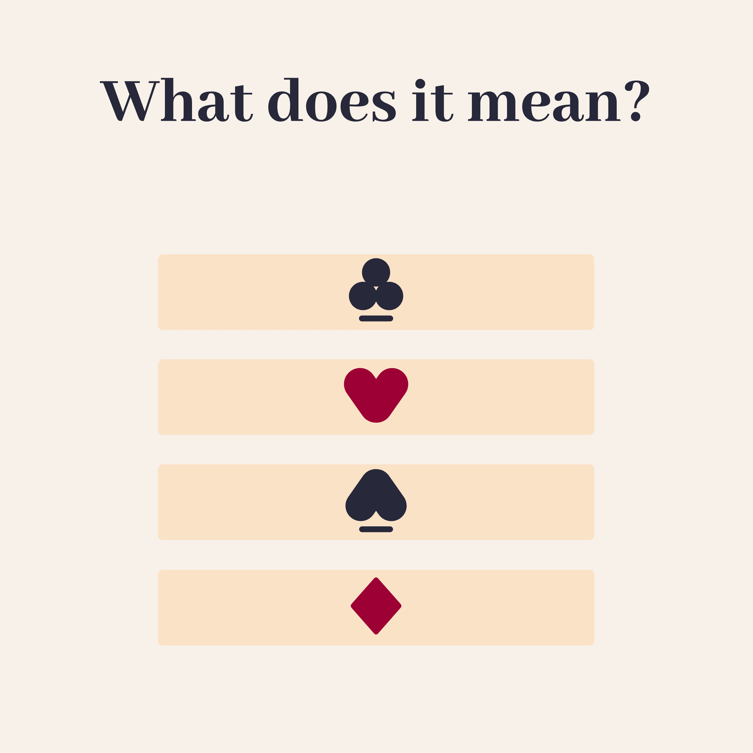
Interested to know what they mean? Try it yourself:
Watch more on my Behance: https://www.behance.net/mohammad-alhelany
Tip: use a computer
The network for creativity
Join 1.25M professional creatives like you
Connect with clients, get discovered, and run your business 100% commission-free
Creatives on Contra have earned over $150M and we are just getting started






Related posts

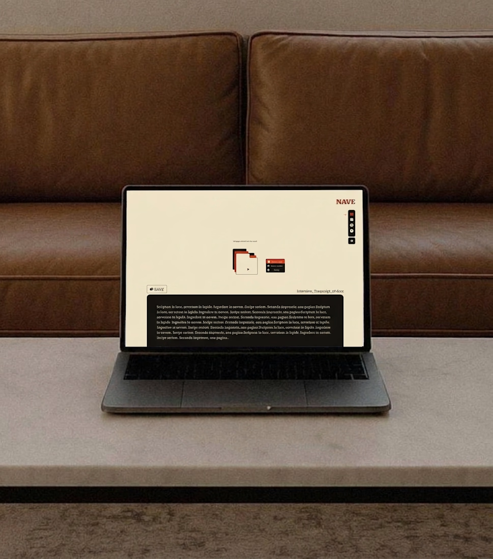
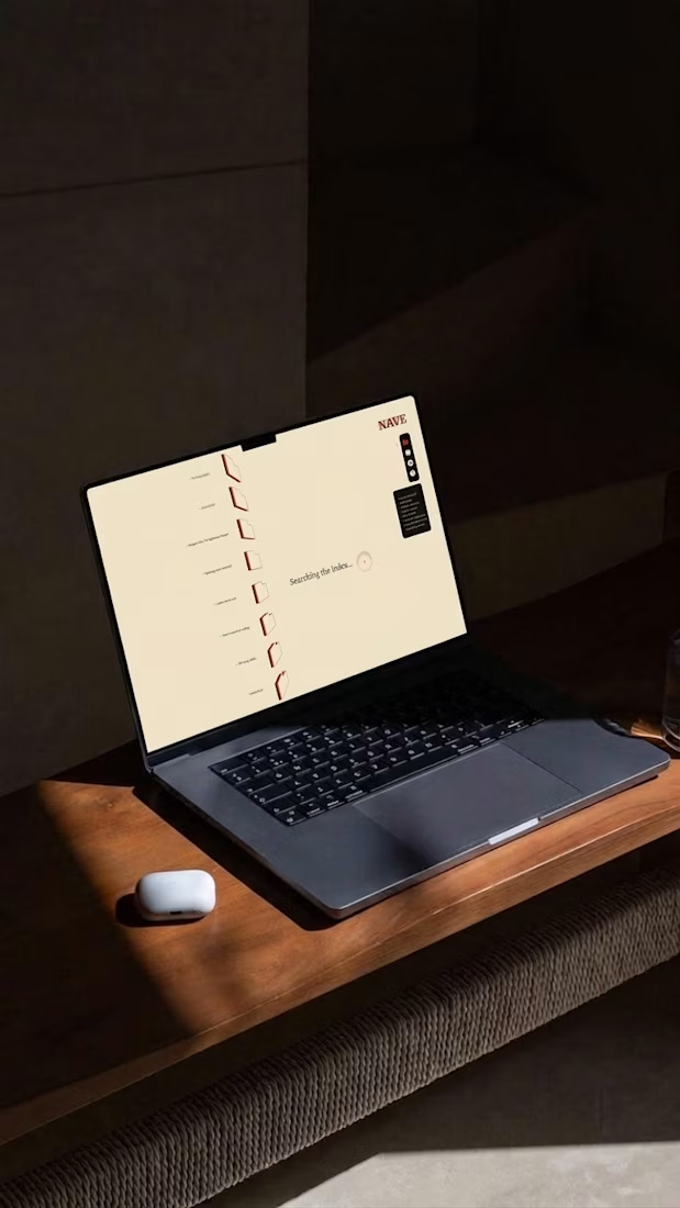
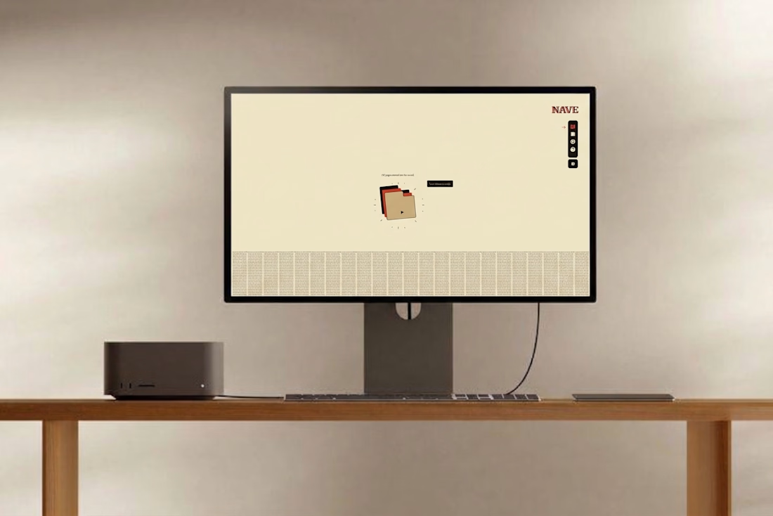
Where did your best idea go last month?
Not the one you finished. The one in a tab you closed, a note you can’t find, a draft you overwrote.
NAVE keeps all of it, every revision, searchable by whatever you half remember.
Written in light. Kept in stone.

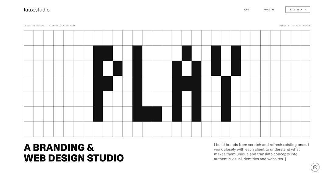
The new luux.studio website is live.
I rebuilt my site around one idea that guides how I work:
⚡️ every project starts by bringing light to what’s hidden ⚡️
So the homepage is a game.
A full-screen minesweeper where you explore the grid, read the clues and, eventually, find the spark. Hit a mine and it explodes, literally, into a “Start your project” button.
What else is new:
→ Three clear services: Brand Strategy, Visual Identity and Website & E-commerce
→ A work index where every project comes to life on hover
→ One person behind it all, from the first idea to launch
Designed and built in Framer, with a few custom code components for the game and the details.
Go play: luux.studio
How many clicks did it take you to find the spark?
Please, leave your feedback below 🫶🏻


Good work, very polished.

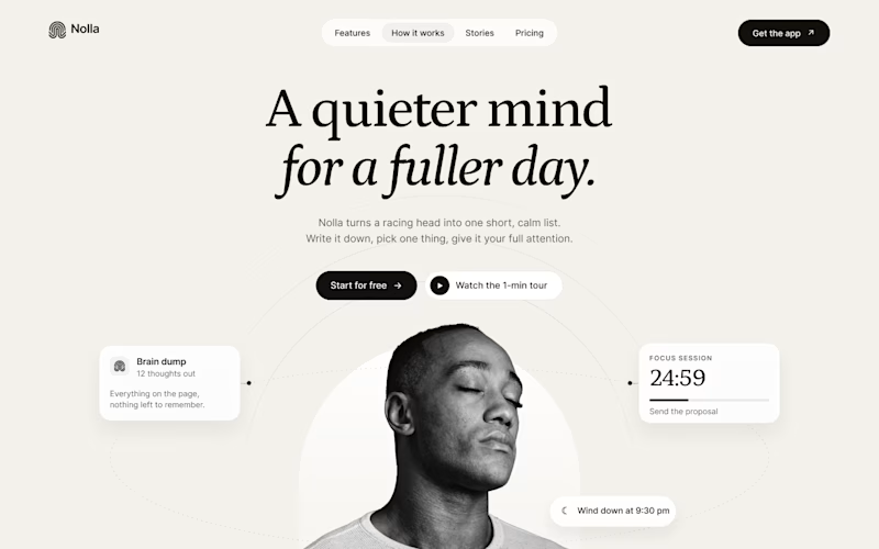
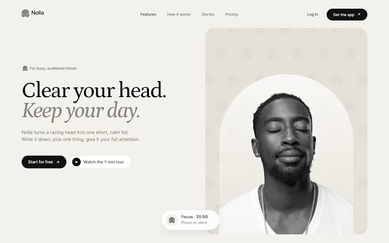
Started a new concept this week: Nolla, a small app for people whose heads won't stop running.
Same words, same brand kit, two hero layouts.
A puts everything in the middle. He sits inside an arch taken straight from the logo, and his to-dos orbit around him.
B is a split. Words on the left. On the right, the logo mark repeats into a quiet pattern behind him.
Fonts are Petrona and Inter.
Which one would make you download the app?


15 voted
71%
6 voted
29%
21 votes
Closed

Split feels more balanced to me!