The network for creativity
Join 1.25M professional creatives like you
Connect with clients, get discovered, and run your business 100% commission-free
Creatives on Contra have earned over $150M and we are just getting started
Back to feedPost

A mental health nonprofit handed me a script with zero visual direction.
They needed a volunteer onboarding video but didn't know how to make words feel cinematic. I applied my RESONANCE Framework—maps emotional pacing through eight beats so the story builds tension, offers resolution, and leaves people feeling something, not just informed.
The script stayed the same. The visuals became a story. Used Runway and Kling for camera movement and scene generation, CapCut for editorial pacing. Wide shots for vulnerability, close-ups for connection.
The exec director asked me to do a second video immediately after seeing the first cut.


The network for creativity
Join 1.25M professional creatives like you
Connect with clients, get discovered, and run your business 100% commission-free
Creatives on Contra have earned over $150M and we are just getting started





Related posts

Pull into the drive-in and save three spots for your friends. 🚘
I built LOT 66, a custom Video.js v10 skin for the Contra challenge. Start a live watch room...


What happens to a logo the moment you ask an AI to move it? 🌊
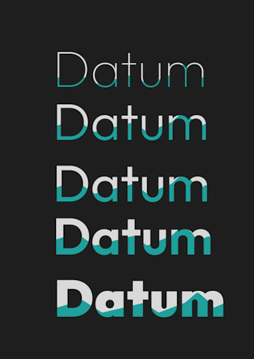
I gave ChatGPT my Datum type system, five weights partly filled with water, and asked for a looping GIF where only the tide moves.
First try: it dropped a row, redrew the letters, turned my flat teal into glossy cyan and cycled the whole stack instead of the water.
So I steered it. Only the water line moves, everything else stays locked, and the last frame matches the first. The second try kept all five rows and the type intact, with a seamless 5 second loop built with ffmpeg.
Still to fix: thin seams in the teal at the tide’s peak, and the rows rise in sync instead of rolling like a swell.
Original on the left, loop on the right.
Which of your stills would you animate first, and what are you afraid it would break? 👇

09 XL — From a Portrait to a Visual Story.
This one started with a simple black-and-white portrait, but I wanted to give it a little more personality. I began experimenting with contrast, grain, and shadows to build a raw, almost cinematic atmosphere.
Then came the fun part — playing around with typography, adding the black strip across the eyes, and using minimal details like 09 and XL to give the composition a subtle editorial feel.
Once the poster came together, I placed it in a real-world bus stop mockup to see how it would live outside the screen.
A little experimentation, a few happy accidents, and lots of tiny adjustments later — this was the result.


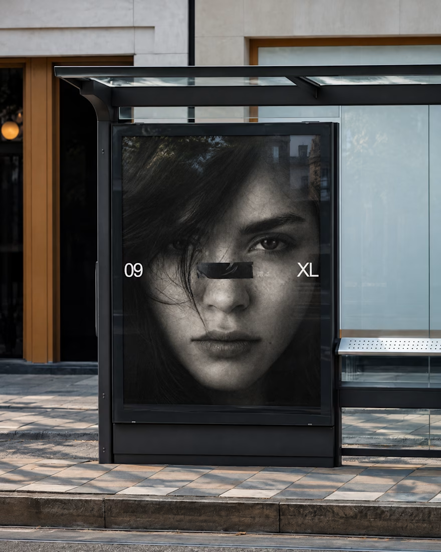
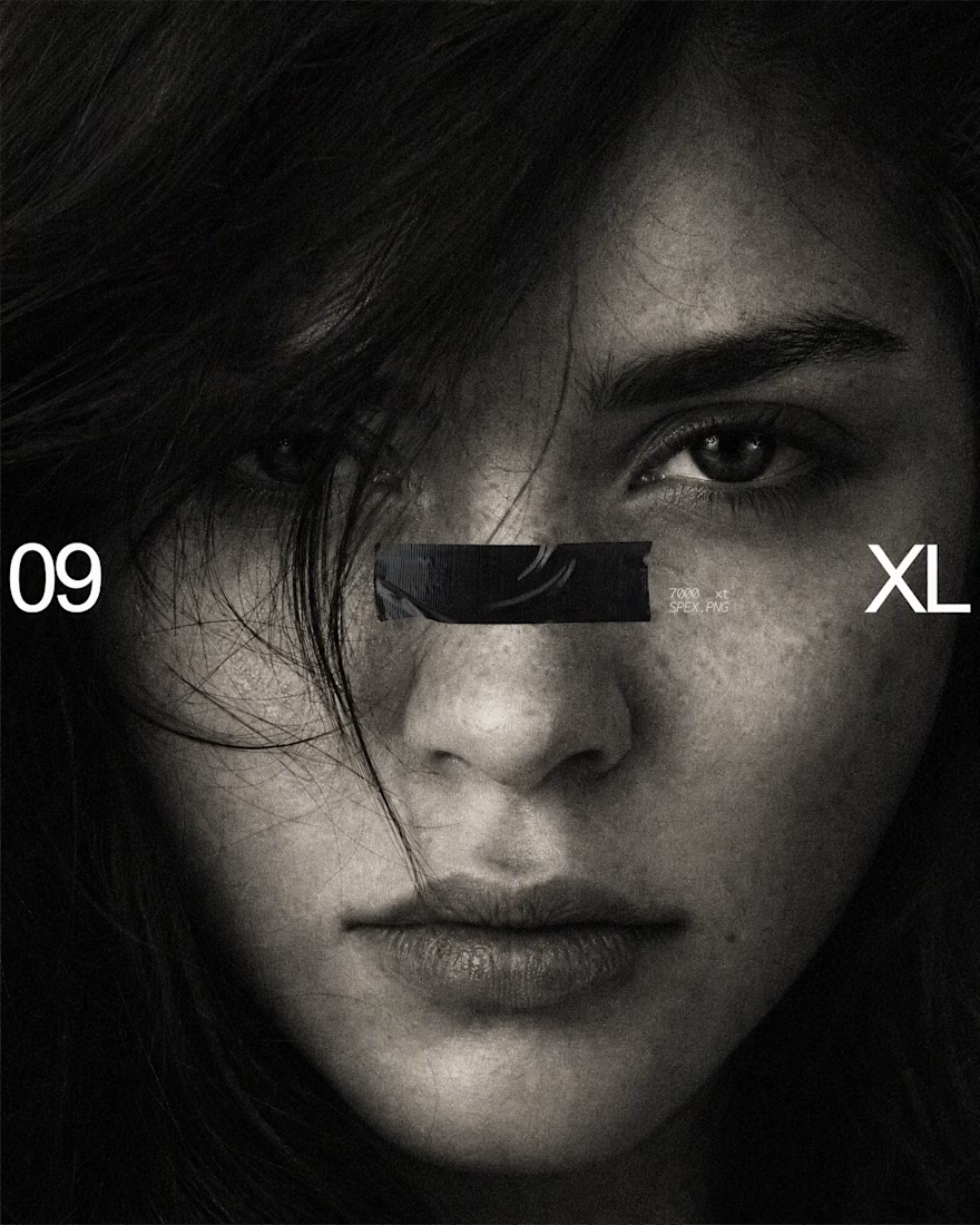

The black bar across the eyes with 09 and XL on the sides turns a simple portrait into a bold poster, and the bus stop mockup shows it works at street scale. Is the grain added in Photoshop or part of the original photo?

