The network for creativity
Join 1.25M professional creatives like you
Connect with clients, get discovered, and run your business 100% commission-free
Creatives on Contra have earned over $150M and we are just getting started
Back to feedPost

Typography is the one design decision nobody notices…until it’s wrong.
We design products for restaurants, jewelers, WhatsApp teams and food brands. This year, type taught me four things:
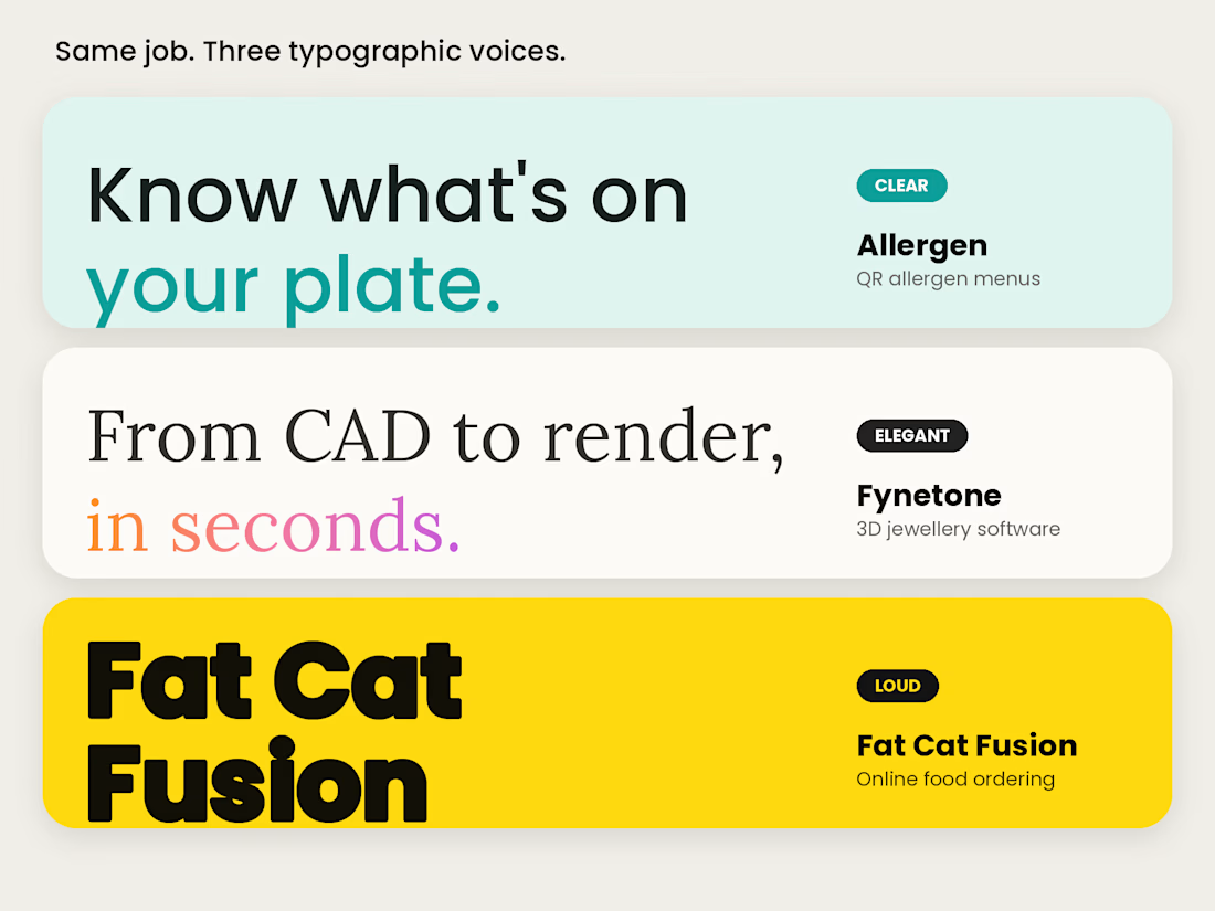
1. In software, type is the interface. Most of a dashboard is text. Get the type right and half the design is already done.
2. Legibility beats personality when it matters. On our Allergen menu, a guest scans a QR code in a dim restaurant, one-handed. “Contains nuts” can’t be pale grey 12px text. Pretty isn’t enough when it’s safety information.
3. One serif can change a product’s mood. For Fynetone, a 3D jewelry software, an elegant serif headline made a technical tool feel crafted instead of “techy”.
4. Loud type can replace decoration. For Fat Cat Fusion, heavy black type on yellow does the shouting, so the food photos can stay the hero.
Good type doesn’t decorate. It makes the message easy to say.
What’s one font (or font crime) you’re done with? 👇
If you’re building or designing a website or SaaS product and want the type to work as hard as the layout, my DMs are open.
The network for creativity
Join 1.25M professional creatives like you
Connect with clients, get discovered, and run your business 100% commission-free
Creatives on Contra have earned over $150M and we are just getting started


Related posts

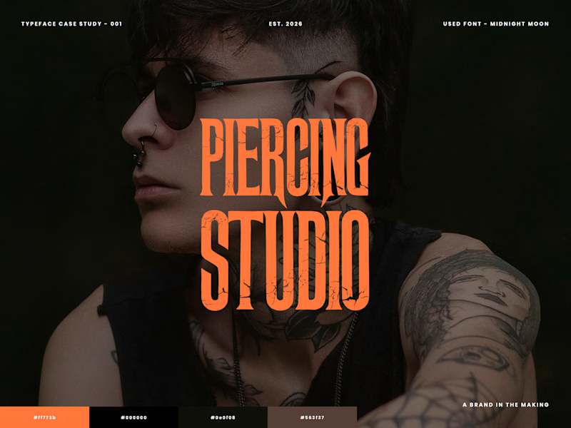
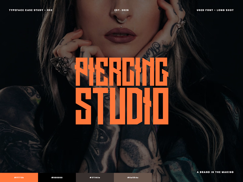
🖤 Which font hits harder?
I'm exploring typography for a Tattoo & Piercing Studio design. Looking for something bold, edgy, and full of attitude.
Which one gets your vote? 🤘
2 voted
29%
5 voted
71%
7 votes
Closed

Long Shot. The uneven edges feel like real flash lettering, which suits a tattoo studio.

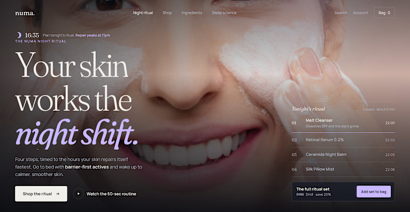
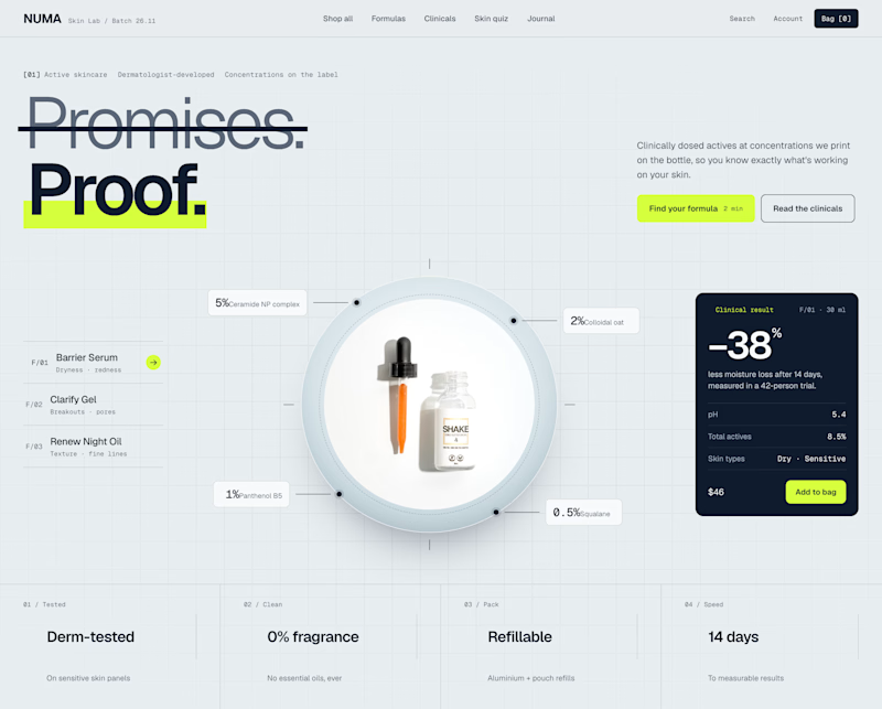
Two Shopify hero sections. Same skincare brand. Two different approaches.
Which one would you choose?
Option A: Night Ritual
Immersive photography, emotional storytelling, and a complete skincare routine with a direct add-to-cart option.
Option B: Lab Specimen
Bold typography, ingredient breakdowns, clinical information, and a clear path to purchase.
Both serve the same brand but take different approaches.
A builds an emotional connection and sells the experience.
B builds trust through product transparency and helps shoppers understand the formula.
But which approach would drive more conversions?
If you were designing this Shopify storefront, which would you choose?
A: Lifestyle & Storytelling
B: Product & Science
And why?

2 voted
18%
9 voted
82%
11 votes
Closed

I'd go with Lab Specimen! 🔥 The bold typography and clean, futuristic layout really stand out. Night Ritual looks beautiful too, but Option B feels more unique and memorable.


What is the Shader name?
BTW it is great