The network for creativity
Join 1.25M professional creatives like you
Connect with clients, get discovered, and run your business 100% commission-free
Creatives on Contra have earned over $150M and we are just getting started
Back to feedPost
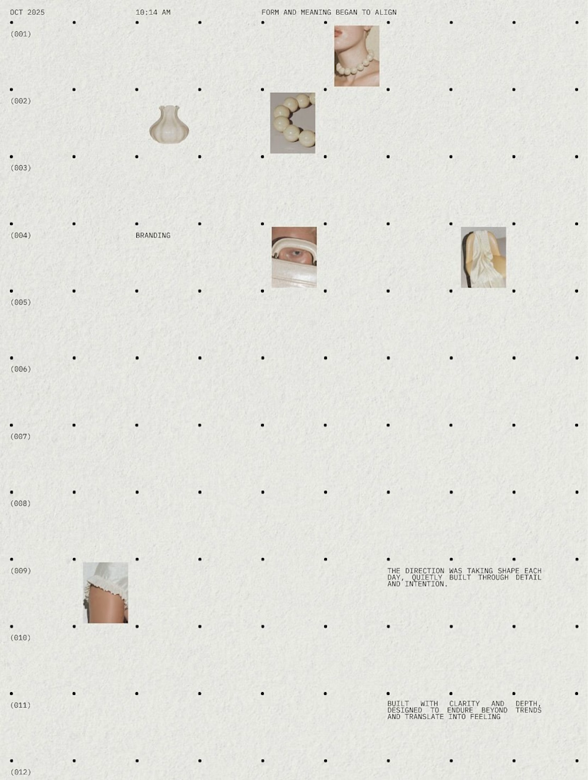
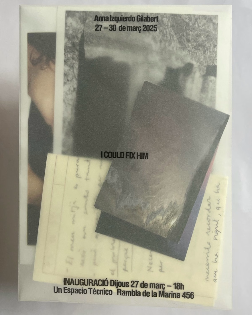
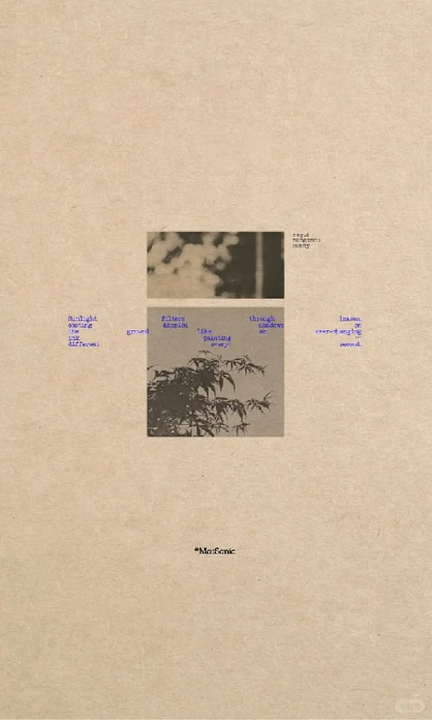
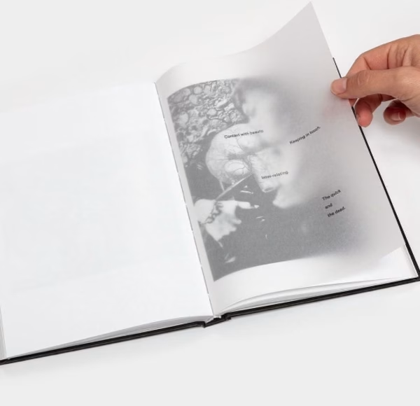
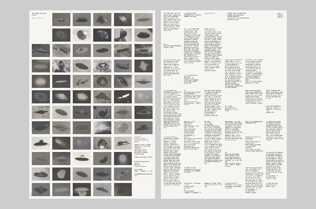
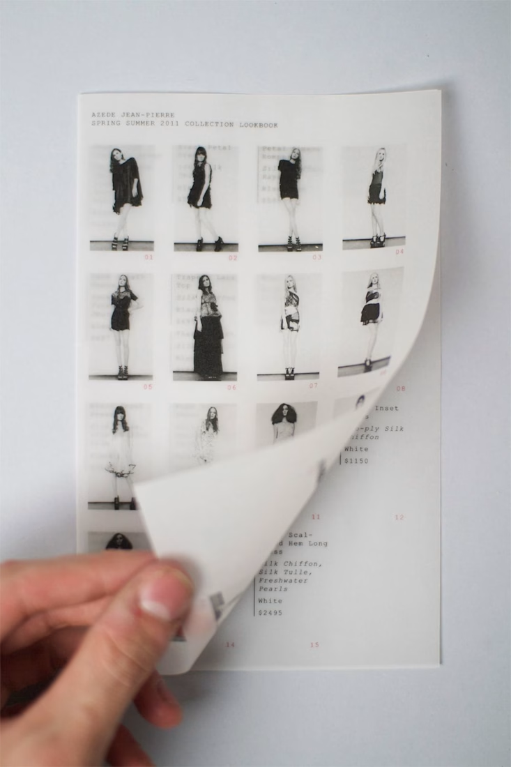
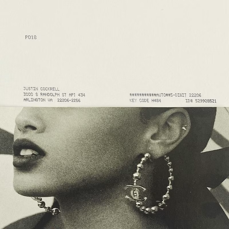
Inspiration #001. Archival Editorial


More

impressive work 👌, very clean and professional
The network for creativity
Join 1.25M professional creatives like you
Connect with clients, get discovered, and run your business 100% commission-free
Creatives on Contra have earned over $150M and we are just getting started





Related posts

experimenting with an editorial style inspired by warm, neutral tones


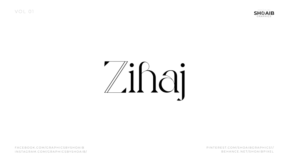
Four brands. Four personalities. One design philosophy: make simplicity feel intentional.
When I started working on this collection, I wasn’t interested in creating logos that were simply clean or visually attractive.
I wanted each identity to feel like it belonged to a real, established brand — something you could imagine seeing on luxury packaging, storefront signage, editorial campaigns, menus, clothing labels, or premium property marketing.
The challenge was creating that high-end feeling without overdesigning.
For Zihaj, I explored expressive editorial typography. The contrast between sharp and flowing letterforms gives the wordmark a fashion-forward personality while keeping it sophisticated and memorable. Rather than adding a separate symbol, the typography itself becomes the identity.
Aristowear takes a different approach. Here, the oversized AW monogram becomes the visual signature. The thin, elegant proportions and high-contrast letterforms were designed to communicate refinement, femininity, and an elevated fashion aesthetic. The goal was to create something that could work just as naturally on a clothing label as it would across premium packaging or a storefront.
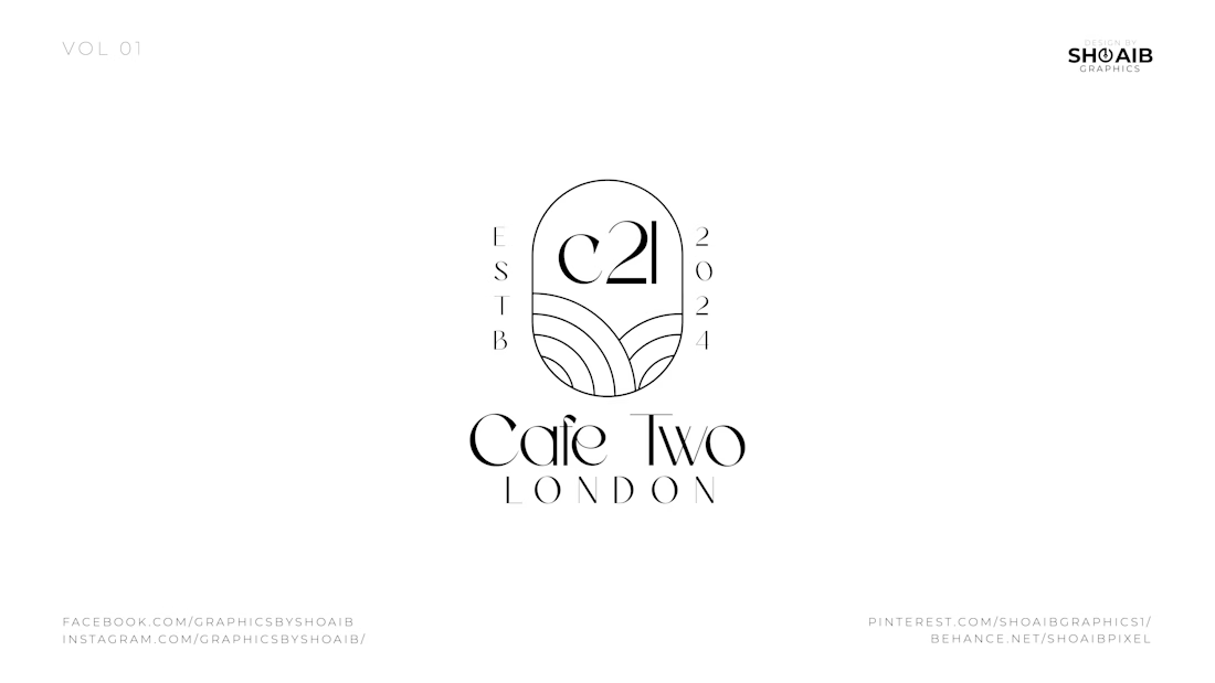
For Cafe Two London, I wanted the identity to feel more architectural. The C21 emblem sits inside an arched structure, supported by subtle curved linework underneath. Combined with the ESTB and 2024 details, it creates the feeling of a contemporary London café with an established, carefully considered visual presence.
Then came Oasis Towers.
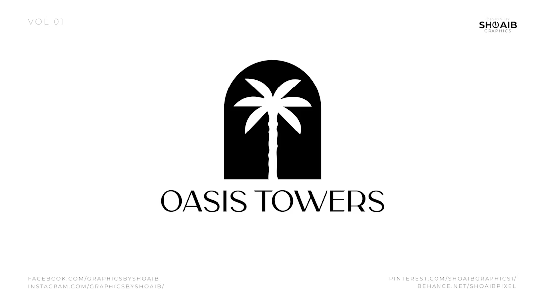
Instead of relying only on typography, I built the concept around a simple architectural arch containing a palm tree. The arch communicates structure and property, while the palm introduces the idea of an oasis, lifestyle, and destination. The result is a bold symbol that can remain recognizable even when the brand name is removed.
What connects all four identities is restraint.
No unnecessary elements.
No decoration added just to fill space.
No complicated symbols that need to be explained.
Every curve, letter, proportion, and piece of negative space has a purpose.
That is the approach I bring to identity design: understand the personality first, then reduce the idea until only the strongest visual elements remain.
Because a premium logo isn't created by adding more.
It comes from knowing exactly what to leave out.
If you're building a fashion, hospitality, lifestyle, real-estate, or premium consumer brand and want an identity that feels distinctive rather than template-driven, I'd love to help shape it.
Available for freelance logo design, visual identity & branding projects.



TESTIMONY OF PROPHECY — Mind Fuel Inspiration
I created this Christian inspirational article for Mind Fuel Inspiration, exploring biblical prophecy, discernment, fulfillment, faith, and the importance of testing spiritual messages against Scripture.
The article is centered on Revelation 19:20 and supported by related biblical references including 1 Thessalonians 5:20–21, 2 Peter 1:20–21, Isaiah 55:10–11, Habakkuk 2:3, Matthew 24:24, and 1 John 4:1.
What I created
Biblical inspirational article
Professional Christian editorial concept
Suggested 4:3 cover design
Scripture-based reflection questions
Faith declaration/prayer
Website-ready content
Social-media promotional copy
Creative goal
The goal was to transform a serious biblical theme into engaging, encouraging content that helps readers develop discernment while strengthening their faith in God's Word.
View the published work
Mind Fuel Inspiration:
https://mind-fuel-divine.lovable.app
Created by: Evangelist Annah Favour Babarinde

