The network for creativity
Join 1.25M professional creatives like you
Connect with clients, get discovered, and run your business 100% commission-free
Creatives on Contra have earned over $150M and we are just getting started
Back to feedPost
Your website gets visitors — but the phone stays quiet. Sound familiar?
The average small business website converts about 2.35% of its visitors. The top 10% convert around 11.45%. Same traffic, same market — the gap isn't luck, it's five specific things the top sites do differently. And Stanford's research explains why: 75% of people judge a company's credibility by its website design, and they form that judgement in about 50 milliseconds.
Here are the five fixes I check first on every site I audit.
1. Say what you do in one sentence — above the fold. Most homepages open with a clever slogan and a stock photo. A visitor should know in five seconds: what you do, who you do it for, and where you work. "Family dental practice in Manchester — same-week appointments" beats "Your smile, our passion" every single time. Clear value propositions convert at more than double the rate of vague ones.
2. One clear call to action, not five. "Call now", "Book online", "Get a quote", "Chat with us", "Download our guide" — all fighting on the same screen. Pages with a single CTA convert at around 13.5%; add a second one and that drops to about 10.5%. Pick the one action that matters most and make it impossible to miss.
3. Put your proof where people actually see it. 97% of consumers read reviews before choosing a local business — but most sites bury their rating in the footer, three scrolls down. Your star rating and review count belong in the first screen, right next to your headline and your call to action. A first-time visitor doesn't read your About page to decide if you're trustworthy. They look for the fastest proof that someone else trusted you first.
4. Make contacting you effortless. Every extra field on a form, every click to find a phone number, costs you enquiries. Your phone number should be visible on every page, the contact form should ask for the minimum, and on mobile the call button should work with one tap. I've seen sites lose half their enquiries to a form that asked for a fax number.
5. Design for the phone first, not the desktop. More than 60% of traffic is mobile, but most small business sites are still designed on a desktop and squeezed down. Check your own homepage on your phone: is the headline readable without zooming? Is the button reachable with one thumb? If not, your mobile visitors are leaving before they ever read your offer.
Run the five-second test tonight: show your homepage to someone who doesn't know your business, hide it, and ask them what you do and how to reach you. If they can't answer both, your website isn't broken — it's just unclear. And unclear is fixable.
We've built and rebuilt 300+ WordPress and Shopify sites for small businesses across the UK, US and UAE, and the pattern never changes: the sites that get enquiries aren't the prettiest ones. They're the clearest ones.
Which of these five is your homepage missing? Tell me in the comments — or message me and I'll take a quick look at your site.


The network for creativity
Join 1.25M professional creatives like you
Connect with clients, get discovered, and run your business 100% commission-free
Creatives on Contra have earned over $150M and we are just getting started



Related posts


So interactive

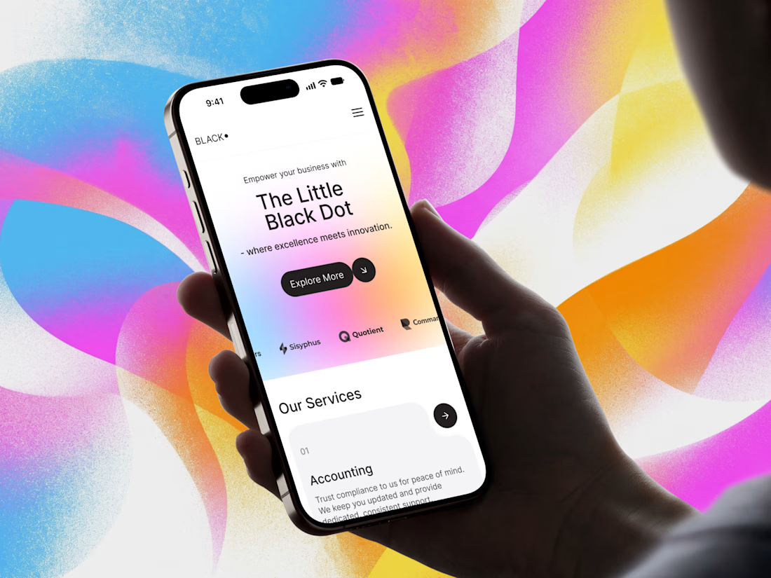
New website project ✨
A clean, modern digital experience built around bold visuals, clear structure, and a strong brand personality.
Designed and developed to feel smooth, engaging, and consistent across desktop and mobile.
Need help with design or development? DM me - always open to new projects!


Your website is slow — and it's costing you customers before they even see your offer.
Google's own data says 53% of mobile visitors leave if a page takes more than 3 seconds to load. Portent found sites loading in 0–2 seconds convert far better than anything slower, and Akamai's research puts a 1-second delay at roughly 7% fewer conversions. For a small business website, that's not a technical detail — that's lost enquiries every single week.
The good news: most slow sites aren't slow because of hosting. They're slow because of five fixable things.
1. Images that were never resized. A 4MB photo uploaded straight from a camera becomes the whole page weight. Resize to the display size, compress it, and serve WebP — this alone often cuts load time in half.
2. Too many plugins doing the same job. I've opened WordPress sites running 40+ plugins — three slider plugins, two form plugins, four SEO tools. Audit ruthlessly: if a plugin isn't earning its place, remove it. One tool per job.
3. No caching or CDN. Without page caching, every visitor makes your server rebuild the page from scratch. A free Cloudflare setup plus a caching plugin is a 20-minute job that changes everything.
4. Fonts loading like it's 2015. Five font weights from Google Fonts, render-blocking. Use two weights max, font-display: swap, and host locally where you can.
5. JavaScript blocking the page. Chat widgets, tracking scripts, popups — all loading before your content. Defer what's below the fold and load scripts after the page renders.
Check your site against Google's Core Web Vitals: LCP under 2.5 seconds, interaction under 200ms, layout shift under 0.1. If LCP is over 4 seconds, start with images — that's the culprit in most sites I audit.
We've rebuilt and optimised 300+ WordPress and Shopify sites for small businesses in the UK, US and UAE, and the pattern is always the same: the slow sites aren't the cheap-hosting ones, they're the ones nobody ever audited.
Which of these five is slowing your site down right now? Drop a comment — or message me and I'll take a quick look.


Slow websites silently lose leads, so start with a technical SEO audit to identify speed bottlenecks, broken resources, and performance issues before they hurt conversions. Tools like SerpSpur can help uncover website issues and prioritize fixes before visitors leave.