The network for creativity
Join 1.25M professional creatives like you
Connect with clients, get discovered, and run your business 100% commission-free
Creatives on Contra have earned over $150M and we are just getting started
Back to feedPost

New case study is up: Sol Brush Welcome Email
HERE IT IS: Check it out
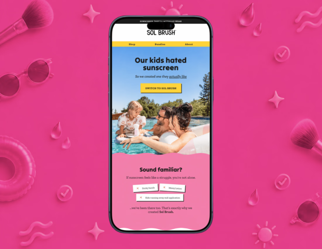
Most welcome emails open with the product. This one opens with a parent's exact frustration instead: sticky hands, messy lotion, and a kid running away mid-application, before Sol Brush's mineral SPF brush-on sunscreen is ever mentioned.
I broke down the full creative process: the emotional hook, the visual language, and the CTA rhythm built to move a skeptical parent from "I feel understood" to "I trust this" to "I'll try it."
Check out the full case study on my portfolio. Would love to hear your thoughts.
#EmailDesign #DTC #ConversionDesign


The network for creativity
Join 1.25M professional creatives like you
Connect with clients, get discovered, and run your business 100% commission-free
Creatives on Contra have earned over $150M and we are just getting started










Related posts

This is my biggest client success story of my carreer.
It's hard to capture 3+ years of work into a single use case page.
Though I gave it a try (it's never perfect 😉)
Read the use case here and let me know what you think of the work. Thanks!🤙🏻

Distilling three years of multidisciplinary work into one use case page is the real craft here, Tim. Long-term client relationships are the best portfolio proof there is. Congrats on the DeFi brand journey.

New case study added!
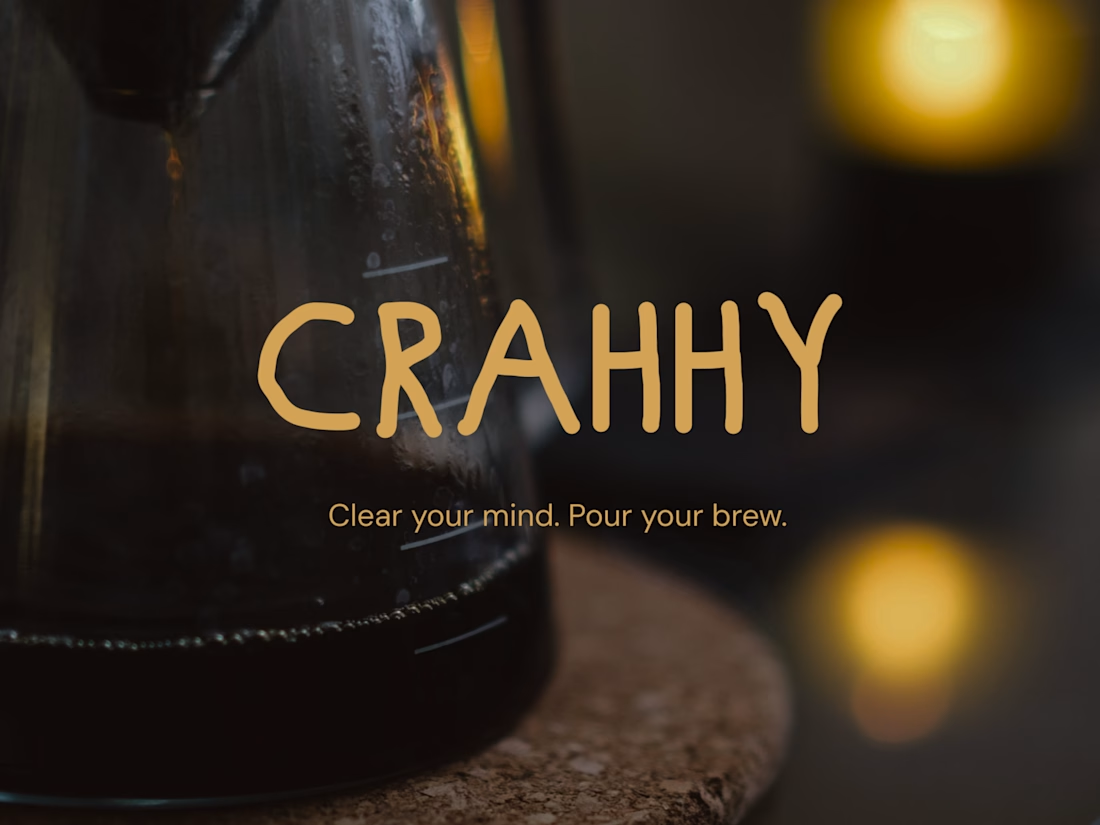
Crahhy is a speciality coffee brand rooted in the relatable human psychology of coffee cravings.
The objective was to design a brand that is minimal on the outside yet delightfully chaotic on the inside, blending specialty coffee aesthetics with honest, humorous storytelling.

minimal outside chaotic inside is the right brief for coffee

Excited to share my latest design project: New Bones 🛋️
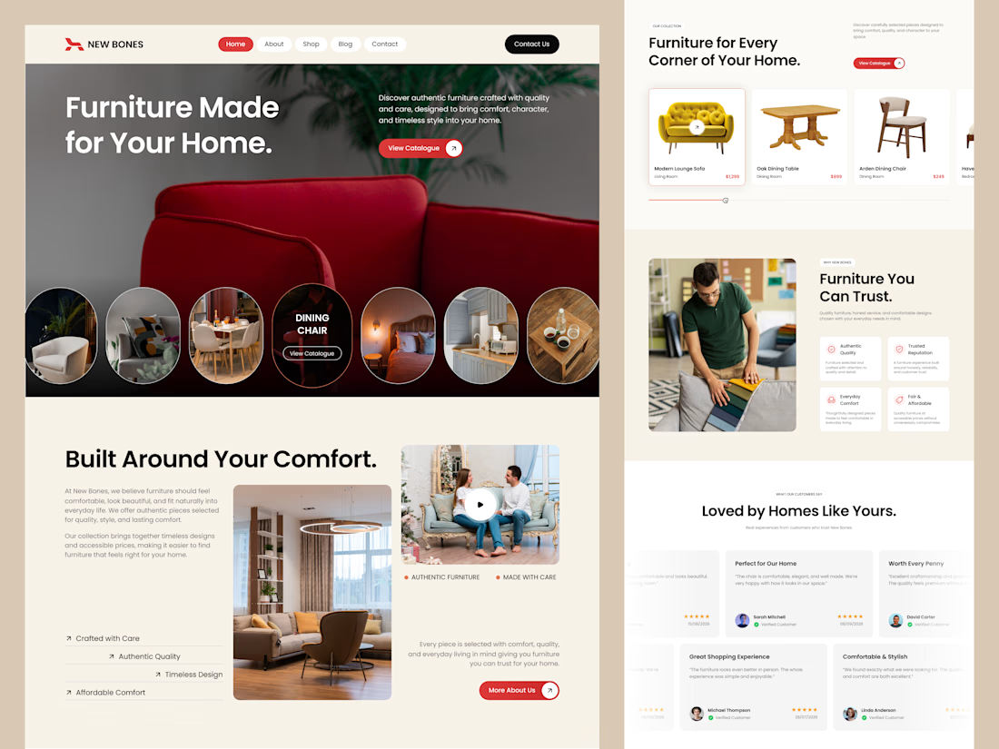
New Bones is a furniture e-commerce landing page designed to make discovering home items and exploring decor trends completely seamless. The main focus was to break down complex online shopping layouts into a clean, minimal, and frictionless user journey.
From smooth product slider discovery to a transparent trust badge flow, every section is crafted with close attention to clear visual hierarchy and layout consistency.
Check out the full UI/UX case study here! 👇

Nice focus on simplifying furniture discovery!