The network for creativity
Join 1.25M professional creatives like you
Connect with clients, get discovered, and run your business 100% commission-free
Creatives on Contra have earned over $150M and we are just getting started
Back to feedPost

Most analytics dashboards feel like a spreadsheet with a chart bolted on. I wanted something that actually feels alive.
NexaMetrics streams a new order into the feed every 8 seconds, KPI cards carry live sparklines, and a command palette (Cmd+K) lets you jump straight to any order, customer or product without touching a menu. Full order table with search, filters and a slide-out detail panel, customer segments with lifetime value, all built on seeded but realistic data.
Live demo: nexametrics-dash.vercel.app
The network for creativity
Join 1.25M professional creatives like you
Connect with clients, get discovered, and run your business 100% commission-free
Creatives on Contra have earned over $150M and we are just getting started
Trending
retrofuturism
Share your favorite designs from the past exploring the distant future. Or your own take on the aesthetic 🚀
halftone
Dots. Texture. Grain. Let's see your designs using the halftone technique.

Midjourney
Creatives are showing off what they're making with Midjourney.
colorgrade
Video editors sound off: How do you enhance the mood of your video in color grading?
Related posts


Super clean, really sick
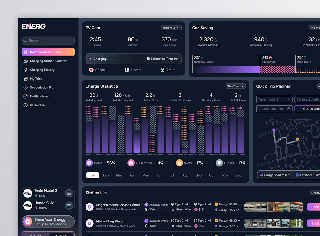
I created a dashboard for Energ, an EV charging management platform that shows charging status, savings, and nearby stations all in one view.
It's designed for electric vehicle owners with multiple cars who want to quickly check battery status, charging costs, and the nearest available charging port without using multiple apps.
The design features a dark UI with purple and pink accents, and a monthly tab strip below the charge chart, making a year's data easy to browse in one card.


A dark-mode study platform for medical and nursing residency candidates: lessons, question practice, flashcards, mock exams and performance analytics in one place.
The goal was to make the next step obvious. Every screen leads with a single action, and progress is always visible, rings, streaks and history charts that turn effort into something you can see.
What do you think?