The network for creativity
Join 1.25M professional creatives like you
Connect with clients, get discovered, and run your business 100% commission-free
Creatives on Contra have earned over $150M and we are just getting started
Back to feedPost

AURÉNE — Lash & Brow Atelier
End-to-end booking experience for a premium beauty studio.
I designed and built a luxury appointment-booking experience for AURÉNE — Lash & Brow Atelier, a concept beauty studio based in Sarajevo.
The goal was simple: turn “Can I book an appointment?” into “You’re booked” with as little friction as possible.
The Challenge
Beauty booking experiences can often feel overwhelming — too many options, long forms, unclear pricing, and unnecessary steps. For AURÉNE, I wanted to create a booking flow that feels as refined and effortless as the service itself.
The Solution
I created a focused, four-step booking journey that guides users from treatment selection to confirmation.
01 — Choose a treatment
Users can quickly compare treatments, durations, pricing, and descriptions before making a decision.
02 — Need help choosing?
I introduced a conversational “Not sure?” option that allows users to describe the look they want instead of having to know the exact treatment name.
03 — Select a time
The flow keeps scheduling simple and focused, reducing unnecessary decisions and form fields.
04 — Confirm
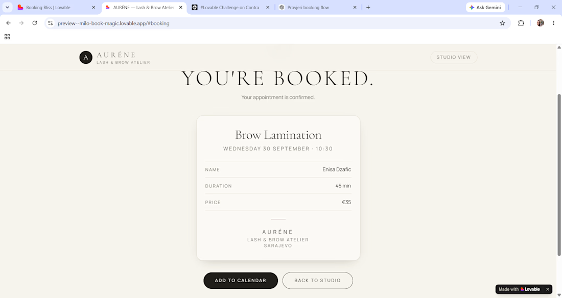
The final step provides a clear confirmation experience so users know exactly what they booked.
UX Focus
The experience was designed around three principles:
Clarity — Make treatments, pricing, and duration immediately understandable.
Confidence — Give users enough information to make the right choice before booking.
Speed — Keep the journey short, intuitive, and free from unnecessary friction.
Visual Direction
For the visual identity, I used a quiet luxury aesthetic with elegant typography, generous whitespace, editorial imagery, and a soft, refined interface.
The visual language was intentionally minimal so that the brand feels premium, feminine, calm, and precise without becoming overly decorative.
What I Designed
Premium beauty studio landing page
Treatment selection experienceConversational treatment recommendation Appointment scheduling flow Booking confirmation experience
Responsive UI Complete end-to-end user journey
The Result
A booking experience that combines premium visual design with practical UX, allowing users to move from discovering a treatment to confirming an appointment in just a few focused steps.
Designed with the principle: less friction, more confidence, better bookings.

✨ AURÉNE — Lash & Brow Atelier
For this challenge, I wanted to redesign one of the simplest — but often most frustrating — customer journeys: booking an appointment.
The problem
A customer starts with a simple question:
“Can I book an appointment?”
But turning that question into a...
The network for creativity
Join 1.25M professional creatives like you
Connect with clients, get discovered, and run your business 100% commission-free
Creatives on Contra have earned over $150M and we are just getting started




Related posts

Built it. It's live: Offseason Ghost
A fictional brand for a travel vlogger who never shows their face — not once, not even by accident. The scroll doesn't just reveal sections, it scrubs the actual hero video: you pull stillness into full-send velocity with your own scroll.
Concept, identity, motion system — all one weekend, all personal.

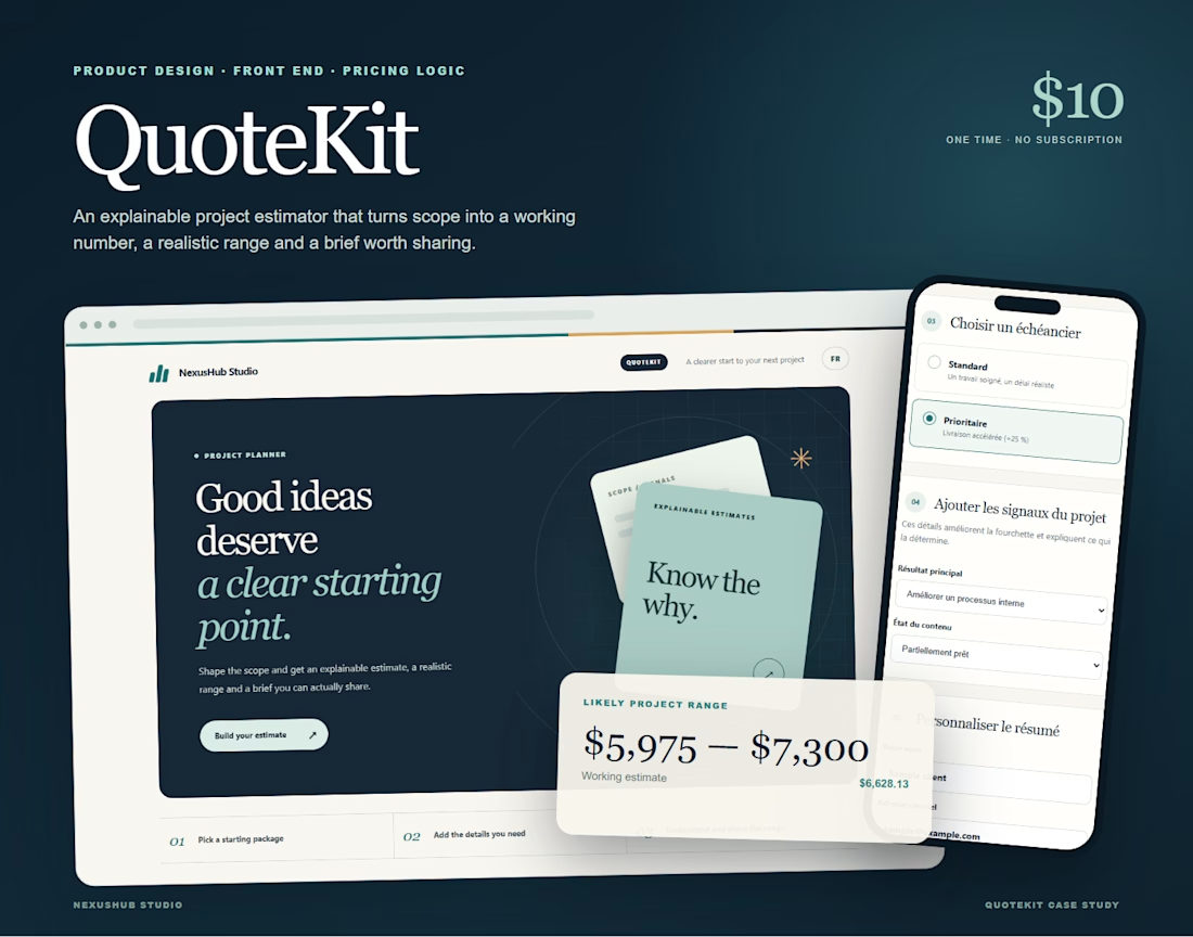
I built QuoteKit because quoting a project should not feel like guessing in public.
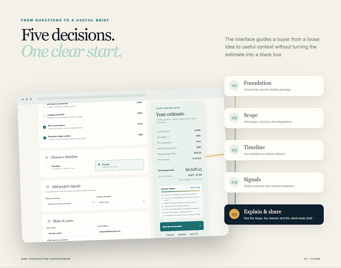
A client starts with a package, shapes the scope, chooses a timeline and explains what they need. QuoteKit turns those choices into a working estimate, a realistic range and clear reasons behind the price.
It works in English and French, adapts to mobile and gives both sides a summary they can copy, download or print.
I designed the product, pricing logic and interface for NexusHub Studio. It is a small tool with a simple goal: make the first client conversation clearer.
QuoteKit is available for 10 USD with a commercial license.
What would you want an estimator like this to explain before you send a quote?
Quote clearly. Start better.

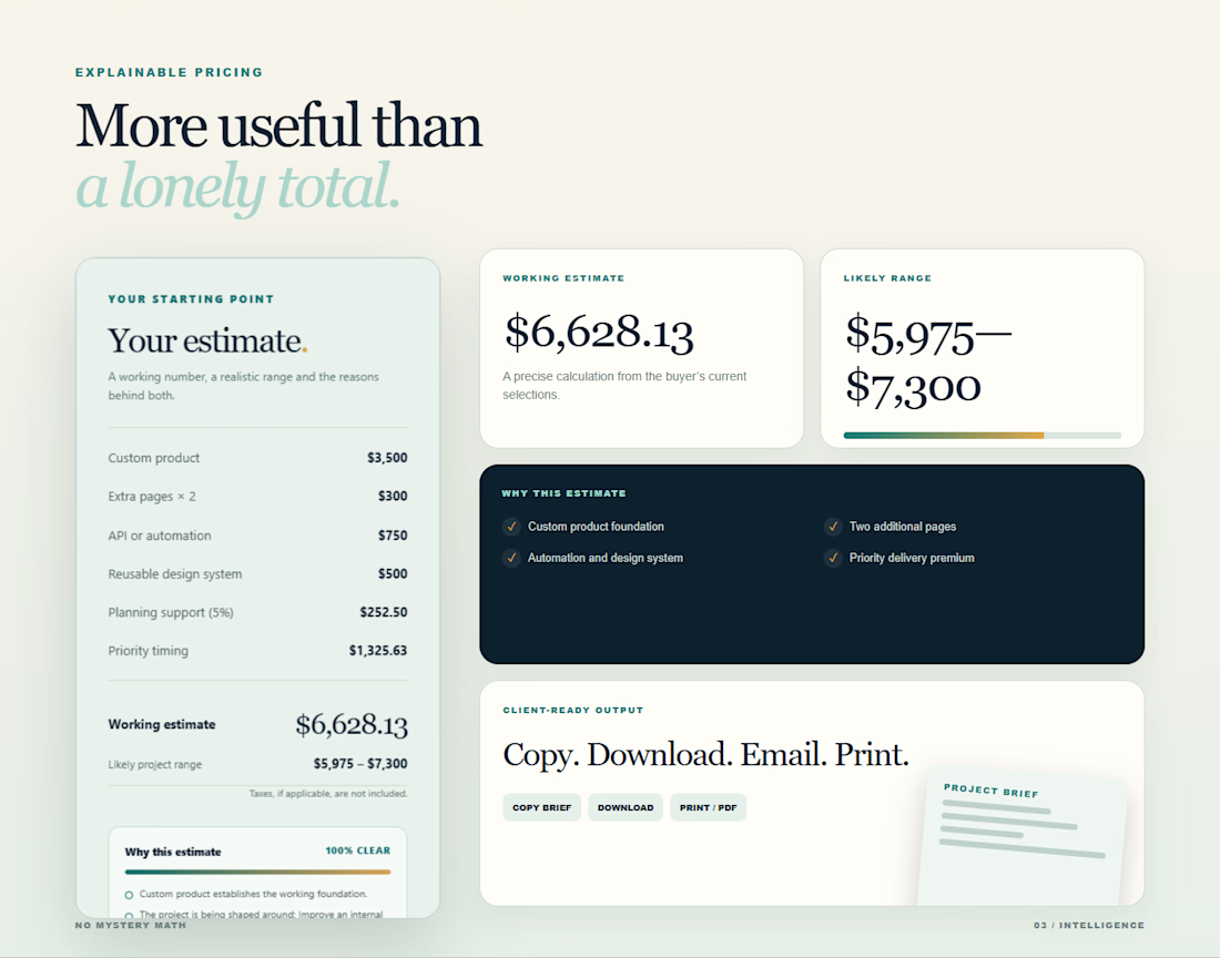
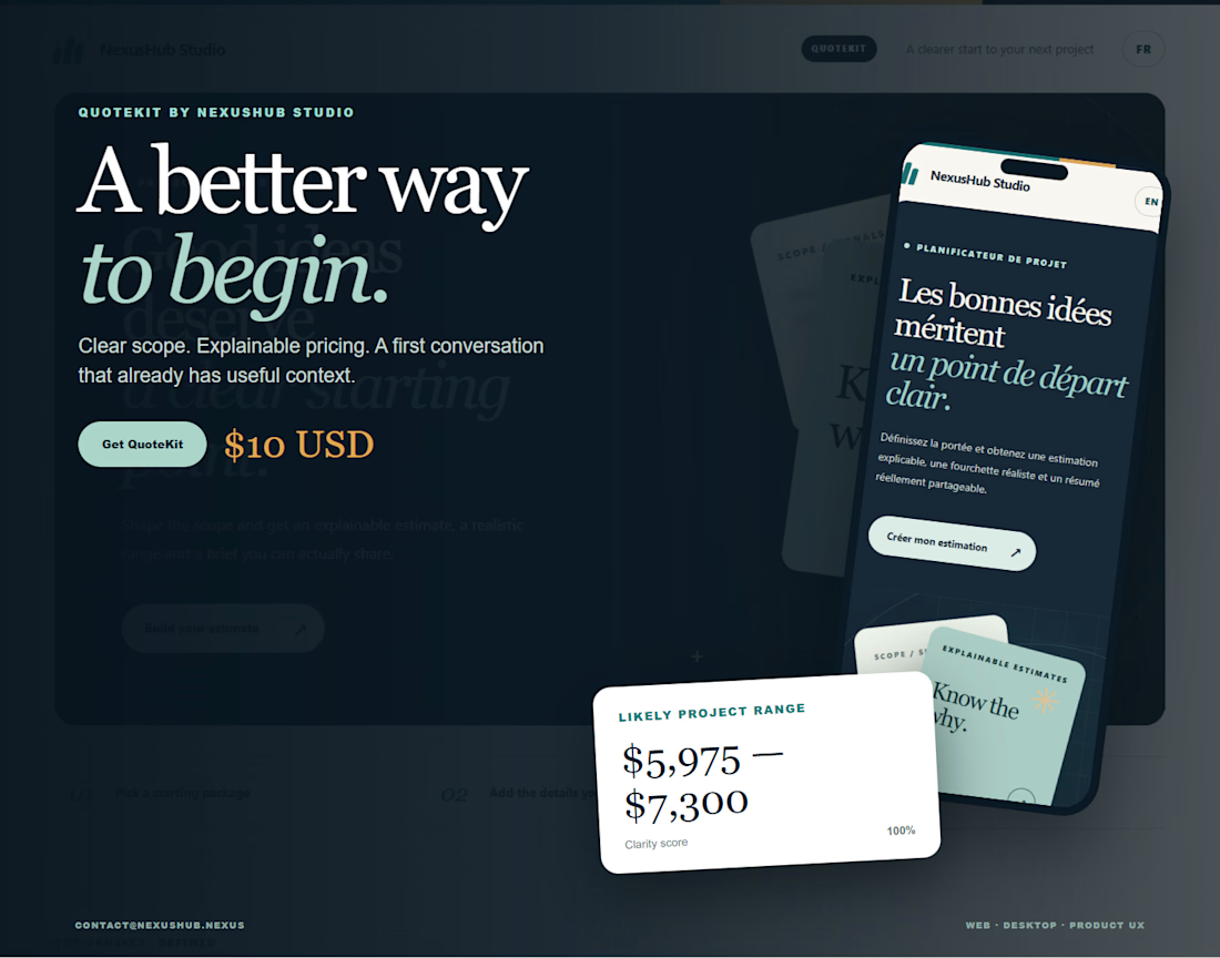

Explaining the estimate turns pricing into a much clearer conversation.

Website Design | UI/UX Design | Web Design
A modern website design concept focused on creating a clean, engaging, and user-friendly digital experience.
The design combines strong visual hierarchy, intuitive navigation, thoughtful spacing, and responsive layouts to create an interface that feels polished while keeping the user journey simple and clear.
From the overall page structure to typography, imagery, and calls-to-action, each element was designed to create a cohesive experience that works across desktop and mobile.


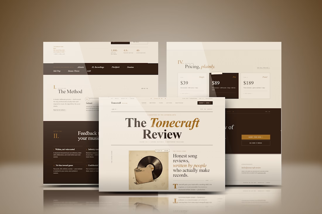
The spacing and hierarchy keep the experience approachable.