The network for creativity
Join 1.25M professional creatives like you
Connect with clients, get discovered, and run your business 100% commission-free
Creatives on Contra have earned over $150M and we are just getting started
Back to feedPost
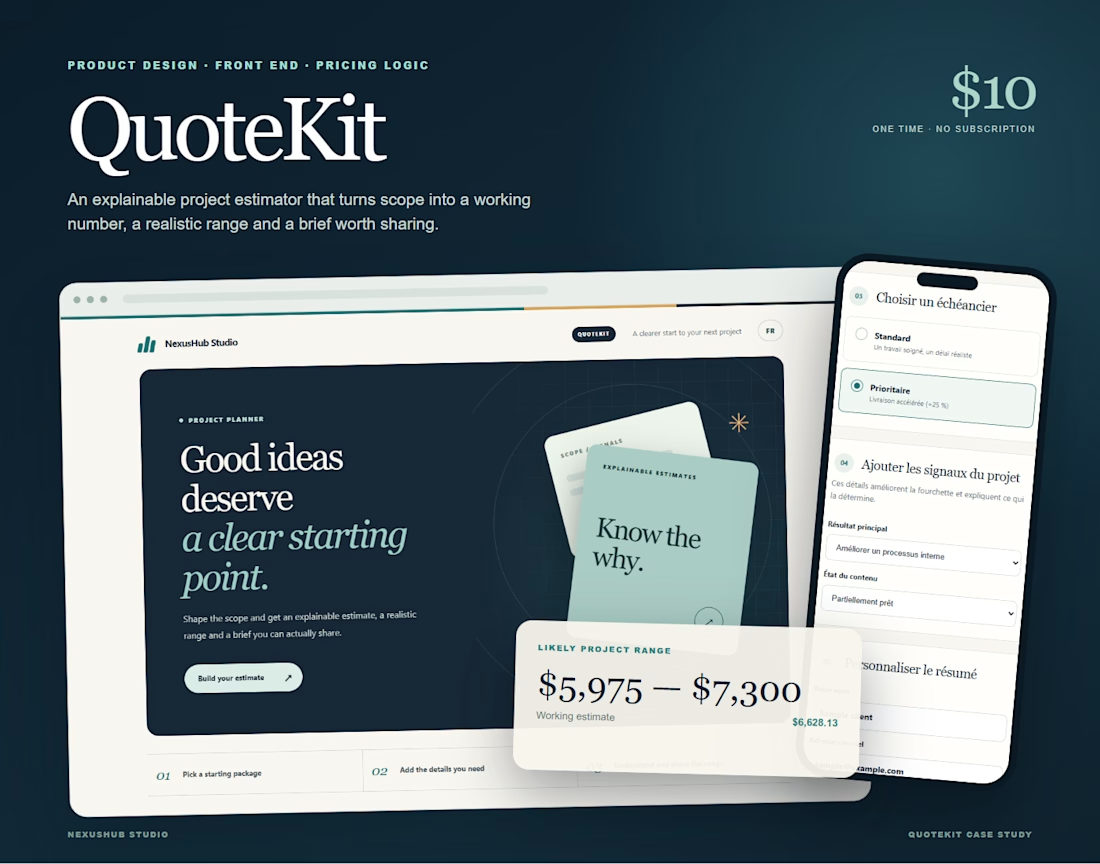
I built QuoteKit because quoting a project should not feel like guessing in public.
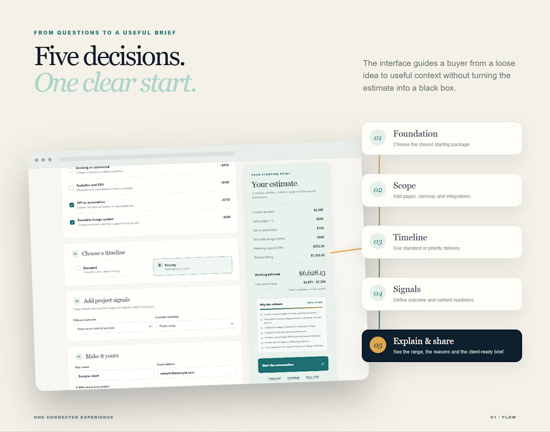
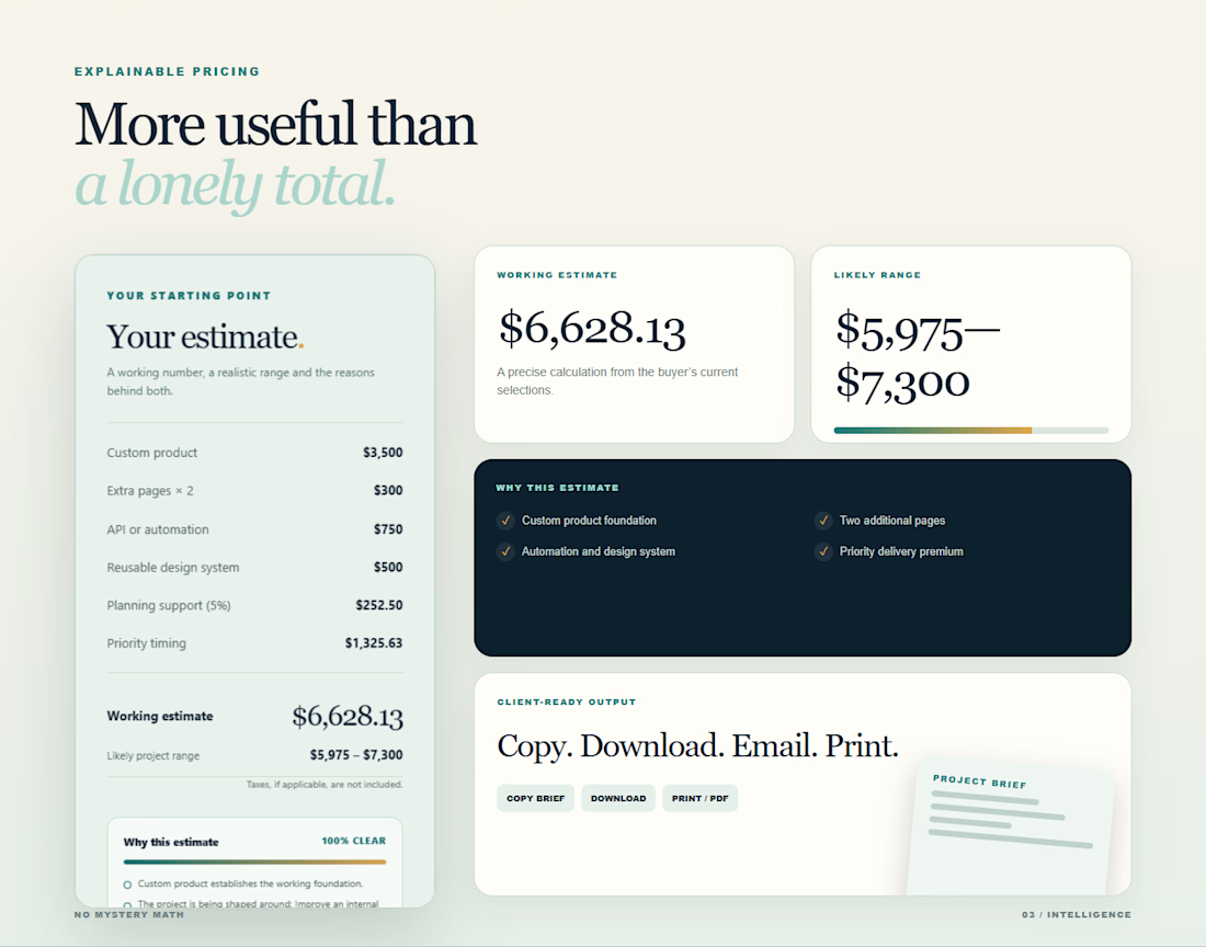
A client starts with a package, shapes the scope, chooses a timeline and explains what they need. QuoteKit turns those choices into a working estimate, a realistic range and clear reasons behind the price.
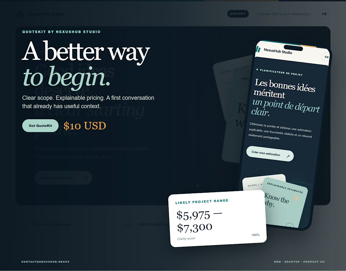
It works in English and French, adapts to mobile and gives both sides a summary they can copy, download or print.
I designed the product, pricing logic and interface for NexusHub Studio. It is a small tool with a simple goal: make the first client conversation clearer.
QuoteKit is available for 10 USD with a commercial license.
What would you want an estimator like this to explain before you send a quote?
Quote clearly. Start better.



quote kit turning choices into a range is cool. how long did that take?

Thanks Benjamin. The first usable version took roughly a day. Most of the work after that went into refining the pricing logic, the bilingual experience and the mobile flow. I wanted it to feel simple even when the estimate is doing a lot underneath.

Turning package, scope, and timeline into a range plus the reasons behind the price is the useful bit. It makes that first client conversation feel like a shared starting point instead of a guess.
Exactly. I wanted both sides to understand where the number comes from before the discovery call begins. A shared starting point makes the conversation much more useful. Thanks Rohan.

Explaining the estimate turns pricing into a much clearer conversation.
That was the goal. A price feels much easier to discuss when the client can see what shaped it. Thank you Mykola.
Exactly—transparency makes pricing easier.

Thank you Alaa. I wanted the interface to feel calm because pricing already creates enough tension on its own. I am glad the palette and contrast came through that way.

The assumptions behind the range. You show $5,975-$7,300 next to the line-item breakdown; naming what's excluded and what pushes it a tier higher makes the next conversation about scope.
That is a great point Mark. Making the exclusions and the conditions for moving into a higher range explicit would make the scope conversation even stronger. I will explore that in the next version. Thank you for the thoughtful feedback.

I'd want to see which choice moves the estimate most. If the timeline changes the range more than the package, that gives both sides something concrete to settle before the first call.
See QuoteKit in action 👇
https://nexushub.nexus/studio/quotekit

This makes the pricing and quoting process feel much easier for clients to understand. Really liked the darker theme! Curious about how did you approach accessibility testing, especially contrast and readability in the dark theme? Any tools or checks you found helpful?
Thank you for the thoughtful comment, Gauri. I’m glad the palette caught your eye. QuoteKit does not have a dark theme yet. The darker impression comes from the soft slate background, warm white cards, deep ink text and violet accents that guide attention to selections and...
Thanks for clarifying, I mistook the slate palette for a dark theme! The colors work really well together and give the interface that calm feel you were aiming for. Appreciate you explaining the contrast checks and being clear about what still needs testing. I’d be interested to see a true dark version in the future! 😊
The network for creativity
Join 1.25M professional creatives like you
Connect with clients, get discovered, and run your business 100% commission-free
Creatives on Contra have earned over $150M and we are just getting started
Challenges
View all


Related posts

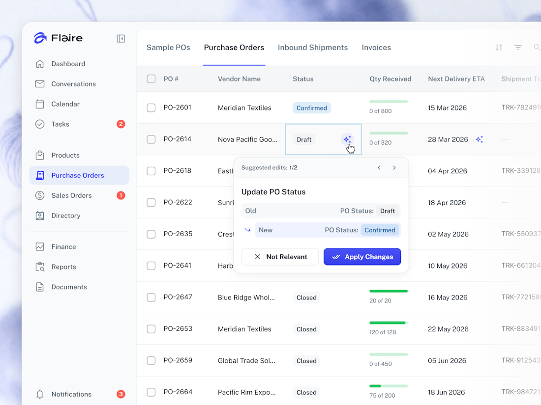
✨ AI Suggestions on the Purchase Orders list. Proposed record edits surface inline for the user to apply or dismiss in one tap.



Great work

A website should make the product easy to understand.
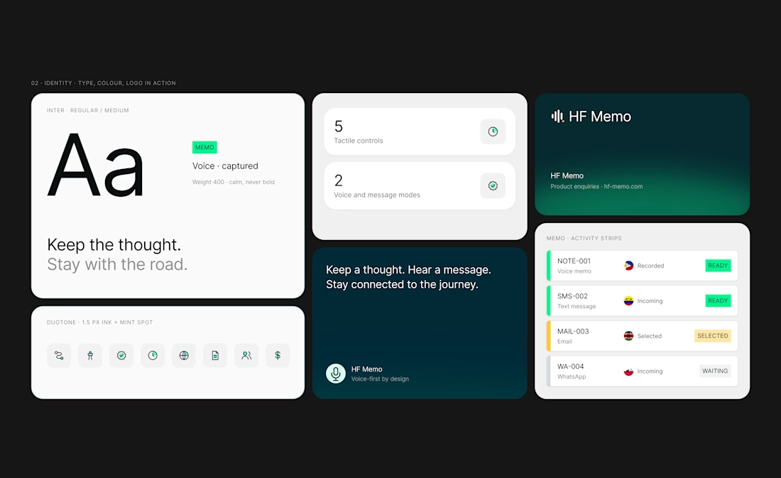
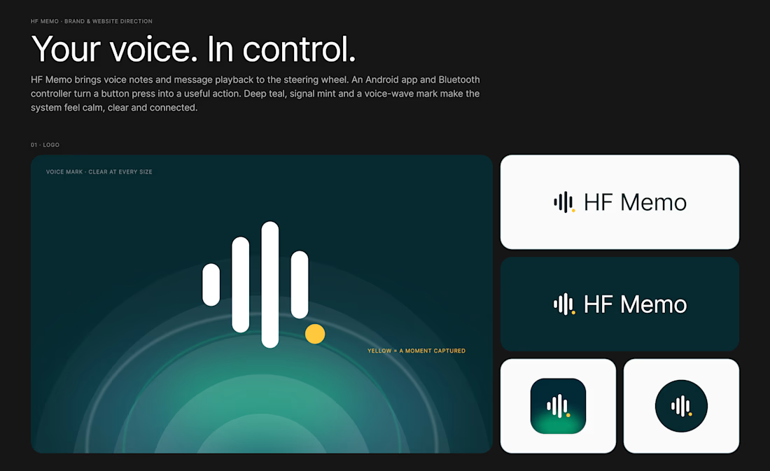
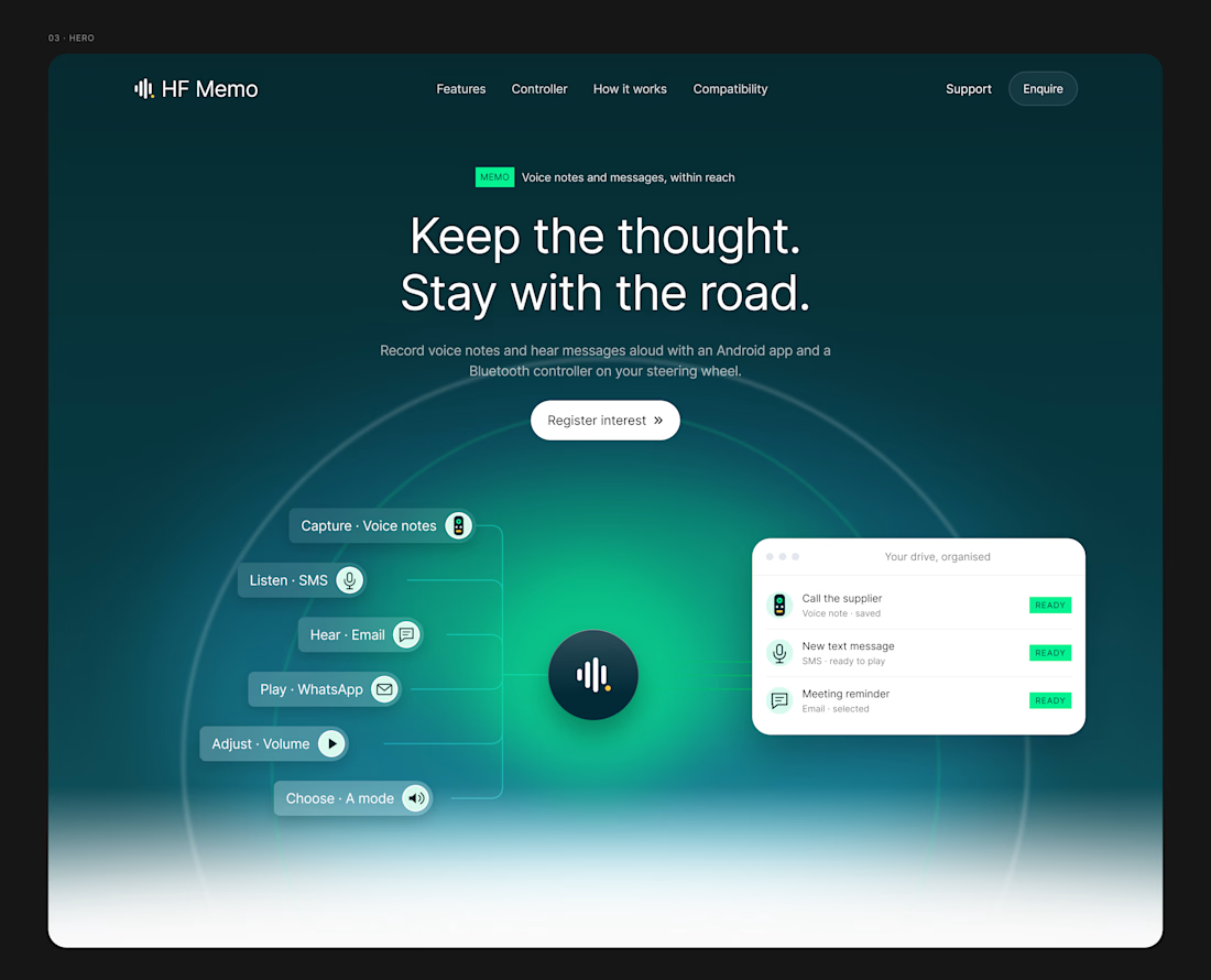
My latest redesign concept explores a new direction for HF Memo—an Android app and Bluetooth controller for recording voice notes and hearing messages aloud.
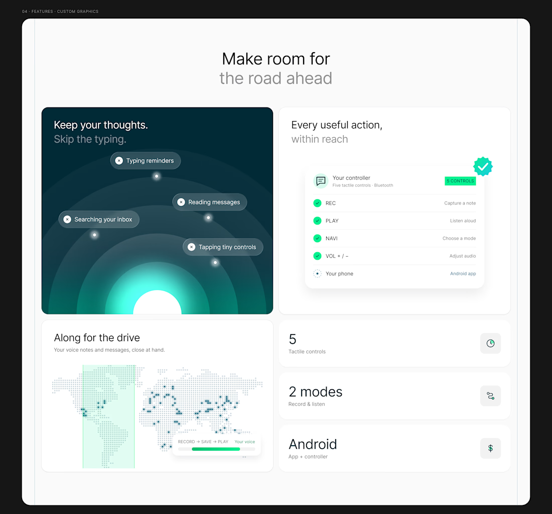
I focused on showing the experience: capture a thought, replay a recording, and understand what each controller button does.
Clean typography, light backgrounds, and lime accents give the product room to tell its story.
Designed in Figma, with editable layouts and custom graphics.
Have a product that needs a clearer website? Let’s connect.
#webdesign #uidesign #figma #productdesign



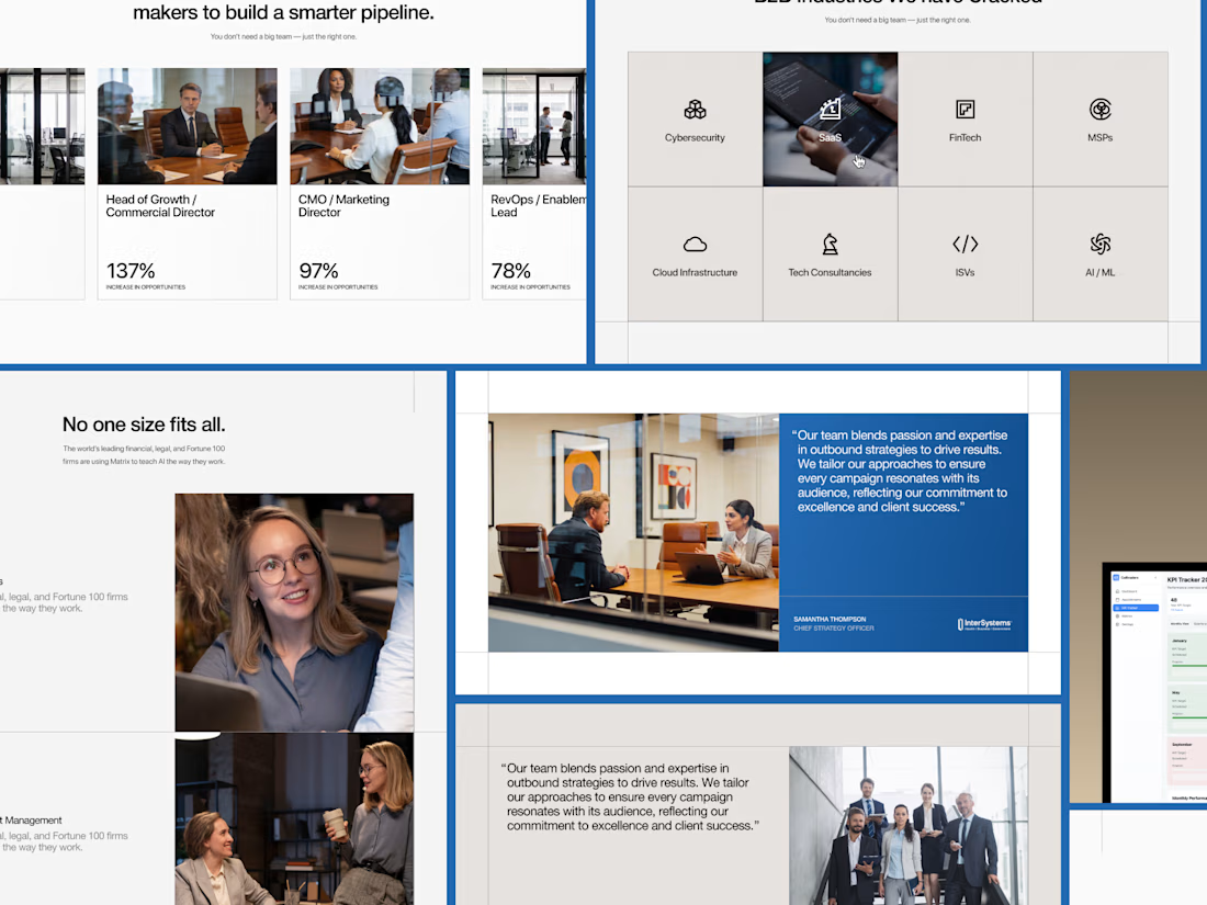
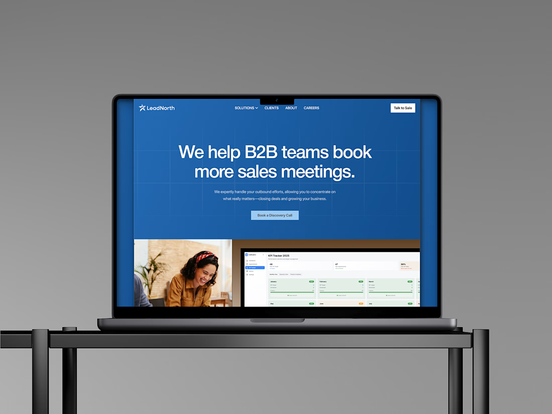
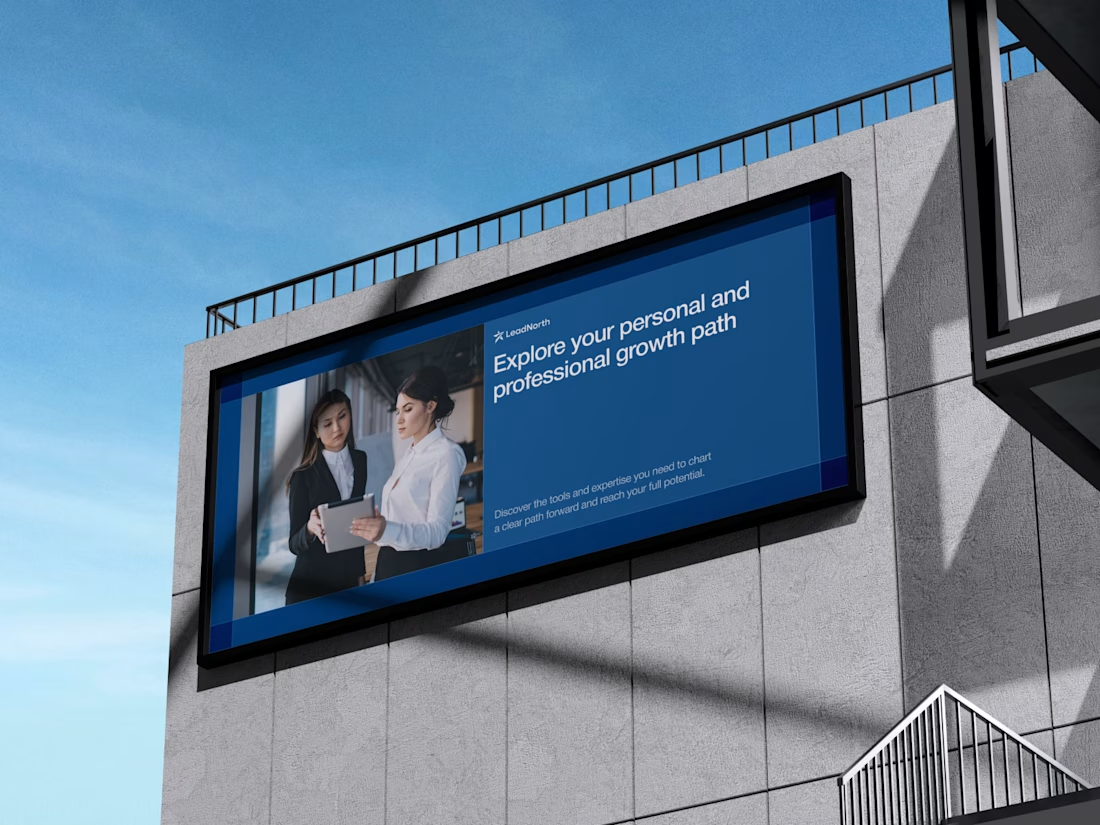
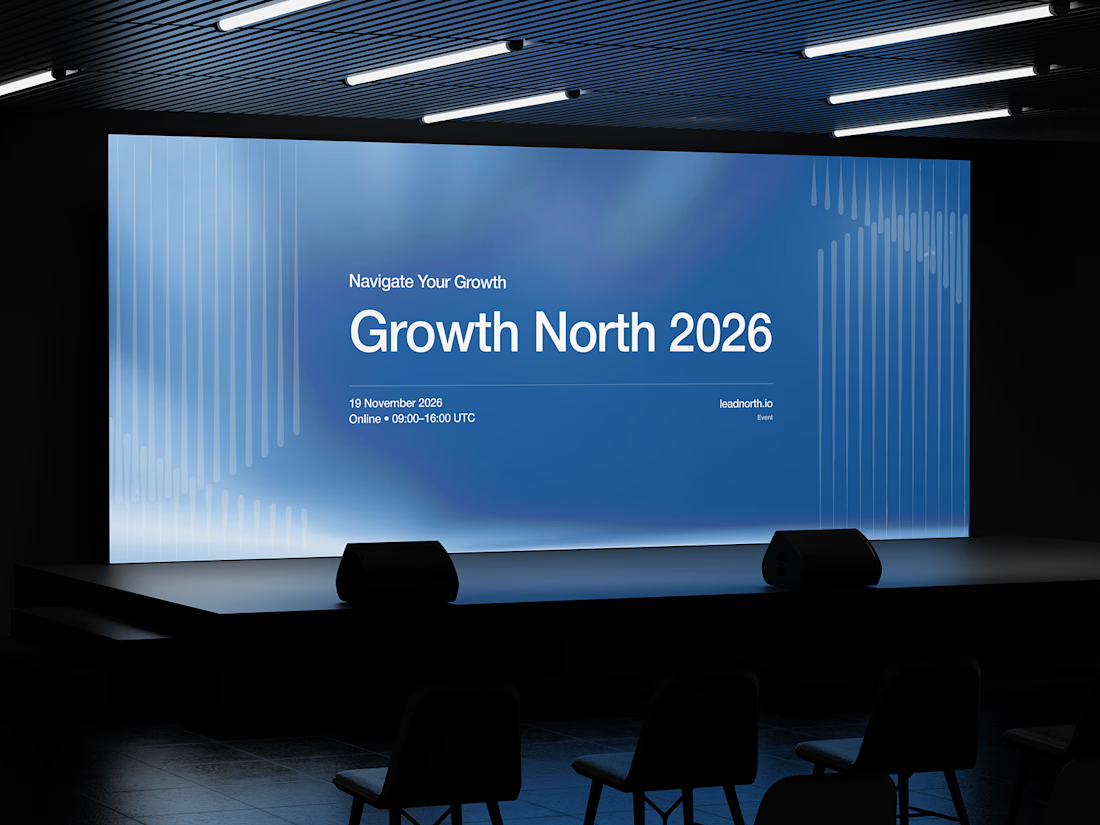


That saturated cobalt blue carries cleanly from the laptop hero onto the outdoor billboard and the Growth North 2026 stage screen.