The network for creativity
Join 1.25M professional creatives like you
Connect with clients, get discovered, and run your business 100% commission-free
Creatives on Contra have earned over $150M and we are just getting started
Back to feedPost

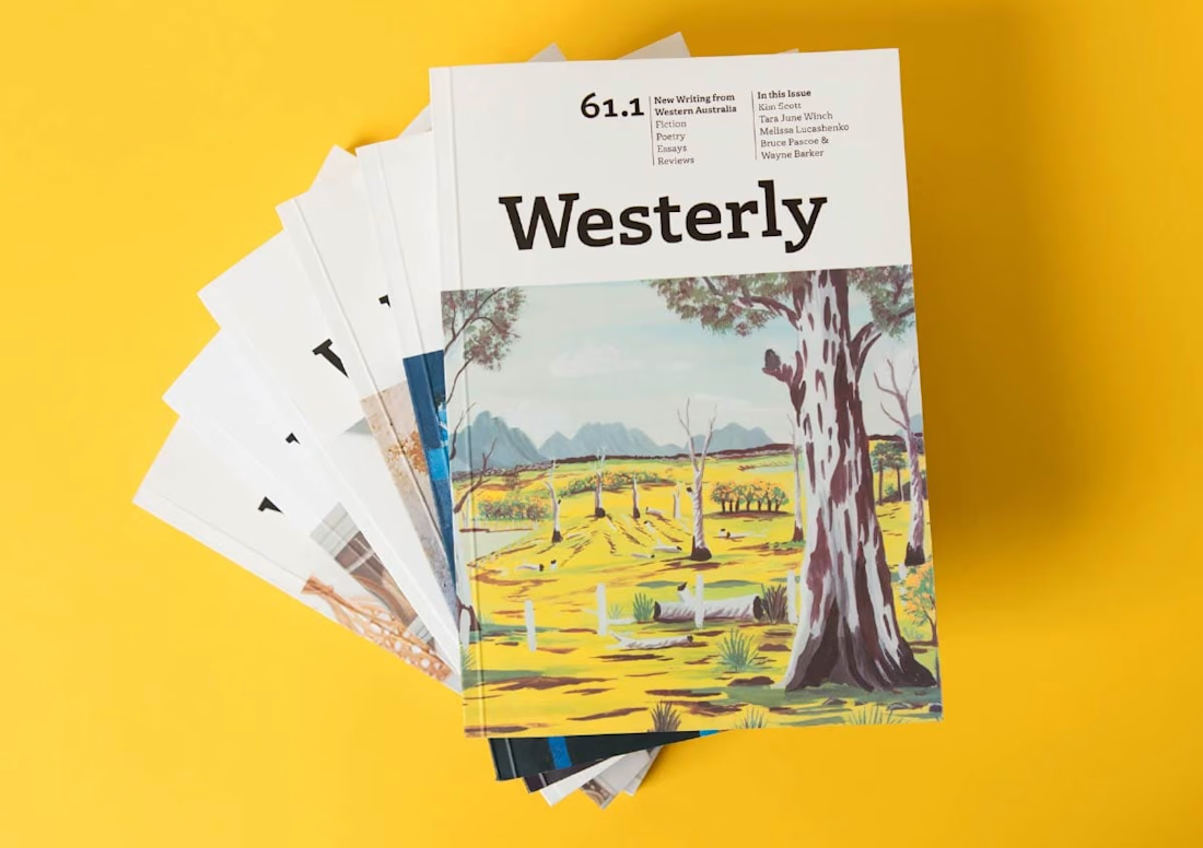
New interview: Becky Chilcott, design from the most isolated city in the modern world
https://www.re-type.com/news/2026/10/07/design-from-the-most-isolated-city-in-the-modern-world/
The network for creativity
Join 1.25M professional creatives like you
Connect with clients, get discovered, and run your business 100% commission-free
Creatives on Contra have earned over $150M and we are just getting started











Related posts


I don’t avoid templates just to make things look different.
I avoid flattening a physical brand into a generic digital experience.
A restaurant, studio, fashion label or product can have incredible character in the real world, then lose all of it the moment it becomes a website.
That gap is what interests me.
The website should be able to carry the atmosphere through layout, typography, pacing, motion and interaction, and ideally attract people before they ever experience the physical space.
Not every project needs to be highly expressive.
Some websites should stay simple, direct and functional.
But even simplicity can carry identity.
Bolluni was built with that in mind: translating the character of the restaurant into a digital experience rather than simply presenting information.
Embrace the Creativity.

So well said. That's exactly the problem - a restaurant can have so much soul IRL then become another generic grid online. Love that you don't just avoid templates to be different, but to protect the brand's actual character. 100% agree.

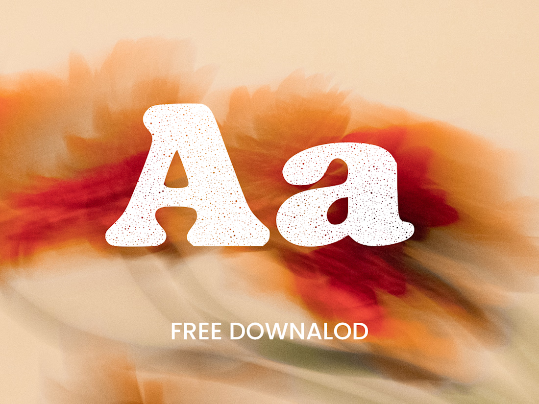
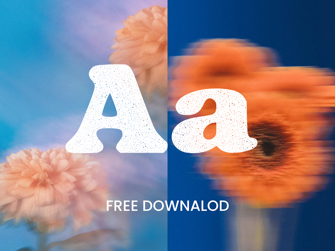
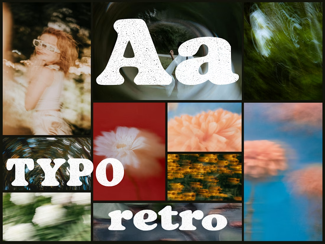
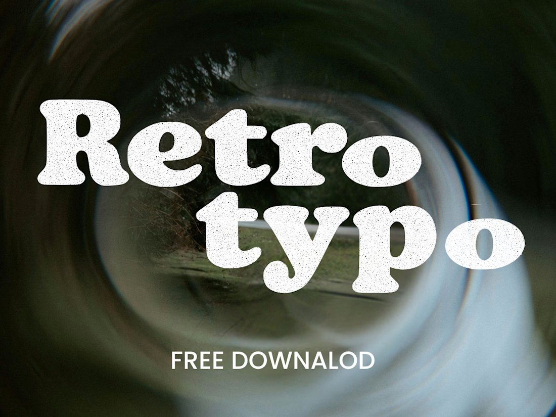
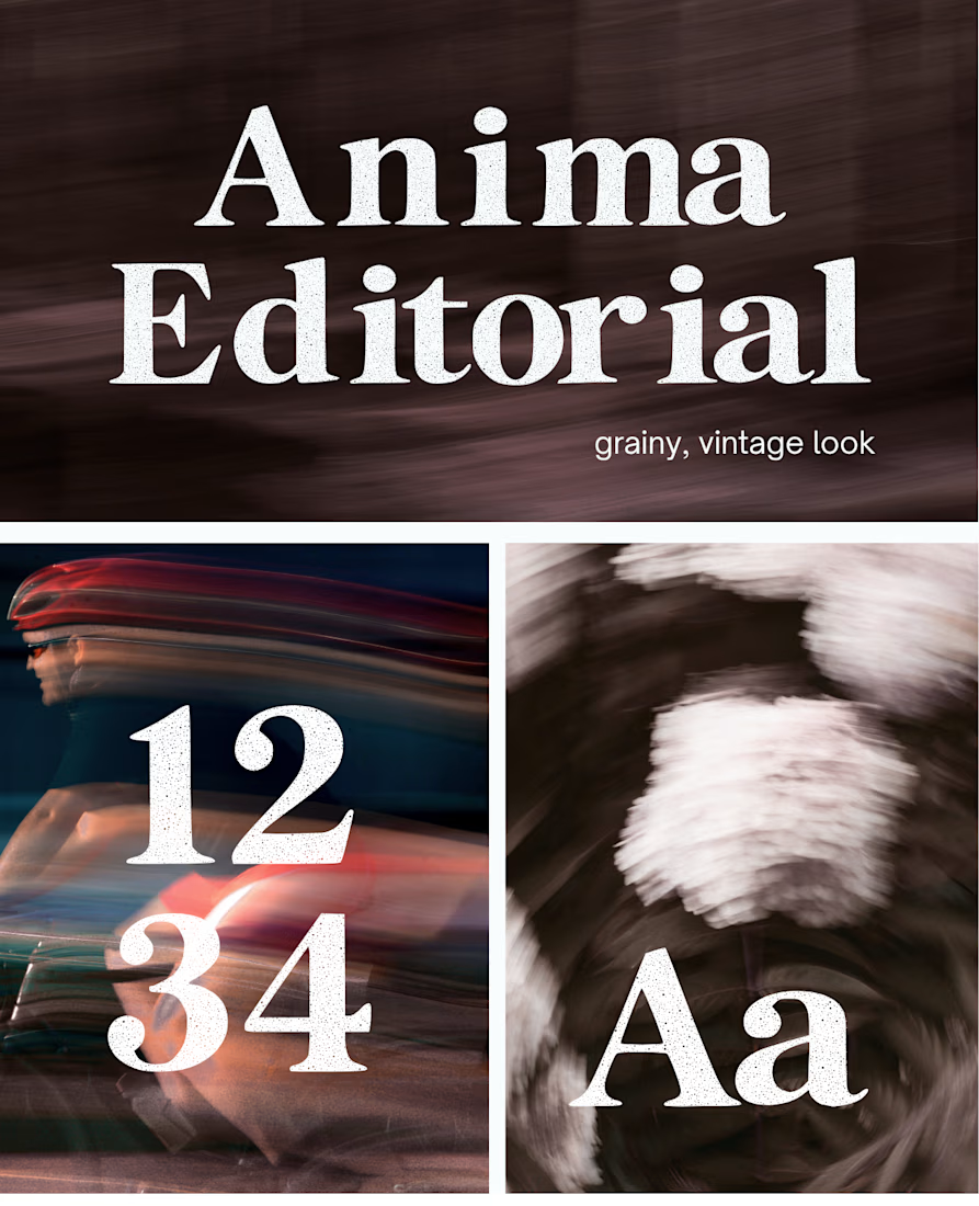
Anima is a self-initiated type design project inspired by vintage print, worn ink and analog photography.
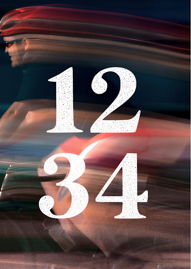
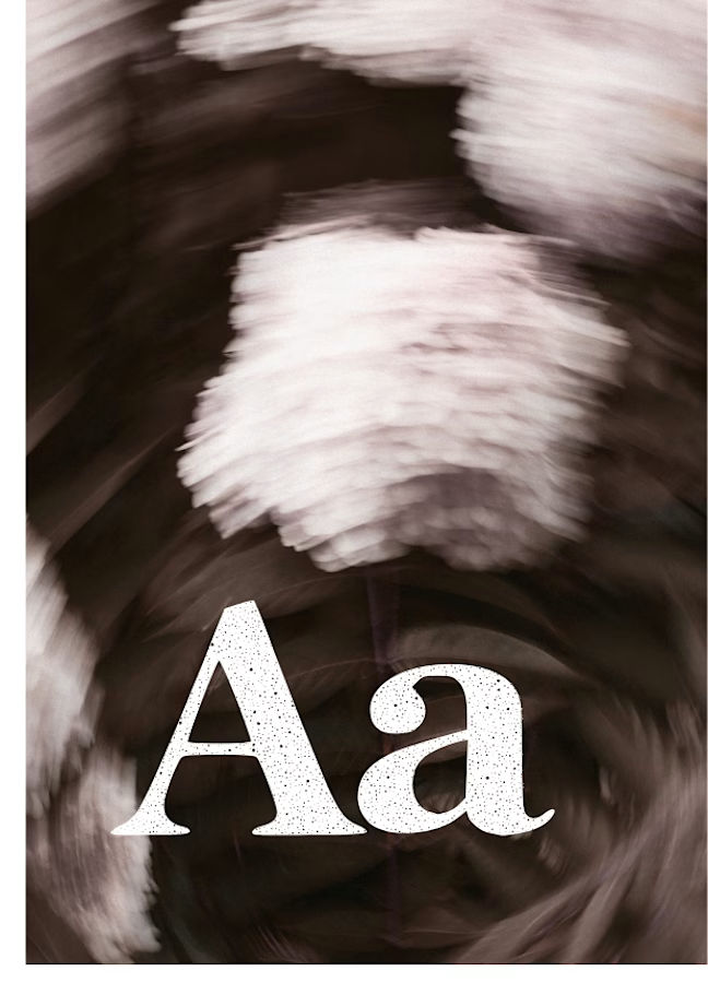
The collection includes two experimental serif typefaces: Anima Editorial, with elegant proportions and contrasting strokes, and Anima Retro, with softer, bolder shapes. Both feature grain built into the letterforms.
I developed the creative direction, custom fonts and promotional artwork, combining AI-assisted exploration with font development. The campaign pairs textured typography with motion-blurred photography to capture a warm, nostalgic mood. FREE DOWNLOAD AT https://twaperdigital.com/anima-retro



Great job Denisa the font style background and it's effects are great 🎉🎉🎉🎉
keep going Denisa🔥🔥🔥🔥
I created this font & it is free to download and use in your free or paid projects. Enjoy 🚀 find it at https://twaperdigital.com/anima-editorial


I like this font