The network for creativity
Join 1.25M professional creatives like you
Connect with clients, get discovered, and run your business 100% commission-free
Creatives on Contra have earned over $150M and we are just getting started
Back to feedPost

I finally turned one of the most repetitive parts of running a youth program into something other owners and instructors can use.
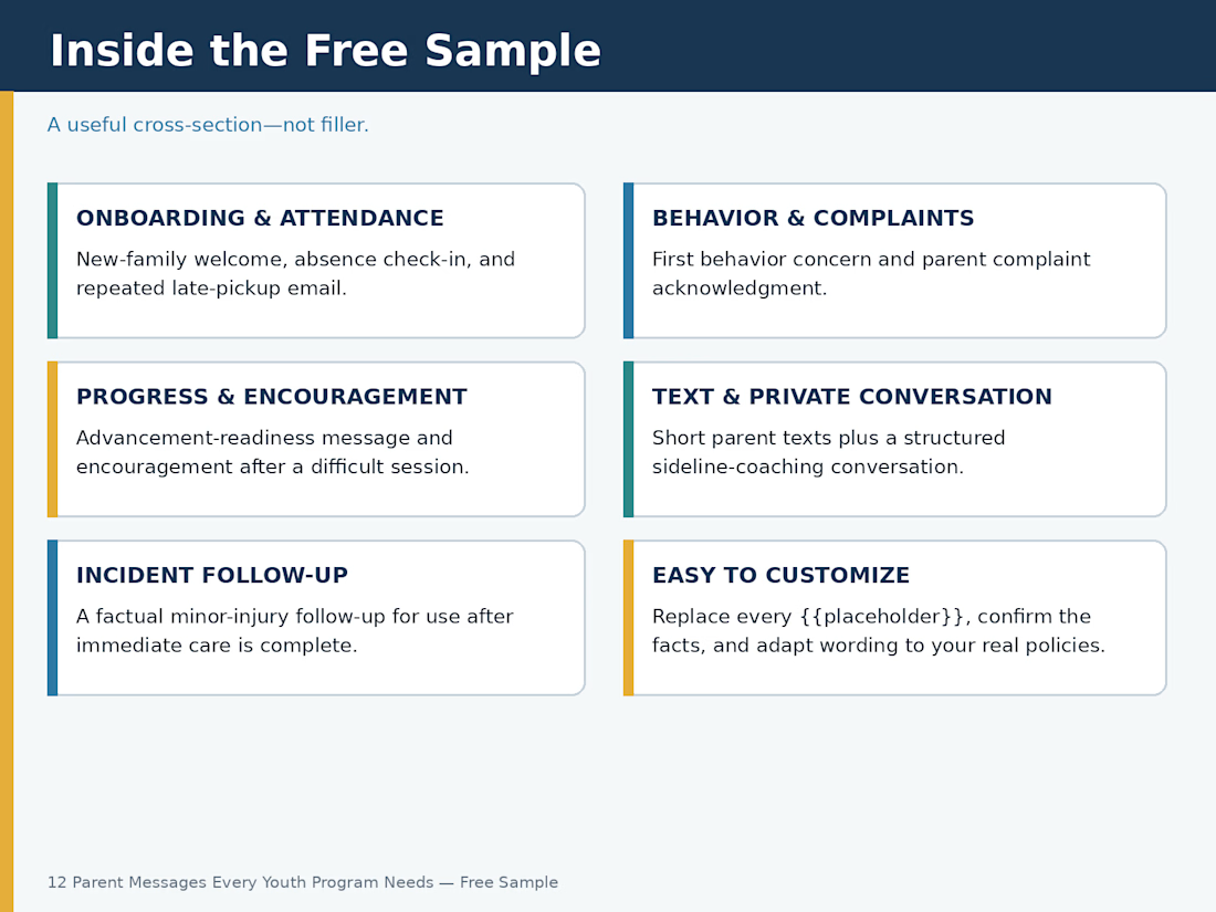
After years of writing parent messages about absences, late pickup, behavior concerns, complaints, advancement decisions, injuries, and everything in between, I built a complete communication system around those situations.
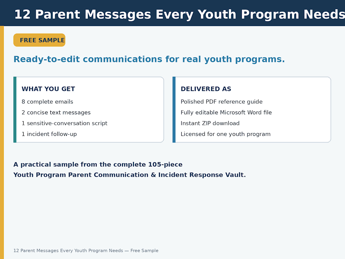
To give people a chance to see whether it’s genuinely useful, I pulled out 12 of the most practical messages and made them completely free.
The sample includes:
• 8 complete emails
• 2 concise text messages
• 1 sensitive-conversation script
• 1 factual incident follow-up
It comes as both a polished PDF and a fully editable Word-compatible DOCX file, so every message can be adjusted to match your own program, policies, and voice.
I made it for martial arts schools, youth sports teams, dance and gymnastics studios, camps, tutoring centers, after-school programs, and anyone else who regularly communicates with parents and guardians.
Download the free sample here:
https://contra.com/products/ogDZQyhN-12-parent-messages-every-youth-program-needs-free-sample
This is a sample from the complete 105-piece Youth Program Parent Communication & Incident Response Vault.
For me, advancement-readiness messages are probably the hardest. You have to be honest about where a student stands while making sure the family understands that “not yet” does not mean failure.
For anyone who works with youth and families: Which parent message takes you the longest to write?
The network for creativity
Join 1.25M professional creatives like you
Connect with clients, get discovered, and run your business 100% commission-free
Creatives on Contra have earned over $150M and we are just getting started
Challenges
View all


Related posts

Sometimes, the problem isn’t that the product doesn’t work it’s that it doesn’t feel right to use.
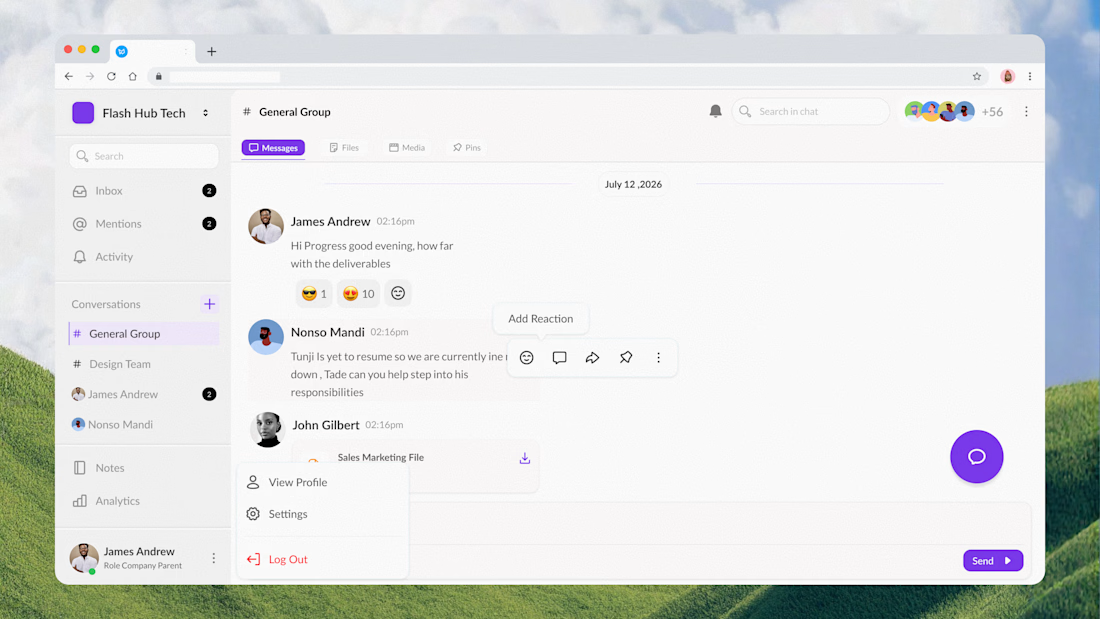
I was recently brought in to redesign an internal communication tool for an organization. The team had already vibecoded the initial interface, but as a chat product, it didn’t quite capture the natural, human feel that makes conversations easy and enjoyable.
The brief was also clear: don’t make it another Slack or Discord.
So instead of forcing familiar patterns onto the product, I reworked the interface around a more approachable conversation experience refining the layout, hierarchy, navigation, messaging patterns, and visual language to give the product its own identity while keeping communication effortless.
Here’s the final approved version for the interface , How is it looking?


Super clean work!

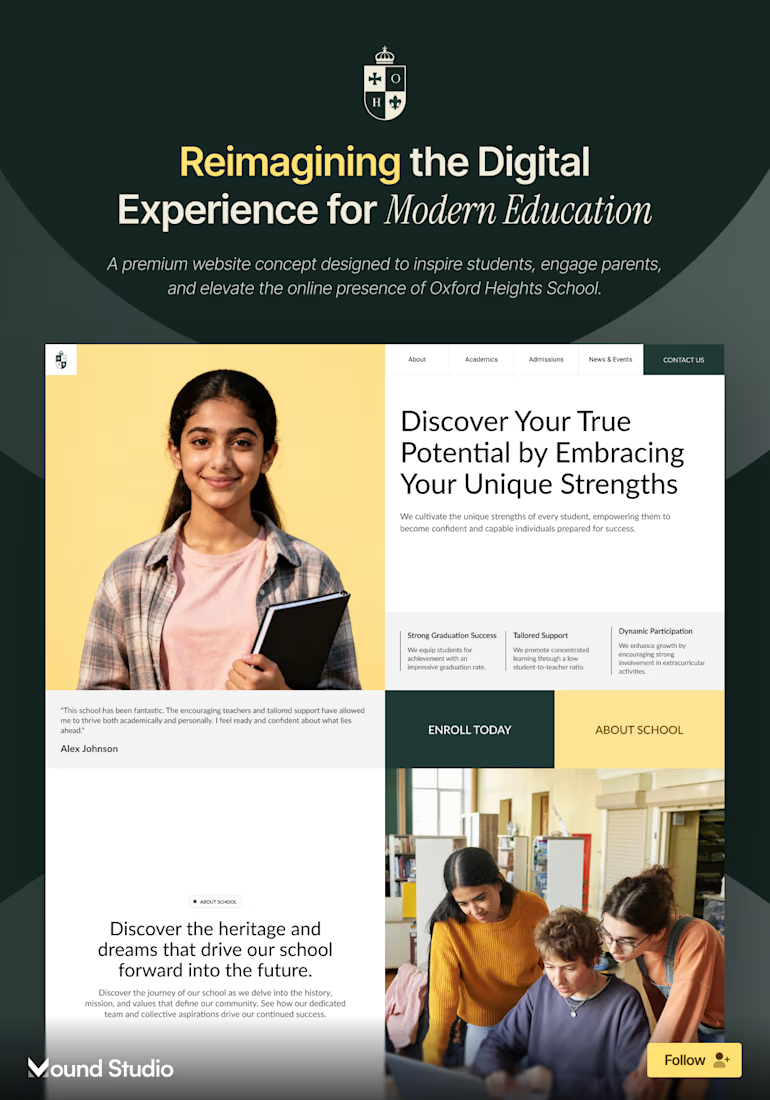
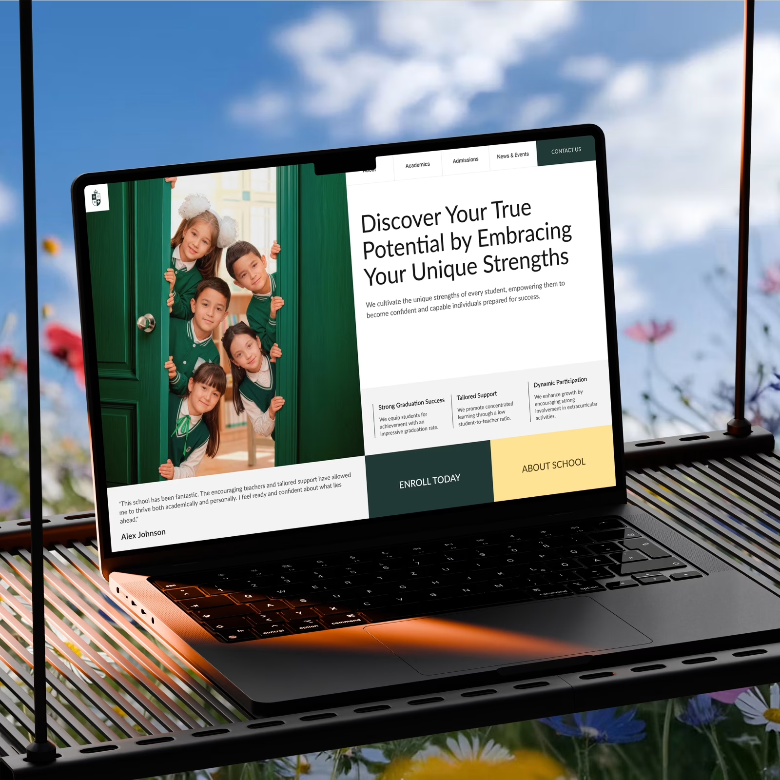
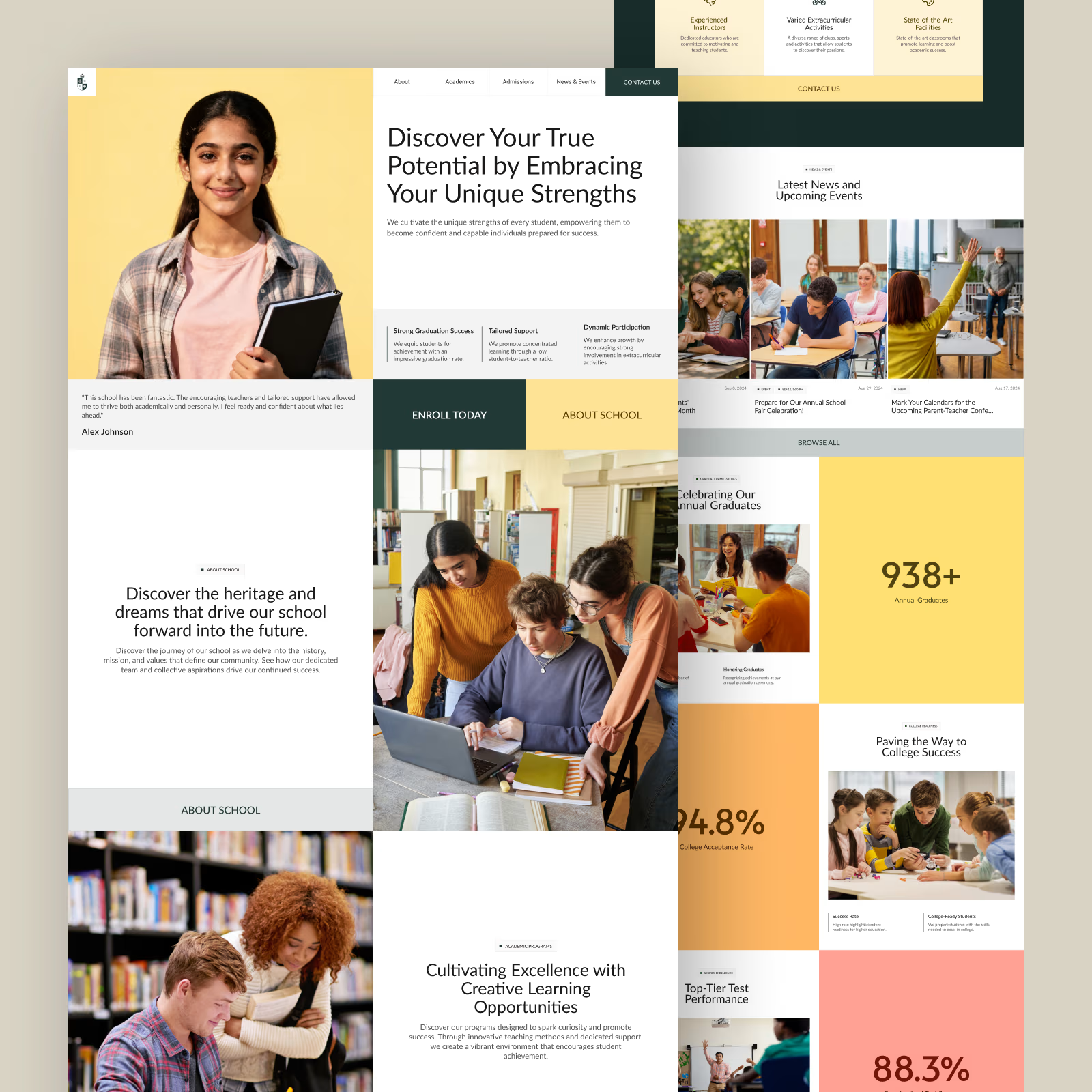
A private school website concept, built around one problem: parents comparing schools need real answers fast, not a brochure.
→ Problem: graduation rate, acceptance rate, and test scores were stuck in a downloadable PDF instead of the homepage
→ Solution: pulled those numbers onto the page, gave admissions its own named section
The mound Studio team worked this one. Have an education project? Let's talk — mound.studio


A full-stack design project for an English learning platform, covering branding, logo design, UX/UI, and responsive web and mobile experiences. Check it out