The network for creativity
Join 1.25M professional creatives like you
Connect with clients, get discovered, and run your business 100% commission-free
Creatives on Contra have earned over $150M and we are just getting started
Back to feedPost

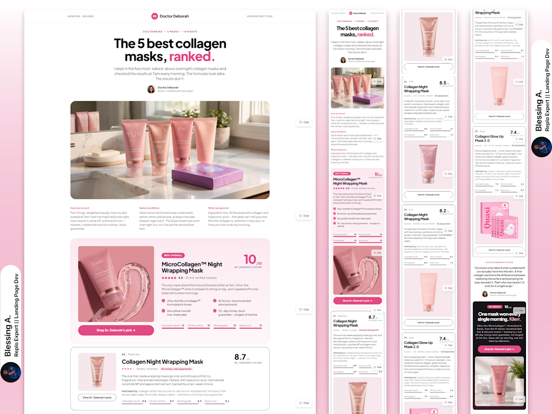
Listicle page built in Replo
The client provided the Figma design, and I brought it to life in Replo — keeping the layout, visuals, and overall experience as close to the original design as possible while making it fully responsive and conversion-focused.


The network for creativity
Join 1.25M professional creatives like you
Connect with clients, get discovered, and run your business 100% commission-free
Creatives on Contra have earned over $150M and we are just getting started



Related posts

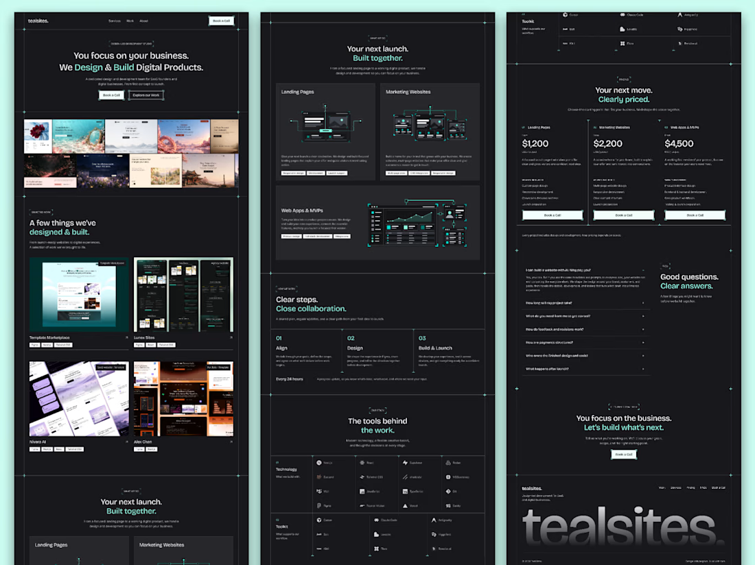
The full landing page design is complete.
I designed this website for a web design and development agency, with founders and growing businesses in mind.
Clear services, selected work, straightforward pricing and answers to common questions. Each section helps visitors understand the offer and take the next step.
Visually, I kept it consistent with teal accents, structured grids and corner details throughout.
Good to see all the sections come together.

Love how you’ve focused on clarity and consistency! The clear services and pricing make it easier for visitors to understand the offer and take the next step. 👏✨

recent website revamp for Founderled.
Founderled is the the trusted GTM partner behind 25+ founders who've raised over $750M from Tier-1 VCs like YC, Sequoia, a16z.
cooking as usual @ clarity design studio
https://cal.com/clarity-design-studio/discovery-call


Great work!

🎨 What makes an e-commerce website stand out: the design, the products, or the shopping experience?
Here’s a look at my e-commerce website design concept for a retro-inspired fashion store.
From product collections and featured items to community-inspired sections, the goal was to create a storefront that brings the brand’s personality to life while making product discovery feel effortless.
But I want to hear your honest thoughts 👇
💬 If you were improving this website, what would you focus on first?
🎨 The visual design and branding
🛍️ The product browsing experience
📱 The user experience and navigation
💰 The layout and conversion potential
Feel free to share your suggestions, even if you would do something differently. I’m always interested in hearing how other designers, founders, and e-commerce professionals think.
#EcommerceDesign #WebDesign #UIDesign #Shopify #UXDesign


The layout is perfect