The network for creativity
Join 1.25M professional creatives like you
Connect with clients, get discovered, and run your business 100% commission-free
Creatives on Contra have earned over $150M and we are just getting started
Back to feedPost

I was tired of bouncing between 5 different tools for UX research, so I built an entire Operating System for it. 🛠️
As a designer/developer, my biggest bottleneck has always been context switching. I'd have user research in one doc, personas in another, Figma open, and an accessibility checklist floating somewhere in a browser tab.
To solve my own problem, I built Edward OS, an intelligent UX/UI design studio workspace.
What it does for my daily workflow:
Research to Journey Maps: Consolidates user research, automated persona creation, and journey mapping in one spot.
Built-in Audits: Handle design reviews and accessibility checks directly in the app.
Microcopy Support: A dedicated UX writing module so I don't lose tone consistency.
I originally built this strictly as a custom tool for my own product workflows, but I'm realizing other modern product teams might face the exact same friction.
Check it out here: Edward OS
💬 To the Founders, Product Managers, and Builders here: If you were using an AI workspace like this to scale your design workflow, what is the one feature missing that would make this an instant daily driver for your team? Would love your brutal feedback on the architecture!


The network for creativity
Join 1.25M professional creatives like you
Connect with clients, get discovered, and run your business 100% commission-free
Creatives on Contra have earned over $150M and we are just getting started



Related posts

A CPU runs four stages in under a nanosecond. Fetch, decode, execute, write back.
Try explaining that in a paragraph.
So I made a 3D exploration where every scroll is one stage. A piece turns from a technical drawing into 3D and locks into place, until the chip is complete.
When people can see what your product does, they don't need a paragraph to believe it.

Nice!

Dark Mode 🖤 or Light Mode 🤍?
Which one matches your vibe? 👀
15 voted
54%
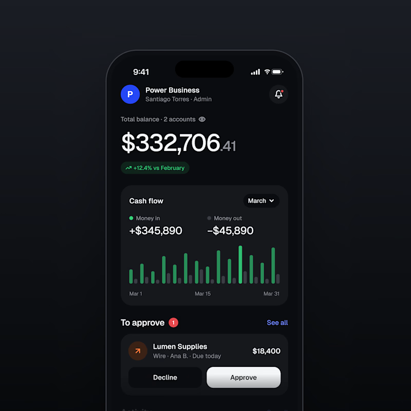
13 voted
46%
28 votes
Closed

Both are nice clean designs...for me,Dark mode!

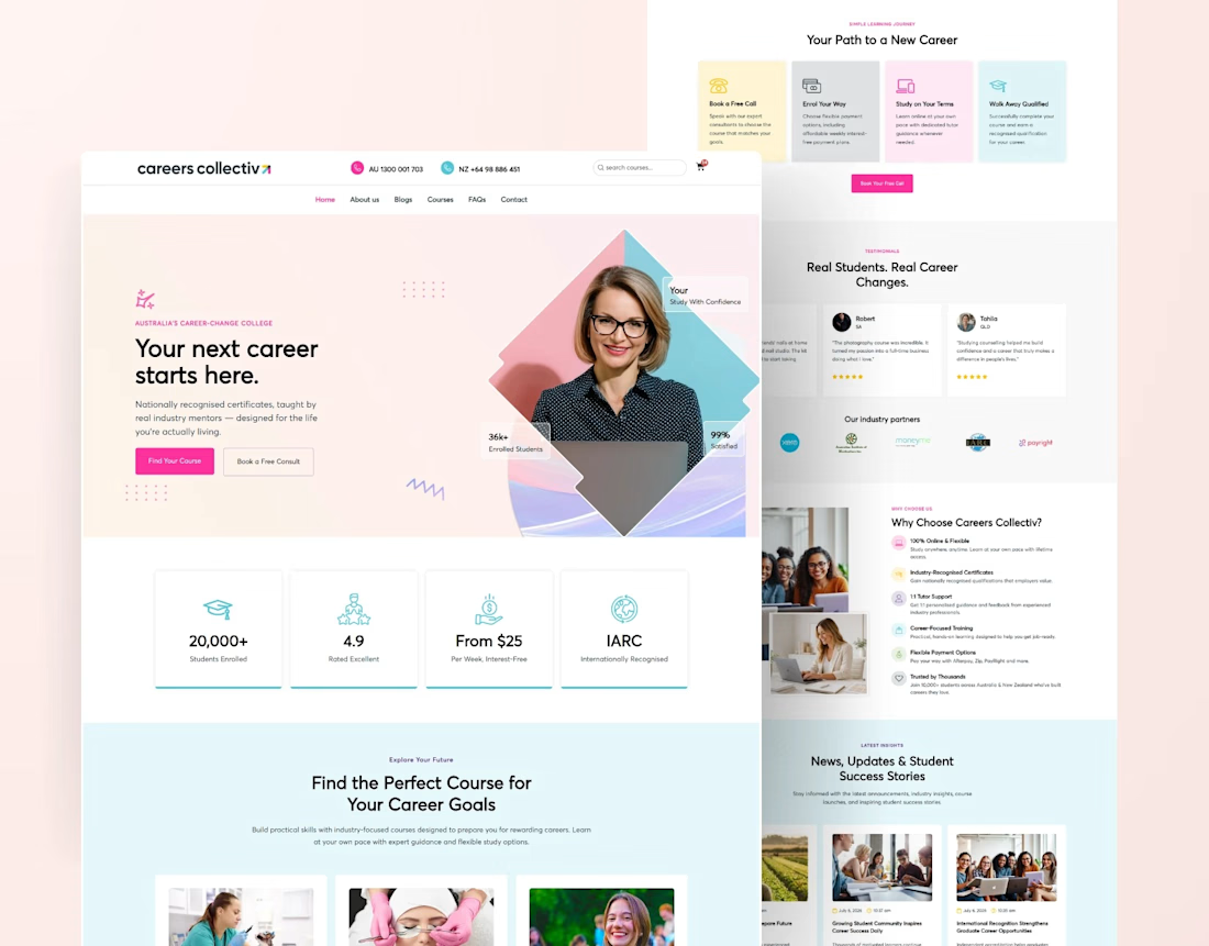
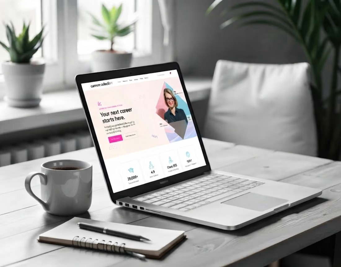
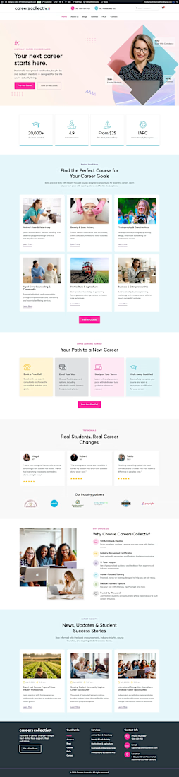
Educational College Website | Modern Kajabi Web Design
This project was about turning a college's online presence from a digital brochure into something that actually enrolls students. They needed a website that loaded fast, guided visitors naturally, and made the leap from "I'm interested" to "I'm applying" feel obvious.
Built on Kajabi, so the whole thing runs in one system: no clunky add-ons, no plugins fighting each other, no inflated maintenance.
What went into it:
Modern, mobile-first design that reflects identity
Clear program and course pages that answer questions before they're asked
A streamlined admissions funnel from first visit to application
pages, all built to convert, not just to look pretty
The part I care about most: it performs. Every section exists to move a prospective student one step closer to saying yes.
If your school, academy, or education brand is living on a dated site, that's my lane. Let's build yours.