The network for creativity
Join 1.25M professional creatives like you
Connect with clients, get discovered, and run your business 100% commission-free
Creatives on Contra have earned over $150M and we are just getting started
Back to feedPost

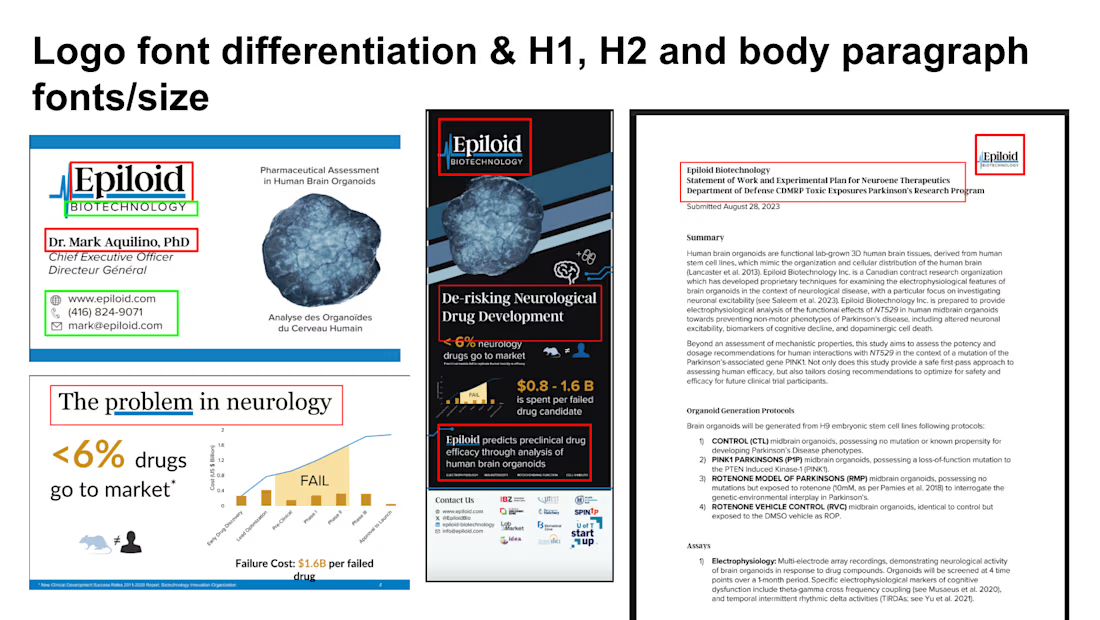
Brand & Template System - Eploid Biotechnology

The network for creativity
Join 1.25M professional creatives like you
Connect with clients, get discovered, and run your business 100% commission-free
Creatives on Contra have earned over $150M and we are just getting started





Related posts

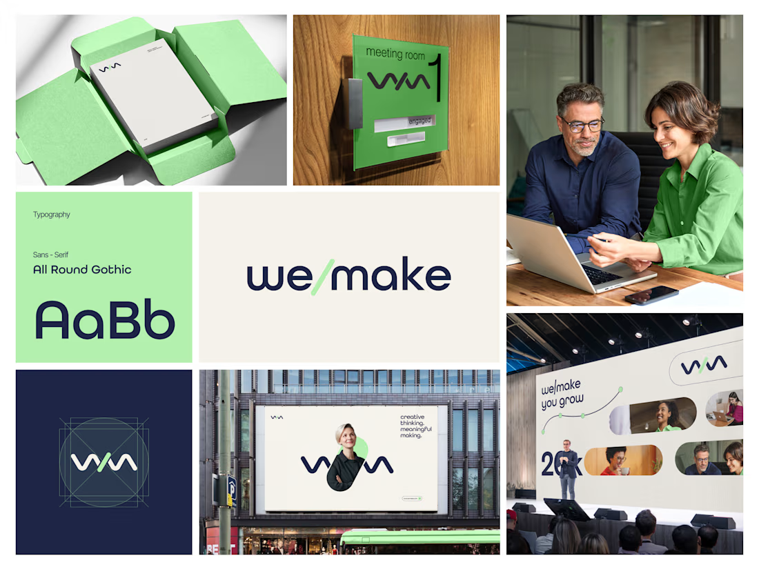
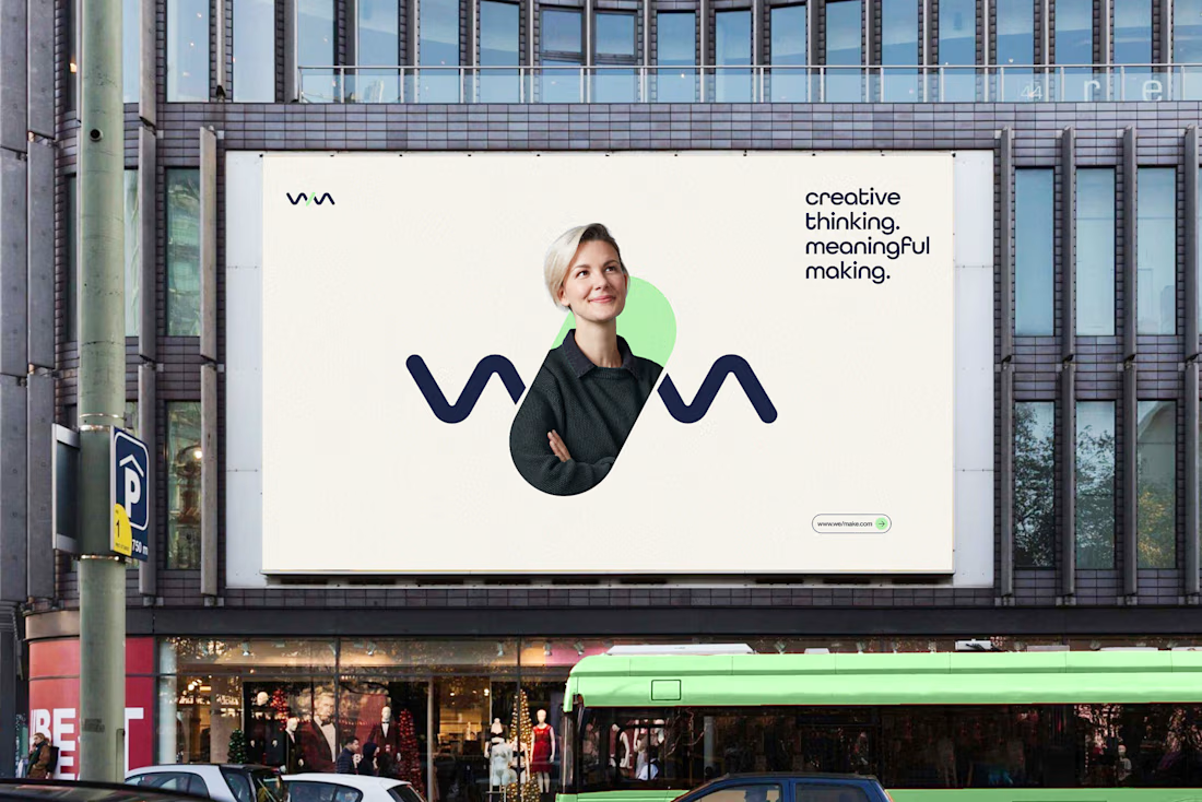
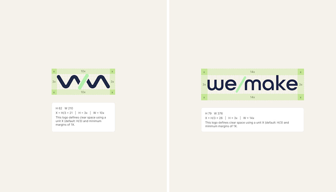
We/Make - Brand Identity Designed for Business Growth
A strategic brand identity for We/Make, built to create a stronger market presence, communicate credibility, and give the business a clear, recognizable visual position.
Rather than creating a logo in isolation, we developed a scalable identity system that helps the brand communicate consistently across digital touchpoints and build stronger recognition as the business grows.
The focus:
→ Clearer brand positioning
→ Stronger visual recognition
→ More credible & professional presence
→ Consistent communication across touchpoints
→ A flexible identity system built for long-term growth
Deliverables: Logo Identity · Visual System · Typography · Color Direction · Brand Guidelines · Logo Construction & Clear Space
Brand Strategy | Brand Identity | Logo Design | Visual Identity | Brand Guidelines | Business Branding
#BrandIdentity #BrandStrategy #LogoDesign #VisualIdentity #Branding #BrandGuidelines #BusinessBranding #BrandDesign #ContraDesigner #CreativeStrategy



This is brilliant


Elias Vent’s services page puts large service names beside a preview of the work. The second image shows a project detail page.
Framer template: https://startfrom.co/templates/elias-vent
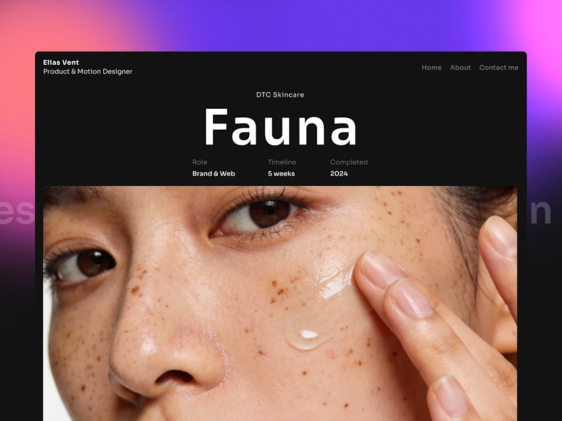
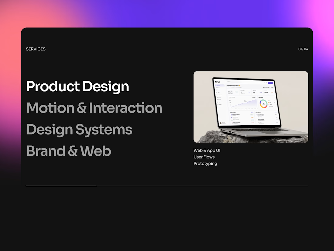

Pairing the service name directly with a preview image instead of making people click through is such an easy win that gets skipped constantly. Does the layout hold up once a client has more than two or three offerings, or does it start to feel cluttered past that?

I tried to create the cleanest AI/SaaS startup template.
Please check and share your thoughts!
https://www.framer.com/marketplace/templates/novasai/


Every interaction remembered, context never lost is a genuinely good hero line for an AI product, it sells the benefit not the tech. That soft blue gradient keeps it calm instead of the usual dark techy template look. Clean build.