The network for creativity
Join 1.25M professional creatives like you
Connect with clients, get discovered, and run your business 100% commission-free
Creatives on Contra have earned over $150M and we are just getting started
Back to feedPost

Defining the aesthetic: Curated, modern and intentional. A quick look at a motion project currently in the works.


Very elegant visual language. Curious — was the muted palette driven more by brand strategy or aesthetic exploration?
Makes sense — lighting is incredibly powerful for shaping emotional tone. The contrast and depth here really influence how the composition feels. Strong exploration.
The network for creativity
Join 1.25M professional creatives like you
Connect with clients, get discovered, and run your business 100% commission-free
Creatives on Contra have earned over $150M and we are just getting started











Related posts

A flower that inflates arrives in the mail.
Next month, a phone made of shell.
STILL LIFE SERVICE. Case study dropping soon.
Which object earns your shelf? Reply below.
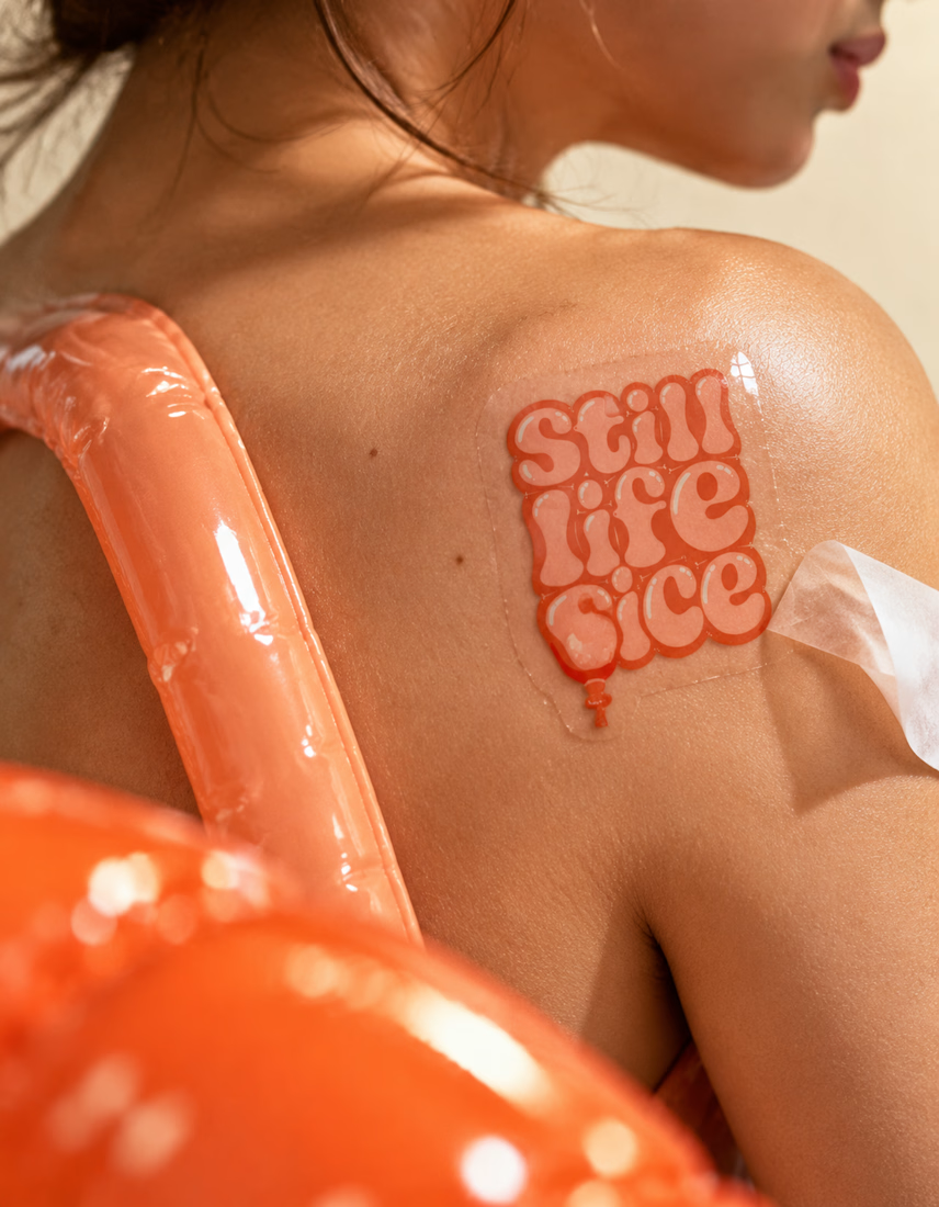
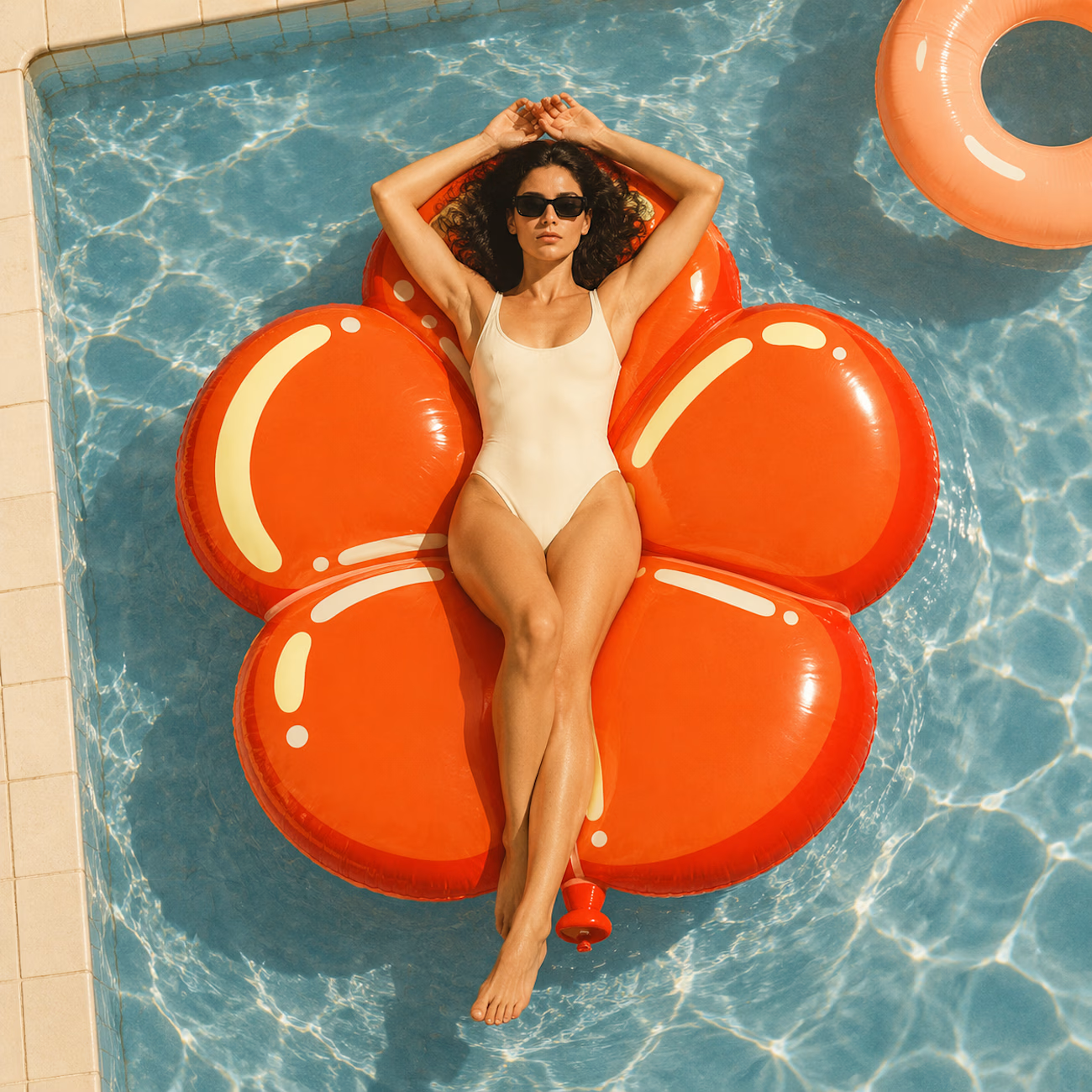
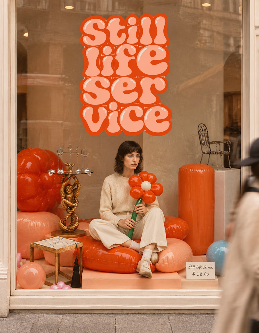

The inflatable flower. Only houseplant I'm guaranteed not to kill. Also, a new object every month is a sneaky good retention hook, people will stay subscribed just to see what's next.

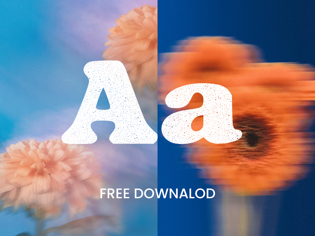
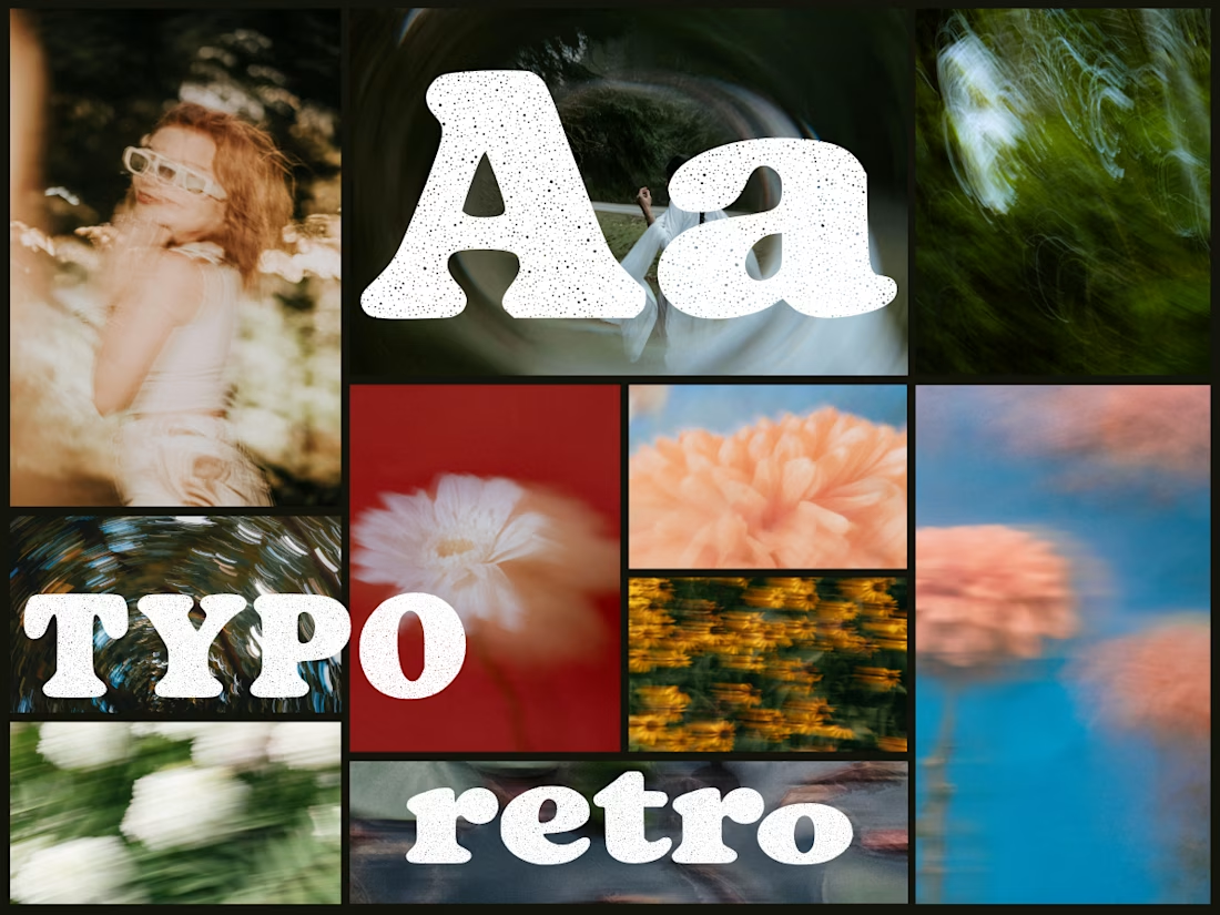
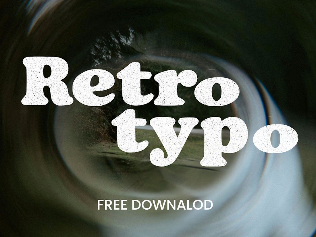
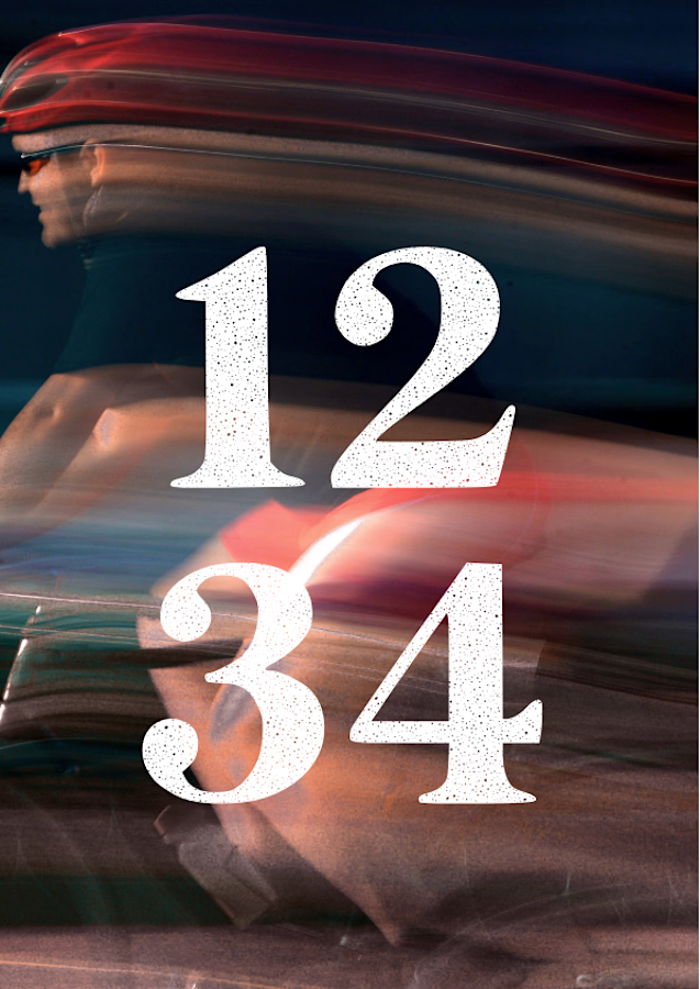
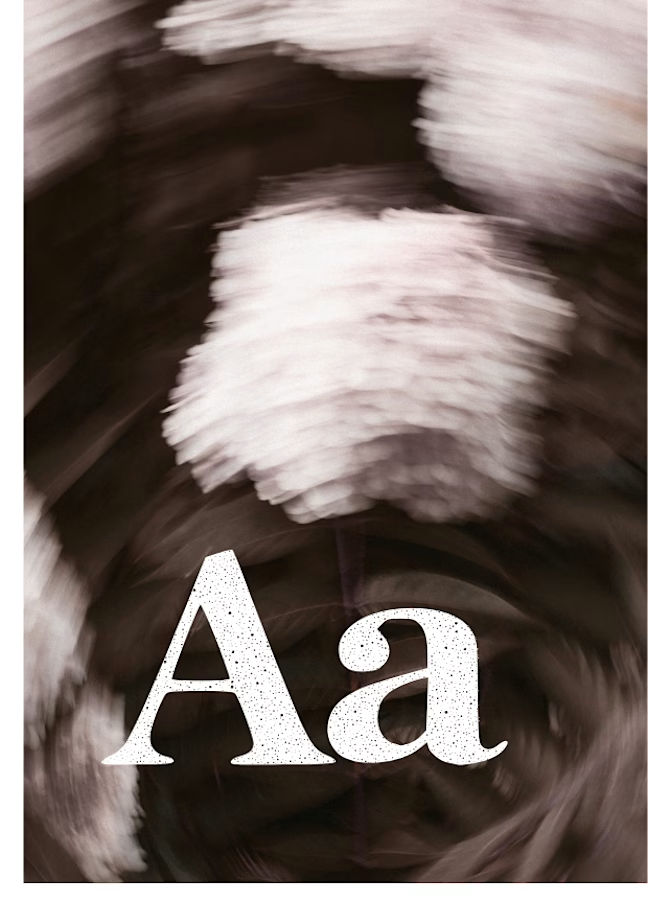
Anima is a self-initiated type design project inspired by vintage print, worn ink and analog photography.
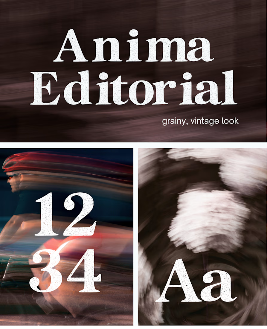
The collection includes two experimental serif typefaces: Anima Editorial, with elegant proportions and contrasting strokes, and Anima Retro, with softer, bolder shapes. Both feature grain built into the letterforms.
I developed the creative direction, custom fonts and promotional artwork, combining AI-assisted exploration with font development. The campaign pairs textured typography with motion-blurred photography to capture a warm, nostalgic mood. FREE DOWNLOAD AT https://twaperdigital.com/anima-retro


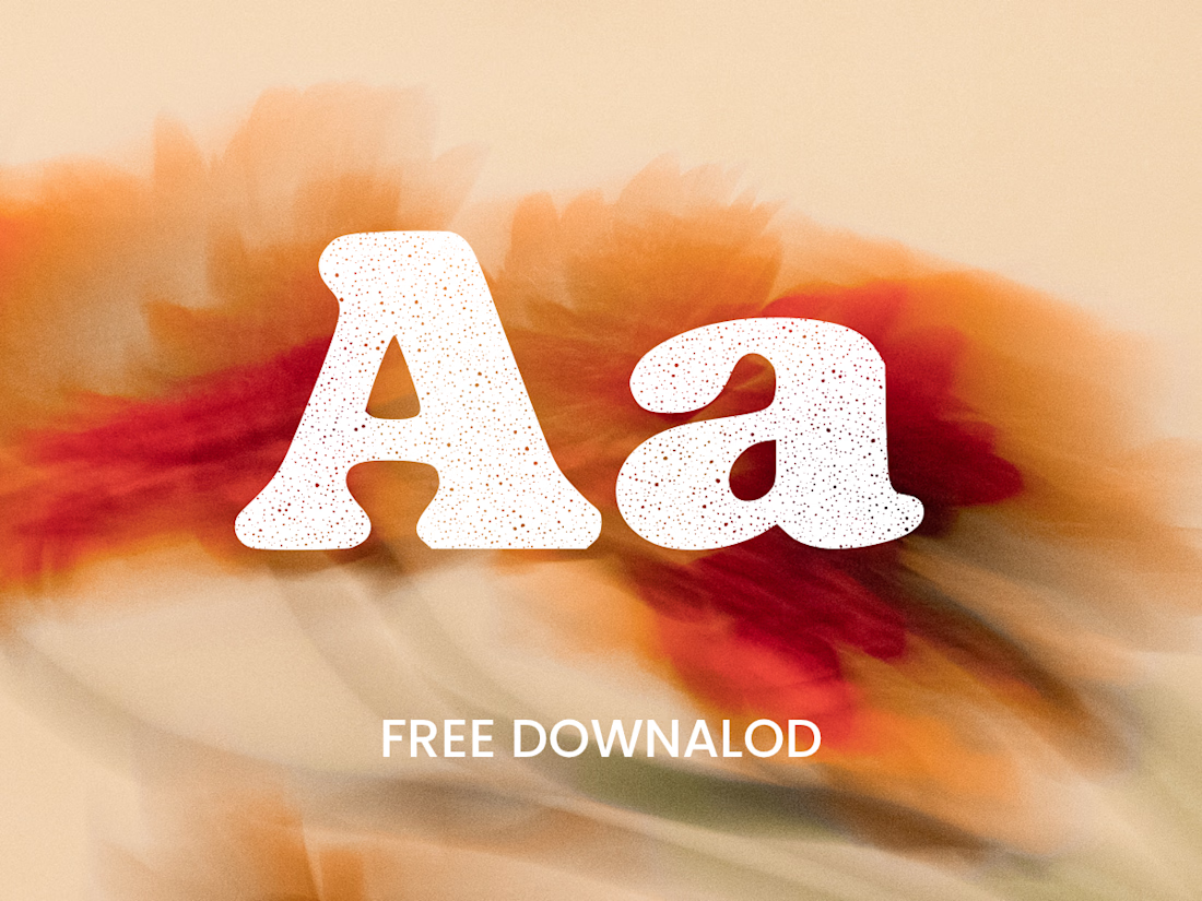

Great job Denisa the font style background and it's effects are great 🎉🎉🎉🎉
keep going Denisa🔥🔥🔥🔥
I created this font & it is free to download and use in your free or paid projects. Enjoy 🚀 find it at https://twaperdigital.com/anima-editorial


I like this font