The network for creativity
Join 1.25M professional creatives like you
Connect with clients, get discovered, and run your business 100% commission-free
Creatives on Contra have earned over $150M and we are just getting started
Back to feedPost
Taste Test
🚀 Design Challenge — Which Concept Wins? 👀
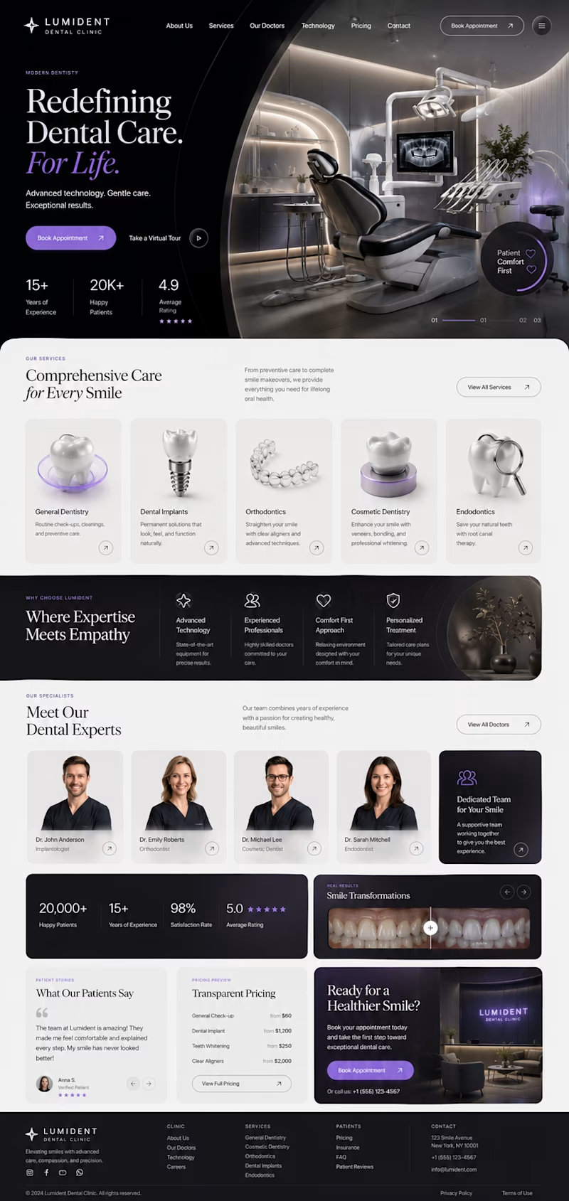
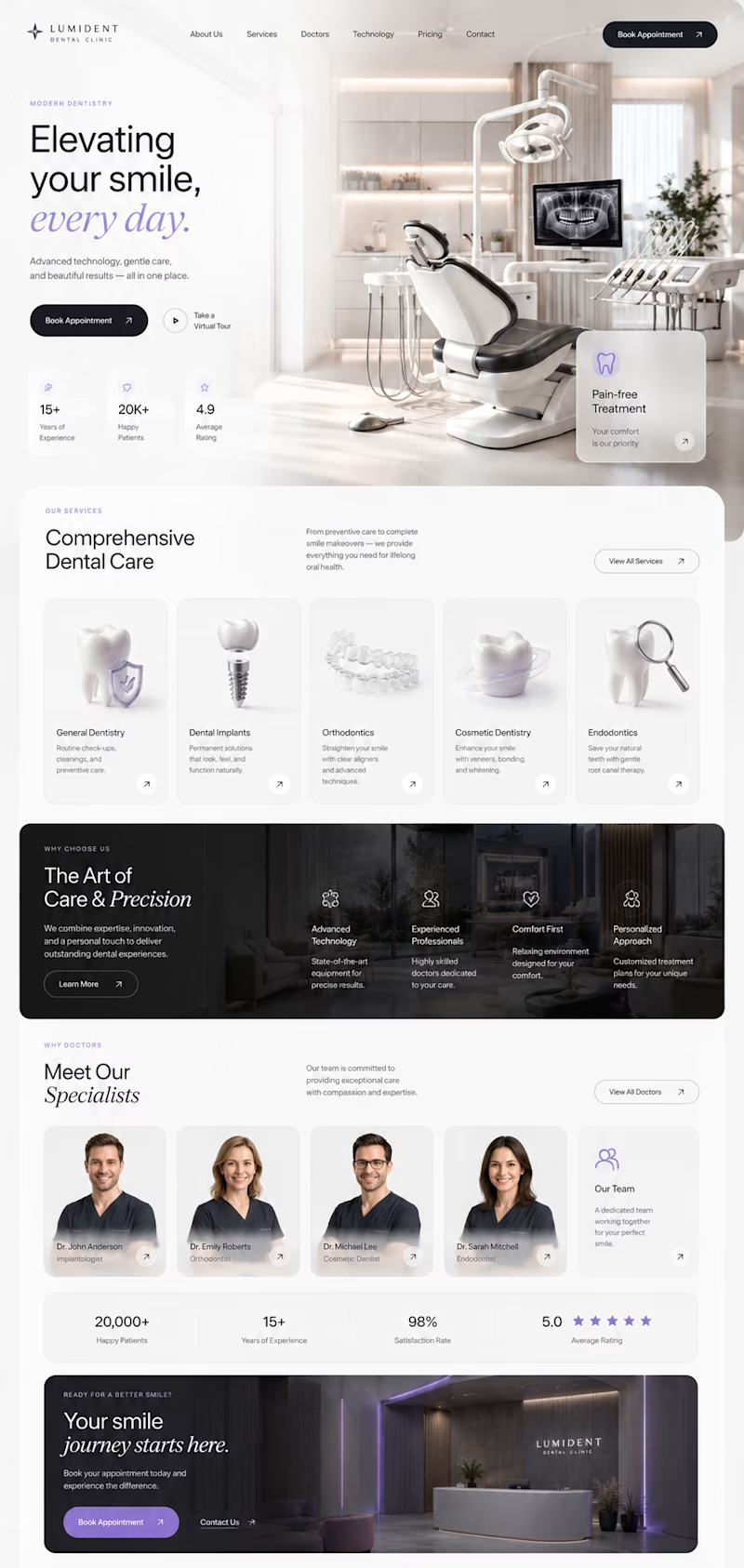
I've been exploring two different directions for a premium dental clinic website, both designed from scratch with a focus on modern UI, clean UX, and strong visual storytelling.
🦷 Concept A
✨ Bold editorial layout
✨ Minimal luxury aesthetic
✨ Large typography
✨ Premium 3D visuals
✨ High contrast & cinematic feel
VS.
🦷 Concept B
🌿 Bright and elegant
✨ Spacious composition
✨ Softer premium look
✨ Modern cards & subtle glass effects
✨ Clean, approachable experience
Both concepts are aimed at creating trust while feeling distinctive—not like another generic medical website.
👇 Which one would you choose and why?
A or B?
Your feedback will help shape the final direction. 💜


4 voted
27%
11 voted
73%
15 votes
Closed

Wonderful !

Voted for A. The dark editorial approach with the bold headline actually makes a dental site feel premium instead of clinical, and it stands out more against the sea of bright blue dentist websites out there.

I went with B. For a dental clinic the real job is trust and calm, and the bright spacious layout reads clean and approachable, which is what actually gets someone to book. A is stunning, but a high contrast cinematic theme can make healthcare feel like a luxury brand rather than a place you trust with your teeth.

Going for B

Concept A's dark cinematic mode feels premium but might read as a little intimidating for a dental site, patients usually want reassurance over drama. Was this tested with actual patient personas or is it more of a portfolio exploration?

This is being tested for an existing client, and I liked both options, but I wanted to ask what other people thought about it🙌

variety B is more easy to scan from the design layout
The network for creativity
Join 1.25M professional creatives like you
Connect with clients, get discovered, and run your business 100% commission-free
Creatives on Contra have earned over $150M and we are just getting started
Trending

Claude
Claude has entered the design space. How are you using it?

Contra University
Learn from expert creatives how to earn more using next-gen AI tools.
Brand Design
The best brand designers are on Contra. Scroll to see what's trending in brand design. What are you building?
creativeaiflow
Creative AI workflows are evolving. What tools do you use, and what are their strengths and weaknesses?
freelancerlife
Freelancer life is wins, pivots, and everything in between. What’s yours right now?






Related posts

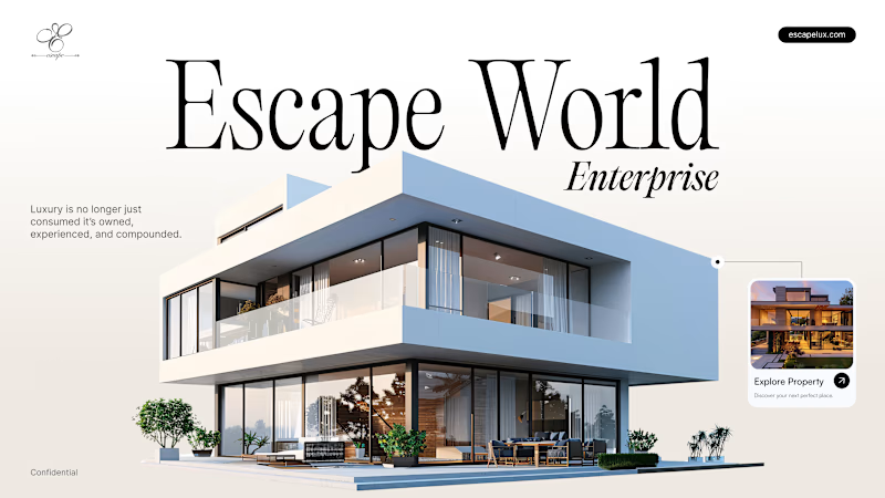
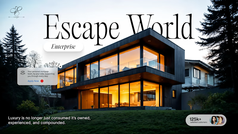
"Luxury is no longer just consumed, it's owned, experienced, and compounded."
Two different ways to sell the dream.
Which hero makes you click "Explore"? 👇
16 voted
23%
53 voted
77%
69 votes
Closed

Cinematic twilight for me. 🌆 That golden-hour mood makes luxury feel like something you step into.

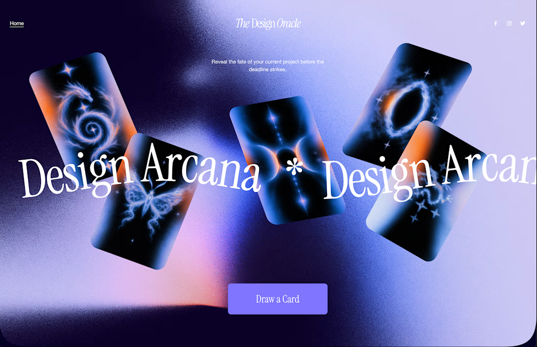
The Design Oracle is Live ✨ | Squarespace Make It Real Challenge
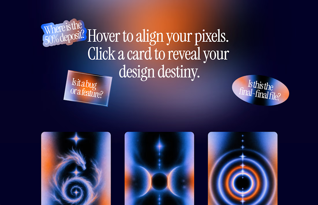
Ever wondered if that "final_FINAL_v4" file is actually the last one? Or if the client will ask to make the logo just a little bit bigger? Let the cards decide. 🔮
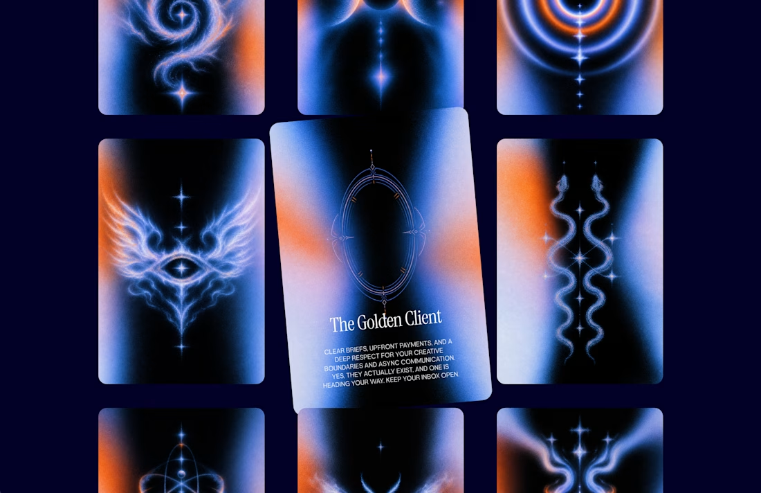
I’m thrilled to unveil The Design Oracle (or Design Arcana)—an interactive, mystical tarot experience created specifically for freelancers and designers to reveal the fate of their current projects.
This is my official submission for the Squarespace Make It Real Challenge. My goal was to completely break away from standard grid layouts and see how far I could push the creative boundaries using the new Finish Layer tools.
Here is how the magic works behind the scenes (without a single line of custom code):
Z-Axis & Overlapping: Used Fluid Engine to scatter the cards and floating stickers across the canvas, creating depth and a true "spread" feel.
Hover Reveals: Leveraged native image swap effects so users can organically "draw" a card just by exploring the screen.
Mobile Overrides: Rebuilt the entire chaotic desktop spread into a sleek, functional vertical stack for perfect mobile UX.
After over a decade in UI/UX and brand design, I still believe the best projects start with pure creativity before locking into rigid systems. This was incredibly fun to build.
Will you pull "The Golden Client" or "The Wheel of Feedback"?
Take a deep breath, align your pixels, and draw your card here:
https://round-herring-m73p.squarespace.
Password: contrathebest
I'd love to hear which destiny you got in the comments! 👇




Awesome work🔥👏👏