The network for creativity
Join 1.25M professional creatives like you
Connect with clients, get discovered, and run your business 100% commission-free
Creatives on Contra have earned over $150M and we are just getting started
Back to feedPost
Taste Test

Which one is better for delivery ?
#aivideo
2 voted
100%
0 voted
0%
2 votes
Closed

Both are absolutely brilliant 👌

Both are nice but Google flow work perfect
The network for creativity
Join 1.25M professional creatives like you
Connect with clients, get discovered, and run your business 100% commission-free
Creatives on Contra have earned over $150M and we are just getting started










Related posts

Help us decide between two different page loaders
0 voted
0%
3 voted
100%
3 votes
Closed

Both look interesting! Curious to see the animations - page loaders set the whole vibe for the site! Which one feels more on-brand for you? Can't see the preview clearly but excited to see the motion!

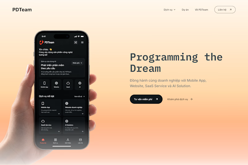
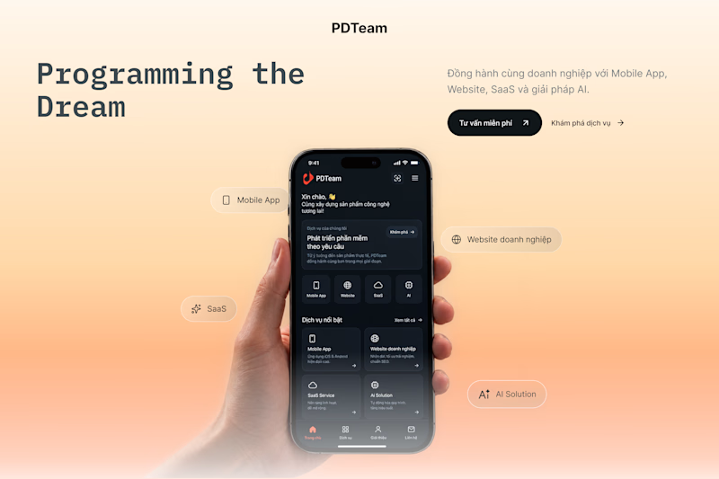
what should i choose for my personal team website
1 voted
33%
2 voted
67%
3 votes
Closed


id try the right one but bump the headline up a size, it reads kinda small next to the phone..

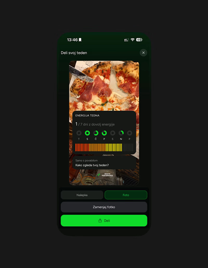
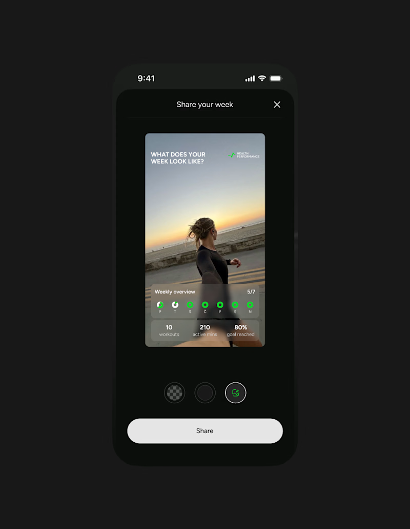
This week client came to me with a new idea for their app's share feature. They were trying something with Claude... But let's simplify this thingy:)
Let's remove all the buttons that confused me already - imagine what they'd do to a user...
Take our predefined bottom sheet and give our users 3 simple choices.
GOALS:
make it as simple as possible for our target persona (35-55 y/olds that aren't necessarily as modern and advanced in tech)
Create an aesthetically pleasing UI frame for stories, that makes people want the app & their lifestyle.
Which one would you go with?
SPOILER ALERT 🚨 we absolutely went with the after result😆
0 voted
0%
5 voted
100%
5 votes
Closed
