The network for creativity
Join 1.25M professional creatives like you
Connect with clients, get discovered, and run your business 100% commission-free
Creatives on Contra have earned over $150M and we are just getting started
Back to feedPost
Taste Test

Designed 2 Hero's
A or B?
36 voted
38%
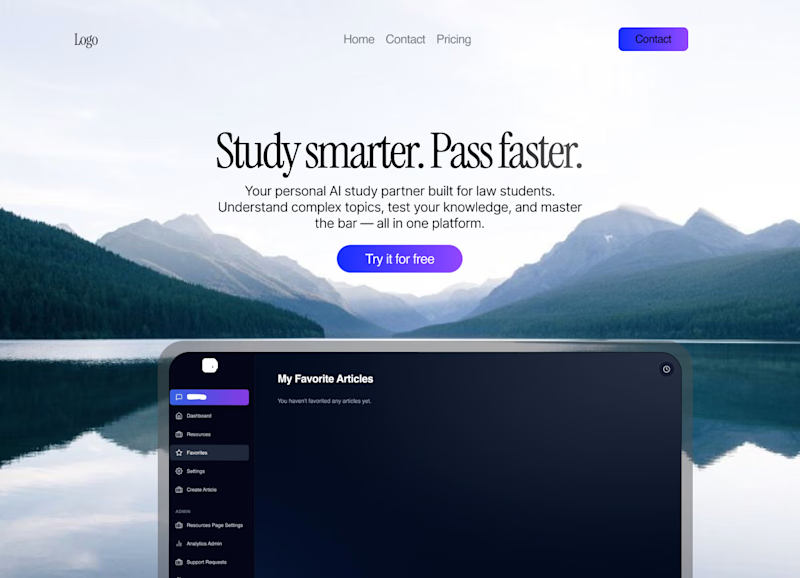
59 voted
62%
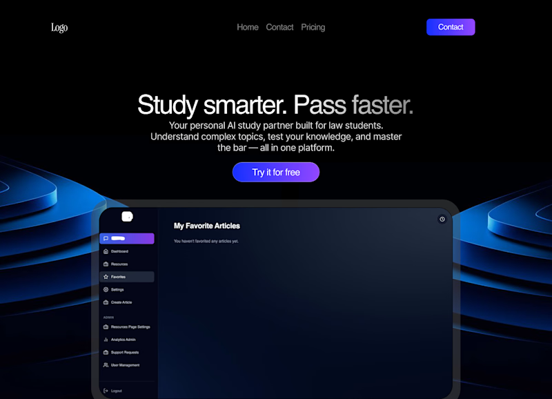
95 votes
Closed

B is better

B

B matches the dashboard styling better

A is more attractive!

Option B is more aligned with the goals.

B clearly wins, stronger contrast on that CTA pulls the eye instantly, perfect for conversion driven heroes

great work 🔥

Dark looks more better!

Although B reminds me of the Amazon Prime intro logo, it reads a lot better in comparison to A. I do like the spacing between button and screen on A though. Great Job!


Variant B is amazing

B is cooler.

B feels a bit crowded to me with the elements

A looks more shiny but way more distracting, I think B would convert better

Use Both

The type is better imo, but I think both designs lack focus and a specific feel for your product, and both images should probably vary less, but great work

B looks clean 🙌 @Danish Nazar

B is better

B

bold and confident vibes!

B works for me

i love the dark mode

I'll go for B
The network for creativity
Join 1.25M professional creatives like you
Connect with clients, get discovered, and run your business 100% commission-free
Creatives on Contra have earned over $150M and we are just getting started





