The network for creativity
Join 1.25M professional creatives like you
Connect with clients, get discovered, and run your business 100% commission-free
Creatives on Contra have earned over $150M and we are just getting started
Back to feedPost
Taste Test

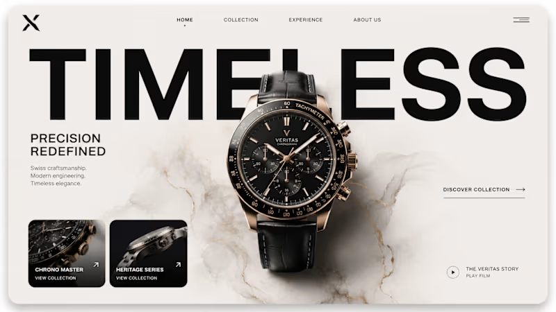
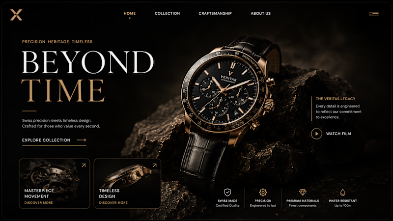
I’m art-directing the homepage for a new luxury watch house, and I hit a fork in the road:
A leans into restraint — precision, whitespace, quiet confidence.
B leans into emotion — atmosphere, heritage, and drama.
You have one screen and 3 seconds to make someone believe this brand is worth $10,000+.
Which direction earns that trust faster — and what would you change before launch?
0 voted
1%
0 voted
1%
0 votes
Closed
The network for creativity
Join 1.25M professional creatives like you
Connect with clients, get discovered, and run your business 100% commission-free
Creatives on Contra have earned over $150M and we are just getting started








Related posts

Which colour palette would you choose for the banner design for a domain business? 🔥 Fiery or 🧊 Frosty?
20 voted
36%
35 voted
64%
55 votes
Closed

Frosty seems really cool for me!!


Gorgeous 😍

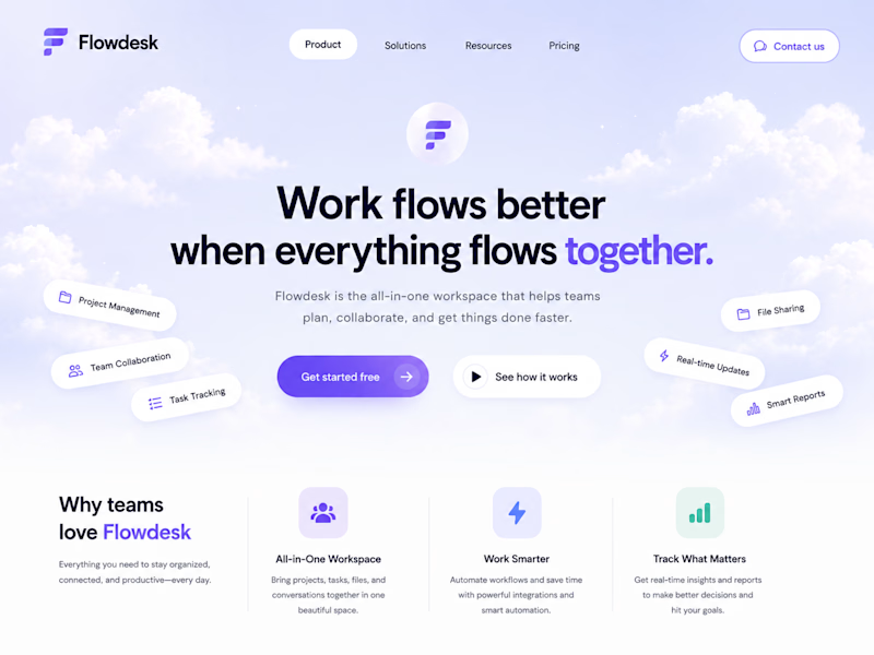
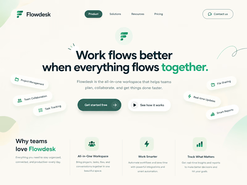
One SaaS header, two personalities.
Color changes how a product feels before anyone reads a word.

6 voted
86%
1 voted
14%
7 votes
Closed


Both work well, but I’d go with Modern. The stronger colors make the SaaS brand stand out more.