The network for creativity
Join 1.25M professional creatives like you
Connect with clients, get discovered, and run your business 100% commission-free
Creatives on Contra have earned over $150M and we are just getting started
Back to feedPost
Taste Test

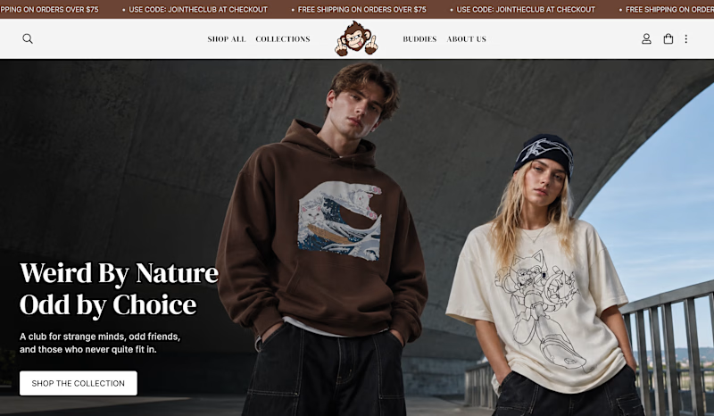
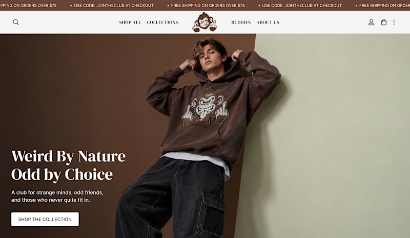
I was exploring two different hero directions for the same streetwear brand.
One feels more raw, bold, and editorial using an outdoor setting.
The other feels more focused, minimal, and art-directed.
Which direction would you go with? 👇
1 voted
50%
1 voted
50%
2 votes
Closed
The network for creativity
Join 1.25M professional creatives like you
Connect with clients, get discovered, and run your business 100% commission-free
Creatives on Contra have earned over $150M and we are just getting started






Related posts

Same 18 seconds, two middles. One pulls you through a tunnel of banners, one lays them out. 1 or 2.
23 voted
55%
19 voted
45%
42 votes
Closed

2 — the laid-out banners read clearer.


Hover Effects: Decoration or Function?
The same online course card can respond to hover in very different ways.
Version A - Visual Hover
The image slightly zooms in, the card lifts, and the CTA arrow moves to the right. It signals that the card is interactive and makes the interface feel more dynamic, but it doesn’t provide any new information.
Version B - Functional Hover
The unedited portrait smoothly transitions into the final retouched version. Users can immediately see the potential outcome of the course before opening its page.
Both options add motion, but they serve different purposes: one attracts attention, while the other supports decision-making.
Which hover would you choose for an online course library?
9 voted
28%
23 voted
72%
32 votes
Closed

Definitely Version B. For visual skills like Photoshop retouching, seeing the actual outcome on hover answers the learner's biggest question immediately.

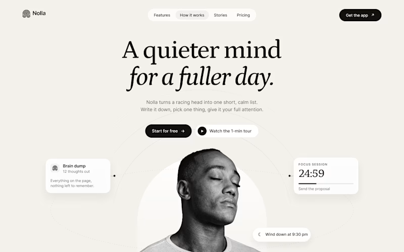
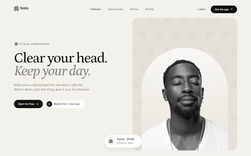
Started a new concept this week: Nolla, a small app for people whose heads won't stop running.
Same words, same brand kit, two hero layouts.
A puts everything in the middle. He sits inside an arch taken straight from the logo, and his to-dos orbit around him.
B is a split. Words on the left. On the right, the logo mark repeats into a quiet pattern behind him.
Fonts are Petrona and Inter.
Which one would make you download the app?


15 voted
71%
6 voted
29%
21 votes
Closed

Split feels more balanced to me!