The network for creativity
Join 1.25M professional creatives like you
Connect with clients, get discovered, and run your business 100% commission-free
Creatives on Contra have earned over $150M and we are just getting started
Back to feedPost

🐾 A website made for people who treat their pets like family.
Designed a premium pet care e-commerce and services website for dogs & cats, with a warm visual direction that feels trustworthy, friendly, and modern.
The design was created in Figma and brought to life in Framer, with a focus on creating a strong visual experience without making the interface feel complicated.
What I focused on:
• Custom Figma UI design
• Framer website design & development
• Dog & cat focused visual identity
• Large editorial-style hero sections
• Interactive service and product cards
• Smooth hover interactions
• Clear appointment and shopping CTAs
• Testimonials and trust-building sections
• Responsive layout
• Custom typography, spacing and visual hierarchy
The idea was to create something that feels premium enough for a modern pet-care brand while still being warm and approachable.
Built for pets. Designed for their people. 🐶🐱
#Framer #Figma #WebDesign #UIUX #PetCare #EcommerceDesign #FramerDesigner #FigmaDesigner #WebDesignInspiration #Contra


This is seriously well done 🔥

Like it😍
The network for creativity
Join 1.25M professional creatives like you
Connect with clients, get discovered, and run your business 100% commission-free
Creatives on Contra have earned over $150M and we are just getting started



Related posts


Some concept work from the agency. Planning to share more of what we create, from clean interfaces to the little motion details that bring them to life.
Check out the website: https://urest.agency/


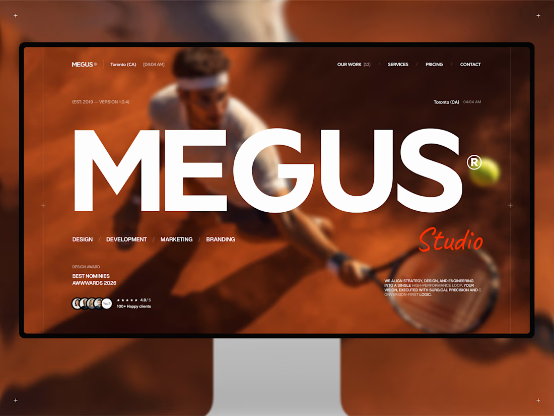
Finally, MEGUS® ⚡️ is live on the @Framer Marketplace! 🚀
After 2 months of focused work, the template is now published and ready.
MEGUS is a complete system for modern brand and portfolio sites — strategy, identity, motion, and development in one cohesive setup. 👾
Explore the full template and see it in action here:
https://www.framer.com/marketplace/templates/megus/
Available now. ⚡️

What if sending money felt a little more like giving a gift?
For Nova, I explored a banking app that brings payments, cards, and a bit of personality together. You can check your balance, browse recent transactions, send or request money, top up, and pay bills.
My favorite part is the digital postcard feature. Before sending a transfer, you can add a little illustrated card—a heart, a birthday greeting, or a playful character. A simple way to make birthday money or a thank-you feel more personal.
I carried that same 3D character into onboarding, pairing it with bold red gradients and large, clear payment details. There’s room for play, while the recipient and amount stay easy to check.
Would you add a postcard to a transfer? I’d love to know what occasion you’d use it for.




